

One of the most difficult processes in promoting a product or service is developing a great landing page. Your overall goal is simple: You want as many interested visitors as possible to sign up for your newsletter, pay for your service, or buy your products. This metric is called your conversion rate. The truth of the matter is that a design packed with tons of information doesn’t always make for a high conversion rate. There’s a lot to consider when creating a great landing page, and sometimes less is more. Are you getting the results that you want from your landing pages? If not, the following tips can help you to refine your landing page to get measurably better results.
Key Takeaways
- Keep landing pages simple and straightforward to maintain viewer interest. Use a well-defined header, avoid long spans of text, and spread sub-headlines throughout the page.
- Incorporate a relevant, meaningful image on your landing page. This can break up text and make the page more appealing, potentially leading to a higher conversion rate.
- Choose the right content and the right amount of content for your landing page. Ensure the content is concise and focused, highlighting the benefits of your product or service.
- Utilize testimonials and an effective call to action to build trust and encourage viewer engagement. A/B testing can also be beneficial in optimizing your landing page and increasing conversion rates.
Keep Your Landing Page As Simple As Possible
More isn’t always better; landing pages aren’t there to cram every single bit of information that you can on one page. In reality, you only have a few seconds to get the viewer’s attention and get them interested enough to continue reading. The age of the Internet has bred an audience whose attention span is getting shorter and shorter. Use the following tips to maintain viewer interest:
- Have a well-defined header – Give it space and make it prominent. Use a bold color to make it stand out even further. Use a subheading that supports your main headline and draws the reader’s eye further into the landing page.
- Avoid long spans of text – A viewer’s short attention span is your worst enemy. No one, even if they are interested in the topic, wants to read two or three huge paragraphs of text. That much text is daunting, and most viewers will skip through it without more careful examination.
- Spread sub-headlines throughout your page – People are notorious for skimming. We are lazy by nature, so it is a good idea to work in a few sub-headlines throughout your landing page. This will allow skimmers to easily find the part that they are interested in. For example, If someone is selling a cleaning product, and I want to know what surfaces it cleans, or how easy it is, I will be looking for a sub-headline that says something like “For use on these surfaces.” Someone considering services that you provide may be wondering why they should choose your services over your competitors, which would make for a great headline and a content section.
Use A Relevant, Meaningful Image
The old adage that an image is worth a thousand words is exactly right. While you should rarely use more than one, (unless they are before and after shots), a strong image can say a lot about a product or service, and it makes a landing page a much better fit for notoriously short attention spans. If a landing page is all text, it can seem intimidating, so adding in a quality image to break things up is a must.
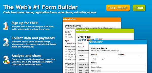
The example above shows how to use images effectively on a landing page. Even something as straightforward as a form building site can group images together in one area to strengthen the overall design and making the page less daunting and more appealing. This will likely result in a higher conversion rate.
Choose the Right Content
It isn’t enough to just have a pretty landing page. If you are going to keep it simple and cater to busy visitors, you’ll need to concentrate your message and make every word count. If someone gets bored or distracted by long-winded marketing copy, they’ll leave your site and dismiss your design from their mind. It is crucial to have a section where you list the benefits of using your product or service. Mention how easy it is. Describe personally how it can save money, save time, or solve a problem for your customers.
Choose the Right Amount of Content
You can also use a benefits section as a clickable teaser section; meticulous visitors who want to learn more can dig a little deeper and find more elaborate content. If you are trying to gain more subscribers to your newsletter, you could have a section where they fill out a form and are sent a copy of the most recent newsletter. If you are selling a product, you could have a signup form that leads to a free sample.
It’s important to remember not to have long-winded landing page content. You are just trying to pique their interest so that they sign up or make a purchase. Keep the information that is essential, and remove what isn’t.
Use Testimonials
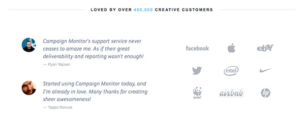
The Internet has generated a lot of mistrust and scrutiny. Many are reluctant to take action online, but a great way to gain trust is to use testimonials. Testimonials (or awards) from known, reputable entities are strong demonstrations of your own credibility. The more realiability and trust you can generate, the more likely it is that visitors will stop and give you their attention.
For example, if some well-known companies have used your products, you can place their logos (with permission) on your landing page to help establish your credibility. However, don’t use too many! Pick three of four of your best. If you are using client testimonials, it is a good idea to have a section of three or four testimonials from satisfied customers. Any more, and it will be redundant, excessive, ineffective information.
Use an Effective Call to Action
When trying to compel visitors to act, it isn’t necessarily what you say, but how you say it. Instead of having a button that says, “submit” or “sign up now”, you could have a button that is much more appealing. Let’s say you had an ebook showing others how to get 1000 Twitter subscribers in a day; you could have a button that says “Grow your Twitter Following Now”. Use specific verbiage that engages your viewer and makes it seem instantly beneficial to fill out a form or sign up for your service. By using default text, such as “submit” or “enter,” you are making it seem like they are doing you a favor instead of making the most of an opportunity.
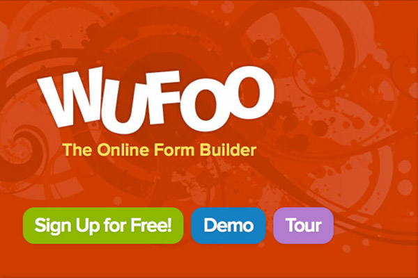
Wufoo’s call to action is excellent. It gives you three options, but it engages you to act, and chances are, you will. The buttons are simple, colorful and they command attention. You really can’t miss them, and they are the first thing that you see.
Use A/B Testing
A/B testing is surprisingly simple. You create two similar versions of the same landing page. One may be your current page, and the other may have slight variations, such as a different graphic or a different language for your call to action. You use them both, and you analyze which one garnered a higher conversion rate and compelled a higher percentage of viewers to act. This method is a common practice, and it will help you to build a truly optimized landing page through an iterative process of small, measurable improvements.
Examples of Great Landing Pages
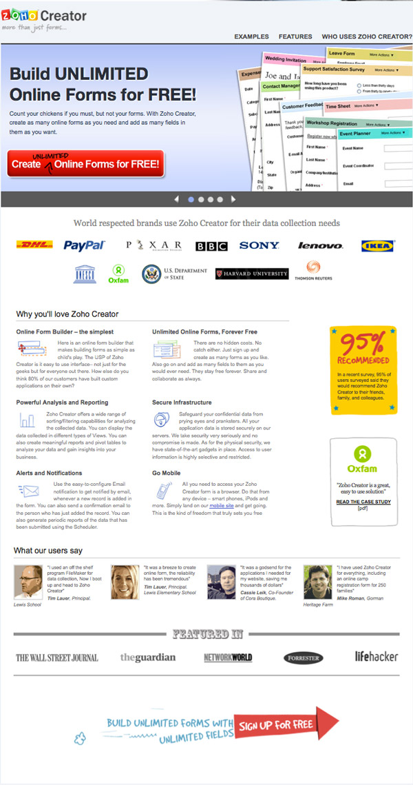
Zoho Form Creator is an excellent real-world example of a practical, useful landing page. They employ a very clear headline that states their main benefit. Once that pulls you in, you see that major, established, successful companies are already using these forms. They have six paragraphs of type (which is a fairly large amount of copy), but the text is organized and separated with mini images.
Below that are additional credibility enhancers, showing that their forms have been featured in The Wall Street Journal, and the last element they see is the very large, colorful, fun signup graphic.
The only thing that I would change about this page is that I would remove the yellow 95% graphic and the Oxfam graphic. I would then utilize the newly-created space to make the six text modules into a 3-column grid. Those two graphics don’t seem to enhance or entice visitors enough to take up such prominent real estate. I would be interested to see if their conversion rate increased after performing an A/B test with those two graphics removed.
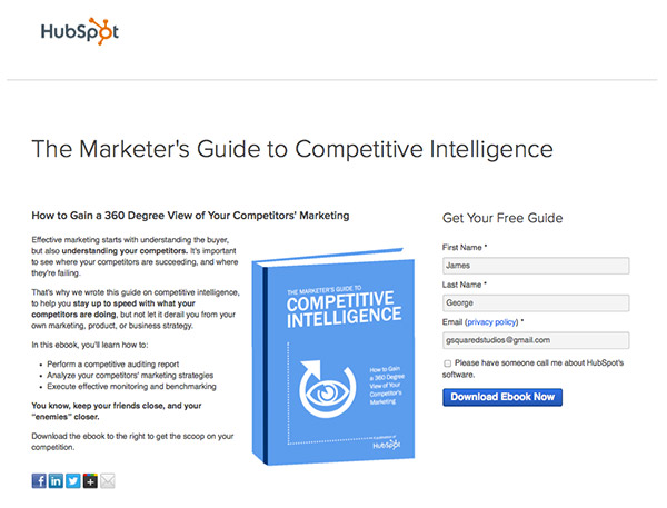
Hubspot definitely knows their stuff when it comes to conversions, testing, and landing pages. Promoting their services through ebook giveaways have helped them to build a business almost overnight. Notice that there isn’t a long paragraph of text. Key points are divided up into bullet points. There is only one graphic, showing the book, and there are a few bold words. This helps for those who are superficially skimming for content.
There is a simple form to fill out in exchange for the ebook, and social media buttons to help with promotion efforts as well. People love to share free stuff when they find it, so you can only imagine how fast free promotions spread around the web. It isn’t always about frills and flashy graphics. The main point is the end results of your efforts.
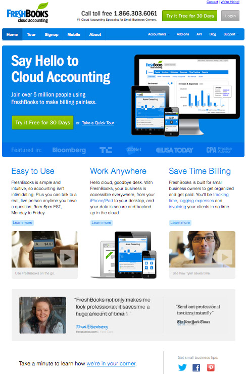
Freshbooks, like many other websites, seems to use their homepage as a landing page. There is a bold headline welcoming you to the site and encouraging action at the same time. They have strategically placed a “Try it free for 30 days” button in two locations, they have featured testimonials, and they kept it simple with three main points that entice you to use their services.
The only thing that I think is lacking here is the understated sentence at the bottom-left. They could have used a button or bolder text. If I wasn’t looking for it, I would have missed it. Otherwise, Freshbooks have effectively used their homepage as an effective landing page.
Conclusion
The tips above are meant to help you streamline your landing pages and to help you to raise your conversion rates. Less is often more when it comes to garnering attention and compelling visitors to act. Too much clutter makes it hard to pick out key points and find relevant information. Try A/B testing to compare a long and short version of your landing page, and you can objectively determine which gets the best results. Don’t forget to use a strong call to action that gives your visitor specific instructions.
Did you try trimming down the content of your landing page? If so, did you see a rise in your conversion rate? Do you have any landing pages of your own to show off? Share your results in the comments section below.
Frequently Asked Questions about Landing Page Design
What are the key elements of a successful landing page?
A successful landing page should have a clear and concise headline, a compelling subheadline, a brief description of the offer, at least one supporting image or video, social proof, and a single conversion goal – your Call-To-Action (CTA). The CTA should be prominent and persuasive, guiding visitors towards the desired action.
How can I make my landing page less busy?
To make your landing page less busy, focus on simplicity and clarity. Remove any unnecessary elements, use whitespace effectively to give your content room to breathe, and ensure your CTA stands out. Keep your copy concise and to the point, and use visuals strategically to support your message.
How important is the design of my landing page?
The design of your landing page is crucial as it directly impacts user experience and conversion rates. A well-designed landing page is visually appealing, easy to navigate, and aligns with your brand identity. It should guide visitors towards your CTA and make it easy for them to convert.
How can I optimize my landing page for mobile devices?
To optimize your landing page for mobile devices, ensure it is responsive, meaning it adjusts to fit any screen size. Keep your design simple, with clear, easy-to-read text and large, touch-friendly buttons. Also, keep in mind that load time is especially important on mobile, so optimize your images and other elements to ensure they load quickly.
What is the role of social proof on a landing page?
Social proof, such as testimonials, reviews, or case studies, can significantly increase trust and credibility. It shows visitors that others have benefited from your offer, making them more likely to convert.
How can I test the effectiveness of my landing page?
You can test the effectiveness of your landing page through A/B testing. This involves creating two versions of your page with one varying element, such as the headline or CTA, and seeing which performs better. You can also use analytics tools to track visitor behavior and conversion rates.
How can I improve the loading speed of my landing page?
To improve the loading speed of your landing page, optimize your images, use a content delivery network (CDN), minimize HTTP requests, and enable browser caching. A faster loading page can improve user experience and increase conversion rates.
How important is the headline of my landing page?
The headline is one of the most important elements of your landing page. It’s often the first thing visitors see, and it can significantly impact their decision to stay on your page or leave. A good headline is clear, compelling, and accurately reflects the offer on your page.
How can I make my landing page more engaging?
To make your landing page more engaging, use compelling visuals, interactive elements, and storytelling techniques. Keep your copy concise and persuasive, and ensure your CTA stands out. Also, make sure your page is easy to navigate and provides a seamless user experience.
How can I increase the conversion rate of my landing page?
To increase the conversion rate of your landing page, focus on clarity, relevance, and value. Make sure your offer is clear and compelling, your page is relevant to your target audience, and you clearly communicate the value of your offer. Also, optimize your CTA, use social proof, and continuously test and refine your page based on user behavior and feedback.

