

Key Takeaways
- Uber’s success in UX is largely due to its ability to identify and resolve friction points in the user experience, such as wait time, contact issues, directions, and making payments. This has been achieved through innovative use of technology and a data-driven approach.
- The company has used GPS technology to reduce wait times, stored vital details in the app to eliminate miscommunication, provided GPS directions to drivers, and offered cashless transactions and fare-splitting options to ease the payment process.
- Despite facing challenges such as surge pricing and issues with drivers, Uber continues to evolve and address problems. For instance, it is now testing self-driving vehicles to potentially reduce friction associated with human drivers.
Whether you’re turning up the volume on your car stereo, or swiping right on Tinder, user interfaces are limited to control panels, touchscreens, and displays.
User experience is not.
Smartphones have expanded the jurisdiction of UX. Now on-demand services are stretching the scope of user experience beyond the confines of your pocket-sized touchscreen.
Uber, Instacart, DoorDash – the list of services that leverage GPS tracking and cashless transactions is growing. As a result, it’s changing our day-to-day experience as people, not just users.
What Did Uber Accomplish?
Public transportation (often) sucks. You have to wait for a scheduled service, you have to pay with cash, and there’s never anywhere to sit.
Traditional taxis aren’t much better. You still have to wait, you often have to pay with cash, and you’re charged a premium for the luxury of riding by yourself.
Uber improved upon traditional taxis by identifying and resolving friction in the rider’s user experience. Now they’re attempting to compete with public transportation through UberPOOL – a ride-sharing service.
Uber have had their well-documented issues but their heady global expansion tells you they’ve done something right.
What real-world UX problems did Uber solve to get here?
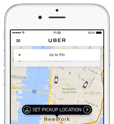
Problem #1: Wait time
Whether booking a cab the night before a big trip or sneaking out before dessert to call a cab company, the wait between requesting a ride and receiving a ride has always been a pain point.
Even standing out in the middle of the street, scanning the oncoming traffic stream for an empty cab can be a soul-destroying waste of time.
Uber used good tech to attack that challenge. Thanks to smartphones, equipped with GPS, on-demand ride-sharing services can use software to pair riders and drivers.
This pairing can be instantaneous, but not always. Uber’s efficiency is a testament to how the company regulates its marketplace, not the UX of its mobile app.
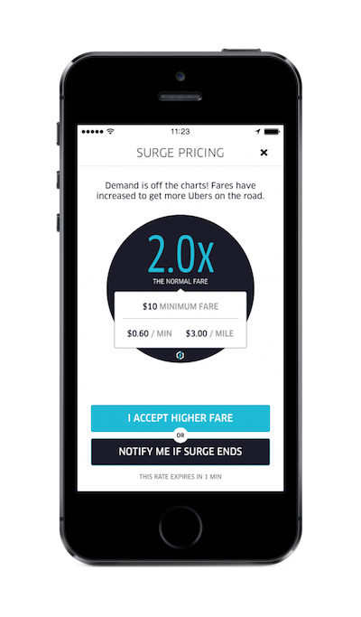
Uber famously raises their prices during peak times – surge pricing – to help offset demand. Riders don’t like surge pricing, but the feature ensures there are enough available rides by both decreasing demand and drawing off-duty drivers back onto the road.
There’s no doubt that surge pricing has been a difficult PR challenge for Uber. Certainly, some users have fallen victim to surge pricing in the past, so Uber will soon display the approximate fare before you agree to ride, whether surge pricing is active or not.
A highly data-driven system allows Uber to tackle the issue of high demand by analyzing the proximity of one route to another and attempting to pair riders. This carpooling feature (UberPOOL) lowers rider costs, increases network capacity (which reduces wait time), and even provides a social solution for daily commutes.
Could ‘plain old taxis’ offer a competing service? Technically, yes. Many have developed more sophisticated data services. Is it in their nature to use that data creatively? Who knows, but I tend to doubt it.
Problem #2: Contact

Placing an order over the phone can be rough because vital information (i.e. credit card numbers, addresses, times, dates, etc.) have to be communicated and reviewed.
Whenever I have to book a dentist appointment or anything else that is scheduled the old-fashioned way, there’s always this moment of “Umm.. I guess we’re good” that I hate. Did I hear the time right? Did they write the time down right? Could there have been a miscommunication?
All vital details are stored and easy to update and share in the Uber app. Of course, this trait is shared by all app-based services, but the pain point is eliminated all the same.
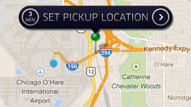
Problem #3: Directions
Directions used to be a huge pain. Cab drivers are human and they can miss exits if you don’t provide careful instructions and pay close attention.
With ride-sharing, GPS takes you where you need to go. Type in an address and the driver has directions.
Also, when you share a ride with a friend and you have different destinations, directing the driver can become the primary focus of your ride. Uber overcomes this problem by sending the destination to the driver and allowing riders to submit subsequent destinations as needed.
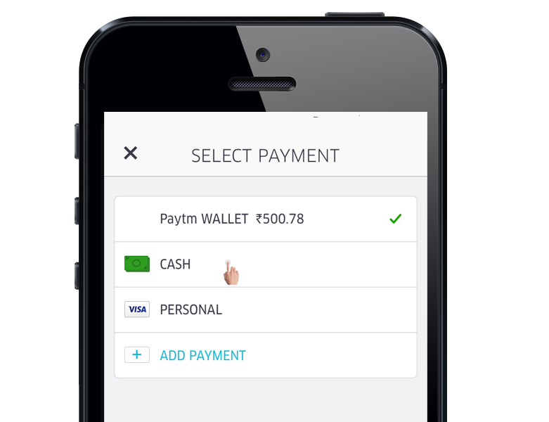
Problem #4: Making Payments
While some cab drivers still force you to pay with cash, you don’t have to have a credit card on you to use Uber.
In addition to storing credit cards, Uber automatically connects to ApplePay and Android Pay on your smartphone. The need to carry cash is coming to an end and Uber is accelerating that trend.
Uber also lets you split fares with your friends. This eliminates the need for a third-party app like Venmo. It reduces tension between friends and makes it faster to get in and out of cars.
The Future
Uber has serious problems, but they don’t shy away from big problems.
Human drivers are currently a source of friction for Uber. They complain about being contractors, campaign for higher wages and are trying to unionize.
Always resourceful, Uber launched a series of road tests for a fleet of self-driving vehicles to fix that too.
Frequently Asked Questions on UX Design and Friction
What is friction in UX design?
Friction in UX design refers to any element that hinders user interaction or disrupts the user journey on a website or app. It could be anything from a slow-loading page, complex navigation, too many steps to complete a task, or unclear instructions. While friction is generally seen as negative, it can sometimes be used strategically to slow down users and make them think before taking certain actions.
How does Uber reduce friction in its UX design?
Uber reduces friction in its UX design by simplifying the user journey as much as possible. The app has a clean, intuitive interface that makes it easy for users to book a ride. It also provides real-time updates on the driver’s location and estimated arrival time, which reduces uncertainty and anxiety. Furthermore, Uber uses machine learning algorithms to predict users’ most likely destinations, further streamlining the booking process.
Can friction ever be beneficial in UX design?
Yes, friction can sometimes be beneficial in UX design. While it’s generally important to make tasks as easy and quick as possible for users, there are situations where adding a bit of friction can improve the user experience. For example, if a task has serious consequences (like deleting an account), adding an extra confirmation step can prevent users from accidentally taking an action they’ll regret. This is known as “positive friction.”
How can I identify friction points in my UX design?
Identifying friction points in your UX design involves closely observing and analyzing user behavior. This can be done through user testing, surveys, heatmaps, and analytics tools. Look for areas where users seem to struggle or drop off, such as forms with high abandonment rates or pages with high bounce rates. These could indicate friction points that need to be addressed.
How can I reduce friction in my UX design?
Reducing friction in your UX design involves simplifying and streamlining the user journey as much as possible. This could mean reducing the number of steps to complete a task, improving page load times, making navigation more intuitive, or providing clearer instructions. It’s also important to regularly test your design with real users to identify and address any friction points.
What is the role of machine learning in reducing UX friction?
Machine learning can play a significant role in reducing UX friction by predicting user behavior and personalizing the user experience. For example, Uber uses machine learning to predict users’ most likely destinations, which saves users the effort of typing in their destination every time. Machine learning can also be used to personalize content, recommendations, and interfaces based on users’ past behavior, further reducing friction.
How does Uber’s UX design contribute to its success?
Uber’s UX design is a key factor in its success. By reducing friction and making the ride-booking process as easy and seamless as possible, Uber has been able to attract and retain a large user base. Its intuitive interface, real-time updates, and personalized recommendations all contribute to a positive user experience that sets it apart from competitors.
What are some common sources of friction in UX design?
Common sources of friction in UX design include slow page load times, complex navigation, too many steps to complete a task, unclear instructions, and lack of personalization. These can all disrupt the user journey and lead to frustration or abandonment.
How does friction impact user satisfaction and conversion rates?
Friction can have a significant impact on user satisfaction and conversion rates. If users find a website or app difficult to use, they’re likely to become frustrated and abandon the task, which can lead to lower conversion rates. On the other hand, a smooth, frictionless user experience can increase user satisfaction and boost conversions.
How can I use positive friction in my UX design?
Positive friction can be used in your UX design to slow down users and make them think before taking certain actions. This can be especially useful for tasks with serious consequences, like deleting an account or making a purchase. Adding an extra confirmation step or making users manually input information can prevent accidental actions and ensure that users are fully aware of what they’re doing.

