Link Text: Best Practices for Desktop and Mobile

Key Takeaways
- The ideal link presentation should differentiate linked text from unlinked text, visually distinguish between visited and unvisited links, work in context, be scannable and predictive of what users will find upon clicking, and keep important words at the start of the link text.
- Mobile usage has sparked new styles in identifying text links within an interface, offering new possibilities for link presentation.
- The best practices for designing links for both desktop and mobile require a balance between visibility, usability, and aesthetics. Links should be easily identifiable, large enough to be easily tapped on mobile, and the link text should be descriptive of where the link leads to.
- Link text, also known as anchor text, plays a crucial role in SEO as it helps search engines understand the content of the linked page, improving its ranking for relevant keywords. Thus, using descriptive and relevant link text can enhance SEO efforts and improve a website’s visibility in search engine results.
Last week’s discussion of text usage in flat UI design sparked some interesting comments, including this one, from Stew:
“I think the lack of underlining on links is a widespread problem already – designers not wishing to spoil their typography work at the cost of an easily navigable page – so a good shout out on that.”
It made me wonder. What is the state of links today?
Is there an optimal link length? Is there an ideal link presentation? Should all links be underlined? What about rollover, viewed, and unviewed states?
Old habits die hard…
Or do they?
If you’re of the old school, you’ll recall the days when all links were blue and underlined and, whatever you did, you didn’t use an underline for anything else.
Ah, how times have changed …

The underline at the top of the sitepoint.com homepage denotes text that acts almost as a sort of carousel. It’s not a link, but the underlined text changes to reflect the different things you can learn here.
That’s nice, but I really want to click on that text every time I come to the home page. It’s almost as if some part of my brain literally cannot believe it’s not linked.
Meanwhile, the boxes (all text!) that list new publications on the site contain three links each:
- the category link
- the article title link
- the author name link.
The category links are the only ones that could be construed as having an underline, yet they’re the only ones that do not change state on rollover.
What’s going on?! Clearly, old habits don’t die hard with designers. But they may with users.
Free rein?
Most of the literature I could dig up on link presentation and length was old—like three years old.
One key problem with that is that this information is pre-mobile. So if you have any mobile-first literature on link treatment and text that you can share with us in the comments, please do.
That said, there are still some guidelines that seem to be as applicable today as they were all that time ago:
- Differentiate linked text from unlinked text.
- Differentiate visually between visited and unvisited links.
- Make link text work in context.
- Make it scannable (that is, make it work if not out of context, then without the context of the sentence that includes it).
- Keep it short but predictive of what users will get when they click.
- Put the words related to that prediction at the start of the link text.
These guidelines all seem applicable to mobile, although (to my mind), mobile seems to have sparked new styles that give new possibility to, for example, identifying text links within an interface. Again, look at sitepoint.com, this time on mobile (or resize your browser), and you’ll see what I mean.

This ages-old Jakob Nielsen piece has good advice for those who want more detail on the basics of links. Even 12 years on …
And for those who want to look at the broader context in which link text sits, usability-obsessed interface designer Paul Olyslager also presents interesting research on text readability on his blog. Compare it with the Web Style Guide information on page width and line length.
An obligatory sidenote for the sake of completeness: some SEO boffins advocate text links of no more than n characters, or n words, because that’s what Google shows in its results. Or, showed when the articles were written. Who knows what zany ideas Google will come up with next? Let’s move on.
A few link text trends
I pointed out some potential link-related issues with the sitepoint.com homepage a moment ago, but I have to admit that those aren’t exactly “text links”—they’re clickable title zones, and many would argue that’s pretty obvious without an underline.
Okay, so they don’t adhere to all the guidelines in the list above, and given the different link interactions within each box on the desktop homepage, things could get a bit confusing, but we could consider these kinds of title links separately from in-content text links.
So let’s look at some of the world’s leading usability and content experts are doing with their links, of all varieties, shall we?
The Interaction Design Association, or IxDA, website uses underlines as the rollover state for every link that’s not a button or part of an image. All links are coloured differently from unlinked text as a starting point.
The Nielsen Norman Group does the same, except, weirdly, with the Popular Topics list in its site footer.
The Hiser Group, an Australian-based usability consultancy, also does the same, though it doesn’t use underlines in any of its site’s menu states.
What about in-text link treatments? We see some interesting examples on text-centric publishers’ sites.
Wikipedia’s internal pages denote links with blue text, and underline them on rollover.
Used links are shown in dark blue, which differentiates them less (making them harder to find, I think) from the surrounding text.
The New York Times site underlines in-text links, which are coloured blue, by default. They appear in pale purple once they’ve been clicked.
It’s also interesting to compare these two publications’ approaches to constructing in-text links, if you’re someone who writes text or encodes the in-text links it contains.
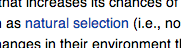
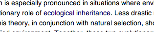
Wikipedia links topic keywords, which is certainly short and informative, within the context of an encyclopaedia. The problem with single-word links, though, lies with mobile usage. To tap a single-word link, a user may well have to zoom their view of your page, which is less than handy.
Still, Wikipedia needs to balance this against a need to provide access to information—which is, after all its purpose—and potentially, to link to lots of different information. Single-word links can be justified for Wikipedia; they’re unlikely to be so easily justified for the average brand.
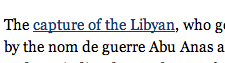
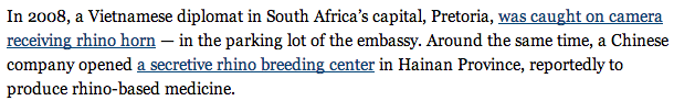
The New York Times, on the other hand, has to include more information in its links than just a keyword. Here are a couple of examples from this New York Times story.
I’d question the inclusion of “was” in the first link, seeing as we don’t know, within the context of the link’s text, who was caught. From a perspective of scannability, it’s probably superfluous. The important information here is that you can see footage of a person being caught, so I’d leave the “was” out of that link’s text.
Similarly, I’d leave the “a” out of the second link’s text, because it’s clear from the use of the singular “center” that we’re only talking about one. My arguments here are based on Neilsen’s “put the important words first” policy, which is also probably good for users reading that link text off the page—in search results, for example.
This example raises another mobile-related issue too, which is proximity. Most of us can manage to tap a text link that’s a few words long or more. But put two close together and we may have trouble tapping the one we want. So this is something to consider too—even a few extra words in between links can make all the difference, pushing the linked text further apart, and making it easier to hit the link you want. Take care with your phrasing, though (don’t just pad!).
So it looks like those guidelines I listed above are generally pretty well adhered to by usability experts and major publishers, probably for good reason.
How does your site stack up? Do your text links work as effectively in desktop and mobile browsers? Let’s hear about it in the comments.
Frequently Asked Questions (FAQs) on Link Text Best Practices
What are the best practices for designing links for both desktop and mobile?
Designing links for both desktop and mobile requires a balance between visibility, usability, and aesthetics. Links should be easily identifiable, with a color that stands out from the rest of the text. They should also be underlined to distinguish them from regular text. For mobile, links should be large enough to be easily tapped with a finger. Additionally, the link text should be descriptive and give a clear indication of where the link leads to. Avoid using generic phrases like “click here” or “read more”.
How can I make my links more user-friendly?
To make your links more user-friendly, ensure they are easily identifiable and distinguishable from the rest of the text. Use a different color for your links and underline them. The link text should be descriptive and give a clear indication of where the link leads to. Avoid using generic phrases like “click here” or “read more”. Also, ensure that your links are large enough to be easily clicked or tapped, especially on mobile devices.
What is the importance of link text in SEO?
Link text, also known as anchor text, plays a crucial role in SEO. It helps search engines understand the content of the linked page, which can improve its ranking for relevant keywords. Using descriptive and relevant link text can enhance your SEO efforts and improve your website’s visibility in search engine results.
How can I design effective hyperlinks for better user experience?
Designing effective hyperlinks involves making them easily identifiable, using descriptive link text, and ensuring they are easily clickable or tappable. Links should stand out from the rest of the text, usually through a different color and underlining. The link text should clearly indicate where the link leads to, helping users decide whether to click on it or not. On mobile devices, links should be large enough to be easily tapped with a finger.
What are some common mistakes to avoid when designing links?
Some common mistakes to avoid when designing links include using generic link text like “click here” or “read more”, making links that are too small to click or tap on mobile devices, and not making links stand out from the rest of the text. These mistakes can lead to a poor user experience and lower engagement with your content.
How can I make my links more visually appealing?
To make your links more visually appealing, choose a color that stands out from the rest of the text but still complements your overall website design. You can also use different styles, such as bold or italic, to make your links stand out. However, ensure that your links are still easily identifiable and usable.
How can I create text links in Squarespace?
To create text links in Squarespace, highlight the text you want to link, click on the link icon in the text editor toolbar, and enter the URL of the page you want to link to. You can also set the link to open in a new tab and add nofollow attributes if necessary.
What are the guidelines for visualizing links?
The guidelines for visualizing links involve making them easily identifiable, using descriptive link text, and ensuring they are easily clickable or tappable. Links should stand out from the rest of the text, usually through a different color and underlining. The link text should clearly indicate where the link leads to, helping users decide whether to click on it or not.
How can I design better links for emails?
Designing better links for emails involves making them easily identifiable, using descriptive link text, and ensuring they are easily clickable. Links should stand out from the rest of the text, usually through a different color and underlining. The link text should clearly indicate where the link leads to, helping users decide whether to click on it or not.
How can I improve the accessibility of my links?
To improve the accessibility of your links, use descriptive link text that gives a clear indication of where the link leads to. Avoid using generic phrases like “click here” or “read more”. Also, ensure that your links are easily identifiable, usually through a different color and underlining. On mobile devices, links should be large enough to be easily tapped with a finger.
Georgina has more than fifteen years' experience writing and editing for web, print and voice. With a background in marketing and a passion for words, the time Georgina spent with companies like Sausage Software and sitepoint.com cemented her lasting interest in the media, persuasion, and communications culture.


Published in
·Bootstrap·Cloud·Miscellaneous·Open Source·Patterns & Practices·PHP·Programming·Web·June 20, 2014