Key Takeaways
- Flat UI design is an increasingly popular trend due to users’ growing familiarity with digital interfaces. It emphasizes minimalism, with the absence of depth, simple elements, and a focus on typography and color.
- The suitability of flat UI design depends on the project and client’s brand persona. Designers should consider the users’ needs and provide clear direction for clickable areas.
- The use of grid in flat UI design is vital as it establishes visual order. Color and typography are also important elements, with strong hues used to draw attention and simple, bold fonts for readability.
- There are numerous flat UI design kits available, such as Flat UI Pro, Modern Touch UI Kit, and Metro Vibes UI Kit. These provide various elements and tools to assist in creating a flat UI design.
A recent Forbes report places the increasing trend towards flat design firmly at the door of people’s growing familiarity with digital interfaces. In years gone by (1995-2003), the author says, designers were designing for only a “certain class of professional workers” who were familiar with desktop software and this meant designing with clickability in mind.
Fast forward to the present day and the latest version of iOS7, and now we’re designing still very much with the user at the forefront of our minds with flat UI design. In the early days of the iPhone, web trends were made popular by the Apple devices too, but with an eye on bubbles, drop-shadows and glares, to name a few popular UI techniques.
It’s this earlier intervention from Apple that the Forbes article says has helped modern users get really comfortable with using the web, on more devices than just a desktop or laptop computer.
“I believe that the flat design trend is a symptom of the growing maturity in the field of web and interface design,” the article states.
“This maturity applies to our designers – who are getting better at making interfaces that encourage interactivity and engagement – as well as to our users.”
Users are of course increasingly sophisticated when it comes to how, where and why they use the internet and because of this, the tendency to make shiny buttons that scream “click me” is now thankfully behind us.
Where to begin
Trends are all very well and good and personally, I love the current minimalist, flat and simple designs that are emerging thick and fast within the design community, but that’s not to say that all of your clients will too.
The first place to start then would be in the suitability of flat UI design to the project that you’re working on. If the client has a good, strong brand persona, then see what you can take from that in terms of colors, layout and content strategy to make sure it matches your ideas.
Most of all though, think about the users as, if the client’s ideas are outdated and horrify you, then you have a good argument to overcome this. Users may be a lot more web/technologically literate than in the past, but they still need a certain amount of direction when it comes to clickable areas and such like.
Elements of flat design
- Absence of depth
- Use of simple elements
- Typography
- Color
- Minimalism
Grid
As with all UI design, the grid plays one of the most vital roles and flat design is no exception. It establishes visual order when you’re working with just a few elements and gives you a guide to work to.
Use the grid to define your content and draw the user’s eye to where you want them to go. You can get creative and user tighter grids to experiment with different visual effects, so that you can gauge how much content can be included, without the overall interface looking cramped and messy.
Color
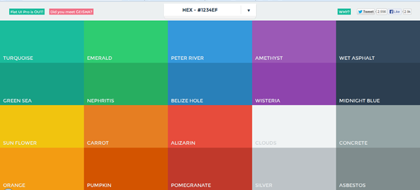
You may have noticed that flat designs tend to be quite colorful, making the most of different shades and hues from the same palette. It’s important not to get carried away with too many colors and bear in mind that very strong colors can be overbearing.
With that in mind, think pastels and save the strongest hues for your actionable areas to draw the eye and entice clicks. Reds and oranges are great for call-to-action buttons, but be careful not to overuse as this will drive users away.
Take a look at Flat UI Colors for inspiration and ideas.
Typography
This is another important part of flat design and it’s vital that the typography fits in with the overall design, using strong, bold fonts that are simple and easy to read. Consider readability too, use simple, solid words and keep them to a minimum, with a consistent tone and voice.
Consider the use of white space too, your design should ideally be able to be taken in at a glance, with clear information and visual indicators that guide the user where you want them to go.
Flat UI Design kits
You have to hand it to the designer/developer community, when it comes to sharing useful tools, libraries and resources, they are generally well on the ball and flat design resources are readily available and plentiful.
Here’s some of the more useful, or just best looking ones, to choose from:
Flat UI Pro
This costs from $39 for a personal version and $149 for developer/business and is definitely worth a look. Flat UI Pro is grid-based, Retina-ready and comes bundled with a wealth of time-saving elements such as icon sets, color swatches, free fonts and glyphs, all designed to make your life easier.
It’s based on Twitter Bootstrap and also allows you to design responsively with a huge variety of devices in mind.
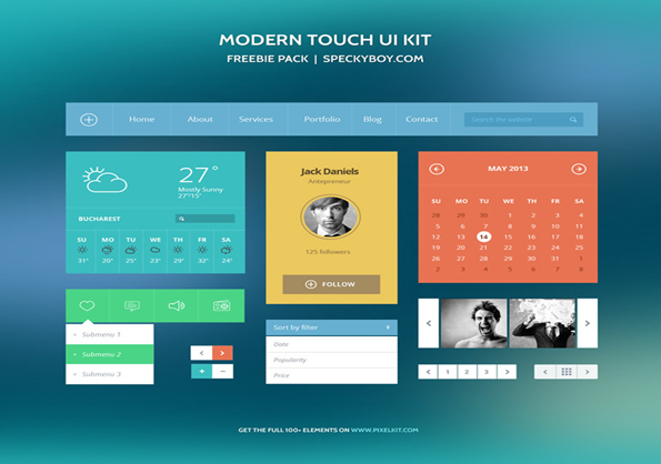
Modern Touch UI Kit
This is completely free to use for both personal and commercial use and is a metro-style kit to help you get started. Click on the image to download the full kit.
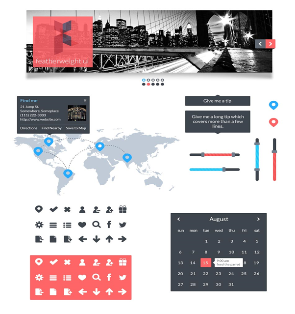
Featherweight UI
This simple kit is again retina-ready and includes elements such as menus, photo scrolling, icons and widgets. The kit is vector-based and has a nice retro feel to it, design and color wise, and whilst it’s not the largest kit out there, it’s a nice little package all the same.
Again free to use for any purpose, the font for Featherweight UI is Lato Normal, which is available from Google Web Fonts for offline and online use. More details on how to use can be found on designer Sarah Hunt’s site.
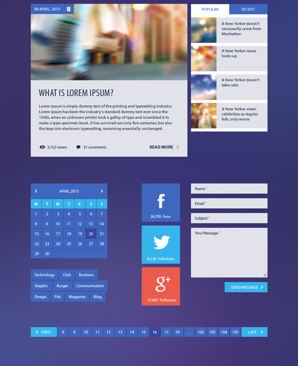
Blog/Magazine Flat UI Kit
Packed with useful components, this kit has been designed with publishers in mind and is perfect for creating magazine-style sites or professional blogs. While the photos in the presentations are not included in the download kit, everything else that comes in the download is fully PSD editable.
Metro Vibes UI Kit
This is a bargain at $39 for a year’s access and contains 100 different elements for you to deliver the perfect metro look and style. Created by Mike of Creative Mints, Metro Vibes is made for 960 Grids and contains free open fonts and layered PSD files.
The year’s subscription entitles you to free updates as they become available and can be used commercially. This gives you every tool you’re likely to need in order to build a flat UI site, including blogging elements, pricing, calendars and so on. Visit the site to see a full preview of all of the available elements.
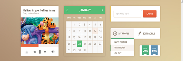
There are, of course, hundreds of kits out there now, so it shouldn’t be a difficult matter for you to find one to suit you and the above give you a great starting point.
So now it’s time to get cracking and put your creative head on again to start experimenting with flat UI design and coming up with some beautifully designed sites.
And if you enjoyed reading this post, you’ll love Learnable; the place to learn fresh skills and techniques from the masters. Members get instant access to all of SitePoint’s ebooks and interactive online courses, like The Principles of Beautiful Web Design, 2nd Edition.
Comments on this article are closed. Have a question about Web Design? Why not ask it on our forums?
Frequently Asked Questions on Flat UI Design
What is the significance of Flat UI Design in modern web development?
Flat UI Design, also known as Flat Design, is a user interface design style that emphasizes minimalism. It is characterized by the use of simple, clean lines, solid colors, and typography to convey meaning and functionality. This design style eliminates any stylistic choices that give the illusion of three-dimensions, such as drop shadows, gradients, or textures. In modern web development, Flat UI Design is significant because it improves usability. It makes the website or app look neat and fast loading, enhancing the user experience.
How does Flat UI Design contribute to mobile responsiveness?
Flat UI Design plays a crucial role in mobile responsiveness. Its minimalist approach means less data usage, leading to faster loading times on mobile devices. The simple and straightforward elements of Flat UI Design are easily adaptable to different screen sizes, ensuring a consistent user experience across various devices.
What are the key elements of Flat UI Design?
The key elements of Flat UI Design include simple elements, minimalistic design, emphasis on typography, and lack of depth and dimension. These elements are characterized by clean, open space, crisp edges, bright colors, and two-dimensional illustrations.
How does Flat UI Design improve user experience?
Flat UI Design improves user experience by making the interface simple and easy to understand. The minimalist design reduces cognitive load, making it easier for users to navigate and interact with the website or app. Moreover, the use of bold and vibrant colors in Flat UI Design can help guide the user’s attention to important elements or actions.
What are the potential drawbacks of Flat UI Design?
While Flat UI Design has many benefits, it also has potential drawbacks. The minimalist approach can sometimes lead to oversimplification, making it difficult for users to understand certain functionalities. Also, the lack of depth and dimension can make clickable elements less obvious, potentially causing confusion for users.
How can I effectively use colors in Flat UI Design?
In Flat UI Design, colors are used to create visual interest and guide user interaction. It’s important to use bold and vibrant colors to highlight key elements or actions. However, it’s also crucial to maintain a balance and not overwhelm the user with too many bright colors. A good practice is to use a limited color palette and apply it consistently throughout the design.
How does typography contribute to Flat UI Design?
Typography is a crucial element in Flat UI Design. Since the design style is minimalistic, typography often takes center stage. It’s used not just for readability, but also to create style and visual interest. Choosing the right font and size can significantly enhance the overall look and feel of the design.
Can Flat UI Design be combined with other design styles?
Yes, Flat UI Design can be combined with other design styles to create a unique and engaging user interface. For instance, it can be combined with Material Design, which adds some depth and shadow to the flat elements, creating a semi-flat design.
What are some popular tools for creating Flat UI Designs?
There are several tools available for creating Flat UI Designs, including Adobe XD, Sketch, Figma, and InVision. These tools offer a range of features that can help you create clean, minimalist designs with ease.
Where can I find inspiration for Flat UI Design?
There are many online platforms where you can find inspiration for Flat UI Design. Websites like Dribbble, Behance, and Pinterest feature a vast collection of Flat UI Design examples from designers around the world. You can also look at popular apps and websites that use Flat UI Design for inspiration.
Kerry is a prolific technology writer, covering a range of subjects from design & development, SEO & social, to corporate tech & gadgets. Co-author of SitePoint’s Jump Start HTML5, Kerry also heads up digital content agency markITwrite and is an all-round geek.
Published in
·Accessibility·Design·Design & UX·Freelancing·Illustration·Sketch·Software·UI Design·Usability·UX·Web·March 23, 2016
Published in
·Accessibility·Animation·Design·Design & UX·Technology·UI Design·Usability·UX·September 13, 2017
