

According to Kissmetrics, a product’s visual appearance is the number one factor influencing consumers’ purchasing decisions. Nowadays, it is common practice among marketing managers to hire color consultants to get assistance in determining a color (or colors) that would attract their customers. They understand that colors are an important marketing tool. Mobile app developers have many useful things to learn from them.
Key Takeaways
- The visual appearance of a product, including its color scheme, is a key factor influencing consumers’ purchasing decisions, making it crucial for mobile app developers to consider color in their designs.
- Color schemes can be created using a color wheel, with common schemes including monochromatic, analogous, complementary, and triadic. These schemes can help provide a consistent visual experience for app users.
- The cultural meanings of colors should be considered in mobile UI design as colors can convey different meanings in different cultures. For instance, while red can signify energy and excitement in Western countries, it represents bridal prosperity and good fortune in Eastern countries.
- Both Apple and Google have proposed color palettes for app developers to use, with Google advising the use of three hues from the primary palette and one accent hue from the secondary palette. These palettes can help ensure that apps have a visually pleasing and consistent appearance.
Color Theory
The color wheel based on the three primary colors (red, yellow, and blue) has been used by artists for centuries. The first color diagram was developed by Newton 350 years ago.
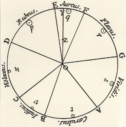
The color wheel used nowadays includes primary, secondary (green, orange, and purple) and tertiary colors (yellow-orange, red-orange, red-purple, blue-purple, blue-green, and yellow-green).
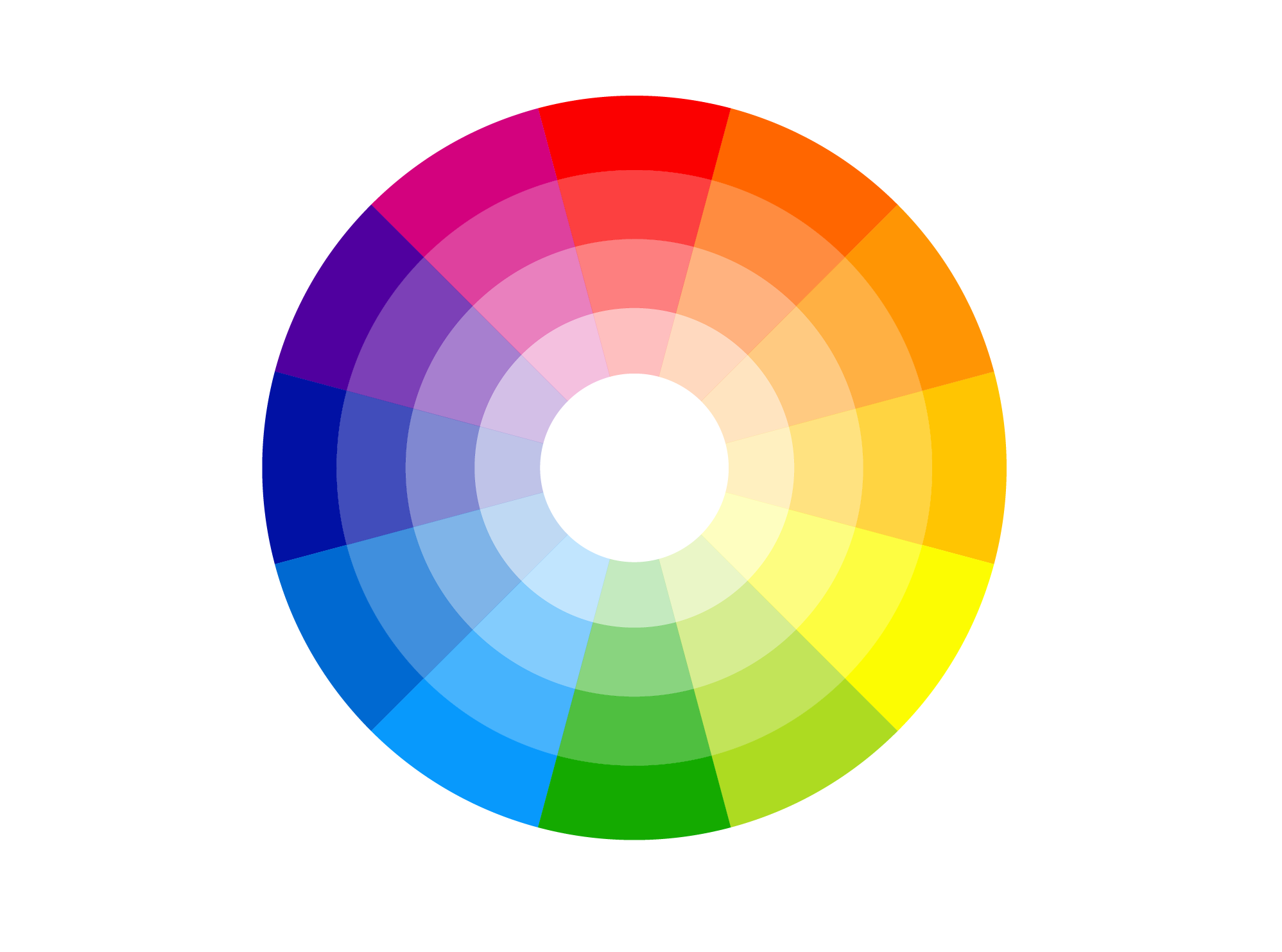
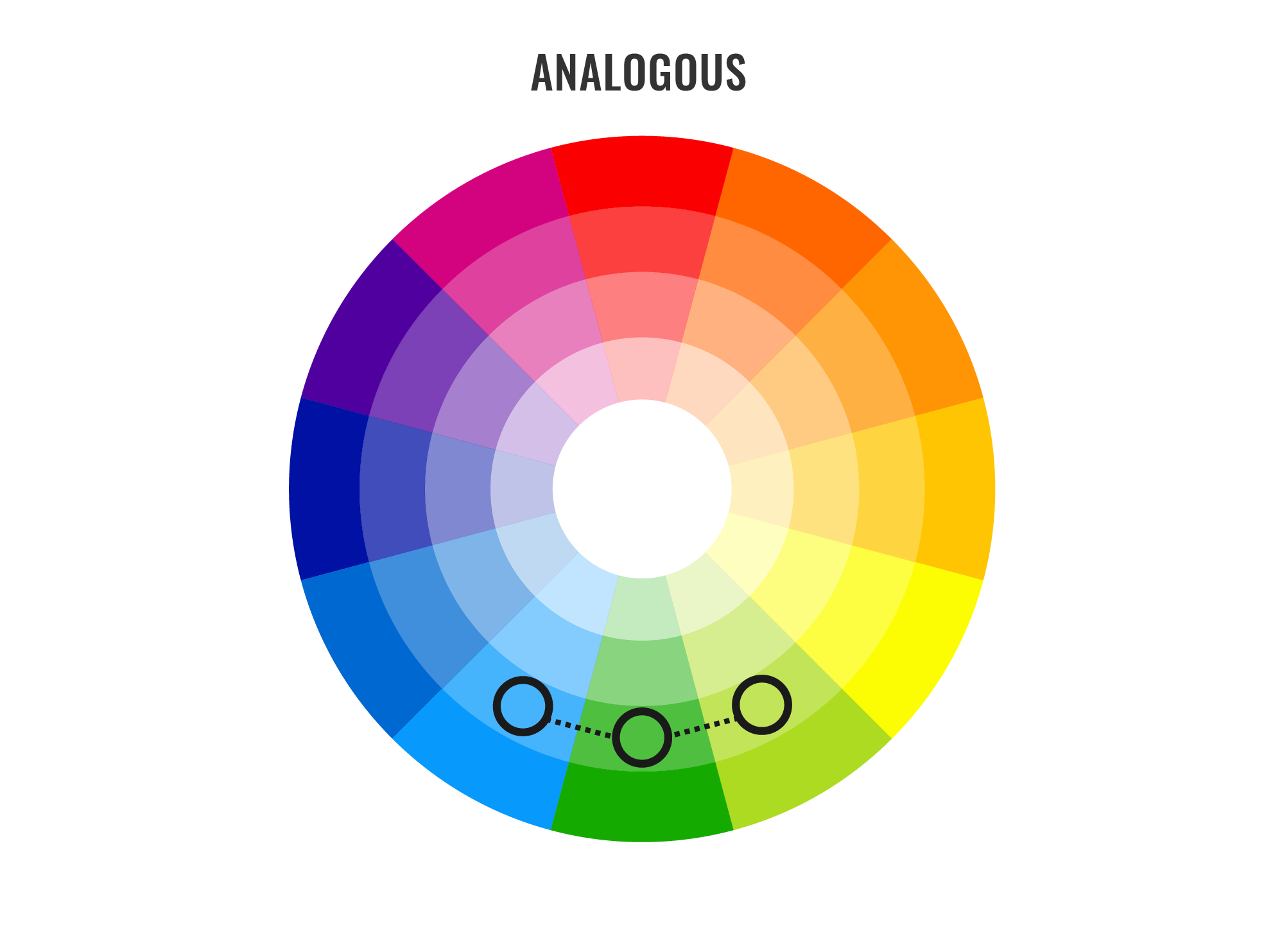
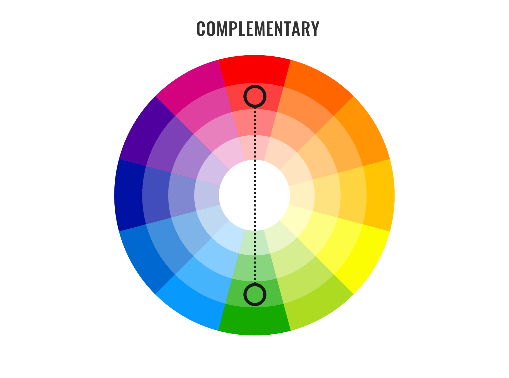
Color wheels help us create color schemes. I listed below the most common ones.
- Monochromatic color scheme
There is only one color in this scheme and its shades and tints.

- Analogous color scheme
This scheme uses colors that go one by one in the 12-color wheel.
- Complementary color scheme
The scheme uses colors that are opposite to each other on the color wheel.
- Triadic color scheme
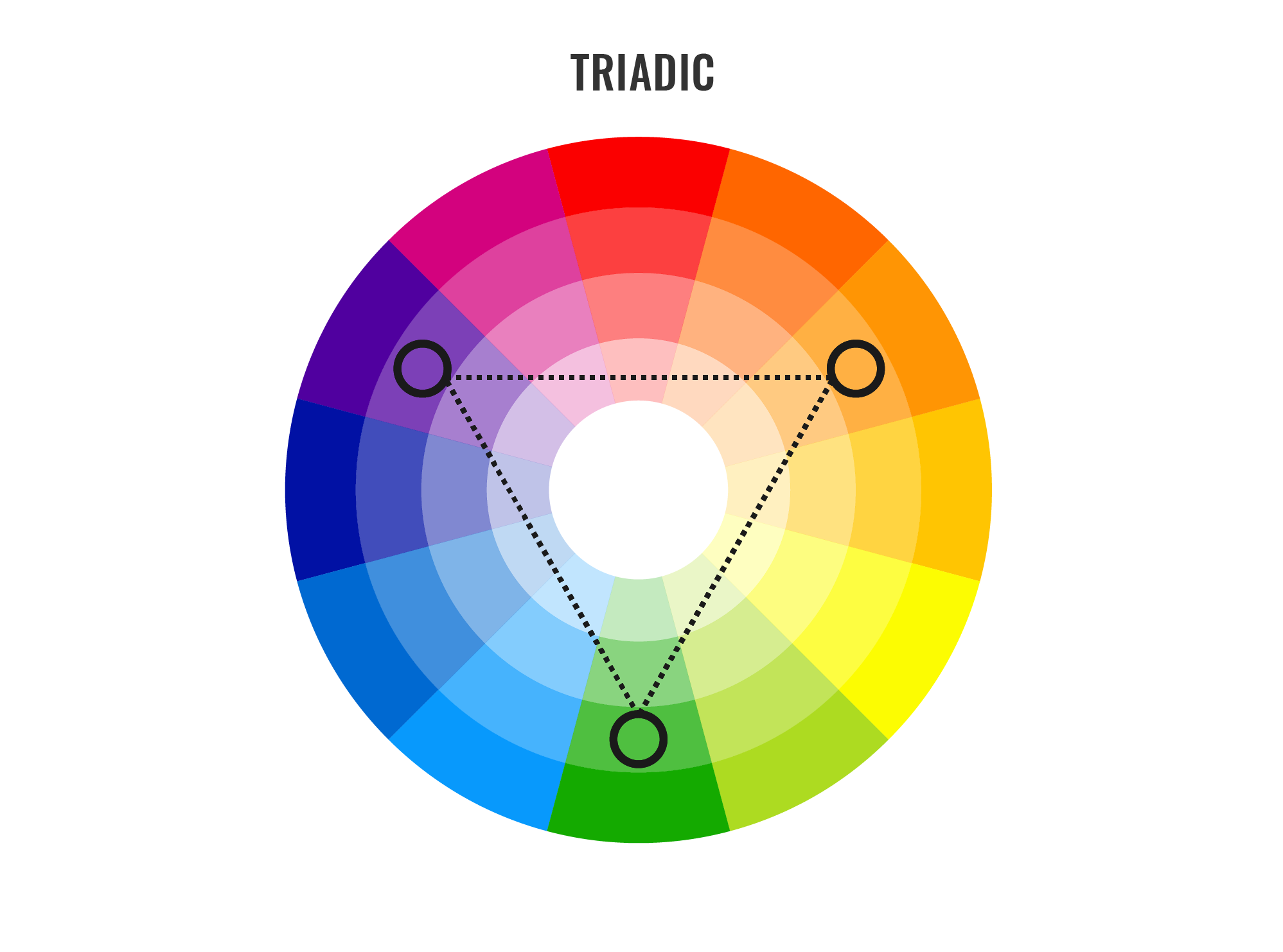
This scheme combines every fourth color on the color wheel. Such a scheme, for instance, was used in this app:
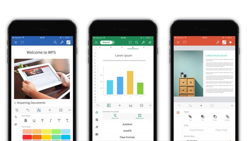
Source: WPS Office
Cultural Meanings of Color and Color Symbolism
Colors may convey specific meanings depending on cultural background.
For instance, purple (the color of the Cadbury’s wrapper) that British associate with luxury has the opposite meaning in Taiwan.
Red has the following meaning for Western countries: energy, excitement, action; anger; love and passion; Christmas (when combined with green); stop; power. But the meaning is different in Eastern countries: bridal, prosperity, joy (when combined with white), good fortune. It can vary even more: life; anger and danger (Japan), Thailand (Sunday), mourning (South Africa), and more.
Find meanings of some other colors on the image below:
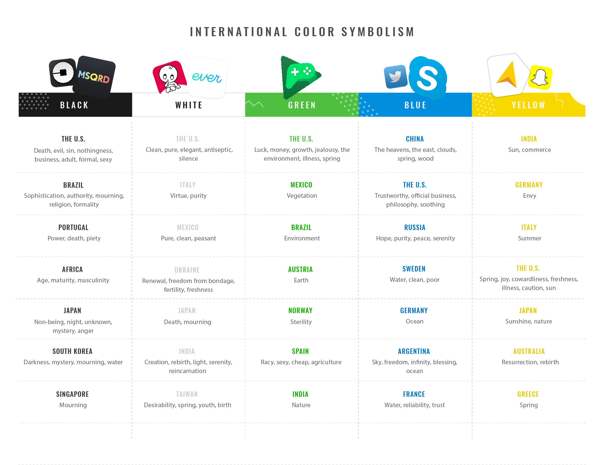
Sources: Global Propaganda, Xerox Corporation
McDonald’s is a brilliant example of multi-branding websites where different colors were chosen depending on a country.
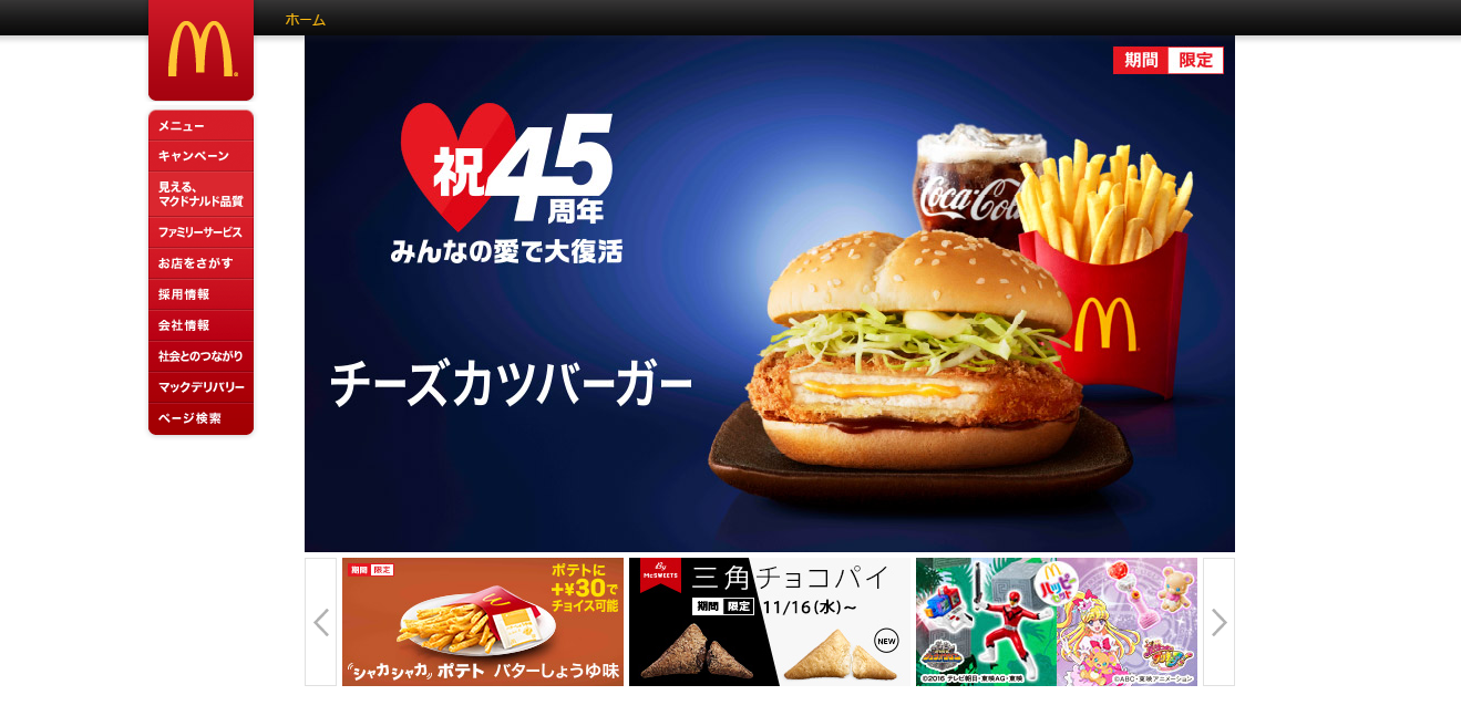
The Japanese website.
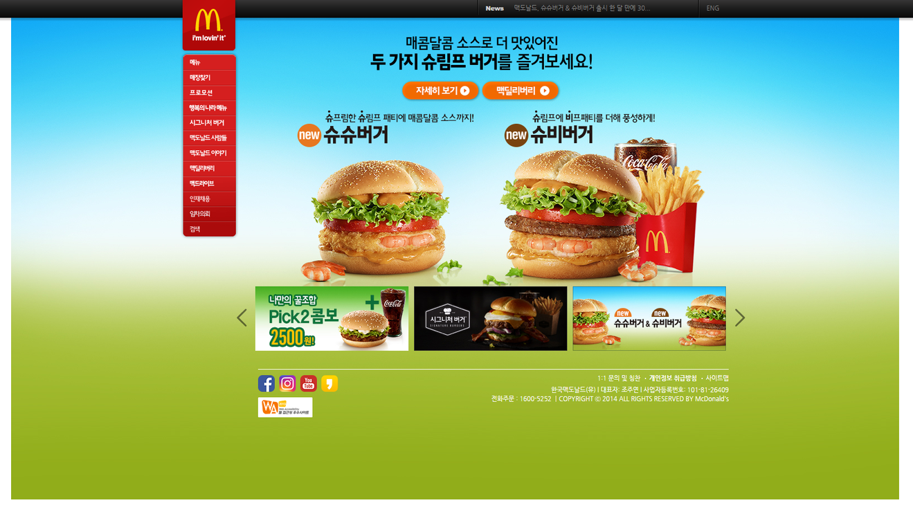
The South Korean website.
Gold color represents wealth in Western countries. Mobile app developers often use this color to identify a paid version of an app:


Source: SD Maid
Color Schemes & Mobile UI
Apple and Google, the developers of iOS and Android, created some basic design principles that mobile app developers are advised to follow, to provide users with a consistent visual experience. These recommendations include advice on the choice of a color palette, color schemes, text colors, etc.
The color palette proposed by Google includes primary and secondary colors. App developers are advised to use any of the 500 colors as primary colors in their apps and other colors as accents colors.
Here are some examples of the color schemes:
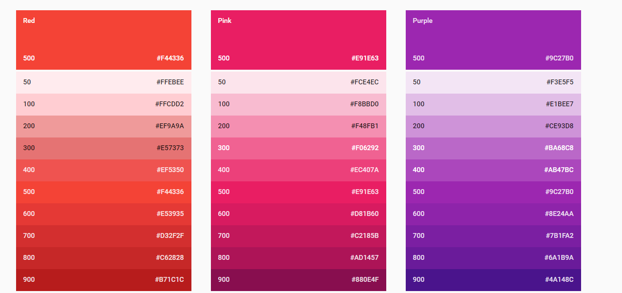
Source: Google
When it comes to choosing a color scheme, Google suggests using colors from the above-mentioned palettes. Google advises to limit the choice to 3 hues from the primary palette and take one accent hue from the secondary palette.
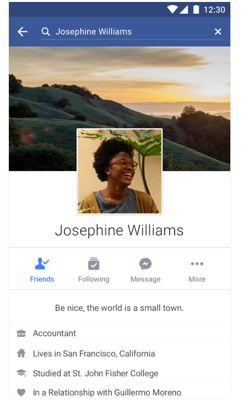
The Facebook app is a good example of an app where the scheme can be found.

Apple suggests the following color palette:
Source: Apple Inc.
Apple suggests picking app tint colors that look great individually and when they are combined together. Besides, they should look great on light and dark backgrounds.
Here are some other tips:
- The use of complementary colors;
- One key color to indicate interactivity;
- A limited color palette;
- The use of different colors for interactive and non-interactive elements;
- And more.
Lifesum is an example of an iOS app with a good color scheme:


Approaches to the Choice of Color Schemes & Tools
People judge by first impressions, and a good app design can elevate the app to the top of the App Store charts. A good design means a good color scheme, as well. Designers can use different online tools while working on an app to make sure that they have chosen the right colors and their app will look great. You can find some of the tools below:
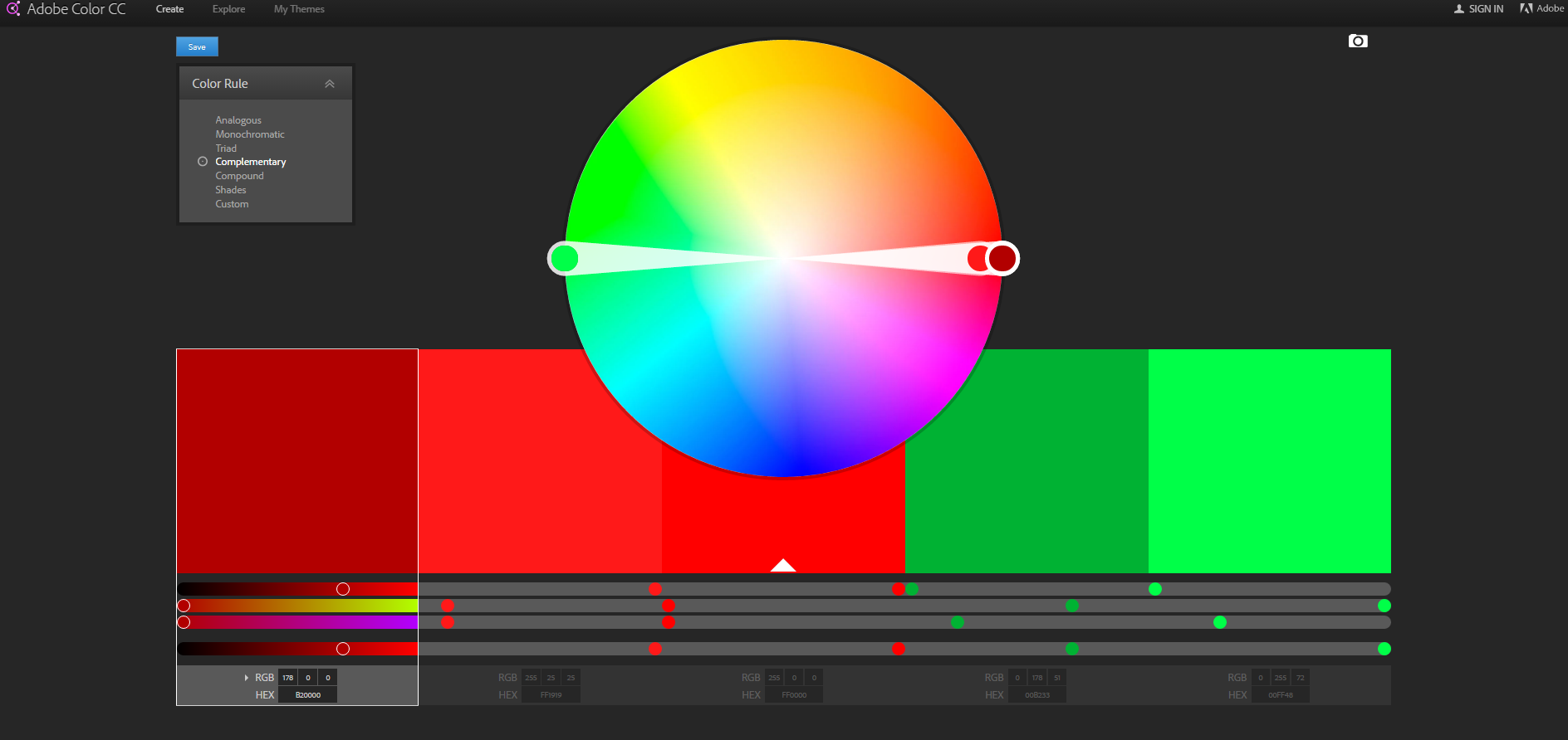
- Adobe Color CC. The website allows its users to create cool color schemes with the color wheel, browse different combinations from the Kuler community and see which colors are used in different images.
- Paletton. This tool lets designers choose one base color for the layout and then it shows similar shades that can be used along with the base color. Color schemes available there enable users to work with 1-4 colors.
- Flat UI Color Picker. Designers use this website when they need to choose a perfect color for a flat design.
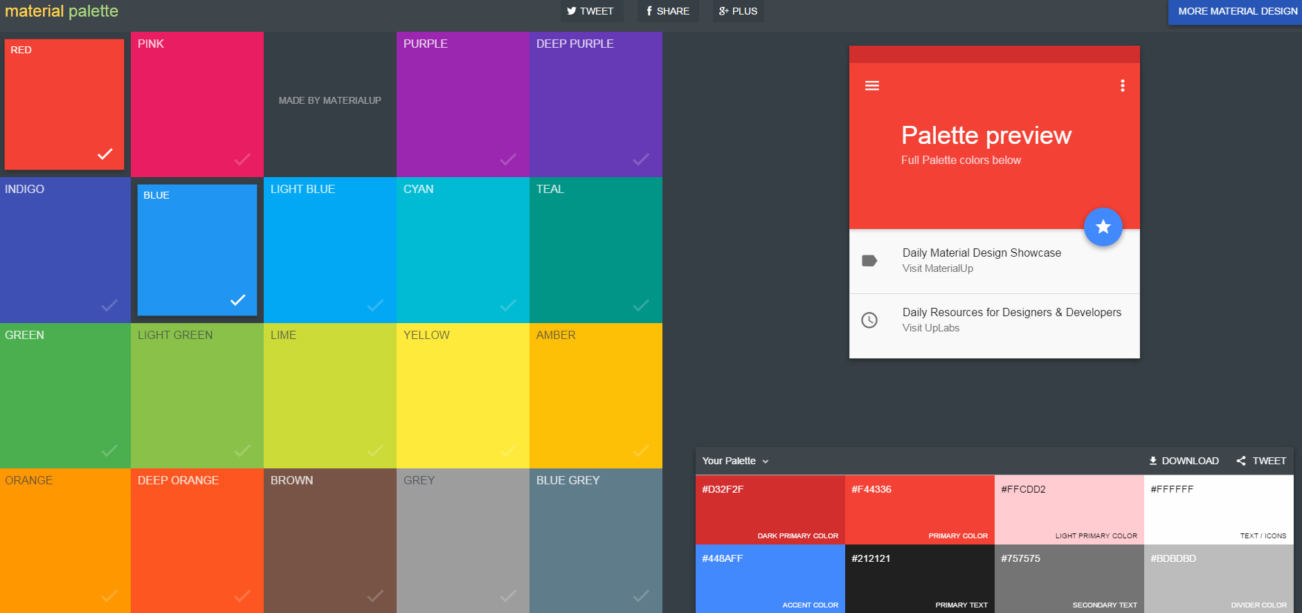
- Material palette. Designers can utilize this website to choose their favorite colors and see how they look in a combination. The chosen colors are combined into a small design concept.
- Material UI. This tool was developed to give a helping hand to designers and developers when they need to choose colors for a project. Users also have access to the list of top material design colors; they can find flat UI colors, social colors, HTML colors, etc.
Practical Example
Let’s focus on the CALCU™ Stylish Calculator Free. This 4.6-star app is beloved by users from all over the world.
CALCU can be used for different purposes, no matter if simple or scientific. calculations. Users are free to add/remove the functions and constants they need. It also provides an enhanced visual experience by enabling the users to choose between 20 different skins.
Check the image below to see some of the most popular skins globally:
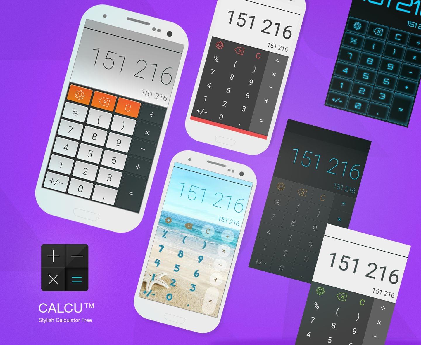
It is evident that the combinations of black with blue, grey, green, and red are the most common. And of all these combinations, the “black and blue” one is the most popular.
If we take a look at the statistics by country, we will see that users from different countries choose the same skins. Yet there are some variations across countries. For instance, color schemes with red are a little bit more popular in the U.S. and Russia than in Japan. Red means anger and danger in Japan, but it has more positive meanings in the U.S. and Russia. The word “red” (“krasni” in Russian) was used to describe something beautiful. Red has many meanings in the U.S., but such positive meanings as love, Christmas, and courage are among the most common ones.
Here is one more example: color schemes with blue enjoy almost the same popularity in the countries mentioned above due to positive meanings of blue: trustworthy (the U.S.), hope and purity (Russia), and theater supernatural creatures (Japan).
Conclusion
Colors can be a deciding factor during the app development process, especially if you want to differentiate your app from similar ones already existing. Good color schemes can provide users with an outstanding visual experience and mobile app developers with a competitive advantage over their rivals.
App designers need to understand that colors have a psychological impact (apart from aesthetics); an important element which should be taken into consideration. Different factors can influence our color perception, like cultural background, age, gender, etc.
Good design cannot exist without a good choice of colors. If you want to attract a loyal user base, colors are one of major factors that should be considered when you work on an app design.
So, if you work on app that will be used in a certain country or by a specific group of people (e.g. young, adults) do an in-depth research first to find out which colors are preferred by your target group. In the end, your efforts will be surely paid off, as your audience will appreciate it.
Frequently Asked Questions on Using Color Schemes in Mobile UI Design
How do I choose the right color scheme for my mobile app design?
Choosing the right color scheme for your mobile app design involves understanding your brand, the emotions you want to evoke, and the message you want to convey. Start by considering your brand’s personality and the feelings you want your app to evoke. For instance, blue often conveys trust and calmness, while red can signify excitement or urgency. Also, consider the cultural implications of colors as they can vary across different regions. Lastly, ensure your chosen colors enhance usability and accessibility. For instance, high contrast colors can improve readability.
What is the role of a color wheel in mobile UI design?
A color wheel is a crucial tool in mobile UI design as it helps designers understand the relationship between different colors. It consists of primary, secondary, and tertiary colors. By using a color wheel, designers can create harmonious color schemes, such as complementary, analogous, or triadic schemes, which can enhance the aesthetic appeal and usability of an app.
How can I use complementary colors effectively in my mobile app design?
Complementary colors are those that are opposite each other on the color wheel. When used together, they create a vibrant and high-contrast look. However, they should be used sparingly and strategically, as too much contrast can be jarring. One effective approach is to use one color dominantly and the other as an accent.
What is a triadic color scheme and how can it be used in mobile UI design?
A triadic color scheme involves three colors that are evenly spaced around the color wheel. This scheme offers high contrast while retaining harmony. In mobile UI design, one color should dominate, while the other two serve as accents. This can create a vibrant and visually appealing interface.
How can I ensure my color scheme is accessible to all users?
Ensuring your color scheme is accessible involves considering users with visual impairments, such as color blindness. Use high contrast colors to improve readability and consider using patterns or icons alongside color to convey information. There are also various online tools available that can simulate how your design appears to those with different types of color blindness.
How can color psychology influence my mobile app design?
Color psychology studies how colors can influence human behavior and emotions. In mobile app design, understanding color psychology can help you choose colors that evoke the desired emotional response from users. For instance, red can create a sense of urgency, making it suitable for call-to-action buttons.
What are some common mistakes to avoid when choosing a color scheme for my mobile app?
Common mistakes include using too many colors, which can create visual clutter, and using low contrast colors, which can reduce readability. Also, neglecting to consider the emotional and cultural implications of colors can lead to miscommunication. Lastly, failing to consider accessibility can exclude users with visual impairments.
How can I test the effectiveness of my chosen color scheme?
You can test the effectiveness of your color scheme through user testing. This involves observing how users interact with your app and gathering feedback. You can also use A/B testing to compare the performance of different color schemes.
How can I use color to guide users through my app?
Color can be used to guide users through your app by highlighting important elements, indicating actions, and creating visual hierarchies. For instance, a bright color can draw attention to a call-to-action button, while a muted color can indicate secondary information.
How can I create a cohesive color scheme across multiple platforms?
Creating a cohesive color scheme across multiple platforms involves maintaining consistency in your use of colors. This can be achieved by creating a color palette or style guide that outlines the specific colors, their uses, and their hex codes. This ensures that your brand is consistently represented across all platforms.