

Key Takeaways
- The 960 Grid System is a highly effective tool for rapid prototyping of website designs, offering a 12-column layout that’s adaptable to any screen size, enabling faster client approval and more consistent design-to-development implementation.
- The 960 Grid System is highly versatile, allowing for various column widths to suit different design needs. The author suggests six primary layout scenarios: full width, half width, 1/3 width, 2/3 width, 1/4 width, and 3/4 width.
- The author provides a detailed guide on how to set up CSS for the 960 Grid System, including code for body width, column margins, and column widths, along with a practical demonstration of how to implement the system in a web design project.
In this article, I will discuss the power of 960 and show you how to create a 12-column layout (or other size if you want) so you can hit the ground running with grid systems. I have a fully functional CSS and HTML example below, and you can download my Photoshop template to design concepts and quickly cut them up for fast implementation.
More and more I’m finding that a 960 pixel width works for every design situation that I encounter. As I’ll discuss in this article, there are lots of great reasons to work with 960 grids, and once you have a system in place, you’ll be off and running.
I use this system for rapid prototyping designs. With a quick flick of the wrist, I can have a layout in place that is easy to use in both graphic design software and web design software. Just tell (or set up) a file in Photoshop with a grid of twelve 80px guides. You can easily cut the design up and lay it out in very little time, getting client approval faster and getting more consistent design to development implementation.
Another reason to work with a system like this is that — as I will demonstrate — you can make this design responsive later very easily.
Why 960?
First and foremost, in the last 10 years I have yet to sit down at a desktop or laptop with a screen resolution under 960. While I know older monitors maxed out at 800px, the 960 grid adapts to this size without a problem. How?
960 is evenly divisible in about a dozen ways:
- 2 x 480
- 3 x 320
- 4 x 240
- 5 x 192
- 6 x 160
- 8 x 120
- 10 x 96
- 12 x 80
- 15 x 64
- 16 x 60
- 20 x 48
- 24 x 40
- 30 x 32
What does this mean? You can create a grid system that adapts to the screen layout of any screen size. I don’t use most of the above column widths (I just can’t think of too many scenarios where I would want 30 columns of 32 pixels each). You can make a pretty good system with just a few.
12 Columns to Rule Them All
Now I don’t really think that 12 columns is the ultimate grid system. In fact, I regularly work with 16 columns and 24 columns, but 12 is a really great place to start. Here are some layout scenarios with a 12 column grid system built on a 960px grid system:
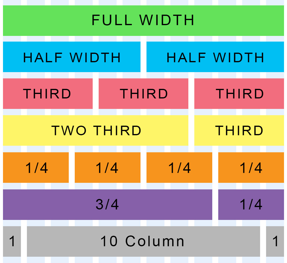
(Click to see the full size version)
There are other ways to slice and dice this up, but you should get an idea here that with a few CSS definitions, you can lay out your grid very easily and effectively. I just reach for 12 columns as the default because it covers 99% of what I need. In extreme scenarios where I need a 16, 20, 24, or even 30 column design, it’s easy enough to accommodate with the design I’m about to show you.
Staging the Layout
For this article, I am going to settle on a simplified layout. Since I usually only need a few of the above layout scenarios, I like to settle on
- Full width
- Half width
- 1/3 width
- 2/3 width
- 1/4 width
- 3/4 width
Again, there are lots more, but I’m also thinking long-term to responsive design. If you break the design into too many small parts, responsive design becomes more awkward and clunky.
With the above layout, you have all the column widths you need for most design scenarios. Full width covers banners and navigation. 3/4 and 1/4 covers articles with a sidebar. The others are great for callout boxes and other design elements.
The CSS
With our above column widths, we can now set up our CSS. Because we want some space between elements, we’re going to add a 10px margin to everything, so you’ll see the widths change to reflect this.
So let’s take a look at the beginnings of the CSS model:
[sourcecode language=”css”]
body {
min-width: 960px;
margin:auto;
}
/* Wrapper */
.row {
width:960px;
margin:auto;
}
[/sourcecode]
To begin, we simply lock down the body width at 960 pixels. We’re going to want to wrap each row of our column in a wrapper that keeps everything where it should be, although there are several good reasons not to have this — like portfolio layouts where you want elements moving around each other.
Now we stage the “gutters” — the widths between the columns so that our text or other design elements aren’t sitting on top of each other.
[sourcecode language=”css”]
/* Column margins */
.col_12, /* full width */
.col_9, /* 3/4 width */
.col_8, /* 2/3 width */
.col_6, /* half width */
.col_4, /* 1/3 width */
.col_3 /* 1/4 width */
{
margin-left: 10px;
margin-right: 10px;
display: inline;
float: left;
}
[/sourcecode]
I labeled each of the column numbers for easy reference in case you forget which column is which. It happens.
Next, we need a way to make sure the left-most columns goes to the left and the right-most columns sticks to the right.
[sourcecode language=”css”]
/* First and Last */
.first {
margin-left:0;
}
.last {
margin-right:0;
}
[/sourcecode]
Then, we stage our actual widths for each column type.
[sourcecode language=”css”]
/* Column widths taking into account the margins */
.col_12 {width:940px;}
.col_9 {width:620px;}
.col_8 {width:700px;}
.col_6 {width:460px;}
.col_4 {width:220px;}
.col_3 {width:300px;}
[/sourcecode]
Now, let’s put it all together in a seamless CSS package that you can save and put to use right away:
[sourcecode language=”css”]
/* Fix the width of the body */
body {
min-width: 960px;
margin:auto;
}
/* Wrapper */
.row {
width:960px;
margin:auto;
}
/* Column margins */
.col_12, /* full width */
.col_9, /* 3/4 width */
.col_8, /* 2/3 width */
.col_6, /* half width */
.col_4, /* 1/3 width */
.col_3 /* 1/4 width */
{
margin-left: 10px;
margin-right: 10px;
display: inline;
float: left;
}
/* First and Last */
.first {
margin-left:0;
}
.last {
margin-right:0;
}
/* Column widths taking into account the margins */
.col_12 {width:940px;}
.col_9 {width:620px;}
.col_8 {width:700px;}
.col_6 {width:460px;}
.col_4 {width:220px;}
.col_3 {width:300px;}
[/sourcecode]
See the 960, 12 Column Grid in Action!
Now, let’s put it into practice. Save the above code as a CSS document and call it “960-12-col.css”. In the same folder, copy and paste the following HTML:
[sourcecode language=”htmtl”]
<!DOCTYPE html PUBLIC “-//W3C//DTD XHTML 1.0 Transitional//EN” “https://www.w3.org/TR/xhtml1/DTD/xhtml1-transitional.dtd”>
<html xmlns=”https://www.w3.org/1999/xhtml”>
<head>
<meta http-equiv=”Content-Type” content=”text/html; charset=utf-8″ />
<title>Sample 960, 12 Column Grid Layout</title>
<link rel=”stylesheet” type=”text/css” href=”960-12-col.css” />
<style>
/* Column margins */
.col_12, /* full width */
.col_9, /* 3/4 width */
.col_8, /* 2/3 width */
.col_6, /* half width */
.col_4, /* 1/3 width */
.col_3 /* 1/4 width */
{
height:50px;
margin-top:10px;
margin-bottom:10px;
text-align:center;
display:table-cell;
vertical-align:central;
}
</style>
</head>
<body>
<div class=”row”>
<div class=”col_12 first” style=”background-color:#936″><p>Here’s a full width column</p></div>
</div>
<div class=”row”>
<div class=”col_9 first” style=”background-color:#3F6″><p>Here’s a 3/4 width column</p></div>
<div class=”col_3 last” style=”background-color:#6CC”><p>And it’s 1/4 width counterpart</p></div>
</div>
<div class=”row”>
<div class=”col_8 first” style=”background-color:#CF0″><p>Here’s a 2/3 width column</p></div>
<div class=”col_4 last” style=”background-color:#9CC”><p>And it’s 1/3 width counterpart</p></div>
</div>
<div class=”row”>
<div class=”col_4 first” style=”background-color:#9CC”><p>I’m a 1/3 width first</p></div>
<div class=”col_8 last” style=”background-color:#CF0″><p>And I’m a 2/3 width last</p></div>
</div>
<div class=”row”>
<div class=”col_6 first” style=”background-color:#9CC”><p>Want to go halfsies?</p></div>
<div class=”col_6 last” style=”background-color:#CF0″><p>Sure, I’ll go halfsies!</p></div>
</div>
<div class=”row”>
<div class=”col_3 first” style=”background-color:#CF0″><p>Here’s a 1/3 width column</p></div>
<div class=”col_3″ style=”background-color:#9CC”><p>I’m a 1/3 width column, too!</p></div>
<div class=”col_3 last” style=”background-color:#9CC”><p>I’m the last 1/3 width :^(</p></div>
</div>
<div class=”row”>
<div class=”col_4 first” style=”background-color:#CF0″><p>Can we do 1/4 column</p></div>
<div class=”col_4″ style=”background-color:#9CC”><p>Sure we can do 1/4!</p></div>
<div class=”col_4″ style=”background-color:#9CC”><p>I echo that sentiment!</p></div>
<div class=”col_4 last” style=”background-color:#9CC”><p>Why am I always last? :^(</p></div>
</div>
<div class=”row”>
<div class=”col_12 first” style=”background-color:#936″><p>Here’s a full width footer column</p></div>
</div>
</body>
</html>
[/sourcecode]
Make sure the stylesheet in line 7 is the same as the CSS file you saved. Open it up in a browser and you’ll see the grid in action:
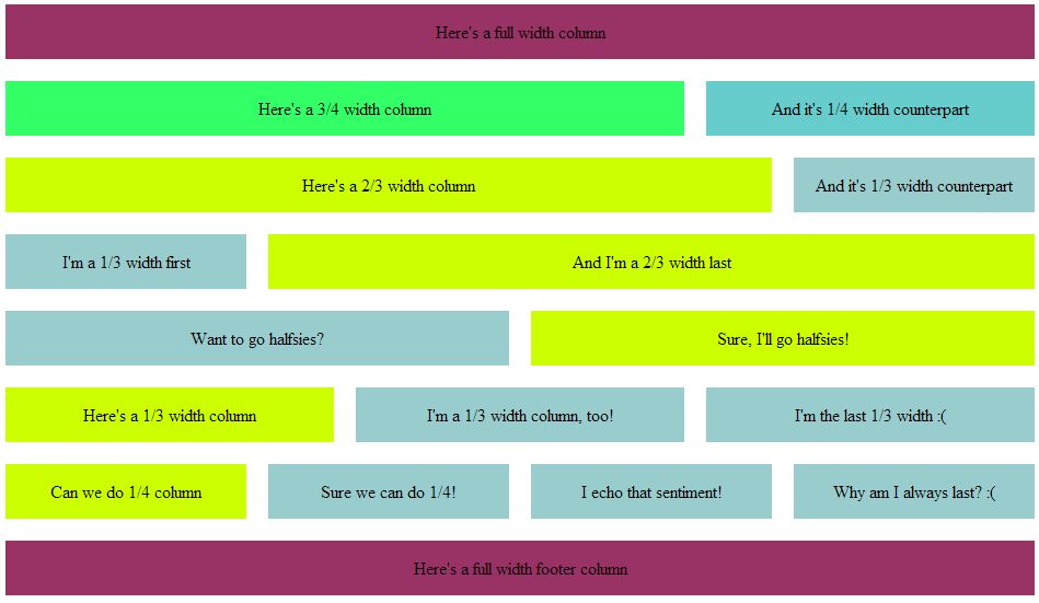
(Click to see the full size version)
The markup in the HTML above adds a few things just to make the grid easy to see. You can delete or comment out the <style> section in the header.
Graphic Design with the 960, 12 Column Grid
So, I couldn’t leave you with just a CSS template. I went ahead and handed you my Photoshop template as well. Download it, save it, and give it a look. Each of the standard column layouts are in there so you can see how each fits together.
The guides will help you lock your design down and make it very easy to translate your graphic design into workable code later. I design the layout in Photoshop and then send to the client for review. Once we go through the umpteenth approval review board and have a final design, Then I’ll finally chop it up into code and translate it to the page.
Depending upon the project, I may skip straight to the CSS design and send them a link for review, but the more complex the design, the more I tend to start with a graphic I can send them and get approval first.
Enjoy and let me know what you think!

