
Key Takeaways
- Xcode 6 allows developers to preview custom controls in Interface Builder and see changes in real time, speeding up the development process. It also enables debugging of the controls without running the app first.
- Custom controls can now be customized via Interface Builder, similar to built-in controls. This makes it easier for developers and designers to collaborate, as a developer can create the control and a designer can style it without writing any code.
- The tutorial demonstrates how to create a custom control, enable live rendering, and expose the control’s properties in Interface Builder. It also shows how to make a custom control reusable and customizable in different apps, enhancing efficiency and collaboration between developers and designers.
iOS allows you to create custom controls that can be used in your apps alongside the Apple provided ones. Prior to Xcode 6, you couldn’t preview custom controls in Interface Builder, you had to run the app to see what you had built. This could get frustrating when you had to continually run the application to check the results of changes you’d made, as running an app on the simulator or device can take some time.
Xcode 6 improves on this process, so you can now preview your custom controls in Interface Builder and see your changes in real time as you make them. This makes development faster as you can quickly see the results of what you are coding. Xcode 6 goes further in enabling you to debug the controls without running the app first.
Built-in controls now have the advantage of being customizable via Interface Builder, you can easily change a control’s properties in the Attribute Inspector. To change a custom control’s properties, you could previously only do it in code. This has improved as you can now expose your control’s properties in Interface Builder and edit them from the Attribute Inspector as you would for a built-in control. This feature is great for creating reusable controls. You can create a control that can be used in different apps that is customizable in Interface Builder, much like the built-in controls. Being able to customize custom controls this way makes it easier for developers and designers to work together. A developer can create the control and leave it up to the designer to style it and customize it to their needs without writing any code.
In this tutorial we’ll look at how to create a custom control, enable live rendering and expose the control’s properties in Interface Builder.
To follow the tutorial, download the starter project which we’ll use instead of starting from scratch. The project is a simple app for a hypothetical social network where the user can look at user profiles. On selecting a profile, you will be taken to a view that shows the user details which include name, biography, profile rating and photo. If you run the app, you’ll notice that the user’s image hasn’t been included in the Profile view. Instead, there is an empty view where we plan to have the image. (Images used in the app are downloaded from uifaces)
Instead of using the ImageView from Apple, we want to create our own custom view that will be styled differently and will be customizable via Interface Builder. (I’ll use ‘custom view’ and ‘custom control’ interchangeably).
To get started, create a new class in the starter project by opening File -> New -> File -> iOS -> Source -> Cocoa Touch Class. Name it CircularImageView, make it a subclass of UIView and set the Language to Swift.
Open the storyboard file and select the View that is above the user details.
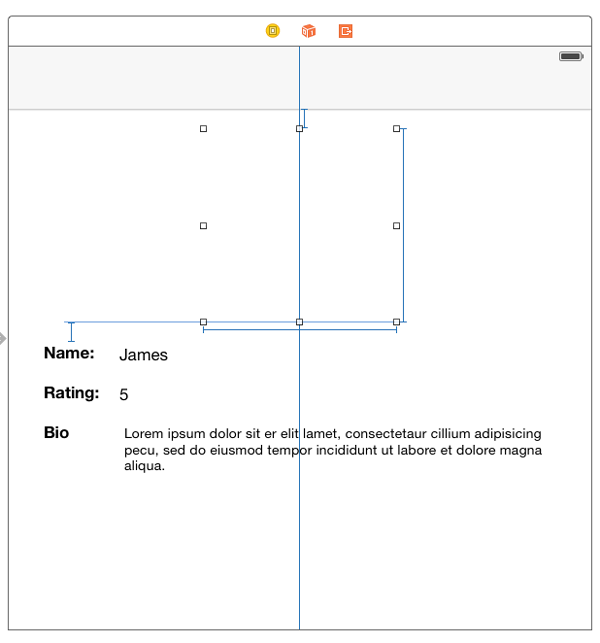
Set its Class to CircularImageView in the Identity Inspector.
In the CircularImageView.swift file, add @IBDesignable before the class declaration. This marks the class as designable. You need to do this for live rendering to be turned on for the class. The class declaration should look like this:
@IBDesignable

class CircularImageView: UIView {

}
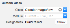
Return to the storyboard file, select the view (I will assume the view is selected from now onwards) and open the Identity Inspector. You will notice a Designables status indicator has appeared in the Custom Class section.
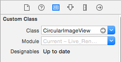
An Up to date status means that the custom view compiled and rendered properly. If an error occurs while rendering, there will be a status of Build failed with a button labelled Show next to it. On clicking the button, Xcode will open a debugging session and show you the issue that caused the crash.
Open CircularImageView.swift and add the following to the class.
var backgroundLayer: CAShapeLayer!
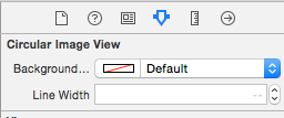
@IBInspectable var backgroundLayerColor: UIColor = UIColor.grayColor()
@IBInspectable var lineWidth: CGFloat = 1.0
Applying the @IBInspectable attribute to a property exposes it in the Attributes Inspector. Return to the storyboard file and you will see the two attributes.
I recommend you use the Assistant Editor for a split view of the CircularImageView.swift and Main.storyboard files instead of switching back and forth between the files to view changes.
The property types that can be marked with @IBInspectable are Int, CGFloat, Double, String, Bool, CGRect, CGSize, CGPoint, UIImage and UIColor.
Add the following to the class:
override func layoutSubviews() {

    super.layoutSubviews()

    setBackgroundLayer()

}
func setBackgroundLayer() {
    if backgroundLayer == nil {

        backgroundLayer = CAShapeLayer()

        layer.addSublayer(backgroundLayer)

        let rect = CGRectInset(bounds, lineWidth / 2.0, lineWidth / 2.0)

        let path = UIBezierPath(ovalInRect: rect)

        backgroundLayer.path = path.CGPath

        backgroundLayer.lineWidth = lineWidth

        backgroundLayer.fillColor = backgroundLayerColor.CGColor

    }
    backgroundLayer.frame = layer.bounds

}
Here we check to see if a backgroundLayer has been created. If not, we create a CAShapeLayer object and add it to the view’s sublayer. We then create a circular UIBezierPath and apply it to the backgroundLayer path. We then set the backgroundLayer’s lineWidth and fillColor.
If you look at Interface Builder, you will see a gray object. This will be the background of our image.
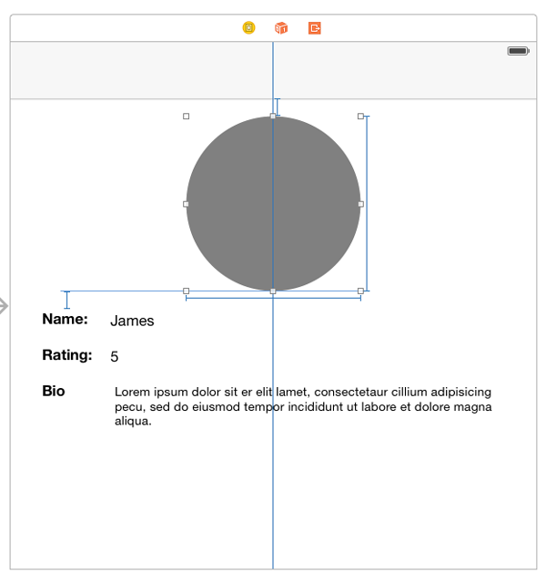
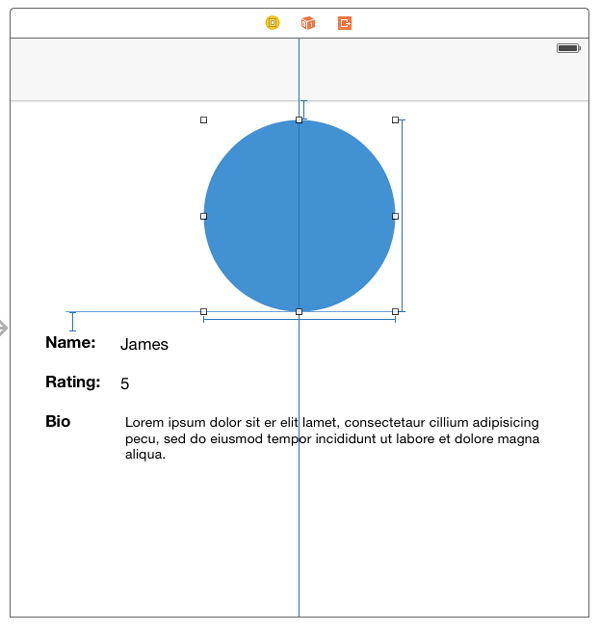
The default color of the backgroundLayer has been set to gray in code. You can test out the inspectable attributes you had set earlier by changing the Background Color or Line Width in the Attributes Inspector. On changing these, the storyboard will be updated immediately.
Add the following to the class:
var imageLayer: CALayer!

@IBInspectable var image: UIImage?
func setBackgroundImageLayer() {
    if imageLayer == nil {

        let mask = CAShapeLayer()

        let dx = lineWidth + 3.0

        let path = UIBezierPath(ovalInRect: CGRectInset(self.bounds, dx, dx))

        mask.fillColor = UIColor.blackColor().CGColor

        mask.path = path.CGPath

        mask.frame = self.bounds

        layer.addSublayer(mask)

        imageLayer = CAShapeLayer()

        imageLayer.frame = self.bounds

        imageLayer.mask = mask

        imageLayer.contentsGravity = kCAGravityResizeAspectFill

        layer.addSublayer(imageLayer)

    }
}
func setImage() {

    if let pic = image {

        imageLayer.contents = pic.CGImage

    }

}
Here we first check to see if imageLayer hasn’t been created. If it hasn’t we create a circular path and set this as imageLayer’s mask. Masking a layer makes that layer transparent where the mask is transparent.
Modify layoutSubViews() as follows so that the two new methods are called.
override func layoutSubviews() {

    super.layoutSubviews()

    setBackgroundLayer()

    setBackgroundImageLayer()

    setImage()

}
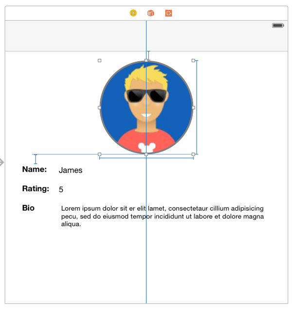
Back in the storyboard file, check the Attributes Inspector and you will see another attribute for Image has been added to the Circular Image View attributes. Select an image from the dropdown menu and you should see the change in the storyboard.
Our control is now complete. The only problem is, if you run the app, you will get the same image for all users. We don’t want a static image for the user profiles. We want it updated for each user.
Add the following to the class.
var userImage: UIImage?
Then open ViewController.swift and create an outlet for our custom view Name it circularImageView. You should have the following in code.
@IBOutlet weak var circularImageView: CircularImageView!
In the same file, add this to the bottom of the if block in viewDidLoad(), right after the line that sets userBio.text
circularImageView.userImage = user.avatar
In CircularImageView.swift modify the setImage() method as shown.
func setImage() {

        if imageLayer != nil {

            if let userPic = userImage {

                imageLayer.contents = userPic.CGImage

            } else {

                if let pic = image {

                    imageLayer.contents = pic.CGImage

                }

            }

        }
    }
This checks to see whether userImage isn’t nil and if it’s not, the view’s image is set to that, otherwise it will be set to the image selected in Interface Builder.
In Interface Builder, the image rendered will be the one you set in the Attributes Inspector, but if you run the app, each profile will show its respective image.
Worth Mentioning
Your custom control might display data that can only be available during runtime and therefore Xcode will not be able to show you a preview of the control with the data. To get around this, you can override prepareForInterfaceBuilder() in your code and place dummy-data in the function. The method is only called at design time and has no effect on the app at runtime.
As mentioned earlier, you can debug your custom control without having to run the app. To do this, set a breakpoint where you want in your custom control class. Select the view in the storyboard file and select Editor -> Debug Selected Views. The debug view will show up just as it does when debugging a running app and you will be able to debug the custom control as usual.
Conclusion
We have looked at how to build a custom control and set up Interface Builder so that the control can be rendered as soon as we write the code. This feature greatly improves the workflow of creating custom controls as you can now work faster and know of errors as they happen.
Apart from rendering the control live in Interface Builder, we have also seen how to make a customizable control. The image below shows some of the variations we can get of the control, just by customizing it in Interface Builder. This helps greatly in creating reusable controls. We can take CircularImageView and use it in any app where we need to display an image, then style it according to that app’s requirement, without modifying code.

You can download the completed project here(broken link).
Frequently Asked Questions (FAQs) about Creating Custom UI Components and Live Rendering in Xcode
What are the key steps to create custom UI components in Xcode?
Creating custom UI components in Xcode involves several steps. First, you need to create a new project in Xcode and select the appropriate template for your project. Next, you need to design your custom UI component using the Interface Builder. This involves dragging and dropping elements onto the storyboard and configuring their properties. Once you’ve designed your component, you need to create a new Swift file for it and connect it to your storyboard. Finally, you can add functionality to your component by writing code in the Swift file.
How can I use live rendering in Xcode?
Live rendering in Xcode allows you to see how your custom UI components will look and behave in real-time, without having to run your app. To use live rendering, you need to mark your custom UI component with the @IBDesignable attribute. This tells Xcode to render the component in the Interface Builder. You can also use the @IBInspectable attribute to make certain properties of your component editable in the Interface Builder.
What are the benefits of creating custom UI components?
Creating custom UI components can provide several benefits. It allows you to create a unique look and feel for your app, which can help it stand out from the competition. Custom UI components can also improve the user experience by providing a more intuitive and enjoyable interface. Additionally, they can make your code more reusable and easier to maintain, as you can use the same custom component in multiple places in your app.
How can I make my custom UI components reusable?
To make your custom UI components reusable, you should design them to be as generic as possible. This means they should not rely on specific data or behavior from the rest of your app. Instead, they should take in data and behavior as parameters, which can be provided by whatever part of your app is using the component. You should also make sure to encapsulate the internal workings of your component, so that other parts of your app don’t need to know how it works in order to use it.
What are some common challenges when creating custom UI components and how can I overcome them?
Creating custom UI components can be challenging, especially if you’re new to Xcode or Swift. One common challenge is getting the layout of your component to look right, especially on different screen sizes and orientations. To overcome this, you can use Auto Layout, which allows you to define constraints for your component that will be automatically adjusted based on the screen size and orientation. Another challenge is handling user interaction with your component. To handle this, you can use gesture recognizers, which allow you to define actions that will be triggered when the user performs certain gestures on your component.
How can I test my custom UI components?
Testing your custom UI components is crucial to ensure they work correctly and provide a good user experience. You can test your components by running your app in the iOS Simulator, which allows you to interact with your components as if they were running on a real device. You can also write unit tests for your components, which can help you catch bugs and regressions early.
Can I use third-party libraries to create custom UI components?
Yes, you can use third-party libraries to create custom UI components. There are many libraries available that provide pre-built components, which you can use as a starting point for your own custom components. However, keep in mind that using third-party libraries can increase the size of your app and may introduce compatibility issues, so it’s important to choose your libraries carefully.
How can I optimize the performance of my custom UI components?
Optimizing the performance of your custom UI components can help your app run smoother and provide a better user experience. One way to optimize performance is by minimizing the amount of work done in the main thread, which is responsible for updating the UI. You can do this by offloading heavy computations to a background thread. Another way to optimize performance is by using efficient data structures and algorithms in your components.
Can I animate my custom UI components?
Yes, you can animate your custom UI components to make them more dynamic and engaging. Xcode provides several tools for creating animations, such as the UIView.animate() method, which allows you to animate changes to your component’s properties. You can also use the Core Animation framework, which provides more advanced animation capabilities.
How can I handle different screen sizes and orientations with my custom UI components?
Handling different screen sizes and orientations is a key aspect of creating custom UI components. You can use Auto Layout to define constraints for your components that will be automatically adjusted based on the screen size and orientation. You can also use size classes, which allow you to define different layouts for different screen sizes and orientations.