
- Custom elements allow developers to create their own HTML elements with custom tag names, which can be challenging due to the need for JavaScript knowledge, handling cross-browser inconsistencies, and supporting browsers that do not support custom elements. Polymer provides an easy-to-use framework to create and use these elements.
- The process of creating a custom element with Polymer involves setting up the project folder, creating an HTML file with the name of the custom element, importing the polymer.html file, declaring the custom element, adding the necessary styles and markup, and calling the Polymer() constructor if JavaScript is involved.
- The content of the custom element is defined within the tag, separating presentation from content. The
tag represents the insertion point where the Light DOM content is injected into the Shadow DOM. - Styling the custom element can be done using various selectors provided by Polymer, and can be written using the
Custom elements allow developers to define their own HTML elements with custom tag names that closely resemble their design components. The W3C defines custom elements as the specification that:
Enables authors to define and use new types of DOM elements in a document.
The definition looks quite simple in theory, but in practice the process of creating and using a custom element involves:
- A decent amount of JavaScript
- Knowledge of the JavaScript API(s) to create the custom element
- Handling cross-browser inconsistencies.
If you manage to survive through these challenges, then you still have to worry about those browsers that do not support custom elements. Thankfully, Polymer saves the day by providing an easy-to-use framework to create and use custom elements.
If you need a quick refresher on Polymer and Web components then I would strongly recommend reading my previous article on SitePoint that introduces these concepts in depth.
In this article, we will take a very basic example of creating a custom element with Polymer to render pull quotes. The idea originated from this article by Louis Lazaris where he sparked a debate on the semantic value of using blockquote vs aside to create pull quotes in your markup.
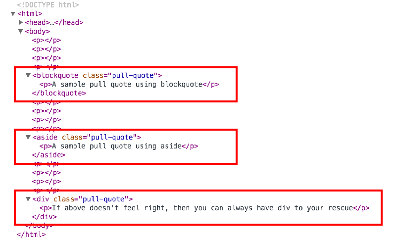
It’s fairly common to see blockquote, aside, or even a plain div element being used to mark up pull quotes. It’s time we put an end to this conundrum by creating a new custom element called <pull-quote> that can accurately represent our content. By the end of this article you will be able to create something like this:
Setting Up the Custom Element
Before we begin with our custom element, we will quickly set up the project folder by installing Polymer and all the dependencies via Bower.
$ bower install --save Polymer/polymerTypically, creating a new custom element involves the following steps:
- Create an HTML file with the name of the custom element.
- Import the
polymer.htmlfile from thebower_componentsfolder using<link>. - Declare your custom element using
<polymer-element>. - Add the styles and the markup needed to define your custom element using the
<template>tag. - If your custom element involves JavaScript, call the
Polymer()constructor to register the element in the DOM.
The basic approach is to first decide how you are going to use the custom element in your markup and then work your way backwards to create the template for the custom element. In this case, we plan to use the following markup every time we intend to use pull quotes in our document:
<pull-quote>Sample text and can even contain other HTML tags.</pull-quote>We’ll start by creating a file called pull-quote.html in the root directory. Edit the file and import the polymer.html file that can be found in the bower_components folder:
<link rel="import" href="bower_components/polymer/polymer.html">We’ll declare our new <pull-quote> element using the name attribute of <polymer-element> in the following way:
<polymer-element name="pull-quote" noscript>
    <!-- More to come -->
</polymer-element>
Couple of points to note:
- The name of the custom element must contain a hyphen (U+002D HYPHEN-MINUS) character to allow the HTML parsers to differentiate custom elements from regular HTML elements.
- The
noscriptattribute indicates that this element doesn’t need any JavaScript to function and hence can be immediately registered in the DOM.
Adding the Content
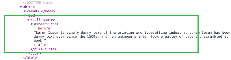
The content that makes up the custom element is defined inside the <template> tag. The <template> tag provides separation of presentation from content. In our case, anything we write inside the <pull-quote> tag would make up the content of the custom element and the styles applied to it would form the presentation.
In nutshell, there are three types of DOM elements that we are dealing with:
- Light DOM – This includes what we write inside the custom element. Hence, the user of the custom element supplies the Light DOM.
- Shadow DOM – This includes everything that we define within the
<template>tag. It is internal to the element and encompasses everything that is required to make the custom element work. - Composed DOM – This is what the browser actually renders. For rendering, the light DOM is distributed into the shadow DOM to produce the composed DOM.
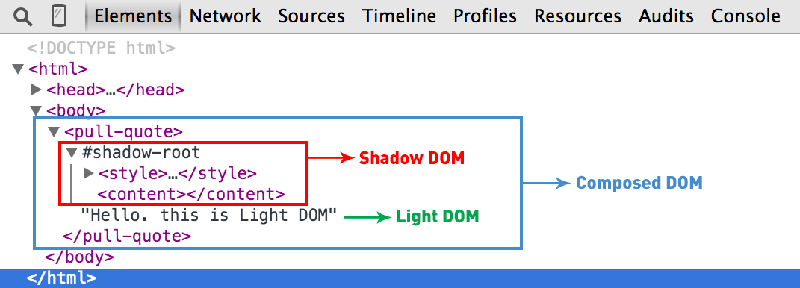
The <content> tag represents the insertion point where the Light DOM content would be injected into the Shadow DOM. The <content> tag has much more advanced usage in selecting only specific content that you write inside the custom element. However, for the sake of this example we’ll stick to the basic usage of this tag.
<polymer-element name="pull-quote" noscript>
    <template>
        <content></content>
    </template>
</polymer-element>
Styling the Custom Element
For styling our custom element, Polymer provides a bunch of useful selectors. For example:
:host– Targets the custom element itself.:host(<pseudo-class>)– Targets the various states of the custom element like:host(:hover),:host(:active)etc.:host(<class-name>)– Targets only those custom elements that have the supplied class name.:host-context(<selector>)– This pseudo class targets the host element if it or any of its ancestors matches<selector>. This is particularly useful for theming when you apply theme-related classes on<html>or<body>tags.
Pro tip – If you simply use selectors (like,
p,#id, or.class) without the:hostthen they would automatically become descendent selectors. For example, to target a paragraph tag inside the<pull-quote>we can simply use,p { ... }and then it will automatically be expanded aspull-quote p { ... }.
We can either choose to style our custom element using the <style> tag:
<template>
    <style>
        :host {
            display: inline-block;
            font-style: italic;
            text-align: justify;
            width: 325px;
            line-height: 30px;
        }
    </style>
    <content></content>
</template>
Or we can write our CSS in a new file like pull-quote.css and then import that file into our pull-quote.html file using <link>:
<link rel="stylesheet" href="pull-quote.css">A couple of points to note:
- By default, all custom elements are set as
display: inline. Hence, we have to explicitly declaredisplay: inline-block. - The
:hostselector has the lowest specificity. Hence, users can override your styles from outside the custom element.
At the time of writing, using pseudo elements (::before and ::after) on the :host selector like :host::before {...} does not work as expected in Blink browsers (Chrome and Opera). This appears to be a known bug that has been fixed and will be shipped soon with Chrome 38. But this shouldn’t stop us from using them altogether.
To surround our pull-quotes with actual quotes, we’ve got three options.
Adding Quotes with :host Pseudo-Elements
The first option is to use :host::before and :host::after pseudo-elements from within the custom element to add double-quotes:
:host::before {
  content: '\201C';
}
:host::after {
  content: '\201D';
}
As described above, this would work only in non-Blink browsers. If you could afford to wait till the other browsers fix the bug then stick with this method.
Adding Quotes with Regular Pseudo-Elements
You can also use pull-quote::before and pull-quote::after pseudo-elements to add double-quotes from outside the custom element.
pull-quote::before {
  content: '\201C';
}
pull-quote::after {
  content: '\201D';
}
This works in all browsers but may not be the most ideal solution keeping in mind that the styles for the same custom element are now fragmented in two different files.
Adding Quotes with Extra HTML
The last option is to use HTML to add double quotes in the template itself:
<template>
    <span>"</span>
    <content></content>
    <span>"</span>
</template>
This works in all browsers too! Additionally, you could also style the quotes with CSS that can then sit inside the <template> tag.
Using Our Finished pull-quote Element
Make sure you add the platform.js polyfill in the <head> of your document. This polyfill will ensure that your custom elements continue to work as expected even in browsers that do not support them.
<script src="bower_components/platform/platform.js"></script>To use the custom elements, we do exactly what I described in my previous article:
- Download the Custom Element package via Bower.
- Import the corresponding
.htmlfile in your document. Use the custom element markup anywhere in your document.
<html>
    <head>
        <script src="bower_components/platform/platform.js"></script>
        <link rel="import" href="pull-quote.html">
    </head>
    <body>
        <pull-quote>Sample text inside pull quote</pull-quote>

        <pull-quote>
            <p>Can also contain other tags</p>
        </pull-quote>
    </body>
</html>
Check out the complete code along-with the demo on Plunker. I’ve also setup a project repository on Github for the pull-quote custom element. And if you want more, CustomElements.io, a project by Zeno Rocha has a useful collection of custom elements created using Polymer, X-Tag, etc.
The Polymer library provides a vast amount of powerful features and APIs to interact with custom elements and other web components. We’ve barely touched the topic and still have a lot of features to explore. However, I am hopeful that this introduction would be simple enough for everyone to understand and serve as a springboard to build many more new custom elements.
Frequently Asked Questions about Building Pull-Quote Custom Element with Polymer
What is the significance of using Polymer for building a pull-quote custom element?
Polymer is a powerful JavaScript library that helps in creating custom, reusable HTML elements. It provides a set of features for creating full-fledged applications out of Web Components. When building a pull-quote custom element, Polymer provides a simple way to define a custom element and its behavior. It also ensures compatibility across different browsers, making your web development process smoother and more efficient.
How does Polymer compare to other libraries for creating custom HTML elements?
Polymer stands out from other libraries due to its focus on leveraging web standards as much as possible. It uses the native implementation of Web Components in the browser if available, and only polyfills the missing pieces. This approach results in better performance and smaller file sizes compared to libraries that rely on JavaScript to implement all functionality.
Can I use Polymer with other JavaScript frameworks?
Yes, Polymer is designed to be compatible with any JavaScript framework that works with HTML. It allows you to create custom elements that can be used just like any other HTML element, regardless of the framework you’re using. This makes Polymer a versatile tool in web development.
How do I style a custom element in Polymer?
Polymer supports both shadow DOM and shady DOM, allowing you to encapsulate your CSS within your custom elements. This means that styles defined inside a custom element won’t leak out and styles defined outside won’t leak in, giving you more control over your element’s appearance.
What are the benefits of using pull-quotes in web design?
Pull-quotes serve to highlight key points in your content, making it easier for readers to scan through and understand the main ideas. They also add visual interest to your page, breaking up large blocks of text and making your content more engaging.
How do I add a pull-quote to my webpage using Polymer?
After defining your pull-quote custom element using Polymer, you can add it to your webpage just like any other HTML element. Simply use the custom element’s tag in your HTML code where you want the pull-quote to appear.
Can I customize the appearance of my pull-quote custom element?
Yes, you can customize the appearance of your pull-quote custom element using CSS. Polymer allows you to encapsulate your CSS within your custom element, giving you full control over its appearance.
What are the browser compatibility issues with Polymer and how can they be resolved?
Polymer is designed to leverage web standards, and it uses polyfills to ensure compatibility across all modern browsers. However, if you encounter any issues, it’s recommended to check the Polymer project’s GitHub page for any known issues and solutions.
Can I use Polymer for building other custom elements besides pull-quotes?
Absolutely. Polymer is a versatile tool that can be used to build any type of custom HTML element. Its features like data binding, property observation, and event handling make it a powerful tool for creating interactive, reusable components.
Where can I learn more about building custom elements with Polymer?
The Polymer Project’s official website is a great resource for learning more about building custom elements with Polymer. It offers a comprehensive guide, tutorials, and API documentation to help you get started.
Key Takeaways
- Custom elements allow developers to create their own HTML elements with custom tag names, which can be challenging due to the need for JavaScript knowledge, handling cross-browser inconsistencies, and supporting browsers that do not support custom elements. Polymer provides an easy-to-use framework to create and use these elements.
- The process of creating a custom element with Polymer involves setting up the project folder, creating an HTML file with the name of the custom element, importing the polymer.html file, declaring the custom element, adding the necessary styles and markup, and calling the Polymer() constructor if JavaScript is involved.
- The content of the custom element is defined within the tag, separating presentation from content. The
tag represents the insertion point where the Light DOM content is injected into the Shadow DOM. - Styling the custom element can be done using various selectors provided by Polymer, and can be written using the
Custom elements allow developers to define their own HTML elements with custom tag names that closely resemble their design components. The W3C defines custom elements as the specification that:
Enables authors to define and use new types of DOM elements in a document.
The definition looks quite simple in theory, but in practice the process of creating and using a custom element involves:
- A decent amount of JavaScript
- Knowledge of the JavaScript API(s) to create the custom element
- Handling cross-browser inconsistencies.
If you manage to survive through these challenges, then you still have to worry about those browsers that do not support custom elements. Thankfully, Polymer saves the day by providing an easy-to-use framework to create and use custom elements.
If you need a quick refresher on Polymer and Web components then I would strongly recommend reading my previous article on SitePoint that introduces these concepts in depth.
In this article, we will take a very basic example of creating a custom element with Polymer to render pull quotes. The idea originated from this article by Louis Lazaris where he sparked a debate on the semantic value of using blockquote vs aside to create pull quotes in your markup.
It’s fairly common to see blockquote, aside, or even a plain div element being used to mark up pull quotes. It’s time we put an end to this conundrum by creating a new custom element called <pull-quote> that can accurately represent our content. By the end of this article you will be able to create something like this:
Setting Up the Custom Element
Before we begin with our custom element, we will quickly set up the project folder by installing Polymer and all the dependencies via Bower.
$ bower install --save Polymer/polymerTypically, creating a new custom element involves the following steps:
- Create an HTML file with the name of the custom element.
- Import the
polymer.htmlfile from thebower_componentsfolder using<link>. - Declare your custom element using
<polymer-element>. - Add the styles and the markup needed to define your custom element using the
<template>tag. - If your custom element involves JavaScript, call the
Polymer()constructor to register the element in the DOM.
The basic approach is to first decide how you are going to use the custom element in your markup and then work your way backwards to create the template for the custom element. In this case, we plan to use the following markup every time we intend to use pull quotes in our document:
<pull-quote>Sample text and can even contain other HTML tags.</pull-quote>We’ll start by creating a file called pull-quote.html in the root directory. Edit the file and import the polymer.html file that can be found in the bower_components folder:
<link rel="import" href="bower_components/polymer/polymer.html">We’ll declare our new <pull-quote> element using the name attribute of <polymer-element> in the following way:
<polymer-element name="pull-quote" noscript>
    <!-- More to come -->
</polymer-element>
Couple of points to note:
- The name of the custom element must contain a hyphen (U+002D HYPHEN-MINUS) character to allow the HTML parsers to differentiate custom elements from regular HTML elements.
- The
noscriptattribute indicates that this element doesn’t need any JavaScript to function and hence can be immediately registered in the DOM.
Adding the Content
The content that makes up the custom element is defined inside the <template> tag. The <template> tag provides separation of presentation from content. In our case, anything we write inside the <pull-quote> tag would make up the content of the custom element and the styles applied to it would form the presentation.
In nutshell, there are three types of DOM elements that we are dealing with:
- Light DOM – This includes what we write inside the custom element. Hence, the user of the custom element supplies the Light DOM.
- Shadow DOM – This includes everything that we define within the
<template>tag. It is internal to the element and encompasses everything that is required to make the custom element work. - Composed DOM – This is what the browser actually renders. For rendering, the light DOM is distributed into the shadow DOM to produce the composed DOM.
The <content> tag represents the insertion point where the Light DOM content would be injected into the Shadow DOM. The <content> tag has much more advanced usage in selecting only specific content that you write inside the custom element. However, for the sake of this example we’ll stick to the basic usage of this tag.
<polymer-element name="pull-quote" noscript>
    <template>
        <content></content>
    </template>
</polymer-element>
Styling the Custom Element
For styling our custom element, Polymer provides a bunch of useful selectors. For example:
:host– Targets the custom element itself.:host(<pseudo-class>)– Targets the various states of the custom element like:host(:hover),:host(:active)etc.:host(<class-name>)– Targets only those custom elements that have the supplied class name.:host-context(<selector>)– This pseudo class targets the host element if it or any of its ancestors matches<selector>. This is particularly useful for theming when you apply theme-related classes on<html>or<body>tags.
Pro tip – If you simply use selectors (like,
p,#id, or.class) without the:hostthen they would automatically become descendent selectors. For example, to target a paragraph tag inside the<pull-quote>we can simply use,p { ... }and then it will automatically be expanded aspull-quote p { ... }.
We can either choose to style our custom element using the <style> tag:
<template>
    <style>
        :host {
            display: inline-block;
            font-style: italic;
            text-align: justify;
            width: 325px;
            line-height: 30px;
        }
    </style>
    <content></content>
</template>
Or we can write our CSS in a new file like pull-quote.css and then import that file into our pull-quote.html file using <link>:
<link rel="stylesheet" href="pull-quote.css">A couple of points to note:
- By default, all custom elements are set as
display: inline. Hence, we have to explicitly declaredisplay: inline-block. - The
:hostselector has the lowest specificity. Hence, users can override your styles from outside the custom element.
At the time of writing, using pseudo elements (::before and ::after) on the :host selector like :host::before {...} does not work as expected in Blink browsers (Chrome and Opera). This appears to be a known bug that has been fixed and will be shipped soon with Chrome 38. But this shouldn’t stop us from using them altogether.
To surround our pull-quotes with actual quotes, we’ve got three options.
Adding Quotes with :host Pseudo-Elements
The first option is to use :host::before and :host::after pseudo-elements from within the custom element to add double-quotes:
:host::before {
  content: '\201C';
}
:host::after {
  content: '\201D';
}
As described above, this would work only in non-Blink browsers. If you could afford to wait till the other browsers fix the bug then stick with this method.
Adding Quotes with Regular Pseudo-Elements
You can also use pull-quote::before and pull-quote::after pseudo-elements to add double-quotes from outside the custom element.
pull-quote::before {
  content: '\201C';
}
pull-quote::after {
  content: '\201D';
}
This works in all browsers but may not be the most ideal solution keeping in mind that the styles for the same custom element are now fragmented in two different files.
Adding Quotes with Extra HTML
The last option is to use HTML to add double quotes in the template itself:
<template>
    <span>"</span>
    <content></content>
    <span>"</span>
</template>
This works in all browsers too! Additionally, you could also style the quotes with CSS that can then sit inside the <template> tag.
Using Our Finished pull-quote Element
Make sure you add the platform.js polyfill in the <head> of your document. This polyfill will ensure that your custom elements continue to work as expected even in browsers that do not support them.
<script src="bower_components/platform/platform.js"></script>To use the custom elements, we do exactly what I described in my previous article:
- Download the Custom Element package via Bower.
- Import the corresponding
.htmlfile in your document. Use the custom element markup anywhere in your document.
<html>
    <head>
        <script src="bower_components/platform/platform.js"></script>
        <link rel="import" href="pull-quote.html">
    </head>
    <body>
        <pull-quote>Sample text inside pull quote</pull-quote>

        <pull-quote>
            <p>Can also contain other tags</p>
        </pull-quote>
    </body>
</html>
Check out the complete code along-with the demo on Plunker. I’ve also setup a project repository on Github for the pull-quote custom element. And if you want more, CustomElements.io, a project by Zeno Rocha has a useful collection of custom elements created using Polymer, X-Tag, etc.
The Polymer library provides a vast amount of powerful features and APIs to interact with custom elements and other web components. We’ve barely touched the topic and still have a lot of features to explore. However, I am hopeful that this introduction would be simple enough for everyone to understand and serve as a springboard to build many more new custom elements.
Frequently Asked Questions about Building Pull-Quote Custom Element with Polymer
Polymer is a powerful JavaScript library that helps in creating custom, reusable HTML elements. It provides a set of features for creating full-fledged applications out of Web Components. When building a pull-quote custom element, Polymer provides a simple way to define a custom element and its behavior. It also ensures compatibility across different browsers, making your web development process smoother and more efficient.
Polymer stands out from other libraries due to its focus on leveraging web standards as much as possible. It uses the native implementation of Web Components in the browser if available, and only polyfills the missing pieces. This approach results in better performance and smaller file sizes compared to libraries that rely on JavaScript to implement all functionality.
Yes, Polymer is designed to be compatible with any JavaScript framework that works with HTML. It allows you to create custom elements that can be used just like any other HTML element, regardless of the framework you’re using. This makes Polymer a versatile tool in web development.
Polymer supports both shadow DOM and shady DOM, allowing you to encapsulate your CSS within your custom elements. This means that styles defined inside a custom element won’t leak out and styles defined outside won’t leak in, giving you more control over your element’s appearance.
Pull-quotes serve to highlight key points in your content, making it easier for readers to scan through and understand the main ideas. They also add visual interest to your page, breaking up large blocks of text and making your content more engaging.
After defining your pull-quote custom element using Polymer, you can add it to your webpage just like any other HTML element. Simply use the custom element’s tag in your HTML code where you want the pull-quote to appear.
Yes, you can customize the appearance of your pull-quote custom element using CSS. Polymer allows you to encapsulate your CSS within your custom element, giving you full control over its appearance.
Polymer is designed to leverage web standards, and it uses polyfills to ensure compatibility across all modern browsers. However, if you encounter any issues, it’s recommended to check the Polymer project’s GitHub page for any known issues and solutions.
Absolutely. Polymer is a versatile tool that can be used to build any type of custom HTML element. Its features like data binding, property observation, and event handling make it a powerful tool for creating interactive, reusable components.
The Polymer Project’s official website is a great resource for learning more about building custom elements with Polymer. It offers a comprehensive guide, tutorials, and API documentation to help you get started.