

Key Takeaways
- It’s crucial to create a unique and recognizable launch icon for your Android app. The design process should consider the Android Developers’ iconography reference guides and Material Design principles.
- The creation of a custom icon involves tweaking the logo or symbol in a graphics editor, experimenting with shadows, and considering the use of negative space for monochrome icons. The final icon should be exported to a 512×512 PNG, the largest resolution available for icons on Android.
- Online tools like the Android Asset Studio can help in the export process, generating icons for various DPIs. It’s recommended to start small and gradually master the rules and guidelines of the style guide, ensuring that your app is ready for Material Design.
You’ve finished your great new app, it runs smoothly and you can’t wait to tell everyone about it.
But wait, there’s something very important missing. If you are not a designer and get nightmares from staring at too many pixels, you’ve probably left working on the launch icon to the end of the process. This is perfectly fine, you wouldn’t want to waste your time if your app will never see the light of the day, right?
We are going to have a look at creating your own launch icon for Android apps and getting them ready for use. We will also have a look at some various resources which will be helpful in the creation process.
Preparation
Before we begin you should check out the iconography reference guides on the Android Developers site.
Note: The link above is the style guide for Android 4.4 KitKat. If you want to follow Material Design (as we will do in this tutorial) you will have to dig a bit deeper, as Android L and Material Design are not finished yet. I will point out changes throughout the tutorial. You can find the Material Design reference and general philosophy here.

Android L generally has a different icon style than KitKat. Material Design is more simplified and uses contrast rich colors for its elements. You may notice the fake shadow implemented in the icons and other elements, which is unique to Material Design, but seen before (for example the Google Admin launch icon, released last year).
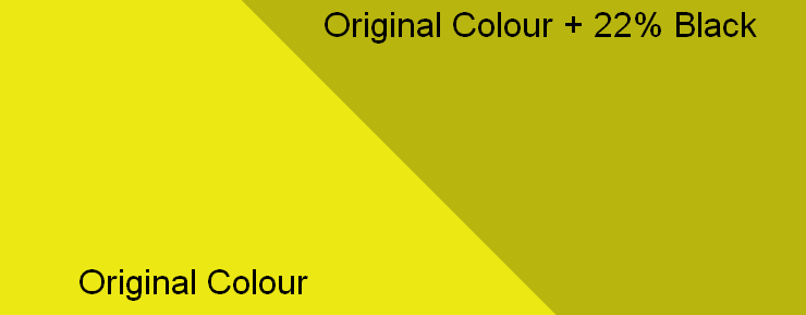
There seems to be no general rules for implementing this kind of shadow, but experiment yourself and make your own mind up. The shadow is a shape filled with black and a transparency of 22%, which covers the main color. For example in the Google Admin app icon you can see 2 main colors, but when the shadow is added, 2 additional colors are created. The shadow is usually 45˚ diagonally aligned.
Let’s try to use the same concept for a custom icon.
Creating Your Custom Icon
I decided to use a special icon (you will see why later), specifically the logo for Open Labs Albania, a great open source community in Albania. The logo looks like this:

We will not include the text, only the actual symbol. Then we play with the remaining logo slightly until we get something we like the look of.
The problem with many logos, as here, is that they might not work well as monochrome logos. With the Open Labs logo it’s mostly due to 3 colors colliding in the same place (technically 2, but the lack of a 3rd and it’s blank space counts), so the shape would be not recognizable.
We can make use of negative space and use the other half of the cut color (and may remind you of Pink Floyd). This monochrome logo is perfect for notification bar icons or other occasions where monochrome icons are needed.
A different approach could be adding strokes to the shapes we can’t convey with the same monochrome color. Instead of filling it with a color it can have a set amount of stroke width. In our case though, it wouldn’t work well with the Open Labs logo.
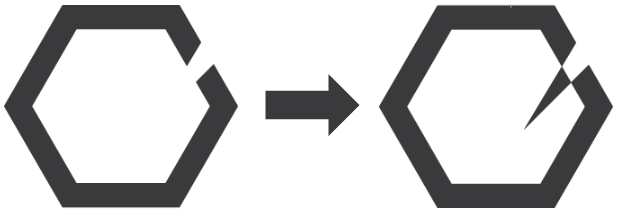
That said, I tweaked the logo in Illustrator and added the shadow where I thought it would work well.
After a quick overhaul, this is the result:

As you can see, you will need different approaches depending on the style you choose.
In our case, I made a version with minimal changes, only adding a slight shadow to the frame. The second and third variations are pure Material Design, as the icons have a circle and a box with rounded corners as containers respectively.
These shapes would either have a 3D effect or a gradient element in KitKat or earlier Android versions, but these icons will look great on non Android L devices to.
Pick what suits you best and export the icon to a 512×512 PNG (the largest resolution available for icons on Android).
Take a look at the great Android Asset studio by Roman Nurik where you can export your finished icons and much more.
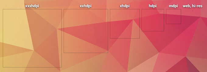
You can also accomplish this via the help of the launch icon generator, which will automatically export the icons for various DPIs.
Get Real? Get Material
It’s true that we still need to wait a few months until we can enjoy the full power of Material Design and Android L, but there is no harm in being prepared and be one of the first to have your app ready for Material Design.
If you get overwhelmed by all the rules and guidelines of the style guide, start small and create your icons in Material Design style as we did. You will eventually get the hang of it. Let us know your results!
Frequently Asked Questions (FAQs) about Creating Icons for Android Apps
What are the best practices for creating Android app icons?
When creating Android app icons, it’s important to follow certain best practices to ensure that your icons look great and function well across different devices. Firstly, always use a full-bleed square shaped canvas. This is because Android will automatically mask your icon to a shape that’s appropriate for the device it’s being displayed on. Secondly, ensure that your icon is simple and recognizable. Avoid using too many colors or intricate details that might not be visible at smaller sizes. Lastly, always test your icon on multiple screen sizes and resolutions to ensure it looks good everywhere.
How can I create adaptive icons for Android?
Adaptive icons are a new feature introduced in Android 8.0 that allow the system to display different shapes for app icons based on a mask selected by the device. To create adaptive icons, you’ll need to provide an icon in two layers: a foreground and a background. The foreground should contain the main graphical elements of your icon, while the background should contain any color or gradient that fills the space behind the foreground. You can create these layers in any graphics editor, and then use Android Studio’s Image Asset Studio to combine them into an adaptive icon.
Can I use SVG files for Android app icons?
While SVG files are great for creating scalable vector graphics, Android does not natively support SVG for app icons. Instead, you should use PNG files for your app icons. However, you can use a tool like Android Asset Studio to convert your SVG files into PNGs at the correct sizes for Android.
How can I change the app icon on my Android device?
Changing the app icon on your Android device requires the use of a custom launcher, such as Nova Launcher or Apex Launcher. Once you’ve installed a custom launcher, you can change the app icon by long-pressing on the app, selecting “Edit”, and then choosing a new icon from your device’s gallery or an icon pack.
How can I create a custom icon for my Android app?
Creating a custom icon for your Android app involves designing an image that represents your app and then setting it as your app’s icon in your project’s manifest file. You can design your icon in any graphics editor, but it should be a square image with a transparent background and a size of at least 512×512 pixels. Once you’ve created your icon, you can set it as your app’s icon by adding the following line to your manifest file: <application android:icon="@drawable/my_icon">, where “my_icon” is the name of your icon file.
What are the size requirements for Android app icons?
Android app icons should be 512×512 pixels for the Google Play Store, and for the device launcher, the full-bleed size should be 108×108 dp. However, the actual icon size in the launcher is often smaller, around 48×48 dp. It’s important to test your icon on different screen sizes and resolutions to ensure it looks good everywhere.
How can I create a round icon for my Android app?
Creating a round icon for your Android app involves designing a circular image and then using a mask to ensure that only the circular part of the image is displayed. You can create this mask in any graphics editor by creating a square canvas, filling it with a solid color, and then cutting out a circular hole in the center. Once you’ve created your mask, you can apply it to your icon using Android Studio’s Image Asset Studio.
Can I use animated icons for my Android app?
While Android does not natively support animated icons for apps, you can create a similar effect by using an Animated Vector Drawable. This is a special type of drawable that can animate its properties, such as color or position, over time. However, keep in mind that animated icons can be more resource-intensive and may not be appropriate for all apps.
How can I create an icon for my Android app without using a graphics editor?
If you don’t have access to a graphics editor, you can use online tools like EasyAppIcon or AppIcon to create an icon for your Android app. These tools provide simple interfaces that allow you to upload an image, adjust its size and position, and download the resulting icon in the correct format for Android.
How can I make my Android app icon stand out?
Making your Android app icon stand out involves creating a design that is unique, recognizable, and representative of your app. Use bold colors and simple shapes to catch the user’s eye, and avoid using too much text or intricate details that might not be visible at smaller sizes. Also, consider using a unique shape or a distinctive element that can help your icon stand out from the crowd.