

Key Takeaways
- Responsive, mobile-friendly website design is not just a technique but a means to enhance user experience. It should be fluid and adaptive, not strictly tied to rigid schemes or pixel sizes.
- Two stylesheets, common.css and responsive.css, are suggested for the design. The common.css contains all the common CSS rules that will be shared by the three versions of the project, while the responsive.css contains the specifications of the rules to apply to the chosen devices.
- Breakpoints are crucial in responsive design as they are browser widths that have a media query declaration to change the layout once the browser is within a declared width range. The choice of breakpoints should be fluid and adaptive, not strictly tied to pixel sizes.
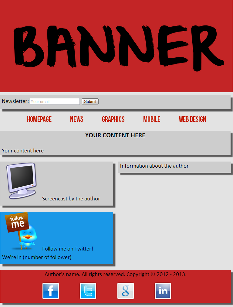
- The rules to pay more attention to when making a website responsive are those applied to the banner image, menu items, and the newsletter box. For instance, the banner image should render at its native dimensions as long as its width doesn’t exceed the width of its container. Menu items should be uniformly spaced and the spacing should be fluid.
In the last article we’ve seen the basic rules to create a simple layout for a website. After concentrating on the pc-desktop version, in this fifth part of the series, we’ll see which are the rules to apply to make the layout responsive.
So, the final result will become pleasant for both tablets and smartphones, as we’ll see in the final part. Remember that a responsive design isn’t a mere matter of a technique applied to pat yourself on the back, but it’s a way to enhance the experience of the user in using the website.
As I introduced in the fourth article of the series, for the sake of clarity, we’ll use two stylesheets for our website to keep different concepts separated; in relation with this topic, it’s good to remember that in production, you should use one of the available tools to minimize and merge the various CSS stylesheets into a unique file to improve performances. You can use either an offline tool like Minify or an online one which combines multiple CSS or Javascript files, removes unnecessary whitespaces and comments, and serves them as a single file.
Returning to our files, the first, called common.css, is the one which contains all the common CSS rules that will be shared (inherited) by the three versions of the project, while the one called responsive.css contains the specifications of the rules to apply to the chosen devices. This is the reason why it’s fundamental to set what we call “breakpoints”, that is browser widths that have a media query declaration to change the layout once the browser is within a declared width range.
Now, let’s dive into the code and examine which are the most important changes that we have to apply to get our result.
First of all, we’ve to set the chosen breakpoints in our document. To do this, you have to put this line at the top of responsive.css:
@media screen and (max-width: 768px)
Doing that we’re limiting the styles defined there to the screen (e.g. not print or braille device) and is further limiting the scope to viewports which are 768px or less in width. So, all the rules that we’ll put under this specification, will be applied only to the devices whose screen is not larger than 768 pixels.
Before continuing, take a minute to reflect on a fact: making a website responsive doesn’t mean to be bonded to pixels.
When a Web Designer plans and realizes a website by applying the technique of Responsive Web Design he wants, firstly, to create an enjoyable experience to users that can visit it using different devices; meanwhile this experience has to be supported by a proper application of the principles of this series of techniques and doing it means avoiding a too rigorous reference to rigid and fixed schemes. In the case of the choice of breakpoints, the designer should think to a layout not strictly sensible to these indications but fluid and adaptive.
In this light, it’s very interesting this article by Craig Buckler which demonstrates how browsers behaves differently when firing media query events introducing the different way they approach the calculation of the vertical scrollbar’size. In particular, the choice to be bounded to pixels raises the risk to turn back to past times when websites were optimized only for a certain size and even the slightest change influenced its proper view. So, keep it in mind when you project and realize a Responsive Website and, above all, do all the necessary tests before considering your work as finished.
After this short digression, let’s see how our tablet-layout will finally appear.
As you can see, its look has not changed a lot but, this time the page occupies the total available width of the screen. The menu list has kept the same style, although now its items are closer than before. Besides, the footer with the social icons has not changed and also the boxes containing the main content have maintained the same floating in the space.
As you’ll see reading the following code, there are few rules to specify for this version.
@media screen and (max-width: 768px)

{

   #banner > img

	{

		max-width: 100%;

	}
	ul.menu-list

   {

      height: auto;

      text-align: justify;

      -ms-text-justify: distribute-all-lines;

      text-justify: distribute-all-lines;

   }
   li.menu-item

   {

      margin: 0em 0.2em;

      width: auto;

      vertical-align: top;

      display: inline-block;

      *display: inline;

      zoom: 1;

   }
   .stretch

   {

      width: 100%;

      display: inline-block;

      *display: inline;

      zoom: 1;

   }
   a.menu-item-link

   {

      font-size: 1.1em;

   }
   #wrapper

   {

      width: inherit;

   }
   .small-box

   {

      width: inherit;

      float: none;

   }
   #wrapper

   {

      float: none;

   }
   .social-bar a

   {

      margin-right: 0em;

   }
   #newsletter-form

   {

      font-size: 1em;

   }
   input#newsletter-email

   {

      width: 10em;

      -webkit-transition: none;

      -moz-transition: none;

      -o-transition: none;

      -ms-transition: none;

      transition: none;

   }
   #team-logo-bar a

   {

      text-decoration: none;

      width: 100%;

      display: inline-block;

      text-align: center;

   }

}
The rules to which you should pay more attention for this version are those applied to the banner image, menu items and to the newsletter box. For the former, thanks to the rule max-width: 100%; the image will render at its native dimensions as long as its width doesn’t exceed the width of its container. Resizing your browser window, the image’s proportions will remain intact, even as the page scales down accordingly.
For menu items, it would be nice if all the menu items are uniformly spaced between them. In addition, also the spacing must be “fluid” so that as the size of the browser window is scaled, even the space between the various voices will decrease, while remaining equal. The solution above is compatible with all browsers, including IE 6. Recalling the HTML code from the third article, we’ve added to our list an item with class stretch, in this way:
<nav class="menu">

   <ul class="menu-list">

      <li class="menu-item">

         <a class="menu-item-link" href="./homepage" title="Homepage">Homepage</a>

      </li>

      ...

      <li class="stretch">

      </li>

   </ul>

</nav>
To the list (ul.menu-list) we’ve applied the rule text-align: justify; that, combined with the class stretch serves to balance the placement of the box and get the result of equitable spacing.
The next step is to set for the class stretch the rule display: inline-block;. As you might know, an element with rule display: inline-block; is placed in line (for example on the same line of a close content) but behaves as a block. Since in IE7 and lower the latter isn’t supported, we have to write a little hack that is very simple. It deals with what is called a “safe CSS hack” that is, quoting the explanation by Mathias Bynens is a hack that works in specific versions of a given web browser and is unlikely to be parsed by all other browsers, including future versions.
To do this, we have to add to the style element these two short lines (as we’ve done for the menu items) and that’s all:
*display: inline;

zoom: 1;
For IE6/7, zoom: 1 provides the property hasLayout. Having “layout” is a prerequisite for display: inline-block to always work. As this article clearly explains,
zoomalways triggershasLayout. Elements having both “layout” anddisplay: inlinebehave in a similar way as what the standards say aboutinline-block: they flow horizontally like words in a paragraph, are sensitive to vertical align, and apply a sort of shrink-wrapping to their content.
The last thing worth discussion is about transactions. For devices with small screens the users should get to what they are looking for quickly and without difficulty. The best thing is to remove the purely stylistic effects in excess. The first reason is more theoretical: Would the users be interested in seeing an effect like this on a small screen? Or do they worry mainly about website’s functionality?
The answer is probably functionality, and this justifies the omission. The second reason is more practical: most tablets and mobile phones are equipped with touch technology. In fact, tablets and smartphones are devices that don’t have the use of a mouse, so they don’t have the hover events.
Conclusions
In this fifth part of the series we’ve seen which are the rules that we have to apply to render our website responsive and to assure a good performance on tablets.
In the next and last part we’ll conclude it with the code for mobile and some final considerations and advices.
Frequently Asked Questions about Building a Responsive Mobile-Friendly Website from Scratch
What are the key elements to consider when designing a mobile-friendly website?
When designing a mobile-friendly website, it’s crucial to consider the following elements: responsive design, easy navigation, fast loading speed, readable text, and clickable buttons. A responsive design ensures that your website adjusts to fit any screen size, providing a seamless experience for users on different devices. Easy navigation means that users can easily find what they’re looking for on your site. Fast loading speed is important because users are likely to leave a site that takes too long to load. Readable text and clickable buttons enhance the user experience by making your site easy to interact with.
How can I test the mobile-friendliness of my website?
There are several tools available online to test the mobile-friendliness of your website. Google’s Mobile-Friendly Test is one of the most popular. Simply enter your website’s URL and the tool will analyze its mobile-friendliness. It will provide a report detailing any issues and suggestions for improvement. Other tools include W3C mobileOK Checker and BrowserStack.
What is responsive design and why is it important?
Responsive design is a web design approach that makes your website look good on all devices, regardless of their screen size. It uses flexible layouts, flexible images, and CSS media queries to achieve this. Responsive design is important because it improves user experience, boosts SEO, and increases your reach to mobile and tablet audiences.
How can I make my website load faster on mobile devices?
To make your website load faster on mobile devices, you can optimize images, minify CSS, JavaScript, and HTML, reduce server response time, leverage browser caching, and use a content distribution network (CDN). These techniques can significantly improve your site’s loading speed, enhancing user experience and SEO.
How can I make my website’s text more readable on mobile devices?
To make your website’s text more readable on mobile devices, use a font size that’s easy to read on small screens, use a simple and clean font style, ensure sufficient contrast between text and background, and use short paragraphs and bullet points for easy scanning.
How can I make my website’s buttons more clickable on mobile devices?
To make your website’s buttons more clickable on mobile devices, ensure they’re large enough to be easily tapped with a finger, provide enough space between buttons to prevent accidental clicks, and use clear and concise labels to indicate what each button does.
What is a content distribution network (CDN) and how can it improve my website’s loading speed?
A content distribution network (CDN) is a network of servers distributed across different geographical locations that deliver web content to users based on their location. By serving content from the server closest to the user, a CDN can significantly improve your website’s loading speed.
How can I optimize images for my mobile-friendly website?
To optimize images for your mobile-friendly website, you can reduce their file size, use the correct image format, and use CSS sprites to combine multiple images into one. These techniques can significantly reduce the amount of data that needs to be loaded, improving your site’s loading speed.
What are CSS media queries and how do they contribute to responsive design?
CSS media queries are a feature of CSS3 that allow you to apply different styles to your website based on the characteristics of the device it’s being viewed on. They’re a key component of responsive design, enabling your website to adjust its layout to fit different screen sizes.
How can I ensure easy navigation on my mobile-friendly website?
To ensure easy navigation on your mobile-friendly website, use a simple and clear menu, provide a search function, use clear and concise labels, and ensure all links and buttons are easily clickable. These techniques can significantly enhance user experience, making your site easier to navigate and interact with.