 Moving on from last week’s versatile Green, today we’re taking a look at the color Orange and its use on the web and in logos. Orange is combination of red and yellow, a warm vibrant color with connotations of energy and flamboyance. It’s less intense or aggressive than red but can be used in a similar fashion to grab attention and highlight important areas of a design.
Orange designs often convey a sense of friendliness and in the right hands can maintain seriousness and professionalism. On the downside, orange is sometimes associated with cheapness thanks to companies such as Easyjet which plaster all of their products and services in bright orange. In general though, it’s a great color to attract attention without offending or stopping anyone in their tracks.
Orange as a citrus fruit conveys thoughts of summer, sun, vitamin C and health. It also has connotations of autumn and change; autumn leaves changing from green to orange to brown. Depending on your audience you might choose a very bright yellow-orange or a more autumnal orange-brown.
Using Orange
As already mentioned, you can use orange as a foreground color to highlight important elements or as a main background color to convey feelings of enthusiasm, vibrancy and warmth. Without screaming, orange makes a big statement.
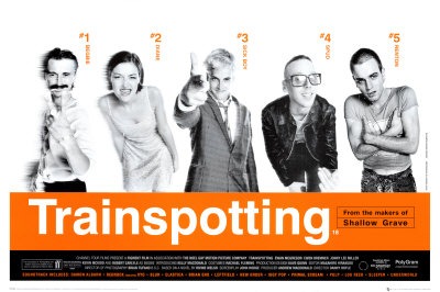
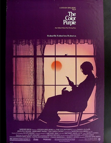
Red-orange is highly energetic and fiery while softer yellow-orange is more soothing and less flamboyant. Black and orange appears in nature in pumpkins and have a strong association with Halloween. Blue and orange really pop together. Green and orange together provide a tropical feel while the complimentary colors of purple and orange are eye-catching without being too overpowering.
Let’s look at some examples of websites using Orange as a main background color, or as a minor color to highlight important areas of the site such as navigation.
Lightway Software

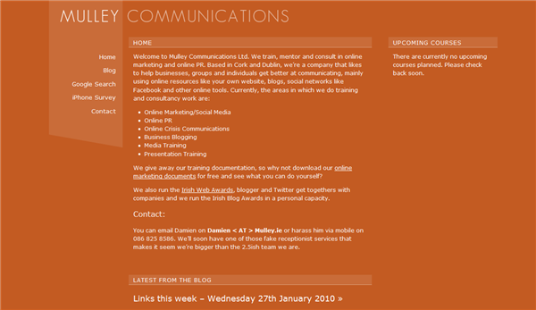
Mulley Communications
Zipper CMS

Navigant Consulting

Biker Rewards

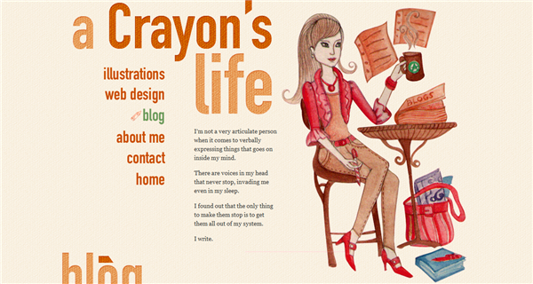
A Crayons Life
Guide Dogs South Australia

Qodo

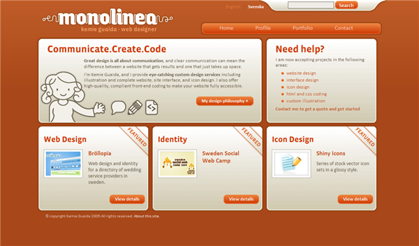
Monolinea
And there you have it. What do you think about Orange in web and logo design? Have you seen any particular orange favorites of your own?
Frequently Asked Questions about Orange in Design
What are the different shades of orange and their significance in design?
Orange, a vibrant and energetic color, comes in various shades, each carrying a unique significance in design. Lighter shades like peach and apricot are often associated with warmth and comfort, making them ideal for spaces meant to evoke a sense of coziness. Darker shades like burnt orange and rust can create a more dramatic and intense feel, suitable for designs aiming to make a bold statement. Understanding the different shades of orange and their implications can help designers use this color more effectively in their work.
How does the color orange affect the psychology of viewers?
Orange, being a combination of red and yellow, carries both the energy of red and the happiness of yellow. It is associated with joy, sunshine, and the tropics. Orange represents enthusiasm, fascination, happiness, creativity, determination, attraction, success, encouragement, and stimulation. In design, orange can be very effective for promoting food products and toys.
What are the best color combinations with orange in design?
Orange is a versatile color that pairs well with many other hues. For a harmonious look, you can pair it with its analogous colors, red and yellow. For a more striking contrast, try pairing orange with its complementary color, blue. Other popular combinations include orange and grey for a sophisticated look, or orange and white for a fresh, clean appearance.
How can I use orange effectively in web design?
Orange is a great color to use in web design as it draws attention without being as overpowering as red. It’s often used for call-to-action buttons or important headlines because it stands out, but still maintains a friendly and inviting tone. However, like any color, it’s important to use orange sparingly and strategically, as too much can be overwhelming and counterproductive.
What does the color orange symbolize in different cultures?
The color orange has different meanings across various cultures. In Western cultures, it often symbolizes creativity, adventure, and enthusiasm. In Eastern cultures, particularly in Hinduism and Buddhism, orange is considered a sacred and spiritual color. In the Netherlands, orange is the color of the Dutch Royal family, while in the United States, it’s often associated with autumn and Halloween.
How does orange influence the perception of a brand?
Orange is often used by brands to convey a sense of fun, youthfulness, and energy. It can be very effective for promoting products and services related to food, entertainment, and adventure. Brands that use orange in their logo or marketing materials are often seen as friendly, cheerful, and approachable.
What are the technical aspects of using orange in digital design?
In digital design, orange can be represented in various ways using RGB, Hex, or HSL values. For example, the RGB value for pure orange is (255, 165, 0), and its Hex code is #FFA500. Understanding these technical aspects can help designers ensure consistency and accuracy in their digital designs.
How does orange affect the readability and accessibility of a design?
Orange can enhance readability when used correctly. It’s a great color for highlighting important elements in a design due to its high visibility. However, it’s important to ensure sufficient contrast when using orange text on a background, especially for accessibility purposes. Pairing orange with darker colors like black or navy blue can enhance readability.
What emotions does the color orange evoke in marketing and advertising?
In marketing and advertising, orange is often used to evoke feelings of excitement, enthusiasm, and warmth. It’s also associated with affordability and good value, making it a popular choice for price-sensitive marketing campaigns. However, because it’s so vibrant and energetic, it’s not typically used in situations where a more serious or professional tone is required.
How can I incorporate orange into my home or office design?
Incorporating orange into your home or office design can create a vibrant and energetic space. You can use orange in a bold, dramatic way by painting an entire room, or use it more subtly through accessories like cushions, rugs, or artwork. Pairing orange with neutral colors like white or grey can balance its intensity and prevent it from being too overwhelming.
Jennifer Farley is a designer, illustrator and design instructor based in Ireland. She writes about design and illustration on her blog at Laughing Lion Design.
Published in
·APIs·Business·Cloud·Entrepreneur·Libraries·Programming·Software·Software Development·Web·October 13, 2014
