

Key Takeaways
- Bootstrap and Masonry are both powerful tools for web development, but using them together can cause layout bugs, particularly with hidden tabs.
- Masonry, a JavaScript grid layout library, is a viable option for creating grids with uneven length cards, despite certain browser support bugs.
- When integrating Bootstrap Tabs with Masonry, it’s not as straightforward as expected. The grid inside the default active tab panel may display correctly, but clicking on a tabbed navigation link to reveal hidden panel’s content may result in grid items being stacked incorrectly.
- The solution to the layout bug is to re-initialize the Masonry library after each panel becomes visible. This can be achieved by using the ‘shown.bs.tab’ event. With this solution, achieving great tiled layouts becomes easier.
Bootstrap is one of the most widely adopted, open-source, front-end frameworks. Include Bootstrap in your project, and you’ll be able to whip up responsive web pages in no time. If you’ve tried using Masonry together with the Bootstrap Tabs widget, one of the many JavaScript components Bootstrap has to offer, chances are you’ve stumbled on some kind of annoying behavior.
On the Masonry website, we read that Masonry is …
a JavaScript grid layout library. It works by placing elements in optimal position based on available vertical space, sort of like a mason fitting stones in a wall.
I did, and this article highlights what the issue is and what you can do to solve it.
Bootstrap Tabs Explained
The Bootstrap Tabs component includes two key, related pieces: a tabbed navigation element and a number of content panels. On page load, the first panel has the class .active applied to it. This enables the panel to be visible by default. This class is used via JavaScript to toggle the panel’s visibility via the events triggered by the tabbed navigation links: if .active is present the panel is visible, otherwise the panel is hidden.
If you have some web content that’s best presented in individual chunks, rather than crammed all in one spot, the Bootstrap tabs component might come in handy.
Why Masonry?
In some cases, the content inside each panel is suited to being displayed in a responsive grid layout. For instance, a range of products, services, and portfolio items are types of content that can be displayed in grid format.
However, if grid cells are not of the same height, something like what you see below can happen.
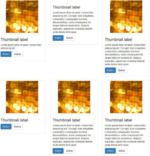
A wide gap separates the two rows of content and the layout appears broken.
Nowadays, Bootstrap solves the equal-width issue with the brand new card component, which is based on Flexbox. Just adding the card-deck class to a group of card components is sufficient to achieve equal-width columns.
If you like your cards to be of uneven length, you could use CSS3 Multi Column Layout. (After all, even though there are some browser support bugs, overall it’s quite good.) This underlies the new card columns option that comes packaged with the card component. However, if you still love the nice animation that the Masonry JavaScript library provides out of the box, and its wide browser compatibility, JavaScript is still a viable option in this case.
Setting Up a Demo Page
Getting a demo page up and running helps to show how integrating Bootstrap Tabs with Masonry is not as straightforward as one might expect.
This article’s demo page is based on the starter template, available on the Bootstrap website.
Below is the skeleton of the markup for the Bootstrap tabs component:
<ul class="nav nav-tabs" id="myTab" role="tablist">

  <!-- nav item 1 -->
  <li class="nav-item">
    <a class="nav-link active" id="home-tab" data-toggle="tab" href="#home" role="tab" aria-controls="home" aria-selected="true">Home</a>
  </li>

  <!-- nav item 2 -->
  <li class="nav-item">
    <a class="nav-link" id="profile-tab" data-toggle="tab" href="#profile" role="tab" aria-controls="profile" aria-selected="false">Profile</a>
  </li>

  <!-- nav item 3 -->
  <li class="nav-item">
    <a class="nav-link" id="contact-tab" data-toggle="tab" href="#contact" role="tab" aria-controls="contact" aria-selected="false">Contact</a>
  </li>
</ul>
The nav nav-tabs classes are responsible for giving the tabs their characteristic appearance. The value of the href attribute forms the relationship between a single tab and its corresponding tabbed content. For instance, an href value of #home creates a relationship with the tabbed content with id="home": clicking that particular tab reveals the contents inside the div with the id value of home.
Also, notice how Bootstrap pays attention to accessibility attributes like role, aria-controls, etc.
Here’s a code snippet to illustrate the tabbed content’s structure:
<!-- content 1 -->
<div class="tab-pane fade show active" id="home" role="tabpanel" aria-labelledby="home-tab">
  <h3>Tab 1 Content</h3>
<div class="card-group">

  <!-- first card -->
  <div class="card">
    <img class="card-img-top" src="path/to/img" alt="Card image cap">
    <div class="card-body">
      <h5 class="card-title">Card title</h5>
      <p class="card-text">Card text here.</p>
      <p class="card-text"><small class="text-muted">Last updated 3 mins ago</small></p>
    </div>
  </div>

  <!-- second card -->
  <div class="card">
    <!-- card markup here -->
  </div&lgt;

  <!-- third card -->
  <div class="card">
    <!-- card markup here -->
  </div>

  </div>
</div>
Just add a similar structure for each tabbed content section corresponding to the tabs elements you coded above.
For the full code, check out the CodePen demo.
Adding the Masonry Library
You can download Masonry from the official website by clicking on the Download masonry.pkgd.min.js button.
To avoid layout issues, the library’s author recommends using Masonry together with the imagesLoaded plugin.
Masonry doesn’t need the jQuery library to work. However, because the Bootstrap JavaScript components already use jQuery, I’ll be making life easier for myself and initialize Masonry the jQuery way.
Here’s the code snippet to initialize Masonry using jQuery and imagesLoaded:
var $container = $('.masonry-container');
$container.imagesLoaded( function () {
  $container.masonry({
    columnWidth: '.card',
    itemSelector: '.card'
  });
});
The code above caches the div that wraps all the card elements in a variable called $container.
Next, Masonry is initialized on $container with a couple of recommended options. The columnWidth option indicates the width of a column of a horizontal grid. Here it’s set to the width of the single card item by using its class name. The itemSelector option indicates which child elements are to be used as item elements. Here, it’s also set to the single card item.
It’s now time to test the code.
Oops! What’s up with the Hidden Panels?
On a web page that doesn’t use Bootstrap Tabs, the code above works like a charm. However, in this case, you soon realize a kind of funny behavior occurs.
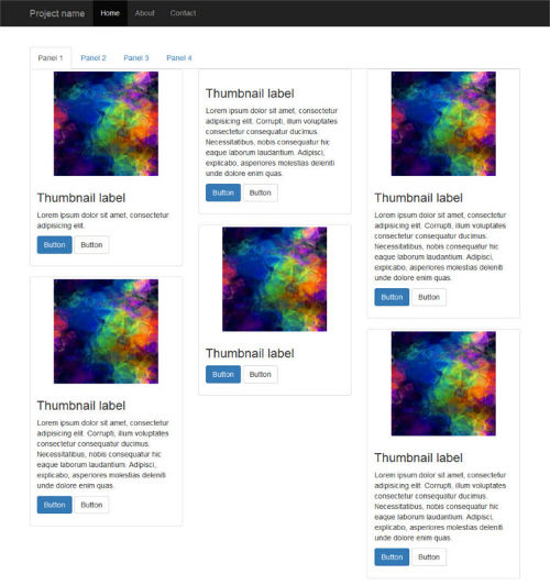
First, it seems fine because the grid inside the default active tab panel is displayed correctly:
However, if you click on a tabbed navigation link to reveal the hidden panel’s content, here’s what happens:
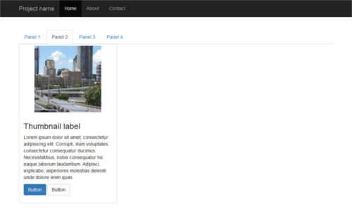
Peeking inside the source code reveals that Masonry has fired as expected, but the position of each item is not being calculated correctly: grid items are all stacked on top of each other like a pack of cards.
And that’s not all. Resizing the browser window causes the grid items to position themselves correctly.
Let’s Fix the Layout Bug
Since the unexpected layout bug becomes apparent after clicking on a tabbed navigation link, let’s look into the events fired by Bootstrap Tabs a bit more closely.
The events list is quite short. Here it is.
- show.bs.tab fires on tab show, but before the new tab has been shown
- shown.bs.tab fires on tab show after a tab has been shown
- hide.bs.tab fires when a new tab is to be shown (and thus the previous active tab is to be hidden)
- hidden.bs.tab fires after a new tab is shown (and thus the previous active tab is hidden).
Because the Masonry layout gets messed up after a tab has been shown, go for the shown.bs.tab event. Here’s the code, which you can place just below the previous snippet:
$('a[data-toggle=tab]').each(function () {
  var $this = $(this);

  $this.on('shown.bs.tab', function () {
    $container.imagesLoaded( function () {
      $container.masonry({
        columnWidth: '.card',
        itemSelector: '.card'
      });
    });
  });
});
Here’s what happens in the code above:
The jQuery .each() function loops over each tabbed navigation link and listens for the shown.bs.tab event. As the event fires, the panel becomes visible and Masonry is re-initialized after all images have finished loading.
Test the Code
If you’ve been following along, launch your demo in the browser, or try out the CodePen demo below to check out the result:
See the Pen Bootstrap Tabs and Masonry by SitePoint (@SitePoint) on CodePen.
Click on a tabbed navigation link and notice how, this time, the grid items fit evenly inside each content panel. Resizing the browser causes the items to reposition themselves correctly with a nice animation effect.
That’s it, job done!
Conclusion
In this article, I’ve shown how to integrate the Bootstrap Tabs component with the Masonry JavaScript library.
Both scripts are easy to use and quite powerful. However, put them together and you’ll face some annoying layout bugs affecting the hidden tabs. As shown above, the trick is to re-initialize the Masonry library after each panel becomes visible.
With this solution in your toolbox, achieving great tiled layouts will be a breeze.
Happy Bootstrapping!
If you’ve got the basics of Bootstrap under your belt but are wondering how to take your Bootstrap skills to the next level, check out our Building Your First Website with Bootstrap 4 course for a quick and fun introduction to the power of Bootstrap.
Frequently Asked Questions (FAQs) about Bootstrap Tabs and Masonry
How can I make Bootstrap tabs responsive?
Bootstrap tabs are responsive by default. However, if you want to customize their responsiveness, you can use Bootstrap’s grid system. You can specify different column sizes for different screen sizes using the col-xs, col-sm, col-md, and col-lg classes. For example, if you want your tabs to take up half the screen on medium-sized devices and the full screen on small devices, you can use the classes “col-md-6” and “col-xs-12”.
How can I add icons to Bootstrap tabs?
You can add icons to Bootstrap tabs by using the “i” element with the appropriate icon class. For example, if you’re using Font Awesome icons, you can add an icon to a tab like this: <a href="#home" class="nav-link active"><i class="fa fa-home"></i> Home</a>. This will add a home icon to the “Home” tab.
How can I change the color of Bootstrap tabs?
You can change the color of Bootstrap tabs by overriding the default CSS. For example, if you want to change the background color of the active tab, you can use the following CSS: .nav-tabs .nav-link.active { background-color: #your-color; }. Replace “#your-color” with the color you want to use.
How can I use Masonry with Bootstrap tabs?
To use Masonry with Bootstrap tabs, you need to initialize Masonry when a tab is shown. You can do this by listening to the “shown.bs.tab” event and then initializing Masonry. Here’s an example: $('a[data-toggle="tab"]').on('shown.bs.tab', function (e) { $('.grid').masonry({ itemSelector: '.grid-item', percentPosition: true }); });.
How can I add animations to Bootstrap tabs?
You can add animations to Bootstrap tabs by using CSS transitions. For example, you can add a fade-in effect to the tab content by using the following CSS: .tab-pane { opacity: 0; transition: opacity 0.5s ease-in-out; } .tab-pane.active { opacity: 1; }.
How can I make Bootstrap tabs vertical?
To make Bootstrap tabs vertical, you can use the “flex-column” class on the “nav” element. This will make the tabs stack vertically. Here’s an example: <ul class="nav nav-tabs flex-column">.
How can I add a dropdown to Bootstrap tabs?
You can add a dropdown to Bootstrap tabs by using the “dropdown” class and the “dropdown-menu” class. Here’s an example: <li class="nav-item dropdown"> <a class="nav-link dropdown-toggle" data-toggle="dropdown" href="#" role="button" aria-haspopup="true" aria-expanded="false">Dropdown</a> <div class="dropdown-menu"> <a class="dropdown-item" href="#dropdown1" data-toggle="tab">Dropdown 1</a> <a class="dropdown-item" href="#dropdown2" data-toggle="tab">Dropdown 2</a> </div> </li>.
How can I change the position of Bootstrap tabs?
You can change the position of Bootstrap tabs by using the “justify-content-center” or “justify-content-end” classes. These classes will center the tabs or align them to the right, respectively.
How can I add a scroll to Bootstrap tabs?
To add a scroll to Bootstrap tabs, you can use the “nav-scroll” class. This will add a horizontal scrollbar to the tabs if they exceed the width of their container.
How can I add badges to Bootstrap tabs?
You can add badges to Bootstrap tabs by using the “badge” class. Here’s an example: <a href="#home" class="nav-link active">Home <span class="badge badge-primary">New</span></a>. This will add a “New” badge to the “Home” tab.