
There are a lot of grid frameworks for us the to choose from while developing websites nowadays. Of the many frameworks, one of most loved and yet most hated framework is definitely Bootstrap.
Today, I’ll like to introduce you to a slightly lesser known framework that has caught on for many people – Susy. In this article, I’ll show a comparison between Susy and Bootstrap’s grid system so you can fully understand what Susy is, and whether you’ll want to try it out.
Key Takeaways
- Susy and Bootstrap are fundamentally different tools, but their grid systems can be compared. Bootstrap is a full-featured framework that includes styles for common web elements, jQuery plugins, and a grid system. Susy, on the other hand, is a layout engine that provides tools to build a custom grid framework, offering more design flexibility.
- Bootstrap’s grid system can be customized to a certain extent, including the number of columns, size of a gutter, and sizes of four available breakpoints. Susy allows for more customization, including the number of columns, size of each individual column, size of gutter, how gutters are positioned, number and sizes of breakpoints, document flow, and the box model used for the grids.
- In terms of markup usage, Bootstrap requires the use of classes like .row and .col-md-4 all over its markup for the HTML to be styled properly. Susy’s HTML is simpler and more semantic, but requires additional styles to be added for elements to show up properly.
- Bootstrap requires coding carefully with HTML classes for proper responsiveness, while Susy leaves the HTML alone and requires careful coding in the Sass file. This can result in a stronger decoupling of HTML and CSS when using Susy, which can make code easier to maintain.
- Bootstrap has a robust documentation and community, making it easier to find information and ask questions. Susy’s community is not as large and its documentation is not as robust, which can make it harder for some to learn.
What is Susy?
In order to answer this question, we have to first answer “What is a grid?”
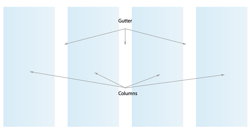
Grids in the web terminology are nothing more than just a set of vertical lines running from the top to the bottom of a page. They originate from print design and are now used every day by web designers to serve as a baseline to organize and present information on pages.

These vertical lines help to segment the page into two kinds of vertical spaces. We call the wider space a column and the narrower space a gutter. Where we order and position the elements is what we refer to as layout.
Many kinds of grid frameworks were used in the past, which you might recognize. Some examples are:
- 960 grid system
- 1140px grid system
- Bootstrap
- Foundation
All these frameworks have one thing in common. They each have a grid already present and you can customize it to a limited extent.
However, interesting web designs that use asymmetric grids have started springing up all over the web and there is no way traditional frameworks like the ones just mentioned can help you create a grid for that.
That is what Susy is for.
Susy is a layout engine. It provides you with the tools to build a custom grid framework that matches the needs of your website. This gives you the flexibility and freedom to play with your design.
What is Bootstrap?
Bootstrap is more than just a grid system. It is a full featured framework and toolkit that provides us with:
- A grid system
- Styles for common web elements like navigation, forms, alerts, and icons.
- jQuery plugins for complex elements like accordions and carousels.
Once you understand what Susy and Bootstrap are, its easy to see that we cannot logically compare between the two. They are fundamentally different things to begin with.
The closest comparison we can draw, therefore, is between Susy and the grid system in Bootstrap. There are a few things we can compare when we look at it this way. Here are some things we will be covering in this article:
- Preprocessor Language
- Markup Usage
- Ability to customize the grid
- Ability to respond to multiple breakpoints
- Coupling of HTML and CSS
- Documentation and Community
Preprocessor Language
Preprocessor languages are important because you need tools to fit into your workflow, not the other way around. Lets first make it clear what works on what.
Although Bootstrap was initially built with Less, it can now be used with both Sass and Less. Thus, language is’t be a barrier to using Bootstrap at all.
The latest version of Susy (Susy 2) only works with Sass version 3.3 and up because it requires the use of Sass maps. There is also an older version if you are only able to use Sass with a version below 3.3. Unfortunately, Susy doesn’t support Less.
Markup Usage
Lets use a simple example to compare Bootstrap’s and Susy’s markup.
Bootstrap requires the use of classes like .row and .col-md-4 all over its markup in order for the HTML to be styled properly.
This is also where most of Bootstrap’s criticisms come in. Critics argue that these classes are presentational classes that shouldn’t be in the markup.
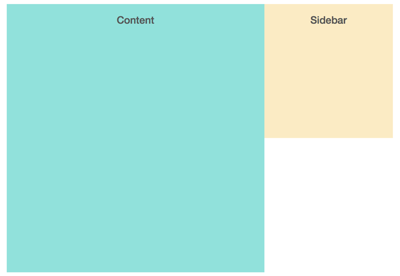
Here’s the markup that Bootstrap requires with some of the example grid-based classes in place:
<div class="container-fluid">

  <div class="row">

    <div class="col-md-8 content"><h2>Content</h2></div>

    <div class="col-md-4 sidebar"><h2>Sidebar</h2></div>

  </div>

</div>
By comparison, here’s what Susy requires.
<div class="wrap">

  <div class="content"><h2>Content</h2></div>

  <div class="sidebar"><h2>Sidebar</h2></div>

</div>
Susy’s HTML is much simpler and more semantic compared to Bootstrap. However, its not enough just to write the HTML with Susy. You’ll have to add some styles to both .content and .sidebar so they show up properly.
Lets do a quick configuration to demonstrate how susy works.
First, notice that Bootstrap applies gutters as paddings to both edges of every column.
By default, Susy applies gutters as margins to the right of every column. To create the same grid as Bootstrap, you will have to change the gutter-position setting in the $susy map.
$susy: (

  gutter-position: inside

)
For every Susy grid, you will have to include a container mixin for the .container class. In the case above, the container would be .wrap and it has a max width of 1140px.
.wrap {

  @include container(1140px);

}
Our example with Bootstrap uses 8 columns for content and 4 columns for .sidebar. You will have to use the span mixin in Susy to create the layouts for .content and .sidebar, which will take up 8 columns and 4 columns respectively.
.content {

  @include span(8 of 12);

}
.sidebar {

  @include span(4 of 12);

}
The markup for Susy is cleaner compared to Bootstrap, but there’s more work involved to get the initial grid up and running because Susy requires you to configure them yourself while Bootstrap has already provided you with the necessary styles.
Ability to Customize the Grid
Bootstrap offers you the ability to customize your grids to a certain extent. You can freely change things like:
- Number of columns
- Size of a gutter
- Sizes of 4 available breakpoints (
xs,sm,mdandlg)
You can customize these grids from two different areas:
- Change them through the customize tab or
- Change the variables in the
_variablespartial in whatever preprocessor you’re using (Sass or Less).
For both cases, columns and gutters can be found in the “grid system” section, while media queries can be found in the “media queries breakpoints” section.
Susy on the other hand allows you to change many more things. You can change things like:
- Number of columns
- Size of each individual column
- Size of gutter
- How gutters are positioned
- Number of breakpoints
- Sizes of breakpoints
- Document flow from left to right or right to left
- Box model used for the grids
…and many more.
Although other grid systems like Singularity and GridsetApp are more well-known for asymmetric grids, Susy allows you to use such grids as well if you know how to set them up. Some examples of great asymmetric layouts are this, this and this.
I particularly like the final one by Nathan Ford and have successfully recreated the same asymmetric layout with Susy. There is no longer a need to stick to a standard grid anymore. Susy lets you be crazily creative with the grids you or your designers make.
Ability to Respond to Multiple Breakpoints Easily
As as I mentioned above, Bootstrap allows you to use up to 4 different breakpoints for your grid: xs, sm, md and lg. These breakpoints are written right into the Bootstrap classes for the grid.
In our above example, if you resized the browser down to less than 991px, .content will become a full 100% of the container and .sidebar will drop down to the next column.
Assuming you wanted both .content and .sidebar to take up half the the screen when on a smaller viewport (below 991px), it is not uncommon to see HTML that contains multiple breakpoint arguments, like this:
<div class="container-fluid">

  <div class="row">

    <div class="col-xs-6 col-md-8 content"><h2>Content</h2></div>

    <div class="col-xs-6 col-md-4 sidebar"><h2>Sidebar</h2></div>

  </div>

</div>
Whereas when you do this with Susy, you change the CSS instead of the HTML. The HTML for Susy remains as we saw earlier, with nothing added:
<div class="wrap">

  <div class="content"><h2>Content</h2></div>

  <div class="sidebar"><h2>Sidebar</h2></div>

</div>
Instead, you will have to add a breakpoint (say 991px) to the Sass file.
While doing so, its possible to go from a mobile-first approach and declare .content and .sidebar each to take up half of the screen first. After 991px, .content will take up 8 columns while .sidebar takes up 4 columns:
.content {

  @include span(6 of 12);

  @media (min-width: 980px) {

    @include span(8 of 12);

  }

}
.sidebar {

  @include span(6 of 12);

  @media (min-width: 980px) {

    @include span(4 of 12);

  }

}
Bootstrap requires you to code carefully with the HTML classes and that sometimes throws things off for me. When I code with Bootstrap, I always have to remember the specific breakpoints and I must include the correct breakpoint acronym into my grids if I wanted them to respond properly.
Susy on the other hand leaves the HTML alone and asks you to code carefully in the Sass file. I have a strong preference to leave my breakpoints in the stylesheet because its much easier cognitively for me to see what’s happening.
Depending on your preference, either Bootstrap or Susy can be suitable. I personally prefer Susy because with Susy, I can now safely decouple my HTML with my CSS. Which brings me to the next point.
Coupling of HTML and CSS
Any nontrivial website today needs to hold a lot of HTML and CSS. The more tightly coupled HTML and CSS are, the tougher it is to maintain the code.
Just imagine if we went back to the time where all CSS was coded right inside the HTML using the style attribute. Using classes in the HTML like .col-xs-6, .col-md-4, and .row is similar to using the style attribute.
When you have multiple HTML elements that require a specific layout with the .col class, the number of times you need to include these classes increases. What if the design has to change and .content needs to go down to 7 columns instead of 8? Do you have to go back and change all the html classes everywhere?
<div class="col-md-7 content">

  <h2>Content</h2>

</div>
To me, thats really tough to maintain.
My personal preference is to use Susy and keep these presentational classes in the external CSS where they belong. For example, in Susy, if I had to change .content to 7 columns, I have to change only the span mixin I used, and make it 7 columns instead of 8!
.content {

  @include span(7 of 12);

}
I think this is much easier to maintain because the HTML and CSS are now decoupled.
Since you will have free reign on the HTML and CSS while using Susy, you can now apply various CSS architecture practices like SMACSS, OOCSS, and BEM without having to think too much on how they will affect your HTML.
Documentation and Community
Finally, documentation and community plays a large part in every framework. the larger the community and the more robust the documentation, the easier it is for you to find information and ask questions.
Bootstrap’s documentation and community is definitely robust. Whenever you have problems, you can post your questions on StackOverflow or other coding forums and someone will definitely be able to help you.
The community for Susy however, is not as large (yet) and the documentation is not as robust. There is also currently a lack of case studies online on how to build a website with Susy, and that has really stopped many from picking it up. To combat this, I have written a book on learning Susy, so please check that out if you’re interested in learning about it.
Conclusion
Although Susy and Bootstrap are fundamentally different tools, we can see clearly what are the differences if we compare their two grid systems. As I have highlighted above, I strongly believe that Susy has a better underlying system compared to Bootstrap.
If you’re interested to learn more about Susy, head over to the official website, check out the documentation, or grab 4 free chapters from my book.
Frequently Asked Questions on Bootstrap’s Grid System vs Susy
What are the main differences between Bootstrap’s Grid System and Susy?
Bootstrap’s Grid System and Susy are both popular tools for creating responsive web layouts, but they have some key differences. Bootstrap is a comprehensive framework that includes a grid system, components, and JavaScript plugins. It’s designed to be easy to use, with pre-defined classes and a standard 12-column grid. On the other hand, Susy is a lightweight grid system that gives you more flexibility. It doesn’t come with any pre-defined classes or components, so you can create your own custom grid layouts. Susy is also more suited to complex layouts, as it allows for any number of columns, not just 12.
How does the performance of Bootstrap’s Grid System compare to Susy?
In terms of performance, both Bootstrap’s Grid System and Susy are highly efficient. However, because Bootstrap is a larger framework, it can be heavier and slower to load than Susy, especially if you’re only using a small part of it. Susy, being a standalone grid system, is lighter and faster to load. It’s also more flexible, allowing you to create custom grid layouts that can be more efficient in terms of performance.
Is Susy more difficult to use than Bootstrap’s Grid System?
Susy can be more challenging to use than Bootstrap’s Grid System, especially for beginners. This is because Susy doesn’t come with pre-defined classes or components, so you need to create your own grid layouts. However, this also gives you more flexibility and control over your layouts. If you’re comfortable with CSS and Sass, you might find Susy to be a powerful tool for creating custom, responsive layouts.
Can I use both Bootstrap’s Grid System and Susy in the same project?
Yes, it’s possible to use both Bootstrap’s Grid System and Susy in the same project. However, it’s important to note that they are both grid systems, so using them together might lead to conflicts or unnecessary complexity. It’s generally recommended to choose one or the other based on your project’s needs.
What are the advantages of using Susy over Bootstrap’s Grid System?
One of the main advantages of using Susy over Bootstrap’s Grid System is its flexibility. Susy allows you to create custom grid layouts with any number of columns, not just 12. It’s also lighter and faster to load, making it more efficient in terms of performance. Additionally, because Susy doesn’t come with pre-defined classes or components, it gives you more control over your layouts.
Is Bootstrap’s Grid System more popular than Susy?
Yes, Bootstrap’s Grid System is generally more popular than Susy. This is largely due to Bootstrap’s ease of use and comprehensive set of features. However, Susy is also widely used, especially by developers who prefer a more flexible and lightweight grid system.
Can I use Susy with other CSS frameworks?
Yes, Susy can be used with other CSS frameworks. However, it’s important to note that Susy is a grid system, so it might not be necessary to use it with another framework that also includes a grid system.
How does the learning curve for Susy compare to Bootstrap’s Grid System?
The learning curve for Susy can be steeper than for Bootstrap’s Grid System, especially for beginners. This is because Susy requires you to create your own grid layouts, whereas Bootstrap comes with pre-defined classes and a standard 12-column grid. However, if you’re comfortable with CSS and Sass, you might find Susy to be a powerful and flexible tool.
Are there any resources for learning Susy?
Yes, there are many resources available for learning Susy. The official Susy documentation is a great place to start. There are also many tutorials and guides available online, both free and paid.
Can I use Susy for commercial projects?
Yes, Susy can be used for commercial projects. It’s an open-source tool, so there are no licensing fees or restrictions on its use. However, it’s always a good idea to check the latest licensing information on the official Susy website.