


Pairing type is one of the toughest parts to get right in a web design project, and having tons of custom fonts at our fingertips doesn’t make things any easier.
If you’re just at the start of your journey to web typography mastery, it’s likely that reading something along the lines of…
The Display and its Stencil are monolinear … but they radiate great rhythm and warmth, with a touch of handwriting.
– Tremolo Typeface Review by Laura Meseguer
… will probably make as much sense to you as wine tasting does to a teetotaler.
Font selection is more an art than a science. Therefore, reading about typography, individual typefaces and foundries goes hand in hand with lots of practice. However — as Tim Brown says in his guide Combining Typefaces — “practice can take an unreasonable amount of time if you’re not careful” (p.38). In the meantime, the website you are working on makes immediate demands on your budding typography skills. You need to come up with a great solution, and do it quickly.
In this article, you’ll find plenty of online resources that will complement your learning about web typography and help you come up with beautiful type combinations.
You’ll also learn how some of the services listed below let you test the browser rendering of your chosen fonts and offer hassle-free ways of including them in your project.
Key Takeaways
- Explore Type Pairing Tools: Utilize interactive tools like Google Fonts Pairings and Font Pair to experiment with and visualize how different typefaces complement each other, enhancing your design project’s aesthetic and readability.
- Learn Through Play: Engage with educational resources like Type Connection, a typographic dating game, to deepen your understanding of typeface pairing while having fun.
- Access Inspirational Collections: Reference sites like Typ.io and Beautiful Web Type for current trends and examples of effective typeface combinations used in various real-world websites.
- Utilize Preview Features: Before finalizing your typeface choices, use preview options available in services like Google Fonts and Adobe Typekit to see how fonts render in different sizes and on various devices.
- Incorporate Fonts Seamlessly: Take advantage of web font services that offer easy integration into your projects, ensuring that the chosen typefaces load efficiently and are consistent across all user experiences.
Great Typeface Combos
Browsing websites with good combinations of typefaces is a great way to develop an eye for how typefaces work together and in which contexts they’re being used. Check out the resources below for some great examples.
Google Fonts Pairings Feature
Google Fonts is not just a service for picking custom fonts. It’s also a place where you can learn more about your chosen typeface, including suggestions on a number of typefaces that work well with it.
When you select a typeface on Google Fonts, click on the small Pop out button to the bottom right of the font’s container box.
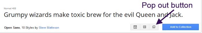
Next, click on the Pairings tab and you’ll see examples of how your selection is paired on the web with other typefaces.
Although I like this resource, in my view it doesn’t say much about the context in which the suggested pairings are used. For instance, what kind of websites use Open Sans and Roboto together? Are they text-heavy websites like news sites and blogs? Are they image-focused websites like a photography portfolio site? Which page elements use Open Sans and which ones use Roboto?
This is super helpful information when it comes to selecting type combinations, and in order to find it we have to look elsewhere.
Beautiful Web Type
Beautiful Web Type showcases a selection of typefaces from Google Fonts.
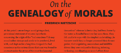
The examples are a bit generic – they’re not taken from real websites with specific goals and strategies. That said, the website shows off its typeface selections in beautifully designed sections. Notice how text hierarchy, font weights and styles, all play a part in making the text more readable and conveying the appropriate mood.
Google Web Fonts Typography Project
Another inspirational collection of typeface combinations from Google Fonts is on the Google Web Fonts Typography Project website.
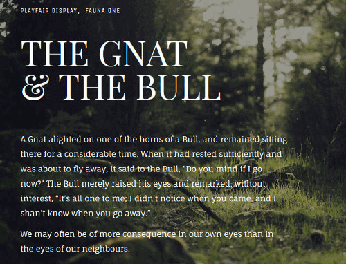
The designs on this website are beautiful illustrations of type pairings and their uses on the web. As the project’s README file on the GitHub repo says:
The primary goal is to communicate, not decorate.
Typ.io
Typ.io gives you tons of information on trendy typography designs and an up-to-date range of websites with well paired typefaces.
Not only will you see matching typefaces, but you will also get a sense of the role type plays in the design of real websites – which typeface is used for headings, which one for body copy, the font selection the designer has made for a certain kind of website, e.g., portfolio, blog, marketing, etc. In fact, you can search websites by industry, typeface, and font service.
Finally, click on the image with your favorite typeface combination, and you’ll get the CSS code and the links to the services where you can purchase or download the font files.
Fonts In Use
Fonts in Use is another popular resource offering a wide collection of typefaces that work well together, taken from real websites.
Its impressive search functionality lets you browse the typography archive by:
- industries
- formats
- typefaces
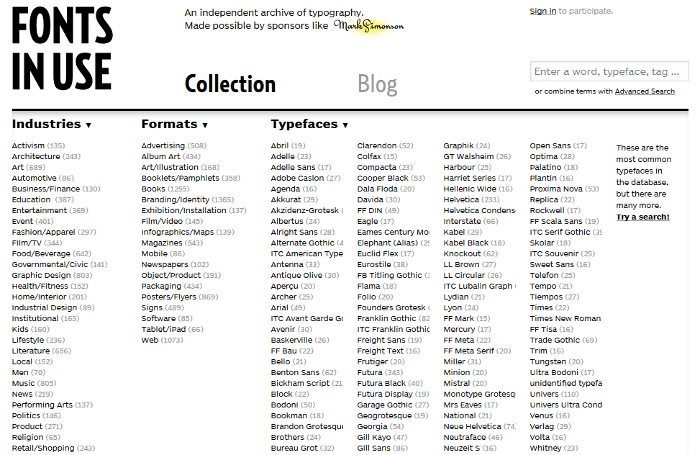
To stress the point, showing how type works on websites from a variety of industries and contexts is crucial to developing an eye for good typesetting decisions.
Interactive Type Pairing Tools
The resources I’m going to list below will ask for your input in the search for the perfect type combination. Be it a way of testing typefaces or simply making a selection and waiting for a number of suitable matches, these tools are interactive and fun to use.
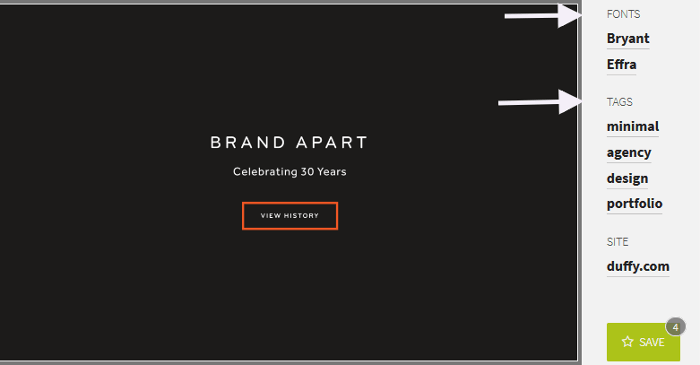
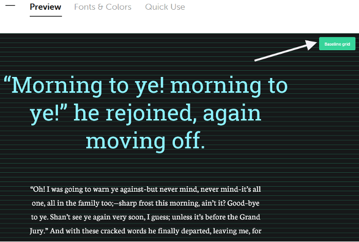
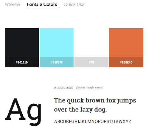
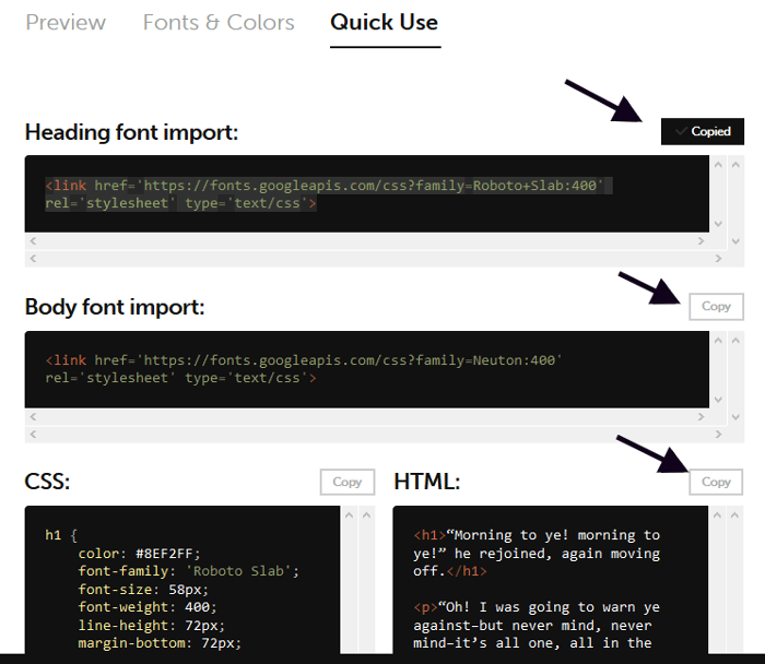
Typespiration
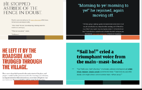
The beauty of Typespiration is that it lets you browse different designs showcasing beautiful free fonts and color palettes.
If you click on any of the designs, you’ll have the option to:
- Preview a close-up of the design. If you click the Baseline grid button on the top right you can also check how the text sits on the baseline grid:
- Learn about the fonts and colors used in the design:
- Copy and paste the HTML and CSS code you need to recreate the design in your project:
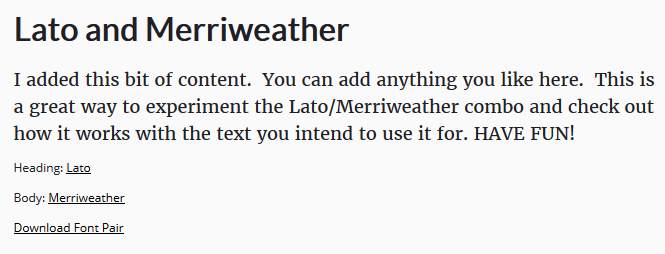
Font Pair
Font Pair allows you to browse typeface combinations on the basis of a number of filters:
- Sans serif/serif – the title will use a sans serif typeface, body copy a serif one. Serif letterforms have small flourishes on the end of each character, sans serif ones don’t.
- Serif/sans serif – serif for the title, sans serif for the body copy.
- Sans serif/sans serif – sans serif typefaces for both title and body copy.
- Cursive/sans serif – cursive for the title, sans serif for the body copy. Cursive typefaces have a handwriting style, which suits titles and logos but is best avoided for body copy.
- Cursive/serif – cursive for the title, serif for body copy.
- Serif/serif – serif typefaces for both title and body copy.

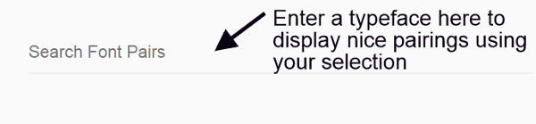
If you have already decided on a typeface and you’re looking for a suitable match, just enter its name in the search box at the top of the page. The website will display a list of suggestions using your selection:
One more cool thing you can do here is replace the sample text with your own. This is great for testing how your selected combination works with your website’s content:
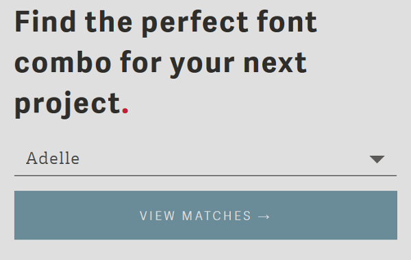
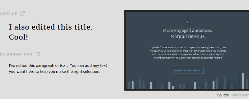
Type Genius
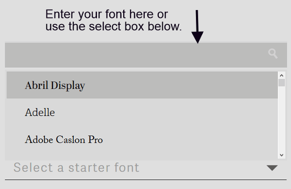
Type Genius is a smart service that lets you find great matches for your chosen typeface.
Just select a font and click the View Matches button.
Type Genius will show you a page with:
- Suggested pairings using your selected typeface.
- Links to the websites using the suggested pairings.
- Editable title and body text to experiment with your choice of typeface.
- Links to the service where you can download the font files.
Font Combinator
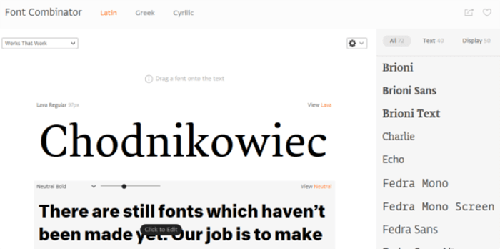
Font Combinator is a powerful online tool, great for browsing matching combinations of typefaces designed by Typotheque, a type foundry and design studio in the Netherlands.
You can choose typefaces from the Latin, Greek and Cyrillic character sets. A select box lets you browse font pairings using various keywords such as Elegant, Classic, Trendy, etc. You can fully edit the text on display, adjust the styles of the selected typeface, and drag any typeface listed to the right of the page on to the display area for testing.
Adobe Typekit Combos
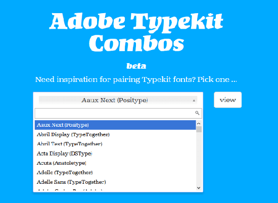
Adobe Typekit Combos by Fontdata is a nifty tool, still in beta, that lets you select a Typekit font and finds matching fonts for you.
Once you make your selection and click the View button, this tool displays a list of suggested matching Webkit fonts and a link to a number of websites where you can see those fonts on display.
Type Pairing Learning Tools
The tools I’m going to list below are not only good for making great suggestions about typefaces that work well together. They also, and most importantly, give you bite-sized chunks of knowledge about type and how to match typefaces.
Type Connection
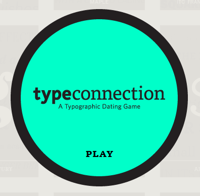
This is a favorite of mine. Type Connection by Aura Seltzer calls itself a Typographic dating game.
It’s a highly interactive tool in the form of a dating game for finding great type pairings and learning about typography.
Type Connection starts with well-known typefaces looking for the right match. You’re the matchmaker who’s going to find the ideal partner using one of the strategies for combining typefaces. At each step of the way, you’ll learn something about the meaning of typographic terms, history of type, etc. Once the game is over, you’ll find out the reason why the match does or doesn’t work.
Its creator has condensed Type Connection’s main goal like this:
By playing Type Connection, you deepen your own connection with type.
Don’t stop at the game, though. The Type Connection website is a treasure trove of typographic nuggets, including a summary of typeface combination strategies and tons of links to a variety of references about typography.
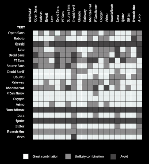
Mixing Typefaces (PDF)
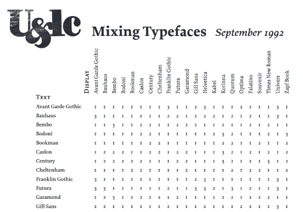
Mixing Typefaces is a PDF copy of a page taken from U&lc (Upper and lower case), a historic publication targeting the design community.
Pick a typeface on the vertical axis to the left for body copy and cross-reference it with a display typeface on the horizontal axis. The number inside the box at the intersection of the two typefaces indicates the degree of compatibility between them:
- Combine at will.
- Not a conservative choice.
- Think again.
The Art of Mixing Typefaces
The Art of Mixing Typefaces is a great infographic about combining Google Fonts created by FastPrint, which takes inspiration from the U&lc document I listed above.
The information is conveyed using colors rather than numbers, but it works pretty much the same way.
The Art of Combining Fonts
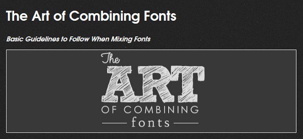
The Art of Combining Fonts is a fantastic infographic for learning a thing or two about type pairing … ah, it’s also fun to read.
Mixing and Matching Fonts
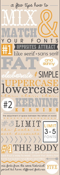
Mixing and Matching Fonts is another beautiful infographic with some mini typography lessons baked in by Fontaholic.
The Ten Commandments of Typography
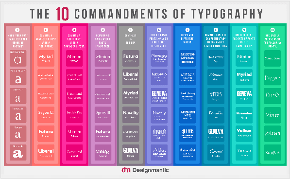
This infographic by DesignMantic includes both examples of typeface combinations and excellent advice about typography.
Previewing and Displaying Fonts in the Browser
Before purchasing or downloading a font, it’s a good idea to test how it renders in the browser at different screen resolutions.
The online resources below do a good job at letting you preview your chosen fonts. Some of them will also help you include the fonts in your project.
Google Fonts Preview and Streaming Service
When you’re browsing a font on the Google Fonts library, you have various display options for previewing your selection.
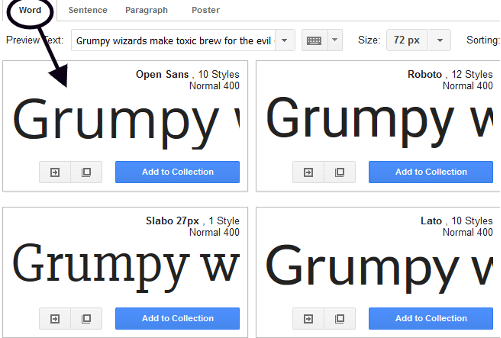
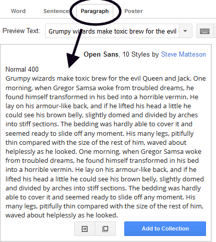
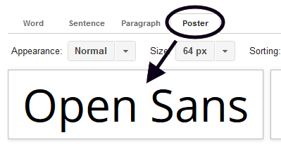
You can:
- Preview a single sentence, which is the default view:
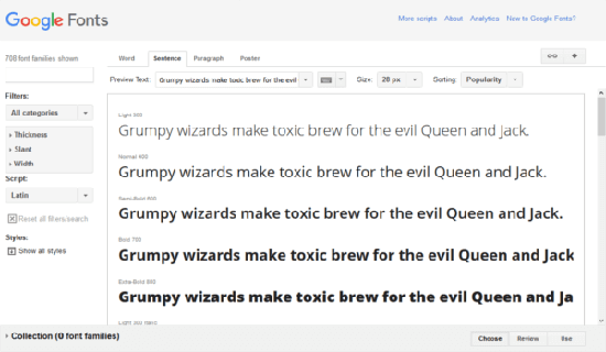
- Preview a single word:
- Preview a paragraph:
- Preview an enlarged, poster-like display of your font:
- Select different text for preview or enter your own:
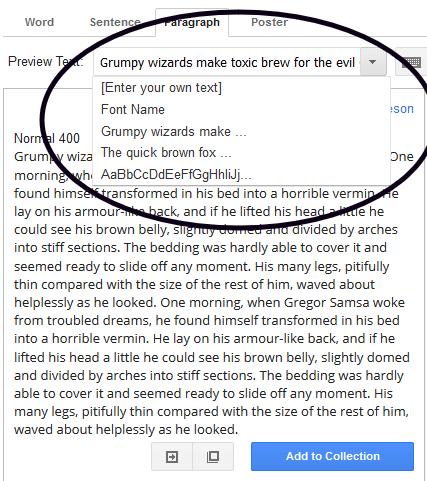
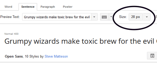
- Increase and decrease the font size in your preview:
With a bit more digging, you’ll find that Google Fonts has a few additional options for previewing and testing your font selections.
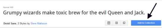
Try adding a couple of fonts to a collection by clicking on the Add to Collection button.
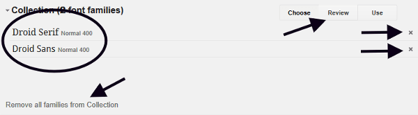
I’ve added Droid Sans and Droid Serif to my collection for testing. Selecting from a type family with sans serif and serif variations is one of the safest bets when you’re just starting out.
Once your fonts are inside a collection, you can:
- Remove an individual font by clicking on the x icon next to it.
- Remove all selected fonts by clicking on the Remove all families from Collection button.
- Test your selections in a variety of interactive ways by clicking on the Review button at the bottom of the screen.
Once you’re on the Review screen, click on the Test Drive option to put your selection to its paces.
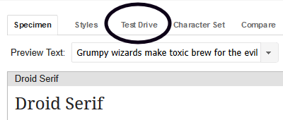
From this screen you can test your typefaces for body text, headings and sub-headings, change font size, line height and other CSS properties, replace the existing content with your own, and more.
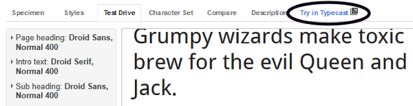
If this weren’t enough, you can test your selection further on Typecast by clicking the Try in Typecast option on the Review screen of the Google Fonts website. This will land you on the Typecast app, which I’m going to cover in the next section.
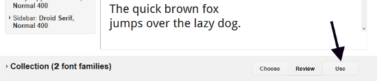
Once you’re happy with your selection, you can painlessly include the fonts in your project using Google CDN (Content Delivery Network).
Start by clicking on the Use button at the bottom of the screen.
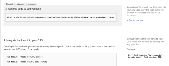
From here you can fine tune your selection by picking the font styles and character sets you need. Stick to what you really need – the more styles and character sets you add the longer it takes for the files to load in the browser.
Best of all, you can simply grab the code Google Fonts provides and paste it in your project, then let the service stream the fonts to your website.
Typecast Prototyping Functionality
Typecast offers an interactive canvas to design working prototypes. By creating a free account you can then export all the necessary HTML and CSS code for easy inclusion in your project.
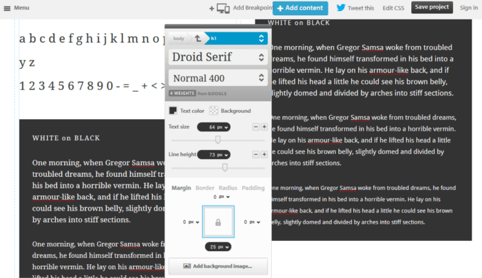
By clicking inside any part of the text in the Typecast app you can do all sorts of stuff like:
- Adding your own text content.
- Changing typefaces.
- Adjusting tons of CSS values like background color, color, font size, line height, etc.
- Previewing your typefaces at different viewport sizes.
- Checking how your text behaves on a baseline grid.
Web Font Blender
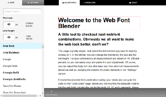
Web Font Blender is not as feature-rich as Typecast, but it’s got all you need to quickly mix and match typefaces from the Google Fonts library, edit the existing text, adjust CSS font values, and grab the code for a seamless integration with your project.
Adobe Typekit Preview and Web Font Streaming Service
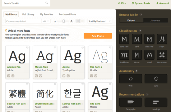
Like Google Fonts, Typekit by Adobe lets you preview an impressive number of fonts and takes care of streaming your chosen fonts to your website for easy inclusion. No need for you to license each individual font.
Unlike Google Fonts, Typekit is a subscription-based service offering different pricing plans. You can give Typekit a try using the free subscription plan, which lets you choose from 940+ fonts for your website.
You have a number of options for browsing fonts, including recommendations for headings and paragraphs, languages, type families, and more.
When you’re ready to preview a typeface, click on it. On the new screen you’ll be able to inspect its various weights and styles and to learn more about the font family and the foundry that created it.
If you click on the Specimens tab, you’ll see a link to Open expanded Web Font Specimen. This link displays a screen where you can preview your chosen typeface at various sizes for body text and headings.
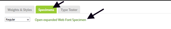
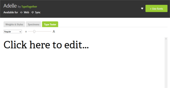
You can go further by clicking on the Type Tester tab, next to the Specimens tab. Now you can add your own text and preview your chosen typeface at different sizes using all its available weights and styles.
Once you’re ready to use a font or a selection of fonts on your website, click on the Use fonts button on the top right of the screen, then on the Web tab.
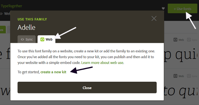
Typekit uses kits as a way of including fonts in a web project. Here’s a short tutorial on how to create a kit. For a detailed one, head over to the Typekit help page.
Start by clicking on the create a new kit link that you see in the image above.
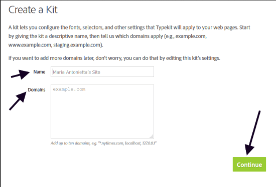
Next, a popup screen asks you to enter a name for your kit and your website’s domain. Go ahead and do so, then click on the Continue button.
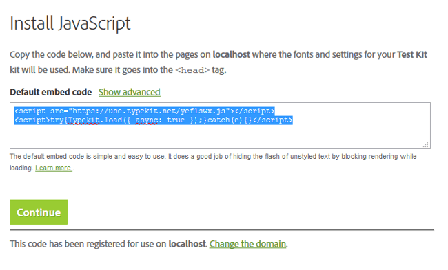
Cool, you’ve just created a kit!
To use the kit in your project, simply copy and paste the code Typekit gives you inside the <head> section of your HTML document. Then click the Continue button to access the next screen.
The final step is to select the font’s character set, weights and styles. Keep an eye on the kit size information at the bottom of the popup window – the more character sets, weights and styles, the more weight you’ll be adding to your web page.
If you want Typekit to take care of styling your typographic elements, enter the relevant CSS selectors in the input box at the top of the page. Alternatively, you can simply add the relevant CSS rules to your website’s stylesheet.
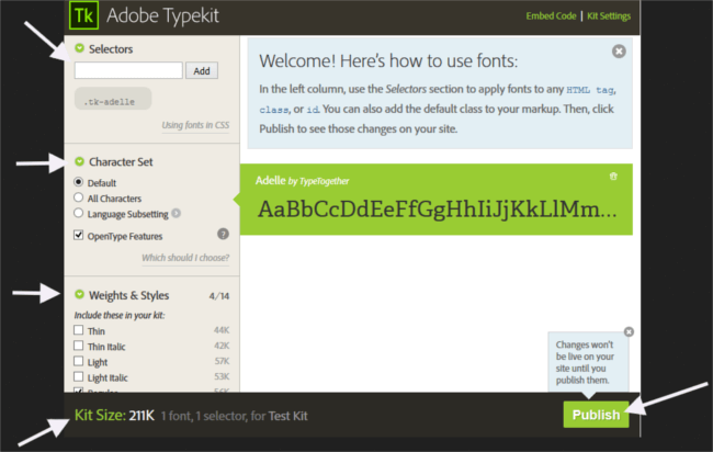
When you’re done, go ahead and click Publish. Your website should display your chosen typefaces within minutes.
Conclusion
This article has been all about online resources for picking great typeface combinations, previewing them and painlessly including them in your project.
Keep in mind that you can use more than one of these tools together. For instance, you can find nice combos on Google Web Fonts Typography Project and try them out on Typecast.
For better learning results, have a read through these evergreen articles about combining typefaces:
- On Web Typography by Jason Santa Maria
- Combining Typefaces: Free guide to great typography, by Tim Brown
Can you suggest other resources for selecting and previewing typefaces? Hit the comment box below to share them with the community.
Frequently Asked Questions on Typeface Pairing
What is typeface pairing and why is it important?
Typeface pairing is the practice of combining different fonts in a way that they complement each other and enhance the overall aesthetic of a design. It’s crucial in graphic design, web design, and other visual mediums because it helps to create hierarchy, contrast, and harmony in your design. A well-paired typeface can make your content more engaging, readable, and visually appealing.
How can I choose the right typeface pair for my project?
Choosing the right typeface pair depends on several factors including the nature of your project, the message you want to convey, and the visual appeal you want to achieve. You can start by understanding the characteristics of different typefaces and how they can impact your design. Experiment with different combinations, consider the contrast, hierarchy, and harmony, and choose the pair that best fits your design needs.
What are some popular typeface pairs?
Some popular typeface pairs include Roboto and Open Sans, Lato and Raleway, and Montserrat and Merriweather. These pairs are popular because they offer a good balance of contrast and harmony, making them versatile for various design projects.
Are there any tools to help with typeface pairing?
Yes, there are several online tools that can help you with typeface pairing. These tools offer a variety of features such as font pairing suggestions, visual previews, and customization options. Some popular tools include Fontjoy, Font Pair, and Google Fonts.
Can I use more than two typefaces in a design?
While it’s possible to use more than two typefaces in a design, it’s generally recommended to stick to two or three to avoid clutter and confusion. Using too many typefaces can make your design look unorganized and difficult to read.
What is the difference between a font and a typeface?
The terms ‘font’ and ‘typeface’ are often used interchangeably, but they have different meanings. A typeface refers to a family of related fonts, while a font refers to a specific style and weight within a typeface.
How can I ensure good readability with my typeface pair?
To ensure good readability, consider factors like size, spacing, and contrast. Make sure your typeface pair offers a good contrast so that the text is easily distinguishable from the background. Also, ensure that the size and spacing are appropriate for the medium and audience.
What are serif and sans-serif typefaces?
Serif typefaces have small lines or strokes attached to the ends of larger strokes in a letter or symbol. They are often used for body text as they are considered easier to read in long passages. Sans-serif typefaces, on the other hand, do not have these small lines and offer a more modern and clean look.
Can I mix different typeface styles in a pair?
Yes, mixing different typeface styles can create an interesting contrast and hierarchy in your design. For example, you can pair a bold, decorative typeface with a simple, clean typeface for a striking effect.
What are some common mistakes to avoid in typeface pairing?
Some common mistakes to avoid include using too many typefaces, not considering readability, and choosing typefaces that clash with each other. It’s important to choose typefaces that complement each other and enhance the overall design rather than detract from it.

