
Key Takeaways
- Digg’s redesign failure serves as a cautionary tale about the danger of drastically changing a site’s core logic and alienating users. Despite some improvements, the redesign was unable to compensate for the loss of users who were unwilling to adapt to the new system.
- The redesign of Yahoo Mail demonstrates the risks of unnecessary changes to a functioning system. The redesign removed popular features and added unwanted ones, leading to user dissatisfaction and likely a significant drop in users.
- Target.com’s redesign is a reminder not to abandon long-term brand values for short-term benefits or trends. Despite avoiding major functionality issues, the site received criticism for straying from its minimalist brand identity.
- The failure of these redesigns highlights the importance of staying true to a site’s unique identity and not attempting to imitate industry leaders. Both Digg and Yahoo Mail tried to become something they were not, leading to their downfall.
- The article emphasizes the importance of thorough planning, user testing, and gathering feedback throughout the redesign process. It also suggests that a gradual approach to change can minimize user dissatisfaction and potential backlash.
(and what we can learn from them)

It’s a familiar story: After years of the same musty, old site design, trumpets sound, angels sing and a glorious, new, cutting-edge redesign is unveiled by proud site owners.
However, instead of grateful, joyous cheers, the criticism starts to pour in. Perhaps it’s dumbfounded silence at first, before gradually building to angry tirades.
Of course, the relative success of a site redesign is often largely subjective – a glance at our wardrobes or music collections tells us that tastes differ, and what one person adores might be hated by others.
However, even allowing for this subjectivity, history is already littered with epic site redesign failures. Web design is still in its infancy, but it isn’t hard to compile a Top 100, if not Top 1,000 site redesign failures, and the criteria for these are anything but subjective.
Using metrics such as plummeting traffic or dramatically decreased conversions, it becomes clear that – even if many insist they like the new design – if users leave the site, the redesign is a failure. Of course, few humans to flaunt their disasters, so the real data describing these failures is frequently kept confidential, making it more difficult to learn from their mistakes.
Instead, we need to make do with publicly accessible signals, such as clear functional failures, or broken features, or public traffic ranking service such as Alexa or Comscore. None of this is precise but for grand failures even these indirect indicators show unambiguously that the idea to redesign wasn’t the brightest one.
While none of us are immune to failure, sometimes the mistakes made that led to other sites’ disasters are easy to avoid. Better to learn from others’ bruises than to get your own.
If there is anything good about redesign failures – be it your own, or other’s – it’s a rare opportunity to learn. Unfortunately, there is no shortage of learning materials in this area. Today I picked 3 classic disasters to review in more depth.
1. How Digg Dug Its Own Grave
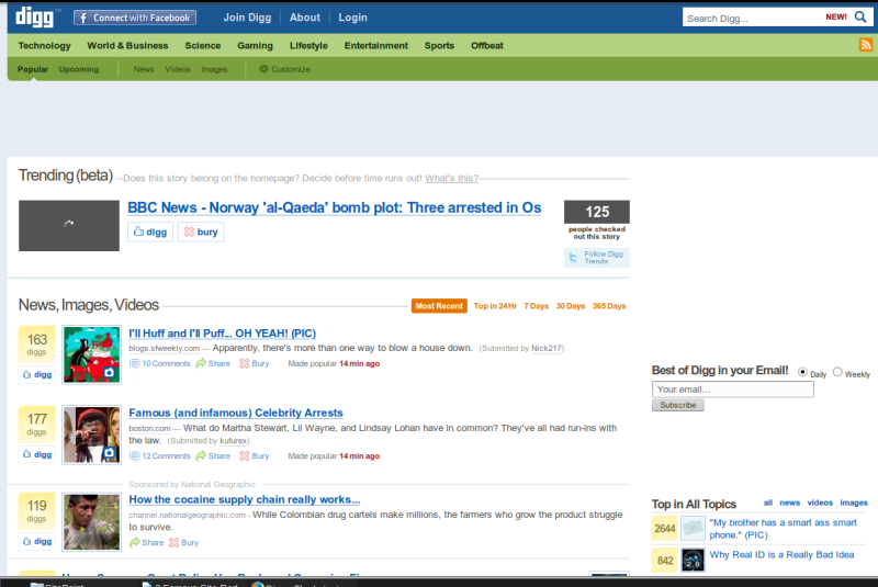
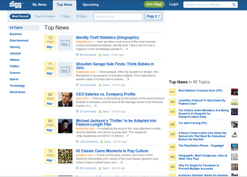
I suspect one of the most well known redesign failures of all time is the redesign of Digg, the popular social bookmarking site. In 2010, after years of reigning as the most highly-trafficked social bookmarking site, Digg decided it was time for a change.
In 2010, Facebook and Twitter were all the rage. Understandably, Digg decided to re-focus its service with a stronger emphasis on social networking than social bookmarking. They wanted to make it easier to share content with your friends and to follow what they have shared.
Instead of having one centralized ‘link stockmarket’ where the opinions of a small cabal of elite power-users outranked everybody else, the Digg redesign was designed to redistributed voting power so users were far more influenced by what their friends had shared.
This sounds like a noble concept, and a logical approach to breaking the monopoly of a small group of users that had ‘gamed the system’, right?
Unfortunately the shift to content prioritized by your friends list didn’t work simply because most users didn’t have an active, robust friends networks on Digg. By 2010 most people already had well-established social networks delivering them more news than most could read. Why would they need to start another one on Digg?
This change in core logic led to a drastic drop in viewers as the new logic required users to change their habits. All evidence appears to be that most decided not to. If you want to socialize with your friends, you go to Facebook and Twitter. If you want to bookmark content, or see trending topics, you go to Reddit or Stumbleupon or Slashdot.
Digg’s attempt to offer the best of both worlds (i.e. social networking and social bookmarking) actually turned into offering the best of neither of them.
The discontent was so marked that some reports state that Digg lost over a quarter of its audience over the change. In the first months of its launch, Digg’s traffic dropped 26% in the U.S. and 34% in the U.K.
For truth’s sake, later Digg managed to at least partially restore its positions. Later redesigns were better received but never able to return Digg to its former glory. Many have argued Digg had been in decline regardless.
Although you can’t slate all the blame to the redesign, Digg’s market valuation certainly took a massive hit through the ordeal. In 2008 the site value was valued at around $160 million, but in 2012 it was sold for the whooping amount of half a million. That is some nasty math.
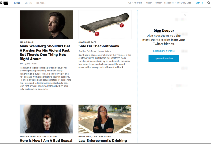
At present the homepage of Digg looks like just another blog with intros to articles, the difference being that these articles are on other sites. Digg has lost much of its distinctive look. Traffic data may well be solid, but it has lost much of its rusted on community.
Digg was big but it didn’t have the monopoly on social bookmarking. If you remember, Facebook had one of its major redesign at more or less the same time, which was also met with a huge backlash from its users.
However, Digg was never to social bookmarking what Facebook is to social networking. Facebook’s almost-monopoly on social networking saw users continue to use it, even when stating they hated the new design.
The lesson to take from Digg’s failure is that huge changes in business logic can alienated users. The fact that the new redesign was very buggy on launch didn’t help either – first impressions count. Even the clear improvements that the redesign introduced, such as streamlined link posting, were not enough to staunch the bleeding.
It’s interesting to speculate about what might have happened if Digg didn’t redesign. My personal opinion is that it would have been a slower death. The smell of a system being gamed was becoming more and more obvious to regular users.
If Digg had remained on this path its relevance would have likely faded over time. With the redesign, its traffic dropped fast and it was a quick death. Though the redesign failed to achieve it’s goals, it’s hard to fault them for trying.
Perhaps they simply waited too long to begin – a 2007 social Digg may have competed very successfully against an infant Twitter and an adolescent Facebook.
2. Yahoo Mail – If Ain’t (Too) Broke, Don’t Fix It
The reasons for Yahoo’s redesign failure are different from the Digg failure. While in the case of Digg there was sound logic behind the redesign – they couldn’t continue to allow their product to be exploited by a small group of power users – the case with Yahoo Mail is different.
Their service saw two redesigns in less than a year (in December 2012 and in October 2013), each concluding with much fury and teeth-gnashing in the community.
Yahoo Mail’s situation can probably be summarized by the old maxim: If it ain’t (too) broke, don’t fix it.
That’s not to say that the original Yahoo Mail was unimpeachable. However the second redesign is a shining example of how panic can turn a small mess into a complete disaster.
Some say that one of the reasons for the redesign of Yahoo Mail was pure ego-boosting. With a new manager appointed just months before the first redesign, it seemed that the driving force for the redesign was an overriding ‘out with the old, in with the new’ policy – and do it as quickly as humanly possible.
This “The new world starts with ME” approach has been the father of many disasters, so it wasn’t a complete shock when it hit trouble. However, what irritated the millions of loyal Yahoo Mail users was that they believed their favorite mail system was quite good before the first redesign, and they saw no compelling reason for change.
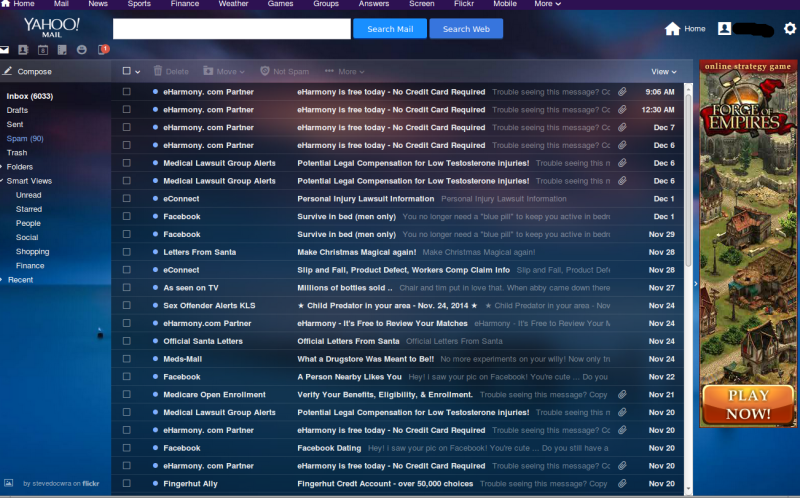
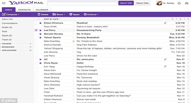
While it’s true that users often object to change of any type – even improvements – this definitely wasn’t the case with the first and second Yahoo Mail redesigns. The redesigns simply flushed much-loved features such as tabs and sort by sender while introducing new features they didn’t like or need (i.e. Flickr integration).
While Yahoo! understandably never released data on the number of users who ditched the service following the redesign, it seems likely that the numbers were not insignificant. The very fact that only 25% of loyal Yahoo staff were willing to use their own mail system says a lot about all the nice features of the redesigned version.
Despite all the differences between the failures of the redesigns of Digg and Yahoo Mail, there is one striking similarity – each tried to be what they are not. In the first case Digg tried to become a Facebook clone, while in the second, Yahoo Mail was clearly aping Google Mail.
To be fair, attempting to imitate an industry leader can work sometimes. Kiddicraft was making plastic bricks 10 years before Lego, but who remembers that now?
But when you have a long-established community of users who are with you because you are NOT Facebook and Gmail, respectively, imitation takes you nowhere.
Add to this that both Digg and Yahoo Mail launched their new sites in a such poor condition it almost appeared the sites hadn’t been tested at all internally. Users couldn’t login, mail didn’t load, key functionalities were broken or outright missing.
For me, the failure of Yahoo Mail is much bigger than Digg’s redesign disaster that has generously been reviewed on various sites. Probably Yahoo Mail’s epic failure didn’t draw that much attention from the media simply because for many readers and writers Yahoo Mail died years before these very unfortunate redesigns.
While it’s true Yahoo Mail is a shadow of its past glory, it still has hundreds of millions of rusted-on users who can get very vocal when people start moving the furniture.
What can we take from Yahoo!’s pain?
- If it ain’t broke, don’t fix it.
- Don’t imitate the leaders – be true to who you are because this is why your users like you.
3. How Target.com Missed the Target
Compared to the first two redesign disasters, the redesign misfortunes of Target.com are simply nothing to worry about but compared to what a perfect site must be, there is a lot to be desired. In all fairness, there are many sites that have escaped any real criticism that look much worse than Target.com.
However, Target is a popular brand and a big targ… – you know what I mean – and as such draws a big spotlight.
The latest redesign disaster of Target.com is another case of a site that forgot to be who they were. One of the signature features of the Target brand is its minimalism. Whitespace, red circles – this is what people love it for.
 http://www.practicalecommerce.com/articles/64011-Dont-Follow-Target-com-when-Redesigning-your-Ecommerce-Site
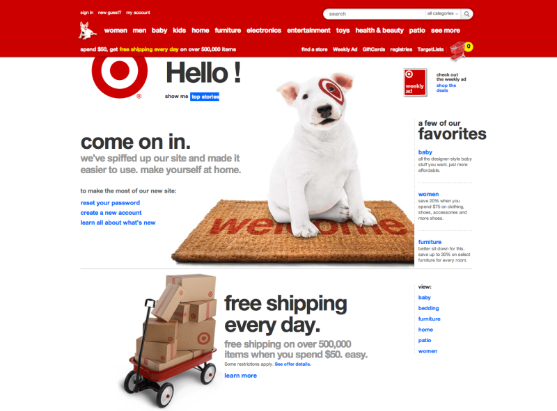
Here is the older Target look. It was introduced in 2011 and yes, this redesign was also considered a big failure at the time.
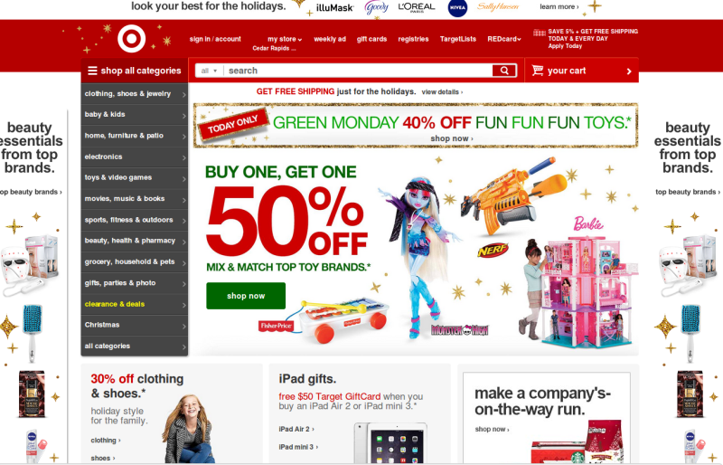
However, when the latest version was launched in 2013, even the critics of the 2011 version started to love it. This is a risky recipe for success – if your users hate your new design, launch something even worse, and they’ll realize how blessed they were.
 http://www.practicalecommerce.com/articles/64011-Dont-Follow-Target-com-when-Redesigning-your-Ecommerce-Site
The 2011 version might have had its glitches, but it remained true to the distinctive feature of Target design – minimalism. There was sufficient air in the design and it loaded in good time.
The new design displays more products on the home page, but it looks cluttered and Target’s minimalist signature is replaced by a densely-packed wall of product. This was the main objection the industry has against the 2013 redesign.
Ironically, Target received less criticism for bigger functionality faux-pas in their 2011 redesign, when some users couldn’t complete purchases or even locate some product categories.
Ironically, while the 2013 redesign avoided such dramas – presumably Target learned their lesson on test key functionalities – the criticism they received for simply ‘straying off brand’ was hardly any less venomous.
Again, compared to many other redesign disasters, the Target’s woes weren’t that drastic. However all that bad publicity might have been avoided if they’d followed a more evolutionary redesign path and introduced change in smaller, staged steps.
In fact, after two consecutive redesign disasters, Target may well have chosen the path of gentle evolution. When I checked their site recently I noticed only minor changes in comparison to the design they launched in 2013. For instance, the shadows that attracted really harsh criticism are gone while the menu has returned to the left.
What saved Target was they had a rock-solid bricks’n’mortar business – all their physical stores. Had they been an online platform only, they may not have been so lucky.
What can we learn from Target’s angst?
- Don’t sacrifice your long-term values (minimalism in Target’s case) on short-term benefits or trend chasing
- Gradual change can be less painful for users – introduce one at a time, assess the result, and proceed if warranted.
And, yes, it doesn’t hurt to have a huge multinational empire to fall back on.
The Big Question: Hit or Stand?
The trick to winning Blackjack (or Twenty-one) is knowing when to ‘hit’ – ask for another card – or ‘stand’ – keep the cards you have and hope they are good enough to beat the dealer.
If you are dealt a ’20’, you should ‘stand’. If you have a ’13’, you’re going to want to hit. A ’17’ is harder decision.
Redesigns can be a similar gamble. Somehow Craigslist has been successful ‘standing’ with the same design since the mid-1990’s – arguably a ’15’ in design terms. Digg ‘hit’ and busted. Yet for a company like MySpace, the game changed so quickly that they were bust before they’d even had time to ask for another card.
It’s a tough game.
Frequently Asked Questions (FAQs) about Site Redesign Disasters
What are some common mistakes made during site redesigns?
One of the most common mistakes made during site redesigns is not considering the user experience. This can lead to a design that is visually appealing but difficult to navigate, causing frustration for users and potentially leading to a decrease in site traffic. Another common mistake is not testing the new design thoroughly before launch. This can result in bugs and errors that negatively impact the user experience.
How can I avoid a site redesign disaster?
To avoid a site redesign disaster, it’s crucial to plan thoroughly, conduct user testing, and gather feedback throughout the process. It’s also important to ensure that the new design is responsive and works well on all devices. Additionally, keeping SEO in mind during the redesign process can help maintain or improve your site’s search engine rankings.
What happened with the Digg redesign?
The Digg redesign in 2010 was met with significant backlash from users. The new design was seen as a departure from the site’s original focus on user-curated content, and many users found it difficult to navigate. This led to a significant drop in site traffic and ultimately contributed to the site’s decline.
What can we learn from the Wikipedia redesign?
The Wikipedia redesign, which took several years to complete, shows the importance of taking a slow and steady approach to site redesigns. By gradually implementing changes and gathering user feedback along the way, Wikipedia was able to avoid many of the pitfalls that can come with a major redesign.
How can I ensure my site redesign is user-friendly?
To ensure your site redesign is user-friendly, it’s important to focus on usability and accessibility. This includes making sure your site is easy to navigate, has clear and concise content, and is accessible to all users, including those with disabilities. Conducting user testing and gathering feedback can also help ensure your redesign is user-friendly.
How can a site redesign impact SEO?
A site redesign can have a significant impact on SEO. Changes to the site structure, content, and URLs can affect your site’s search engine rankings. To minimize the impact on SEO, it’s important to plan your redesign carefully and consider SEO best practices throughout the process.
What are some signs that my site needs a redesign?
Some signs that your site may need a redesign include outdated design, poor usability, low conversion rates, and poor performance in search engine rankings. If your site is not meeting your business goals or the needs of your users, it may be time for a redesign.
How can I measure the success of my site redesign?
The success of a site redesign can be measured in several ways, including user feedback, site traffic, conversion rates, and search engine rankings. It’s important to set clear goals for your redesign and track these metrics before and after the launch to assess the impact of the changes.
How can I ensure my site redesign is successful?
To ensure your site redesign is successful, it’s important to plan thoroughly, focus on the user experience, and test thoroughly before launch. Gathering user feedback throughout the process can also help ensure your redesign meets the needs of your users.
What should I consider when choosing a design team for my site redesign?
When choosing a design team for your site redesign, it’s important to consider their experience, portfolio, and approach to user experience and SEO. It’s also important to ensure they understand your business goals and the needs of your users.