The 3 ‘Non-Negotiables’ of Successful Product Design
Every successful product has them… does yours? Below we boil down the practice of product design into its 3 essential components.
Useful, functional, and enjoyable.
Key Takeaways
- A successful product must be useful, functional, and enjoyable. Usefulness is 1.5 times as important as usability, according to a University of Michigan study. A useful product makes the user feel good or solves a problem in their life.
- Before launching a complete product, test the waters with an MVP (minimum viable product). This is the most barebones version of your product that still shows its value. Releasing an MVP before the completed product gets you crucial feedback that you can implement before the final launch.
- The UX experts at the Nielsen Norman Group list five factors of usability: efficiency, errors, learnability, memorability, and satisfaction. These can be handled in technical ways, such as through wireframing, testing prototypes, and repeating testing until ready.
- Designing an enjoyable product is not as easy as understanding why it’s important. Different user types respond to different triggers. The easiest place to start is visuals. Aesthetics are closely linked with enjoyment. Users also appreciate surprises and gamification features. The tone of your copy can also entertain.
1. Is it Useful?
If we had to choose one of these three traits to be the most important, it would be this one.
First and foremost, a product must be useful. If a product isn’t useful, everything else is irrelevant because nobody will need it.
Obviously, usability and enjoyability are important as well… just not as important. In fact, a University of Michigan study not only confirmed this, it also put a number to it. Usefulness is 1.5 times as important as usability.
So now that we know what the most important trait in UX is, let’s talk about how to achieve it.
The Please-Pain Principle
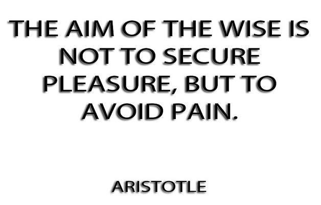
It’s a common psychology theory that many living creatures act only for two reasons:
- Receive pleasure
- Avoid pain
Right away, a useful product with either make the user feel good, or solve some kind of problem in their life.
Jon Burgstone and Bill Murphy, Jr., take this a step further in an article for Fast Company. They suggest a product that lets the user “avoid pain” if far more useful.
Good products make the user’s life easier. The most successful products throughout history have offered either a helpful service that no one else provided, or a helpful feature that their competitors lacked. Solving a problem demonstrates more value to a user than merely being fun to use (although both are important, as we’ll explain later).
How do you figure out what problems your users have? The answer is simple — customer development. Interviews, surveys, diary studies, analytics, A/B testing, etc., reveal pressing users problems are with your product, outside of your product, and what their preferences are for solving them.
Once you have a solid idea of how you can help users avoid pain, you can always validate your assumptions with an MVP.
Minimum Viable Products
Before launching the complete product, test the waters with an MVP (minimum viable product). This is the most barebones version of your product (minimum) that still shows its value (viable). Releasing an MVP before the completed product gets you some crucial feedback that you can implement before the final launch, and indicates if your product idea is actually useful.
MVPs can come in different forms and shapes, but here are three of the best:
-
Start a fundraising campaign — In our free ebook UX Design for Startups, we explain how fundraising doubles as a test for how valuable your product is, plus keeps you in direct contact with supporters from the start.
-
Create a landing page – A lone landing page with an email form can establish an early base before the site launch. Run some advertisements (Adwords) to generate interest, then check how the statistics on traffic or emails.
-
“Wizard of Oz” product – Fake it ‘til you make it. The shoe retailer Zappos started with co-founder Nick Swinmurn actually going to stores and buying the shoes that users selected, then shipping them out. It required dedication and hard work, but it was a cheap and low-tech method to test his idea.
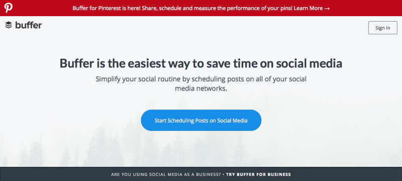
A good mix was Buffer, which started as a landing page that mimicked a home page, centering around a call-to-action to use the product. The CTA was fake, and took users to an apologetic page explaining that they were still putting the “finishing touches” on it. However, they collected emails from “earlyvangelists” and determined that enough people were willing to use it.
Therefore, they verified that their product idea was indeed useful.
2. Is it Functional?
Once you have a useful product idea, you better make sure that it works. “Functional” describes how well a product performs its purpose. To use another word, usability.
According to the UX experts at the Nielsen Norman Group, there are five factors of usability:
-
Efficiency — How easily users can accomplish tasks.
-
Errors — How many mistakes are made by either the user or the interface.
-
Learnability — How quickly the user learns how to use it.
-
Memorability — How well the user remembers how to use it after an absence.
-
Satisfaction — How much the user enjoys using it.
Because these requirements are pretty technical, they can be handled in technical ways. We find the following 3-step method most effective and repeatable.
Wireframe
Wireframing your designs lets you solidify the structure and navigation early on, when they’re easier to modify, before moving on to more involved usability and visual decisions. Think of them as the skeleton of your design, with the real meat coming later.
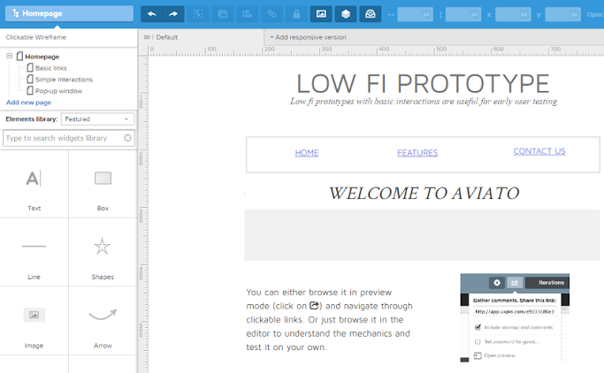
If you happen to use a collaborative design app like UXPin, you can even add interactions with dragging-and-dropping. This turns your wireframes into low-fidelity prototypes, so you can start usability testing with real users right away.
Test Prototypes
A workable prototype of any fidelity provides the answers you need to tailor your design to your target users. Tests vary in how they’re conducted, but they should always involve at least five users.
Testing generates either qualitative or quantitative data, but it’s best to have both. Record quantitative details like the amount of time, the number of clicks, which pages were visited, etc., but also elicit qualitative feedback on how the user feels when using the system. A post-test interview or survey helps, as does having your user speak their thoughts aloud during the test.
Repeat Testing Until Ready
Implement the results of one test immediately, and then test the next iteration. Repeat this cycle over and over throughout the design process to ensure your product stays on track with what your users want.
3. Is it Enjoyable?
Humans are not the rational creatures we like to think we are.
UX pioneer Don Norman explains that emotions greatly factor into our decision making, often surpassing logic. The science behind it is the evolutionary development of our “gut” instincts — in life-or-death situations, we simply don’t have time to make a pros/cons list.

Other studies support this. Masaaki Kurosu and Kaori Kashimura proved that users perceive enjoyable products as more useful. Researchers tested two ATMs, one brand new and the other dilapidated, but with identical usability. Users perceived the aesthetic one as functioning better.
It’s actually pretty simple: when users enjoy themselves, they relax. When they relax, their brains work more smoothly. Mental activities like learning and recalling — even motor skills — are performed better when users are enjoying themselves.
Manufacturing Enjoyment
Unfortunately, designing an enjoyable product is not as easy as understanding why it’s important. Different user types respond to different triggers.
The easiest place to start is visuals. Aesthetics are closely linked with enjoyment., but again there’s no one cure-all visual style that everyone will enjoy. As a minimum, keep your graphics clean and high-quality.
Surprise is also linked with enjoyment. Users appreciate easter eggs like discoverable microinteractions.
Gamification features, like rewards system or unlocking options, can also heighten enjoyment — but be careful. As explained in UX Gamification Redefined, these tactics can have a reverse effect and annoy users unless it’s built into existing behavioral patterns.
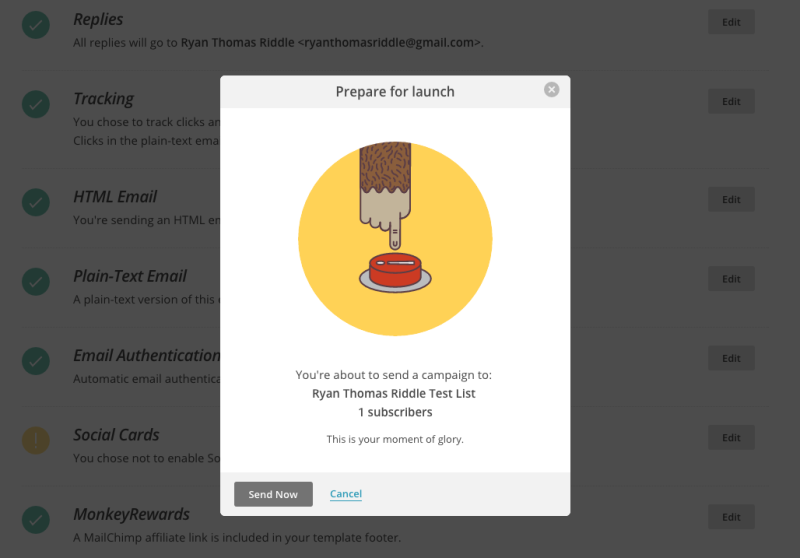
And don’t forget that the tone of your copy can also entertain. A well placed joke or cute turn of phrase can put a smile on your user, and even defuse an otherwise tense action, like MailChimp above.
The 3 Traits in Action
To see the 3 traits at work, let’s look at Duolingo, a language-learning site.
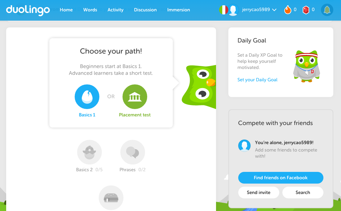
Useful. Most people want to learn a new language, so a service that makes this “easy” and fun is certainly useful. Because it’s free and applies a game-like system for teaching, it’s a much more useful option than sifting through a textbook.
Functional. Duolingo is so popular because it actually delivers on its promise. The teaching methods are sound and the interface controls are easy to learn, understand, and remember. Content is delivered at a pace customized to each user.

Enjoyable. The same effective teaching methods make Duolingo fun to use as well. Learning is done through fun games, and users are rewarded with a currency system to buy additional features. The aesthetics are also exceptional, with smooth flat design images and a fun owl mascot.
Further Reading
To learn more about the points we discussed in this article, browse our free design e-book library. This piece is just an overview of these elaborate topics.
Specifically, take a look at the e-books on the topics discussed above:
-
Interaction Design Best Practices — One of our most popular e-book series covers the nuances of interaction design with practical advice. Volume 1 covers aspects like visual hierarchy, copywriting, and negative space; Volume 2 covers topics like animations, response times, and user behaviors.
-
The Guide to Usability Testing — Everything you need to know about usability and user testing, including the different types of tests available, and advice on how to conduct them.
-
UX Design Process Best Practices — A 100+ page guide to the entire UX design process, start to finish, with expert pointers and guidelines for the most helpful documentation.
Frequently Asked Questions about Successful Product Design
What are the key principles of successful product design?
The key principles of successful product design include understanding the user’s needs, creating a clear and concise design, and ensuring the product is functional and easy to use. It’s also important to consider the product’s lifecycle and how it will be used in the real world. This includes considering factors such as durability, maintenance, and sustainability.
How can I ensure my product design meets the needs of the user?
To ensure your product design meets the needs of the user, it’s crucial to conduct thorough user research. This can include surveys, interviews, and user testing. By understanding the user’s needs and preferences, you can design a product that is both functional and appealing.
What are some non-negotiables in product design?
Non-negotiables in product design often include user-centric design, functionality, and sustainability. The product must be designed with the user in mind, ensuring it is easy to use and meets their needs. It must also function as intended and be durable and reliable. Additionally, more and more consumers are demanding products that are environmentally friendly, making sustainability a non-negotiable in many cases.
How does the role of a Head of Product influence product design?
The Head of Product plays a crucial role in product design. They are responsible for overseeing the entire product development process, from initial concept to final production. This includes setting the vision for the product, making key design decisions, and ensuring the product meets the needs of the user and the business.
What are some features necessary for a successful online store?
Some non-negotiable features for a successful online store include a user-friendly design, secure payment options, and a responsive customer service team. It’s also important to have a wide range of products available, clear and detailed product descriptions, and easy navigation.
How can I make my business non-negotiable?
Making your business non-negotiable means offering a product or service that is so valuable or unique that customers can’t do without it. This can be achieved by offering superior quality, exceptional customer service, or a unique product that can’t be found elsewhere.
How can I incorporate sustainability into my product design?
Incorporating sustainability into your product design can be achieved by using eco-friendly materials, designing for durability and longevity, and considering the product’s lifecycle. This includes considering how the product will be disposed of at the end of its life and finding ways to minimize waste.
What is the importance of user testing in product design?
User testing is crucial in product design as it allows designers to understand how users interact with the product, identify any issues or problems, and make necessary improvements. It ensures the product is user-friendly and meets the needs of the user.
How can I ensure my product is functional and easy to use?
Ensuring your product is functional and easy to use involves thorough testing and user feedback. It’s important to consider the user’s needs and preferences throughout the design process and to make adjustments as necessary based on feedback and testing results.
What are some common mistakes in product design and how can they be avoided?
Common mistakes in product design include not understanding the user’s needs, overcomplicating the design, and not considering the product’s lifecycle. These can be avoided by conducting thorough user research, keeping the design simple and intuitive, and considering factors such as durability and sustainability.
Jerry Cao is a UX content strategist at UXPin – the wireframing and prototyping app . His Interaction Design Best Practices: Volume 1 ebook contains visual case studies of IxD from top companies like Google, Yahoo, AirBnB, and 30 others.
Published in
·Design·Design & UX·HTML & CSS·Photoshop·Prototypes & Mockups·Review·Sketch·Software·Technology·UI Design·UX·Web·March 11, 2019
Published in
·Conversion·Design·Design & UX·Illustration·Testing·UI Design·Usability·UX·April 13, 2016

Published in
·Conversion·Design·Design & UX·Email Marketing·Testing·UI Design·Usability·UX·May 30, 2017


