

Key Takeaways
- Harnessing humans’ innate tendency to follow gaze can be a powerful tool in design, guiding users’ attention to specific elements on a page such as text, navigation, subscription boxes, or purchase buttons.
- Implementing this ‘eye-line’ technique requires careful planning from the start of a project, often necessitating original photos to get the desired eye-line angles.
- Effectively directing the eye can significantly enhance the user experience, leading to increased engagement, improved usability, and a more positive overall user experience.

Humans love to look at eyes. We can’t help it.
Tests have shown that from birth babies will seek out faces that engage in mutual gaze. It’s our own ‘built-in eye-reading software’ and it only becomes more and more sensitive as we grow older.
As designers, we tap into that ability when we use faces in our designs. The faces might be laughing and content, or serious and contemplative, but typically they’ll be gazing out to meet the reader’s eye.
Which is good, right?
Sometimes. But not always… Let me explain.
Look into my eyes…
While there’s is something deeply powerful about looking into the eyes of another human, it does create a big potential design problem – our eyes like to stay anchored to any eyes that return our gaze.

The famous National Geographic ‘Afghan Girl’ is perhaps the purest example you’ll ever see of this. Most of us find it physically difficult to stop our eye returning to hers. You’re probably battling that gravitational pull as you read this, right?
And that’s what makes this photo – by itself – such an astonishingly powerful piece of work.
But it becomes an issue when you need your users to notice other important page elements – text, navigation, subscription boxes, purchase buttons etc. In short, photographs with strong eye contact can slow down and even paralyze our users when we are trying to move them forward.
You could think of it as a kind of ‘visual quicksand’.
Luckily, we can use our designer superpowers to harness their ‘eye-reading software’ another way.
What Are You Looking At?
It turns out that humans are also very good at noticing what other people are looking at. We’re naturally nosey creatures and want to know what others find interesting. We track their glance.
Let’s see how it works in a layout.

In this all-time classic poster from ‘Breakfast at Tiffany’s‘, a rather coquettish Audrey Hepburn is glancing to her left (as is her cat). We almost can’t help following her eyes across to her name and reading down to the title text, before automatically following her long cigarette extender back to her face.
And then you probably start the track again!
But what happens if we make a tiny edit to the position of her eyes? Let’s see.

For such a trivial change – no more than a handful of pixels – it changes the dynamic of the poster dramatically.
Audrey isn’t interested in the text, so it becomes instantly less interesting to us too. Sure, we can read it if we try, but our eye no longer glides easily around the whole composition. Instead, we spend much more time anchored on Audrey.
This can have a big effect on how users interact with our interfaces.
Putting It Into Practice
Good UI design is often about drawing attention to just the right thing at just the right time. I think this ‘eye line’ technique is under-utilized on the web, but there are a few good examples out there.
I particularly love the way t-shirt maker Real Thread uses this idea.
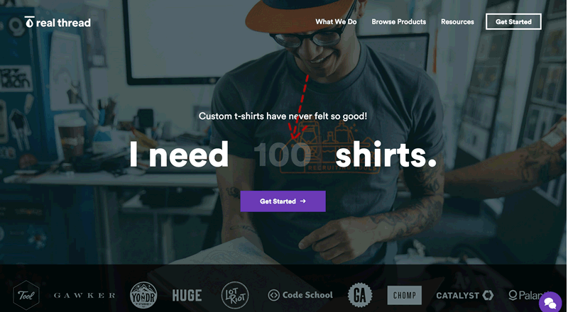
The Real Thread website takes a fantastically bold, no-nonsense sales approach. Rather than trying to sell you on the idea of getting t-shirts made, they jump the conversation straight to ‘How many do you want?‘ This page is 95% focused on a single task – getting you to enter a number to complete the sentence ‘I need X shirts‘.
In the background, we see a happy, tattooed, t-shirt-making hipster setting the scene. And where is he looking?
- Out at us?
- Around the room?
He’s looking DIRECTLY at the blinking cursor – re-inforcing the only thing they want you to do.
It’s a really simple layout but I suspect this page design is killing it.
Be aware: this ‘eye-line’ technique will usually take more work to implement as you will need to be planning for it from the start, rather than shoehorning in images towards the end of the project.
You might get lucky and find just the right stock photo, but it’s more likely that you’ll need to shoot original photos to get the eye-line angles you want. In 2016, that shouldn’t be a big deal – most of us can source a decent camera at a pinch.
Used wisely, this is powerful design magic. Try it in your A/B testing.
Originally published in the SitePoint Design Newsletter.
Frequently Asked Questions about Directing the Eye
What is the importance of directing the eye in design?
Directing the eye in design is crucial as it helps guide the viewer’s attention to specific elements of the design. This can be achieved through the use of color, contrast, size, and placement. By effectively directing the eye, designers can ensure that the most important aspects of their design are noticed first, thereby enhancing the overall impact and effectiveness of the design.
How can I use color to direct the eye?
Color is a powerful tool in directing the eye. Bright, bold colors naturally draw the eye, while softer, muted colors tend to recede into the background. By strategically using color, you can guide the viewer’s attention to specific elements of your design. For instance, a bright red button on a webpage will immediately draw the viewer’s attention, making it an effective call to action.
How does contrast help in directing the eye?
Contrast is another effective tool in directing the eye. By creating a stark difference between elements in your design, you can make certain aspects stand out. This can be achieved through the use of contrasting colors, sizes, shapes, or textures. For example, a large, bold headline will stand out against a background of smaller, lighter text, drawing the viewer’s attention to the headline first.
How can I use size to direct the eye?
Size is a simple yet effective way to direct the eye. Larger elements naturally draw the eye, while smaller elements tend to be less noticeable. By varying the size of elements in your design, you can guide the viewer’s attention to the most important aspects. For instance, a large, bold headline will immediately draw the viewer’s attention, while smaller subheadings and body text will be read later.
How does placement affect the direction of the eye?
Placement plays a crucial role in directing the eye. In Western cultures, people naturally read from left to right and top to bottom, so placing important elements in these areas can help ensure they are seen first. Additionally, elements placed in the center of a design tend to draw the eye, making this an effective strategy for highlighting key aspects of your design.
What are some common mistakes to avoid when trying to direct the eye?
Some common mistakes to avoid when trying to direct the eye include overloading the design with too many elements, using too many bright colors, and not providing enough contrast. These mistakes can make the design feel chaotic and confusing, making it difficult for the viewer to know where to look. To avoid these issues, it’s important to keep your design simple and focused, using color, contrast, size, and placement strategically to guide the viewer’s attention.
How can I practice directing the eye in my designs?
Practicing directing the eye in your designs can be as simple as experimenting with different design elements and observing how they affect where your eye is drawn. Try varying the color, contrast, size, and placement of elements in your design and see how it changes the viewer’s focus. Additionally, studying the work of other designers can provide valuable insights into effective strategies for directing the eye.
Can directing the eye improve the user experience?
Yes, directing the eye can significantly improve the user experience. By guiding the viewer’s attention to the most important aspects of your design, you can make it easier for them to understand and interact with your design. This can lead to increased engagement, improved usability, and a more positive overall user experience.
How can I use directing the eye in web design?
In web design, directing the eye can be used to guide the viewer’s attention to key elements such as headlines, calls to action, and important information. This can be achieved through the use of color, contrast, size, and placement. For example, a bright, bold call to action button will immediately draw the viewer’s attention, encouraging them to click and interact with the site.
Are there any resources to learn more about directing the eye in design?
There are many resources available to learn more about directing the eye in design. Books, online courses, and tutorials can provide in-depth information and practical exercises to help you develop your skills. Additionally, studying the work of other designers can provide valuable insights into effective strategies for directing the eye.

