
Key Takeaways
- CSS is a powerful tool for creating interactive, visually appealing graphs and charts that reduce bandwidth requirements and are easily downloadable.
- The post provides 10 tutorials and techniques for creating CSS graphs and charts, including snazzy animated pie charts, 3D bar graphs, and accessible data visualizations.
- Creating a CSS chart involves understanding HTML and CSS, using ‘div’ elements for the chart container, styling with CSS, and using ‘data-‘ attributes to store chart data. Charts can be made responsive, animated, and labeled using various CSS techniques.
The Cascading Style Sheets (CSS) is a language that is used to describe the format of a document that is written in the markup language like HTML, XHTML, etc. The important feature of the CSS chart or graph is that it allows the users to easily download by reducing the bandwidth requirements of the HTML page. There are numerous techniques involved which would create a style in the CSS3 graphs and charts. In any web industry, a good and an excellent presentation of the data plays a major role in making the customers to understand the contents of your analysis.
In this post we have collected 10 Helpful CSS Graph and Chart Tutorials and Techniques that you would definitely find very useful! Enjoy.
Related Posts:
1. Snazzy Animated Pie Chart with HTML5 and jQuery
Learn how to use the HTML5 canvas element, CSS3 and jQuery to create a gorgeous, interactive animated pie chart. Full code included for your own use.

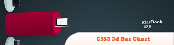
2. Animated Wicked CSS3 3d Bar Chart
When hovering, the animation shows and the bar will grow to the appropriate size.
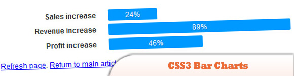
3. CSS3 Bar Charts
Bar charts in CSS are neither very new, nor very difficult. Using some pretty basic styling you can force lists etc into resembling graphs and charts fairly easily. However, using some rich CSS3 and progressive enhancement, you can really start pushing the display and presentation of these normally boring documents to the next level.
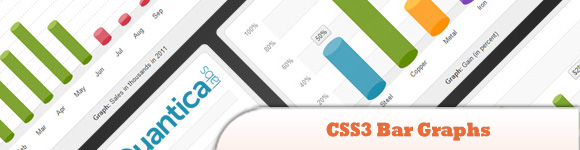
4. CSS3 Bar Graphs
This is a set of pure CSS3 Bar Graphs in clean 3D style. You can easily visualize data without having to use JavaScript or PHP or even images. This set comes with 9 predefined graph styles – single and grouped bar graphs.
5. CSS3 Graph Animation
Learn how to create a chart using CSS3 animation.

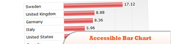
6. An Accessible Bar Chart
Main features:
> Table headers are there but hidden using the aural text class.
> A bar is created using an image which is stretched to the appropriate size.
> Bar widths are calculated relative to the largest value.
> Value cells have a repeated background image which shows the vertical lines.
> Browsing the chart without CSS or images will render an ordinary table.
> Value labels can be hidden by using the aural text class.
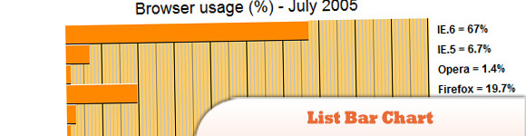
7. List Bar Chart
These charts are nothing more than a styled definition list with just classes defining each line.
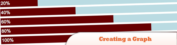
8. Creating a Graph
Creating a graph using percentage background images.
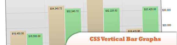
9. CSS Vertical Bar Graphs
The difference here is that the whole thing is a simple set of nested lists and CSS.
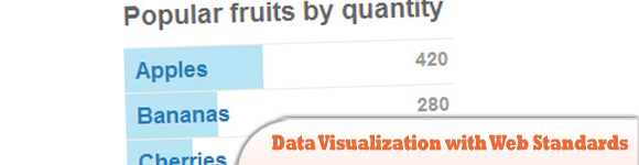
10. Accessible Data Visualization with Web Standards
This simple technique just adds bars to a list of items behind the text (check out the finished example for an idea of what we’re shooting for). It works for lists of any length. Longer lists benefit from being sorted by count since the relative values of the bars are easier to read when they are sequential.
Frequently Asked Questions on CSS Graph and Chart Tutorials
What are the basic elements needed to create a CSS chart?
Creating a CSS chart involves several elements. First, you need to have a basic understanding of HTML and CSS. HTML is used to structure the content on the web page, while CSS is used to style this content. You’ll need to create a ‘div’ element for the chart container and then use CSS to style and position the chart. You’ll also need to use the ‘data-‘ attribute to store the chart data. This attribute allows you to store extra information directly within the HTML elements.
How can I make my CSS chart responsive?
Making a CSS chart responsive involves using relative units like percentages instead of absolute units like pixels. This allows the chart to resize based on the size of its container. You can also use media queries to change the chart’s style based on the device’s screen size. For example, you might want to reduce the size of the chart on smaller screens to ensure it fits within the viewport.
Can I animate my CSS chart?
Yes, you can animate your CSS chart using CSS animations or transitions. CSS animations allow you to create complex, multi-step animations, while CSS transitions allow you to smoothly change an element’s property from one value to another. For example, you could animate the height of a bar in a bar chart to create a ‘growing’ effect.
How can I add labels to my CSS chart?
Adding labels to a CSS chart involves using the ‘before’ or ‘after’ pseudo-elements. These pseudo-elements allow you to insert content onto the page without having to modify the HTML. You can use the ‘content’ property to specify the text of the label, and then use other CSS properties to position and style the label.
Can I create a pie chart using CSS?
Yes, you can create a pie chart using CSS. This involves using the ‘border-radius’ property to create circular elements, and the ‘transform’ property to rotate these elements. However, creating a pie chart with CSS can be quite complex, especially if you want to include features like labels or legends. You might find it easier to use a JavaScript library like Chart.js or D3.js, which provide built-in functions for creating pie charts.
How can I create a bar chart using CSS?
Creating a bar chart with CSS involves using the ‘div’ element to create the bars, and the ‘height’ or ‘width’ property to specify the size of the bars. You can use the ‘background-color’ property to color the bars, and the ‘margin’ or ‘padding’ property to space the bars apart. You’ll also need to use the ‘data-‘ attribute to store the bar data.
Can I use CSS to create a line chart?
While it’s possible to create a line chart with CSS, it’s quite complex and involves using the ‘clip-path’ property to create the line. This property allows you to define a specific region of an element to display, effectively ‘clipping’ the element. You might find it easier to use a JavaScript library like Chart.js or D3.js, which provide built-in functions for creating line charts.
How can I create a stacked bar chart using CSS?
Creating a stacked bar chart with CSS involves creating multiple ‘div’ elements for each bar, and then using the ‘height’ or ‘width’ property to specify the size of each segment of the bar. You can use the ‘background-color’ property to color each segment, and the ‘data-‘ attribute to store the segment data.
Can I use CSS to create a scatter plot?
While it’s possible to create a scatter plot with CSS, it’s quite complex and involves using the ‘position’ property to position the points. This property allows you to specify the position of an element relative to its normal position or its parent element. You might find it easier to use a JavaScript library like Chart.js or D3.js, which provide built-in functions for creating scatter plots.
How can I create a donut chart using CSS?
Creating a donut chart with CSS involves using the ‘border-radius’ property to create circular elements, and the ‘transform’ property to rotate these elements. You can also use the ‘box-shadow’ property to create the hole in the middle of the donut. However, creating a donut chart with CSS can be quite complex, especially if you want to include features like labels or legends. You might find it easier to use a JavaScript library like Chart.js or D3.js, which provide built-in functions for creating donut charts.