HTML5 Form Attributes (Part 1)


The following is an extract from our book, HTML5 & CSS3 for the Real World, 2nd Edition, written by Alexis Goldstein, Louis Lazaris, and Estelle Weyl. Copies are sold in stores worldwide, or you can buy it in ebook form here.
Key Takeaways
- The `required` attribute in HTML5 forms ensures that specific input fields must be filled out before the form can be submitted, enhancing form validation directly in the browser without additional JavaScript.
- The `placeholder` attribute provides a short hint within the input field, guiding users on what data to enter, and disappears when the field is focused and data is entered.
- Advanced styling options for required, optional, valid, and invalid form fields can be achieved using CSS pseudo-classes such as `:required`, `:optional`, `:valid`, and `:invalid`, allowing for visual cues and feedback on data entry without extra scripting.
- For browsers that do not support HTML5 form attributes like `placeholder`, JavaScript polyfills can be utilized to simulate this functionality, ensuring a consistent user experience across different browsers.
- The use of WAI-ARIA attributes like `aria-required=”true”` alongside HTML5 form attributes can further enhance accessibility, although native support in modern browsers is making these attributes increasingly redundant.
The required Attribute
The Boolean required attribute tells the browser to only submit the form if the field in question is filled out. Obviously, this means that the field can’t be left empty, but it also means that, depending on other attributes or the field’s type, only certain types of values will be accepted. Later in the chapter, we’ll be covering different ways of letting browsers know what kind of data is expected in a form.
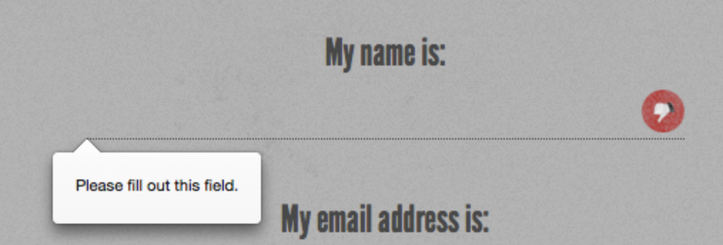
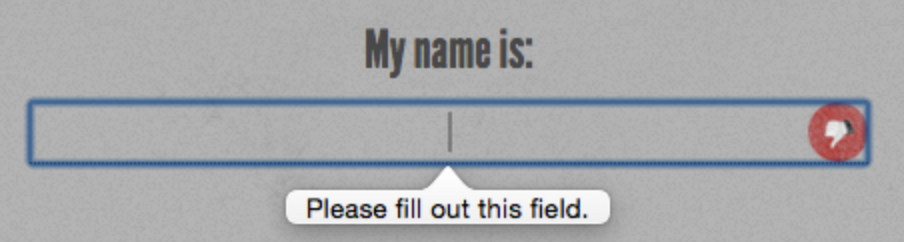
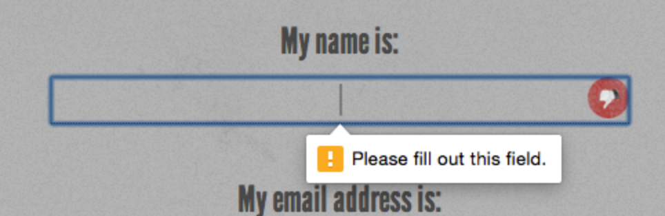
If a required field is empty the form will fail to submit. Opera, Firefox, Internet Explorer 10+, and Chrome provide the user with error messages; for example, “Please fill out this field” or “You have to specify a value” if left empty.
Note: Time to Focus
Time for a quick refresher: a form element is focused either when users click on the field with their mouse, tap into the field with their finger on a touch device, tab to it with their keyboard, or click or touches the label associated with that form element. For input elements, typing with the keyboard will enter data into that element.
In JavaScript focus event terminology, the focusevent will fire on a form element when it receives focus, and the blur event will fire when it losesfocus.
In CSS, the :focus pseudo-class can be used to style elements that currently have focus.
The required attribute is valid on any input type except button,submit, image, range, color, and hidden, all of which generally have a default value so the attribute would be redundant. As with other Boolean attributes we’ve seen so far, the syntax is either simply required, or required="required" if you’re using XHTML syntax.
Let’s add the required attribute to our sign-up form. We’ll make the name, email address, password, and subscription start date fields required:
<ul>
  <li>
    <label for="register-name">My name is:</label>
    <input type="text" id="register-name" name="name" required aria-
↵required="true">
  </li>
  <li>
    <label for="email">My email address is:</label>
    <input type="text" id="email" name="email" required aria-
↵required="true">
  </li>
  <li>
    <label for="url">My website is located at:</label>
    <input type="text" id="url" name="url">
  </li>
  <li>
    <label for="password">I would like my password to be:</label>
    <p>(at least 6 characters, no spaces)</p>
    <input type="password" id="password" name="password" required
↵aria-required="true">
  </li>
  <li>
    <label for="rating">On a scale of 1 to 10, my knowledge of
↵HTML5 is:</label>
    <input type="text" name="rating" type="range">
  </li>
  <li>
    <label for="startdate">Please start my subscription on:
↵</label>
    <input type="text" id="startdate" name="startdate" required aria
↵-required="true">
  </li>
  <li>
    <label for="quantity">I would like to receive <input
↵type="text" name="quantity" id="quantity"> copies of <cite>
↵The HTML5 Herald</cite></label>
  </li>
  <li>
    <label for="upsell">Also sign me up for <cite>The CSS3
↵Chronicle</cite></label>
    <input type="checkbox" id="upsell" name="upsell"
↵value="CSS Chronicle">
  </li>
  <li>
    <input type="submit" id="register-submit" value="Send Post
↵Haste">
  </li>
</ul>
Note: Improving Accessibility
You can include the WAI-ARIA attribute aria-required="true" for improved accessibility; however, as most browsers and screen readers now natively support the required attribute, this will soon by unnecessary. See Appendix B for a brief introduction to WAI-ARIA.
Figure 4.1, Figure 4.2, and Figure 4.3 show the behavior of the required attribute when you attempt to submit the form.
Styling Required Form Fields
You can style required form elements with the :required pseudo-class, and optional form elements with the :optional pseudo-class (or use the negation pseudo-class :not(:required)). You can also style valid and invalid fields with the :valid and:invalid pseudo-classes respectively. With these pseudo-classes and a little CSS magic, you provide visual cues to sighted users indicating which fields are required, and give feedback for successful data entry:
input {
  background-position: 0% 50%;
  background-repeat: no-repeat;
  padding-left: 15px;
}
input:required {
  background-image: url('../images/required.png');
}
input:focus:invalid {
  background-image: url('../images/invalid.png');
}
input:focus:valid {
  background-image: url('../images/valid.png');
}
We’re adding a background image (an asterisk) to required form fields. We can’t include generated content on an input as they’re replaced or empty elements, so we use a background image instead. We’ve also added separate background images to valid and invalid fields. The change is only apparent when the form element has focus, to keep the form from looking too cluttered.
Warning: Firefox Applies Styles to Invalid Elements
Note that Firefox applies its own styles to invalid elements (a red shadow), as shown in Figure 4.1 earlier. You may want to remove the native drop shadow with the following CSS:
:invalid { box-shadow: none; }Tip: Targeted Styles for Older Browsers
Older browsers such as IE8 and IE9 don’t support the :required pseudo-class, but you can still provide targeted styles using the attribute selector:
input:required,
input[required] {
  background-image: url('../images/required.png');
}
You can also use this attribute as a hook for form validation in browsers without support for HTML5 form validation. Your JavaScript code can check for the presence of the required attribute on value-less inputs, and not submit the form if any are found.
The placeholder Attribute
The placeholder attribute allows a short hint to be displayed inside the form element—space permitting—telling the user what type of data should be entered in that field. The placeholder text disappears when the field gains focus and the user enters at least one character, and reappears when the value is null. Developers have provided similar functionality with JavaScript for years―adding a temporary value, then clearing the value on focus―but in HTML5 the placeholder attribute allows it to happen natively with no JavaScript required, and stays present until a value is entered.
For The HTML5 Herald’s sign-up form, we’ll put a placeholder on the website URL and start date fields:
<li>
  <label for="url">My website is located at:</label>
  <input type="text" id="url" name="url"
↵ placeholder="e.g. http://example.com">
</li>
…
<li>
  <label for="startdate">Please start my subscription on:</label>
  <input type="text" id="startdate" name="startdate" required
↵aria-required="true" >
</li>
In Internet Explorer, because the placeholder attribute only received support in IE10, and because the placeholder text disappears once the user enters data, you shouldn’t rely on it as the only way to inform users of requirements. If your hint exceeds the size of the field, describe the requirements in the input’s title attribute, in the label or in text next to the input element. Some developers suggest adding “e.g.” as part of the placeholder text to make it evident that it’s placeholder text and not actually prefilled data.
All browsers starting with Safari 4, Chrome 10, Opera 11.1, Firefox 4, Android 2.3, and Internet Explorer 10 support the placeholder attribute, though the original implementation ofplaceholder removed the placeholder text on focus rather than on data entry.
Polyfilling Support with JavaScript
Like everything else in this chapter, it won’t hurt to include theplaceholder attribute even when dealing with older browsers that lack support.
As with the required attribute, you can make use of theplaceholder attribute and its value to make older versions of Internet Explorer behave as if they supported it—all by using a little JavaScript polyfill magic.
Here’s how you’d go about it: first, use JavaScript to determine which browsers are without support. Then, in those browsers, use a function that creates a faux placeholder. The function needs to determine which form fields contain the placeholderattribute, then temporarily grab that attribute’s content and replace empty value attributes with that text.
Then you need to set up two event handlers: one to clear the field’s value on focus, and another to replace the placeholdervalue on blur if the form control’s value is still an empty string. If you do use this trick, make sure that the value of your placeholder attribute isn’t one that users might actually enter, or alternatively use the “e.g.” precursor to indicate that the placeholder is an example and not a valid value. Additionally, remember to clear the faux placeholder when the form is submitted. Otherwise, you’ll have lots of “(XXX) XXX-XXXX” submissions!
Let’s look at a sample JavaScript snippet to progressively enhance our form elements using the placeholder attribute.
Here’s our placeholder polyfill:
<script>
  // check if supported
  if(!Modernizr.input.placeholder) {
  // get all the form controls with the placeholder attribute
  var fcToCheck = document.querySelectorAll("*[placeholder]"),
      frmsToCheck = document.querySelectorAll('form'),
      i, count;
  // loop through form controls with placeholder attribute,
  // copy placeholder value into value, clearing on focus and
  // resetting, if empty, on blur
  for(var i = 0, count = fcToCheck.length; i < count; i++) {
    if(fcToCheck[i].value == "") {
      fcToCheck[i].value = fcToCheck[i].getAttribute("placeholder");
      fcToCheck[i].classList.add('placeholder');
      fcToCheck[i].addEventListener('focus', function() {
          if (this.value==this.getAttribute("placeholder")) {
            this.value = '';
            this.classList.remove('placeholder');
        }
      });
      fcToCheck[i].addEventListener('blur', function() {
        if (this.value == '') {
            this.value = this.getAttribute("placeholder");
            this.classList.add('placeholder');
        }
      });
    }
  }
  for(i = 0, count = frmsToCheck.length; i < count; i++) {
    frmsToCheck[i].addEventListener('submit', function(e) {
      var i, count, plcHld;
    // first do all the checking for required
    // element and form validation.
    // Only remove placeholders before final submission
      plcHld = this.querySelectorAll('[placeholder]');
      for(i = 0, count = plcHld.length; i < count; i++){
        //if the placeholder still equals the value
        if(plcHld[i].value == plcHld[i].getAttribute(
↵'placeholder')){
          // don't submit if required
          if(plcHld[i].hasAttribute('required')) {
            // create error messaging
            plcHld[i].classList.add('error');
            e.preventDefault();
          } else {
            // if not required, clear value before submitting.
            plcHld[i].value = '';
          }
        } else {
            // remove legacy error messaging
            plcHld[i].classList.remove('error');
        }
      }
    });
  }
</script>
The first point to note about this script is that we’re using theModernizr JavaScript library to detect support for the placeholderattribute. There’s more information about Modernizr in Appendix A, but for now it’s enough to understand that it provides you with a whole raft of true or false properties for the presence of given HTML5 and CSS3 features in the browser. In this case, the property we’re using is fairly self-explanatory.Modernizr.input.placeholder will be true if the browser supportsplaceholder, and false if it doesn’t.
If we’ve determined that placeholder support is absent, we grab all the elements on the page with a placeholder attribute. For each of them, we check that the value isn’t empty, then replace that value with the value of the placeholder attribute. In the process, we add the placeholder class to the element, so you can lighten the color of the font in your CSS or otherwise make it look more like a native placeholder. When the user focuses on the input with the faux placeholder, the script clears the value and removes the class. When the user removes focus, the script checks to see if there is a value. If not, we add the placeholder text and class back in.
Before submitting the form, we need to check if any form controls have a value that matches their placeholder attribute. In this scenario, we could have also checked to see whether any required input still has the placeholder class when the form is submitted. If a form control is required, we add error messaging and prevent the form from submitting. If the form control isn’t required, we clear the placeholder values that are still in place before submitting, only clearing those if no required elements have prevented form submission.
Before adding a reset button to your form, determine whether your users will ever want to throw away all of their work. If the answer is yes and you include a reset button, note that if the user clicks on the reset button, our faux placeholders will disappear but the placeholder class will remain, as we are using the value in our polyfill.
This is a great example of an HTML5 polyfill: we use JavaScript to provide support only for those browsers without native support, and we do it by leveraging the HTML5 elements and attributes already in place, rather than resorting to additional classes or hard-coded values in our JavaScript.
While the placeholder attribute may not be the most important one to polyfill, it’s a good example of how we can simplify form validation scripts while polyfilling support for all the new attributes, all while maintaining separation between the content and presentation layers.
Frequently Asked Questions on HTML5 Form Attributes
What are the new attributes introduced in HTML5 for forms?
HTML5 introduced several new attributes to enhance the functionality and user experience of web forms. These include the ‘placeholder’ attribute, which displays a hint to the user in the input field before they enter a value. The ‘required’ attribute ensures that a field must be filled out before the user can submit the form. The ‘autofocus’ attribute automatically focuses the cursor on a particular input field when the page loads. The ‘autocomplete’ attribute helps users fill out forms more quickly by suggesting input based on earlier typed values.
How does the ‘pattern’ attribute work in HTML5 forms?
The ‘pattern’ attribute in HTML5 forms is used to specify a regular expression that the input field’s value is checked against. This attribute works with text, search, url, tel, email, and password input types. It helps in validating the input data according to the specified pattern. For example, if you want to ensure that a password contains at least one uppercase letter, one lowercase letter, and one digit, you can use the pattern attribute like this: pattern=”(?=.\d)(?=.[a-z])(?=.*[A-Z]).”
What is the purpose of the ‘form’ attribute in HTML5?
The ‘form’ attribute in HTML5 is used to associate an input, select, or textarea element with an existing form on the page, even if they are not nested within the form element. This attribute’s value should be the id of the form you want to associate the element with. This is particularly useful when you want to position form controls outside the form for layout purposes but still want them to be submitted with the form.
How does the ‘multiple’ attribute work in HTML5 forms?
The ‘multiple’ attribute in HTML5 forms allows users to select or input multiple values in a single input field. This attribute works with email and file input types. For example, in a file input, if the ‘multiple’ attribute is present, the user can select multiple files from the file dialog box. Similarly, in an email input field, the user can enter multiple email addresses separated by commas.
What is the ‘novalidate’ attribute in HTML5 forms?
The ‘novalidate’ attribute is a boolean attribute that, when present, prevents the browser from validating form fields when the form is submitted. This means that even if you have fields marked as ‘required’ or have specified a ‘pattern’ for the input, the form will still submit even if these conditions are not met. This attribute is useful when you want to handle validation manually using JavaScript.
How does the ‘datalist’ element enhance HTML5 forms?
The ‘datalist’ element in HTML5 forms provides an “autocomplete” feature on form elements. It contains a set of ‘option’ elements that represent the permissible or recommended options for the input field. The browser displays these options as suggestions when the user starts typing in the input field. This can significantly enhance the user experience by making form filling faster and easier.
What is the ‘output’ element in HTML5 forms?
The ‘output’ element in HTML5 forms represents the result of a calculation. It is used in conjunction with the ‘oninput’ event handler to dynamically display the result of a calculation as the user enters values in the form fields. The ‘output’ element can be particularly useful in forms that involve calculations, such as order forms, calculators, etc.
How does the ‘formaction’ attribute work in HTML5 forms?
The ‘formaction’ attribute in HTML5 forms specifies the URL where the form data should be submitted. This attribute overrides the ‘action’ attribute of the ‘form’ element. It is useful when you want to submit the form data to a different URL based on the button clicked by the user. The ‘formaction’ attribute works with ‘submit’ and ‘image’ input types.
What is the ‘formenctype’ attribute in HTML5 forms?
The ‘formenctype’ attribute in HTML5 forms specifies how the form data should be encoded before it is sent to the server. This attribute overrides the ‘enctype’ attribute of the ‘form’ element. It is useful when you want to change the encoding type based on the button clicked by the user. The ‘formenctype’ attribute works with ‘submit’ and ‘image’ input types and only when the ‘method’ attribute is ‘post’.
How does the ‘formmethod’ attribute work in HTML5 forms?
The ‘formmethod’ attribute in HTML5 forms specifies the HTTP method (GET or POST) to be used when sending the form data to the server. This attribute overrides the ‘method’ attribute of the ‘form’ element. It is useful when you want to change the HTTP method based on the button clicked by the user. The ‘formmethod’ attribute works with ‘submit’ and ‘image’ input types.
Alexis Goldstein first taught herself HTML while a high school student in the mid-1990s, and went on to get her degree in Computer Science from Columbia University. She runs her own software development and training company, aut faciam LLC. Before striking out on her own, Alexis spent seven years in Technology on Wall Street, where she worked in both the cash equity and equity derivative spaces at three major firms, and learned to love daily code reviews. She is a teacher and a co-organizer of Girl Develop It, and a very proud member of the NYC Resistor hackerspace in Brooklyn, NY.
Estelle Weyl is a front-end engineer from San Francisco who has been developing standards-based accessible websites since 1999. She also writes two technical blogs with millions of visitors. Her passion is teaching web development so you'll find her speaking about CSS3, HTML5, JavaScript, and mobile web development at conferences around the United States.
Louis is a front-end developer, writer, and author who has been involved in the web dev industry since 2000. He blogs at Impressive Webs and curates Web Tools Weekly, a newsletter for front-end developers with a focus on tools.