

Key Takeaways
- The CSS properties object-fit and object-position allow for the sizing and positioning of embedded images and other replaced elements, similar to the CSS background-size and background-position properties for background images.
- The object-fit property provides options for how an image is displayed within a designated area, hiding parts of it if necessary. This is particularly useful for fitting an image into a specific amount of space without distortion.
- The object-fit property offers five main keyword values: cover, contain, none, scale-down, and fill. These determine how an image will be displayed within its container, either by covering the area, fitting within it, maintaining its natural dimensions, scaling down to fit, or filling the content box.
- The object-position property controls the positioning of an image element within its own content box. It defaults to 50% 50%, aligning the center of the image with the center of its content box, but can be adjusted with a range of keyword values or by using length values.
- While object-fit and object-position are designed to work with any kind of replaced elements, they are most commonly used for fitting images into a specific space without distortion. They are supported in all modern browsers, but not in Internet Explorer.
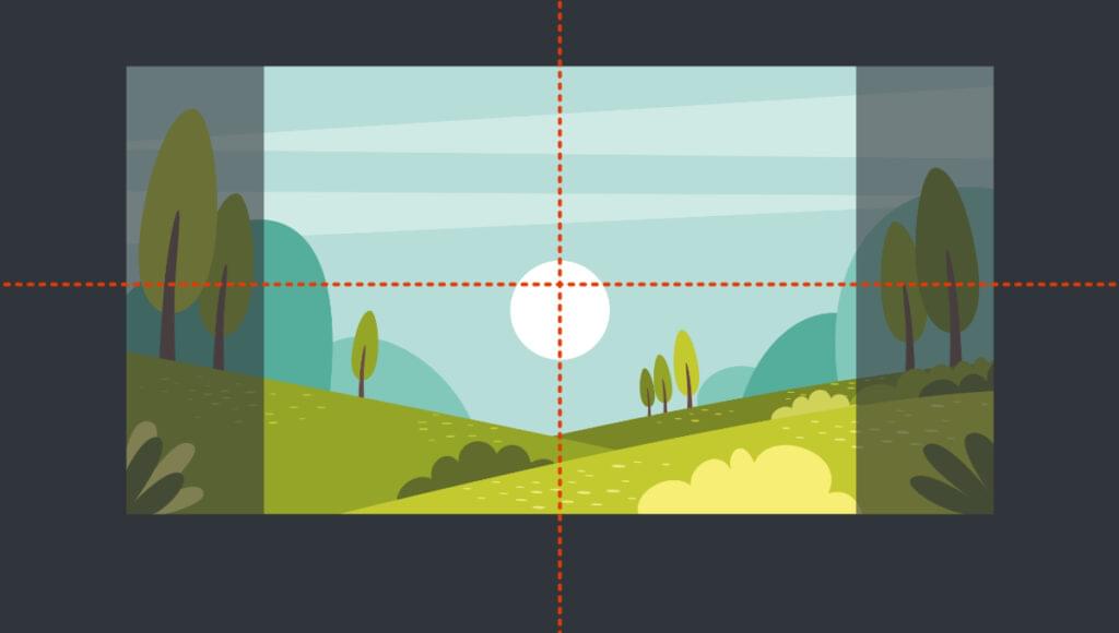
There are lots of options for sizing and positioning background images with the CSS background-size and background-position properties. The object-fit and object-position properties allow us to do similar things with embedded images (as well as other replaced elements like videos). In this article, we’ll dig into how to use object-fit to fit images into a specific amount of space, and how to use object-position to get the positioning within that space just right.
What object-fit Is For
Sometimes an image is too big for the space we want it to fit into. In the past, we would either have to crop the image in an image editor, or resize the image by setting width and/or height constraints (an imperfect option), or perform some kind of complicated clipping, or perhaps resort to using a background image instead (which is a pity if the image isn’t just for decoration).
The object-fit property does for images what background-size does for background images: it provides options for how an image is displayed within a designated area, hiding some of it if necessary. This designated area might have a fixed width and height, or it may be a more responsive space such as a grid area that grows, shrinks and flexes depending on the size of the browser’s viewport.
How object-fit Works
Every HTML element has its own “content box”, which represents the space it occupies. By default, the content box of an image matches the image’s natural dimensions.
When we apply a different width and/or height to an image, we’re really changing the dimensions of the content box. If the dimensions of the content box change, the image will still fill the content box. So if we have a 300px by 300px image and set its dimensions to 300px by 200px, the image will appear distorted.
The object-fit property gives us options for how the image is displayed within that resized content box. Instead of it appearing distorted, we can hide part of the image, or force the image to only partially fill its content box so that it’s fully visible and not distorted.
Setting Up
To illustrate in detail how the object-fit property works, we’ll place an image inside a div that’s centered using Grid layout. The div has a brown background, and a dotted border provided by the ::before pseudo-element that will help us understand what’s happening with the image.
See the Pen
object-fit: setup by SitePoint (@SitePoint)
on CodePen.
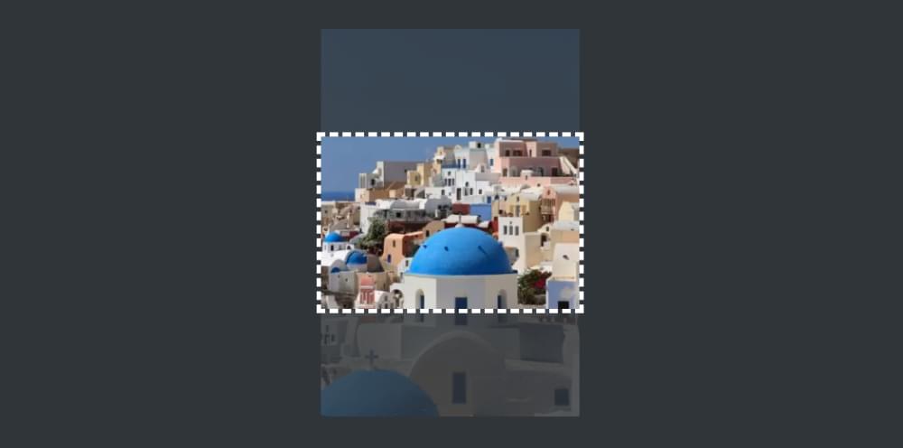
For our image demos, we’ll use the following image (of Oia on Santorini, Greece). Its natural dimensions are 400px by 600px.

Our image is much larger than our div, and if we place the image inside the div, it will spill out, as shown below.
See the Pen
object-fit: setup2 by SitePoint (@SitePoint)
on CodePen.
Our goal is to prevent the image from bursting out of its container like this, but also to have it fit comfortably within it, and object-fit will help us do that.
If we were working with a background image, we could set something like background-size: cover and the background image would be constrained to the area of the container. But as we’ve seen, for object-fit to do anything useful, we first need to define a height and width on the image’s content box that’s different from its natural size. In the examples below, we’ll constrain the width and height of the image to 100%, so that its content box matches the size of the container div:
img {
  width: 100%;
  height: 100%;
}
Here’s what that looks like.
See the Pen
object-fit: setup3 by SitePoint (@SitePoint)
on CodePen.
The image and its content box now fit snugly within the container, but the image is badly distorted. This is where the magic of object-fit comes to our rescue, so let’s see what it has to offer.
Fitting an Image into a Container with object-fit
The object-fit property offers five main keyword values for determining how our image will be displayed within its container. Two of those keywords — cover and contain — perform the same role as their background-size cousins.
object-fit: cover
The cover value forces the image to completely cover the area of the container, showing as much of the image as possible without distorting it:
img {
  width: 100%;
  height: 100%;
  object-fit: cover;
}
See the Pen
object-fit: cover by SitePoint (@SitePoint)
on CodePen.
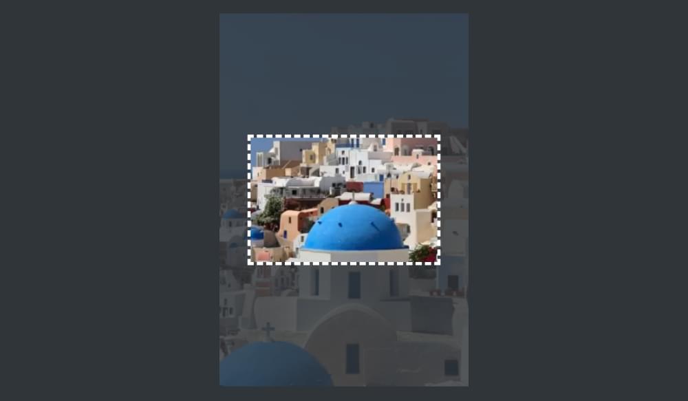
Because the image is quite tall, we see its full width but not its full height, as illustrated in the image below.
The cover value is probably the most useful of those on offer, being the go-to option in most circumstances.
It’s worth noting here the positioning of the image. Unlike background-position, which defaults to 0 0 (positioning the background image from the top left of the container), the default object-position is 50% 50%, which centers the image in its content box. When we look at the object-position property later, we’ll learn how to specify which part of the image is visible.
object-fit: contain
The contain value forces the image to fit entirely within its content box but without distortion. The image retains its natural aspect ratio, and therefore doesn’t fill its container:
img {
  width: 100%;
  height: 100%;
  object-fit: contain;
}
See the Pen
object-fit: contain by SitePoint (@SitePoint)
on CodePen.
It might seem like we would get the same result above by just setting height: 100% on the image and nothing else. But not quite, as that would leave the image positioned to the left rather than in the center, which is the default with object-fit. In combination with object-position, object-fit provides more options for how the image is positioned within the container.
object-fit: none
The none property allows the image to maintain its natural, original dimensions. Only as much of it as can fit in the resized content box is visible.
See the Pen
object-fit: none by SitePoint (@SitePoint)
on CodePen.
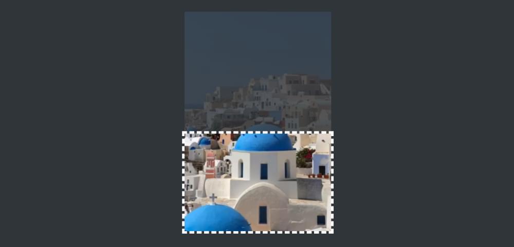
Unlike with object-fit: cover, our image isn’t forced to be completely visible along at least one axis. The original image is wider and taller than the content box, so it spills out in both directions, as illustrated below.
Note, again, that the center of the image aligns with the center of the content box by default.
Also note that object-fit: none doesn’t mean object-fit is doing “nothing”. As we can see, it’s doing a lot compared with no object-fit setting at all. (See what happens in the Pen above if you remove object-fit: none as a reminder.)
object-fit: scale-down
The scale-down property either does the same as none or contain. It chooses whichever will result in the image appearing smaller.
See the Pen
object-fit: scale-down by SitePoint (@SitePoint)
on CodePen.
Obviously, in our current example, contain is what it will choose, because our container is smaller than the image. If our container were larger than the image, none would prevail, and the image would stay at its natural size rather than fill the container in one direction, as you can see in this CodePen demo.
object-fit: fill
If we change the object-fit value to fill in our demo, it’s as if object-fit isn’t set at all. That’s because, by default, the image fills its content box no matter what dimensions are set.
See the Pen
object-fit: fill by SitePoint (@SitePoint)
on CodePen.
Because the fill property is likely to distort an image, it’s probably not the best one to turn to in most cases.
Using object-fit without a Container
In the examples above, we’ve been using object-fit to size an image within a div container, but the principles we’ve seen in practice work just as well without that container. What’s important is the size of the image’s content box and how the image is displayed within that box.
For example, we could apply the following CSS to the image, without any surrounding div:
img {
  width: 300px;
  height: 300px;
  object-fit: contain;
}
The result is shown in the CodePen demo below.
See the Pen
object-fit: no container by SitePoint (@SitePoint)
on CodePen.
Try changing the values on the object-fit property in the Pen above to cover, fill, scale-down and none to see how each behaves. The results are the same as if the image were set to width and height of 100% and contained within a div set to 300px by 300px.
Using object-fit in Responsive Layouts
The object-fit property is probably most useful in situations where the dimensions of the image’s designated area respond to the size of the browser viewport. The following demo assigns our image to a specific, flexible grid area:
img {
  width: 100%;
  height: 100%;
  object-fit: cover;
  grid-row: 2 / 3;
  grid-column: 2 / 3;
}

article {
  display: grid;
  grid-template: 5% 1fr 10% / 40% 1fr 40%;
  height: 100vh;
}
See the Pen
object-fit in a responsive area by SitePoint (@SitePoint)
on CodePen.
As the viewport and grid areas expand and contract, the cover value ensures that the image always fits nicely into its grid area, changing how much of the image is visible so that it’s never distorted. (Check out the demo in full page view to get the best sense of this.)
To learn more about grid areas, check out our beginner’s guide to CSS Grid.
Setting the Position of Images with object-position
Just as background-position is used to set the positioning of a background image within its container, the object-position property is used to control the positioning of an image element within its own content box.
As we’ve seen, object-position defaults to 50% 50%, which means that the center of the image aligns with the center of its content box. We can change that with a range of keyword values (top, bottom, left, right, center), or by using length values (such as px, em, or %), or by using combinations of both.
Let’s say we now want to position our image from the bottom right. We could use the keywords right bottom, or percentage values 100% 100%:
img {
  width: 100%;
  height: 100%;
  object-fit: cover;
  object-position: right bottom; /* or 100% 100% */
}
See the Pen
object-position 1: keywords by SitePoint (@SitePoint)
on CodePen.
The image below illustrates the positioning of our image now.
You can play around with the positioning keywords in the Pen above to see how they work, along with the object-fit keywords, but the results should be easy to predict.
We can also offset the image from its container with units such as pixels or ems. For example:
img {
  width: 100%;
  height: 100%;
  object-fit: cover;
  object-position: 20px 2em; /* 20px from left and 2em from top */
}
See the Pen
object-position 2: units by SitePoint (@SitePoint)
on CodePen.
We could do a similar offset from the bottom right by combining units and keywords, like so:
img {
  width: 100%;
  height: 100%;
  object-fit: cover;
  object-position: right 20px bottom 2em; /* 20px from right and 2em from bottom */
}
See the Pen
object-position 3: units and keywords by SitePoint (@SitePoint)
on CodePen.
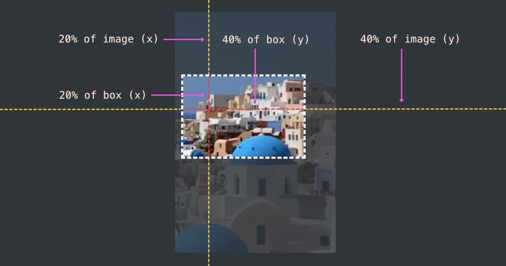
We’ve seen already that we can position our image in its content box with percentages. As with the background-position property, using percentages with object-position can get a bit confusing. An object-position of 50% 50% means that the center of the image aligns with the center of its content box on both horizontal and vertical axes.
If we set the object-position to 20% 40%, it means that a vertical line 20% from the left of the image coincides with a vertical line 20% from the left of the content box, and a horizontal line 40% from the top of the image coincides a horizontal line 40% from the top of the content box, as illustrated below.
We can see this in practice in the CodePen demo below.
See the Pen
object-position 4: percentages by SitePoint (@SitePoint)
on CodePen.
Conclusion
The object-fit property is designed to work with any kind of replaced elements, such as images, videos, iframes and embeds. Quite how useful it is to fit elements like videos into a defined area (where some of the element might be hidden) is perhaps a matter for debate, but no doubt there are viable use cases. A better option might be to set the width of an iframe to width: 100% of the available space and then use the aspect-ratio property to preserve its proportions.
It’s more common to have a specific amount of space in which an image needs to fit, so object-fit is very useful for allowing the image to fit into that space without being distorted (even if some of it has to be hidden).
To learn more about object-fit and object-position, check out the MDN pages for these properties:
Finally, as noted above, it’s worth comparing the object-fit and object-position properties with the background-size and background-position properties, which have a lot of similarities. Check out How to Use CSS background-size and background-position to get up to speed with them.
Frequently Asked Questions (FAQs) about CSS Object-fit and Object-position Properties
What is the difference between object-fit and object-position in CSS?
The object-fit and object-position properties in CSS are used to control the content of replaced elements, such as images or videos. The object-fit property defines how an element responds to the height and width of its content box. It’s similar to background-size in CSS but works with replaced elements. It has five values: fill, contain, cover, none, and scale-down.
On the other hand, the object-position property determines the position of the replaced element within its box. It’s similar to background-position but for replaced elements. It takes two values representing the x and y coordinates, which set the position of the element.
How can I use the object-fit property to resize an image?
The object-fit property can be used to control how an image should be resized to fit its container. Here’s an example:img {
object-fit: cover;}
In this example, the image will be resized to cover the entire width and height of its container, while maintaining its aspect ratio. The image will be clipped if its aspect ratio does not match the aspect ratio of its container.
Can I use object-position with background images?
No, the object-position property cannot be used with background images. It only works with replaced elements, such as img, video, or embed. For background images, you can use the background-position property instead.
How does the ‘contain’ value of object-fit work?
The ‘contain’ value of the object-fit property resizes the content to fit within the content box, while maintaining its aspect ratio. The entire content will be visible, but there may be some space left in the content box if its aspect ratio doesn’t match the content’s aspect ratio.
What does the ‘none’ value of object-fit do?
The ‘none’ value of the object-fit property means the content will ignore the height and width of the content box. It will retain its original dimensions, which may result in the content being clipped if it’s larger than the content box.
How can I center an image using object-position?
You can center an image within its content box using the object-position property. Here’s an example:img {
object-position: 50% 50%;}
In this example, the image will be positioned at the center of its content box.
Can I use percentage values with object-position?
Yes, you can use percentage values with the object-position property. The values represent the position of the content relative to the content box. For example, ‘0% 0%’ positions the content at the top left of the content box, while ‘100% 100%’ positions it at the bottom right.
What happens if I don’t specify an object-position value?
If you don’t specify an object-position value, the default value is ‘50% 50%’, which centers the content within its content box.
Can I use object-fit and object-position together?
Yes, you can use the object-fit and object-position properties together to control both the size and position of the content. Here’s an example:img {
object-fit: cover;
object-position: 50% 50%;}
In this example, the image will be resized to cover its content box and centered within it.
Are the object-fit and object-position properties supported in all browsers?
The object-fit and object-position properties are widely supported in all modern browsers, including Chrome, Firefox, Safari, and Edge. However, they are not supported in Internet Explorer.