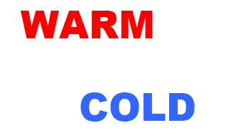
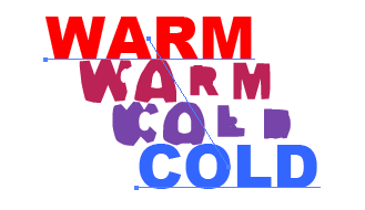
 Select both text objects, then choose Object > Blend > Make. (The shortcut is Ctrl+Alt+B on the PC and Cmd+Alt+B on the Mac). You’ll see something along the lines of this:
 You can adjust the blend by going back to the Object menu, and choosing Blend > Blend Options. Check the preview box so you can see how your blend changes. Here I’ve changed the number of specified steps to 4.
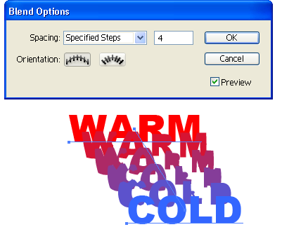 The good thing about this technique is that both pieces of text are still editable and you can also move your start and end text wherever you want and Illustrator will fill in the gaps for you.
Rotate A Single Character And Apply A Type Graphic Style
If you want to rotate one letter or number, you can use the Rotate Character option in the Character palette. If the Character palette isn’t open in Illustrator, choose Window > Type > Character or hit Ctrl+T (PC) or Cmd+T (Mac) to open it.
Add some text to your document and then select a single character that you want to rotate. On the Character Palette, choose a rotation angle. Note: If you don’t see the Character Rotation field, click on the Palette Menu on the top-right, and choose Show Options.
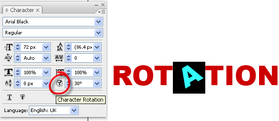 You can rotate individual characters or you can select a full block of text and rotate it. When you’re working with individual characters you might find that the rotated letter pushes the surrounding letters too far apart, like this:
 To get rid of that extra space, you can change the Kerning between the characters. Click between two characters that you want to change the space between. Here, I’ve clicked between the first T and the A. Then to reduce the amount of space between them, enter a minus value in the Kerning field.
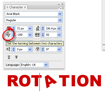 Repeat the Kerning on the other side of the letter A.
To finish this off, I added a graphic style to make it look like the letters are really being rotated. Open up the Graphic Styles palette. On the palette menu, choose Open Graphic Style Library > Text Effects.
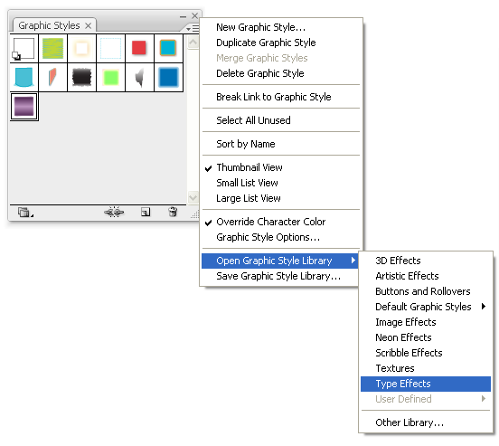 Make sure your text is still selected, then click once on “Jiggle” in the Type Effects palette.
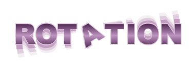
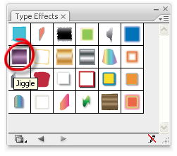 You should now have a nice style applied to your original text.
Frequently Asked Questions (FAQs) about Illustrator Text Effects
How can I create a 3D effect on text in Illustrator?
Creating a 3D effect on text in Illustrator is quite simple. First, select the text you want to apply the effect to. Then, go to the ‘Effect’ menu, select ‘3D’, and then ‘Extrude & Bevel’. A dialog box will appear where you can adjust the settings to achieve the desired 3D effect. You can manipulate the position, perspective, and depth of the text. Once you’re satisfied with the settings, click ‘OK’. Your text will now have a 3D effect.
Can I rotate text in Illustrator without distorting it?
Yes, you can rotate text in Illustrator without distorting it. Select the text box using the Selection Tool, then hover over one of the corners until you see a curved arrow. Click and drag to rotate the text. Holding down the Shift key while rotating will constrain the rotation to 45-degree increments, ensuring your text remains undistorted.
How can I change the orientation of text in Illustrator?
Changing the orientation of text in Illustrator is straightforward. Select the text box with the Selection Tool, then go to the ‘Object’ menu, select ‘Transform’, and then ‘Rotate’. A dialog box will appear where you can enter the desired rotation angle. Click ‘OK’ to apply the rotation.
Is it possible to scale text in Illustrator without affecting the stroke thickness?
Yes, it is possible. Go to ‘Illustrator’ > ‘Preferences’ > ‘General’ and uncheck ‘Scale Strokes & Effects’. Now, when you scale your text, the stroke thickness will remain the same.
How can I wrap text around a shape in Illustrator?
To wrap text around a shape, first create your shape and your text. Then, select both the text and the shape using the Selection Tool. Go to the ‘Object’ menu, select ‘Envelope Distort’, and then ‘Make with Top Object’. Your text will now wrap around the shape.
How can I create a gradient effect on text in Illustrator?
To create a gradient effect, first select your text. Then, go to the ‘Window’ menu and select ‘Gradient’ to open the Gradient panel. Click on the gradient slider to apply a gradient to your text. You can adjust the colors and direction of the gradient as desired.
Can I convert text to outlines in Illustrator?
Yes, you can convert text to outlines to make it editable as a graphic. Select your text, then go to the ‘Type’ menu and select ‘Create Outlines’. Your text will now be converted into a graphic that you can manipulate as you would any other shape in Illustrator.
How can I skew text in Illustrator?
To skew text, select your text box with the Selection Tool, then go to the ‘Object’ menu, select ‘Transform’, and then ‘Shear’. A dialog box will appear where you can enter the desired shear angle. Click ‘OK’ to apply the shear.
Is it possible to create a drop shadow effect on text in Illustrator?
Yes, it is possible. Select your text, then go to the ‘Effect’ menu, select ‘Stylize’, and then ‘Drop Shadow’. A dialog box will appear where you can adjust the settings to achieve the desired drop shadow effect. Click ‘OK’ to apply the effect.
How can I align text to a path in Illustrator?
To align text to a path, first create your path using the Pen Tool or any other drawing tool. Then, select the Type on a Path Tool from the Tools panel and click on the path. You can now type your text and it will follow the path. You can adjust the position and orientation of the text using the Direct Selection Tool.
Jennifer Farley is a designer, illustrator and design instructor based in Ireland. She writes about design and illustration on her blog at Laughing Lion Design.

Published in
·Accessibility·Community·Computer science·Debugging·Design·Design & UX·Programming·Software·Software·Software Development·Web·January 28, 2015
