
Key Takeaways
- Responsive email layouts should account for mobile devices, as their use in email consumption is growing. This involves arranging email content so that cells, which are naturally positioned horizontally, are arranged vertically on mobile devices.
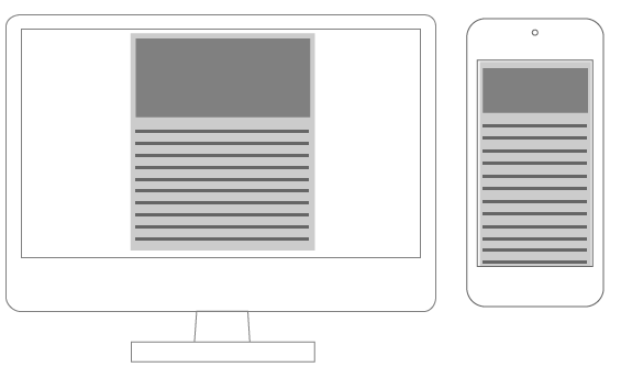
- Single column email layouts, which usually include a single header image, do not require elements to be rearranged. Instead, the widths need to be adjusted to match device sizes. This is an example of scalable design rather than responsive design.
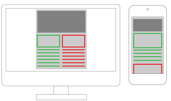
- Multicolumn email layouts require columns to be rearranged as device width decreases. This can be achieved through using nested tables or changing table cells’ display property. The latter method is more elegant and uses native CSS rules.
- Images in responsive emails do not require anything more than the classic responsive technique (img {max-width: 100%;}). However, using media queries, one image can be hidden and another one shown as a background image instead.

In my previous article on newsletter authoring we’ve seen how a handful of tricks can make a huge difference in how your email displays in different clients.
Moreover, we have to take account of mobile devices, whose use in email consumption grows daily. This brings us to the question of building responsive layouts for email.
Since we know email templates are built with HTML tables, and have the inline CSS, our work is a bit more complicated than usual:
- Inlined CSS rules have high specificity values (they always win an arm wrestle).
- Tables are not designed for layout composition so we must take care to compose our emails keeping in mind the need that cells – which have a naturally horizontal positioning – should be arranged vertically in mobile devices.
- Of course, we can’t use JavaScript.
Luckily, most mobile devices have a high compatibility with modern CSS rules, so we are able to tackle all these problems easily using media queries, making a large use of the !important declaration (to over-rule inline styles), and paying careful attention to the way your content is arranged.
A mobile first approach to this kind of projects is very important and allow to avoid layout that can’t be properly arranged in small devices.
Consider that even if, in this article, we will only address responsiveness issues, responsive mobile emails are not automatically good ones. Effective mobile email design involves many elements including font sizing, layout composition and so on: these are very important tasks and we’ll cover them in an another article.
Email layouts patterns
Regarding responsiveness, we can identify two types of email: single column and multicolumn ones.
Single column layout
Single column layouts (often with a single header image) don’t have particular needs. Since they don’t need to rearrange elements, we have only to take care that all widths degrades gracefully to match device sizes. Rather than Responsive design, this is a classic example of Scalable design (see Scalable, Fluid or Responsive: Understanding Mobile Email Approaches).
To ensure your email resizes correctly, you have only to adjust table width:
<table cellspacing="0" cellpadding="0" border="0" width="600">

	<!-- email content -->

</table>
@media screen and (max-width:480px) {

	table {

		width: 100%!important;

	}

}
You will need to resize images too (see the About images paragraph at the end of this article) and to adjust your font-size also, but there aren’t any other particular needs.
Multicolumn layout
Multicolumn layouts require your columns to be rearranged as device width decreases. It makes no difference whether you’re working with two columns, three or more: you will need to display them vertically instead than horizontally.
There are two easy ways to accomplish this:
- Using nested tables
- Changing table cells
displayproperty.
Nested tables layout
Email composition often requires you to use nested tables. This has always been considered the best way to ensure client compatibility, but on the other hand the resulting code is very dirty and practically illegible.
The trick is the use of the table align="left" attribute that causes tables to align horizontally.
Every element must have a specific width and their total must have the same value as their container.
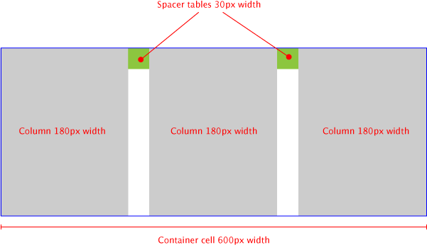
When the device width decreases, we have to resize the container and force all the tables-columns to 100% width.
table[class="body_table"] {

	width: 600px;

}
table[class="column_table"] {

	width: 180px;

}
table[class="spacer_table"] {

	width: 30px;

	height:30px;

}
@media only screen and (max-width: 480px) {

	table[class="body_table"] {

		width: 420px!important;

	}

	table[class="column_table"] {

		width: 100%!important;

	}

}
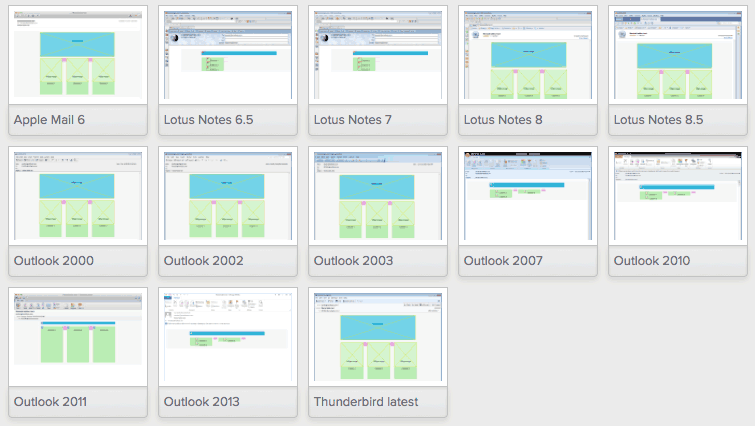
This technique ensures compatibility with the majority of clients: I’ve tested the demo file in Litmus and I had good results for all clients, allowing the following caveat:
- Outlook 2007, 2010 and 2013 (these versions of Outlook use Microsoft Word as rendering engine: see A Guide to Rendering Differences in Microsoft Outlook Clients on Litmus blog);
- Oldest versions of Lotus Notes;
- Gmail Android App.
This is a good start point (see below for a partial result of the test), and we must also consider that this test has been built with empty tables: adding content (and more nested tables!!) you should be able to fix all bugs and make this technique working properly with all clients.
I’ve made a codepen with the code I used (note that the CSS is not inlined in this pen, so you’ll need run a CSS inliner before using it for production email).
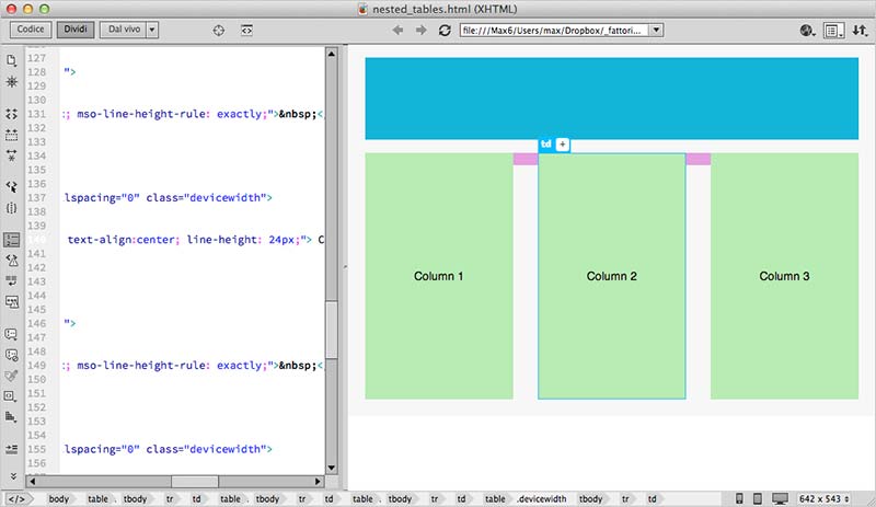
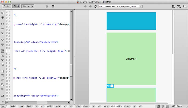
A note about the code editors:
Although I currently use Coda or Brackets for coding, in these cases I really appreciate visual editors, such as Dreamweaver. It makes it very easy to navigate within nested tables and edit HTML and CSS.
In the screenshots below you can see the email layout in Dreamweaver in desktop and phone views.
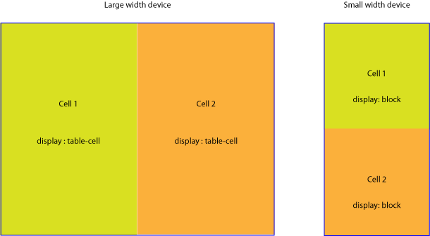
Changing table cells display property
The second way to built multi-columns email, is more elegant and uses native CSS rules.
This technique consists in changing the default table cells display property when device width decreases (you can find many examples at responsiveemailpatterns.com). This causes the cells to re-stack vertically:
table[class="body_table"] {

	width: 600px;

}

table td[class="column"] {

    height:100px;

    width:200px;

}
@media only screen and (max-width: 480px) {

	table[class="body_table"] {

		width: 440px!important;

	}
	table td[class="column"] {

        width:100%!important;

        display: block!important;

    }

}
The results of this test are excellent: all clients rendered properly test email (sometimes with minor bugs), anyway remember that we have tried an empty mail, and the results may be different adding content.
Here is the codepen for you to pick through.
About images
In responsive emails, images don’t requires anything more than the classic responsive technique (img {max-width: 100%;}) we currently use in the web.
Anyway, as suggested in Campaign Monitor Responsive Email Design Guide, using media queries, you can hide an image and show another one as a background image instead.
@media only screen and (max-device-width: 480px) {
img.original_img {
display: none;
}
.substitute_image {
background-image: url(background_image.png);
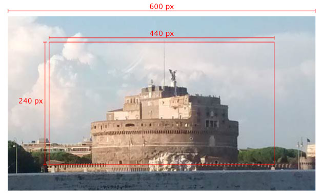
width: 440px !important;
height: 240px !important
}
}
Keep in mind that even images hidden via CSS are loaded into the client, so be careful about this.
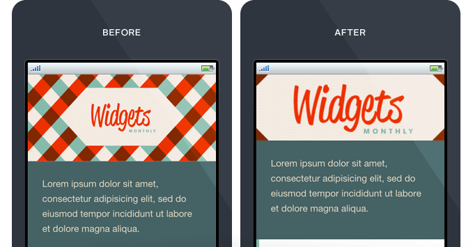
A good option can be to use the same image both for the img tag and the background-image source. You have to prepare a multipurpose image that can be used for all that scopes, just like the example below:
Choosing the right image, you can use it for many media queries breakpoints. After have prepared it, you have only to add a handful of CSS rules:
@media only screen and (max-device-width: 480px) {

    img.original_img {

        display: none;

    }

    .substitute_image {

        background-image: url(original_image_source.jpg);

        background-position: center center;

        background-repeat: no-repeat;

      width: 440px !important;

      height: 120px !important

    }

}
You can also add a background-size property to adjust each breakpoint view (paying attention to clients support for this rule).
Unfortunately, this is unlikely to solve all your needs for high density devices – however it can reduce the number of files loaded for all other cases.
Conclusions
So, is there a single, all-conquering, best-ever technique for responsive email authoring?
As is usually the case, there isn’t. Every project needs a different approach and has a different best solution. The real answer is to have a useful selection of techniques to choose from at your fingertips, and always experiment with new ways.
Resources
- https://litmus.com/blog/the-how-to-guide-to-responsive-email-design-infographic
- http://responsiveemailresources.com/
- http://responsiveemailpatterns.com/
- https://www.campaignmonitor.com/blog/post/3541/designing-ultra-short-emails-for-mobile-using-progressive-disclosure/
- https://litmus.com/blog/responsive-scalable-email-design-whats-the-difference
- https://litmus.com/blog/anatomy-mobile-email
- https://www.campaignmonitor.com/guides/mobile/
Frequently Asked Questions on Building Responsive Emails
What are the key elements to consider when designing a responsive email?
When designing a responsive email, it’s crucial to consider the layout, typography, images, and buttons. The layout should be flexible and adapt to different screen sizes. Use a single column layout for better readability on small screens. Typography should be legible, with a minimum font size of 14px for text and 22px for headlines. Images should be optimized for different devices, and buttons should be large enough to tap on a mobile device.
How can I use media queries for responsive email design?
Media queries are a powerful tool for making your email design responsive. They allow you to apply different styles depending on the screen size of the device. For example, you can change the font size, image size, or layout when the email is viewed on a small screen. To use media queries, include them in your CSS within style tags in the head of your HTML document.
Why is it important to test my responsive email design?
Testing is crucial because it ensures your email looks and functions as intended on different devices and email clients. Some email clients may not fully support all CSS properties, which can affect your design. By testing, you can identify and fix any issues before sending the email to your subscribers.
How can I optimize images for responsive emails?
To optimize images for responsive emails, use the HTML img tag and set the width to 100%. This makes the image scale to the width of its container. Also, compress your images to reduce their file size without losing quality. This ensures your email loads quickly even on slow internet connections.
What are some common challenges in building responsive emails and how can I overcome them?
Some common challenges include email client compatibility, maintaining readability on small screens, and ensuring images and buttons scale correctly. To overcome these challenges, use inline CSS to ensure styles are applied correctly, use a single column layout for small screens, and test your email on various devices and email clients.
How can I ensure my responsive email looks good on all devices?
To ensure your email looks good on all devices, use a responsive design approach, test your email on various devices, and consider using a tool or service that provides email previews on different devices. Also, keep your design simple and clean, and use a single column layout for small screens.
Can I use external CSS for responsive email design?
While you can use external CSS, it’s generally recommended to use inline CSS for email design. This is because some email clients strip out head and body tags, which can remove your external CSS. Inline CSS ensures your styles are applied correctly.
How can I make my HTML table responsive for email?
To make your HTML table responsive, you can use the HTML attribute width=”100%” to make the table scale to the width of its container. Also, consider using a tool or service that converts your HTML tables into responsive tables.
What is mobile responsive email stacking and how does it work?
Mobile responsive email stacking is a technique where the content blocks or columns in your email stack vertically on small screens. This improves readability on mobile devices. You can achieve this by using media queries to change the layout when the email is viewed on a small screen.
How can I create responsive column layouts for my email?
To create responsive column layouts, you can use media queries to change the layout depending on the screen size. On large screens, you can display multiple columns side by side. On small screens, you can stack the columns vertically for better readability.