

Key Takeaways
- “Don’t Make Me Think Revisited” by Steve Krug is an updated version of the classic UX book, now including a chapter on mobile UX, acknowledging the importance of mobile web and app design in today’s world.
- According to Krug, the basic principles of UX remain the same for both desktop and mobile, but mobile UX presents some unique challenges that make it more difficult. The key to good mobile usability is making effective tradeoffs.
- Mobile apps should be easy to use, efficient, and enjoyable, requiring minimal time investment from the user to learn how to use them. If an app fails to impress, it’s likely to be abandoned.
- Krug advocates for usability testing as an ongoing part of the design process, not just a final check before launch. This helps identify and fix issues that may not be apparent to the design team.

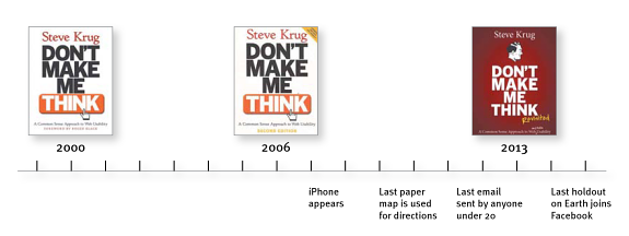
Back in May, I wrote a review of the classic UX book by Steve Krug, Don’t Make Me Think.
After reading the review, Steve was kind enough to send me the updated version, written in late 2013, as named in the title which covers mobile web and app UX too. Mobile is of course very important to every web designer these days, as more and more of us access the web on our various devices. The first edition of the book was penned back in 2000, so as Steve points out, “the world has changed” and “technology got its hands on some steroids”.
Not only do we now access the web on substantially smaller screens, but the web has continued to improve in leaps and bounds, usability itself has gone mainstream and computers are now significantly faster. I could go on, we now have the cloud, for example, which allows us to be able to store files for access from any location.
While Don’t Make Me Think has remained hugely popular in the design community since it was first published, mobile has meant that the time was right for an updated version. As I mentioned in my first review, the book is quite timeless in the advice that it gives, but the additional information will ensure that it remains a firm favorite for many years still to come.
What’s New in ‘Don’t Make Me Think Revisited’?
For the most part, there’s one main change that you will find useful in the updated version of the book and that’s the additional of a chapter on mobile: Chapter 10 – Mobile: It’s not just a city in Alabama anymore – Welcome to the 21st Century – you may experience a slight sense of vertigo.
Phones had been gradually getting smarter for years, gathering in desk drawers and plotting amongst themselves. But it wasn’t until the Great Leap Forward that they finally achieved conciousness.
He is, of course, referencing the introduction of the iPhone in June 2007 and this is relevant as he also points out several times in the book what impact Steve Jobs and Jonathan Ive had on UX. Thanks to them, it’s gone mainstream and now, even business people understand its relevance, even if they don’t really get the discipline itself.
With better smartphones, the mobile web and faster processing power came problems though, the first of which being the issue of trying to squeeze a web page onto a tiny screen. Apple came up with the idea of being able to pinch and scroll and a great browser interface, but it was essentially the ability for tiny computers to respond to requests quickly that made it all useful.
Mobile Usability
According to Steve, when it comes to mobile UX, not much is actually that different to desktop. The basic principles remain, but there are some “significant differences” that make UX more of a challenge. In some respects, he says, web and app design are still in the “Wild West” phase and it’s unlikely that we’ve found the best ways to work with it just yet. The first thing to consider is that when it comes to mobile:
It’s all about tradeoffs
And …
Most of the challenges in creating good mobile usability boil down to making good tradeoffs
So it’s likely that the user will have to make more clicks to get to the content that they want and therefore a mobile site is going to be deeper, for example. As we know, another issue with mobile is how content is presented as compared to the full site. Do you offer a pared down version, get a separate mobile site made (at a large cost both in terms of cash and going ever so slightly mad) or work to the Mobile First ethos?
Currently of course the tendency is to create a site built using Responsive Web Design (RWD) but Steve points out that:
If there are two things I can tell you about scalable design (a/k/a dynamic layout, fluid design, adaptive design, and responsive design), they’re these:
- It tends to be a lot of work
- It’s very hard to do it well
Despite this, the author believes that this will be ironed out in time, not least because it’s highly connected to revenue when it comes to business websites. He then goes on to give some suggestions as to what designers can do to overcome problems with scalable design and UX, including the clickable area issue that we’ve all seen many sites get wrong (and continue to).
Mobile Apps
Of course, no modern discussion of mobile and UX would be complete without some talk of mobile apps. With apps like any other project that demands good UX, the key is simple, according to Steve:
A person of average (or even below average) ability and experience can figure out how to use the thing [i.e., it’s learnable] to accomplish something [effective] without it being more trouble than it’s worth [efficient].
Apps need to be all of these things if they’re to be effective and enjoyed by the user. You shouldn’t have to have a degree in logic to find your way around an app, it should be a “delight” to use and should be learnable, as well as memorable.
This section contains some great examples and points out that apps need to allow the user to invest as little time as possible in learning how to use them. This is because, as Steve points out, if you’re not hugely impressed by an app, enough to use it regularly, then you’ll abandon it and since that’s the fate of most apps, UX is fundamentally important to their design.
Usability Testing for Mobile
The final section of the 20-page chapter talks about the logistics of usability testing for mobile. As well as some great suggestions on the best ways to carry this out (clue, it’s not by watching the users’ faces), there’s actionable tips on issues that can cause real problems.
This section, for example, shows you how to make Steve’s proof of concept ‘Brundlefly camera’. I’m just going to leave that one there and not tell you any more about it, I found it to be entertaining, although I haven’t tried my hand at making one just yet.
Final Thoughts
I was a big fan of the first book and I’m an even bigger fan of this one. The updated version addresses the issues that are relevant to readers now, with a good look at mobile and apps, it’s by far not a throwaway chapter just added to update the book and gather more sales (although it undoubtedly will).
The style remains too, which is undoubtedly one of the reasons the book has sold so well – it’s easy to understand, and it’s funny!
Personally, I keep the book in the office and refer to it over and over when it comes to things I’m writing about UX, it’s serves as a straightforward reminder of the main principles and helps to kickstart further research. It is, in fact, the most used print book in my office and rarely leaves my desk.
So if you’re looking for a great book to help you get started in UX then this is definitely recommended.
Frequently Asked Questions (FAQs) about “Don’t Make Me Think: Revisited”
What is the main premise of “Don’t Make Me Think: Revisited”?
The main premise of “Don’t Make Me Think: Revisited” is to emphasize the importance of usability in web design. The author, Steve Krug, argues that a good website or app should let users accomplish their intended tasks as easily and directly as possible. The title itself is a metaphor for the user’s desire for an intuitive and effortless online experience.
How does this book differ from the original “Don’t Make Me Think”?
“Don’t Make Me Think: Revisited” is an updated version of the original book. It includes new examples, a new chapter on mobile usability, and updated information to reflect the changes in web usability since the original was published. However, the core principles remain the same, emphasizing simplicity, clarity, and ease of use in web design.
Who should read “Don’t Make Me Think: Revisited”?
This book is a valuable resource for anyone involved in creating, managing, or using websites or apps. This includes web designers, developers, content creators, digital marketers, and even end-users who want to understand the principles of good web design. It’s written in a non-technical, accessible style, making it suitable for beginners as well as experienced professionals.
What are some key takeaways from “Don’t Make Me Think: Revisited”?
Some key takeaways from the book include the importance of eliminating unnecessary elements, creating clear navigation, and designing with the user’s needs and expectations in mind. Krug also emphasizes the value of usability testing to identify and fix issues that may not be apparent to the design team.
How does “Don’t Make Me Think: Revisited” relate to modern web design practices?
Despite being published several years ago, the principles in “Don’t Make Me Think: Revisited” are still highly relevant to modern web design. The focus on user-centered design, simplicity, and usability testing aligns with current best practices in the field. The book’s insights can help designers create more effective, user-friendly websites and apps.
Can the principles in “Don’t Make Me Think: Revisited” be applied to mobile app design?
Yes, the principles in “Don’t Make Me Think: Revisited” can be applied to mobile app design. In fact, the book includes a chapter specifically about mobile usability. The same principles of simplicity, clarity, and user-centered design apply, although they may need to be adapted to the specific constraints and opportunities of the mobile platform.
What is the author’s perspective on usability testing?
Steve Krug is a strong advocate for usability testing. He believes that even small-scale, informal testing can provide valuable insights and help identify usability issues. He argues that testing should be an ongoing part of the design process, not just a final check before launch.
How does “Don’t Make Me Think: Revisited” approach the topic of web accessibility?
“Don’t Make Me Think: Revisited” emphasizes the importance of making websites and apps accessible to all users, including those with disabilities. Krug discusses practical strategies for improving accessibility, such as using clear, simple language, providing alternative text for images, and ensuring that all functionality can be accessed with the keyboard.
What is the writing style of “Don’t Make Me Think: Revisited”?
“Don’t Make Me Think: Revisited” is written in a conversational, engaging style. Krug uses humor and real-world examples to make complex concepts accessible and enjoyable to read. The book is also visually appealing, with plenty of screenshots, diagrams, and other visual aids to illustrate the points.
Where can I buy “Don’t Make Me Think: Revisited”?
“Don’t Make Me Think: Revisited” is widely available in both print and digital formats. You can purchase it from major online retailers like Amazon, or check your local bookstore. It’s also available in many libraries.