Ten Free Display Fonts From The Behance Network
 As well as holding portfolios for graphic designers, illustrators and photographers, you’ll also find some unusual and interesting fonts available from typographers and designers kindly sharing their wares on Behance. Creating a typeface is a lengthy job so hats off to the typographers who give away their hard work for free.
Many of these fonts are display fonts, making them suitable for posters and headlines rather than body text.
VAL from font fabric is a chunky bubble style font. The direction of the letters can be flipped by choosing the upper or lower case version of the letter. You can download it from font fabric.
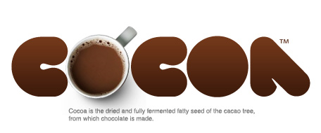
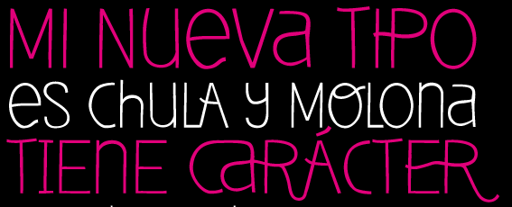
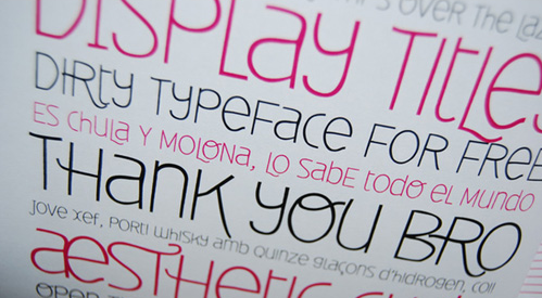
Deibi is a sans serif, somewhat cartoony style font from Wete, a spanish designer.
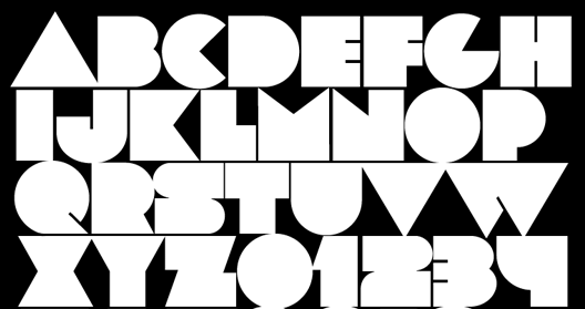
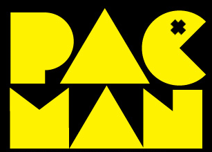
Lot is a bold, super chunky display typeface. It can also be downloaded from font fabric.
Days is a display typeface available in one weight with a slightly Russian feel about it.

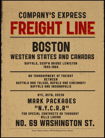
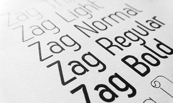
Zag is a beautiful sans serif font available for free in two styles (Regular and Bold) and for purchase in five other styles.
Public Gothic is a free font release from Mehmet Gozetlik. “It is little industrial, little vintage, little condensed, little bold.” You can download it from a2591.com.
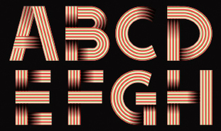
The Ribbon Alphabet font and its variation Tribbon, are available for free download from noupe.com. This one is not a font that can be installed on your system but rather a layered file, but you can see a short video explaining how it works on the noupe site.
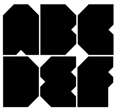
Named after the James Bond movie, Thunderball is a big fat font created by John Skelton/afrojet and available for download from Fontstruct.
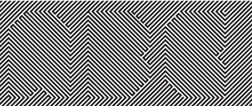
And finally, get your sunglasses on for this one. Portal strips is a little hard on the eye, but it is certainly different.
From the same designer, and a little less dazzling is Portal black.
What do you think of this bunch? Do you use Behance to find fonts? Do you use it as a portfolio site for your own work?
Frequently Asked Questions about Free Display Fonts
What are display fonts and how are they different from other types of fonts?
Display fonts are a type of font that is designed for large size usage such as in headlines, posters, or billboards. They are often more decorative and have unique characteristics compared to other types of fonts like serif or sans-serif. Display fonts can add personality and visual interest to your design, making them a popular choice for branding, advertising, and creative projects.
Where can I find free display fonts?
There are several online platforms where you can find free display fonts. Websites like Behance, MyFonts, and 1001Fonts offer a wide range of display fonts that you can download for free. However, always make sure to check the license agreement before using the font in your project as some fonts may have restrictions on commercial use.
How do I install a display font on my computer?
Once you’ve downloaded a font file, usually in .ttf or .otf format, you can install it on your computer by opening the file and clicking the ‘Install’ button. On some operating systems, you may need to drag the file into your Fonts folder. After installation, the font should be available in any application that uses system fonts.
Can I use these free display fonts for commercial projects?
The usage rights for free fonts can vary. Some fonts are completely free for both personal and commercial use, while others may require a license for commercial use. Always check the font’s license agreement or contact the font’s creator if you’re unsure.
How do I choose the right display font for my project?
Choosing the right display font depends on the nature of your project and the message you want to convey. Consider the mood and style of your design, as well as readability at large sizes. It’s also important to ensure that the font complements the other elements of your design.
Can I modify the display fonts I download?
This depends on the license agreement of the specific font. Some font creators allow modifications, while others do not. Always check the font’s license or contact the creator if you’re unsure.
What is the difference between a display font and a text font?
Display fonts are designed for use at large sizes and often have more unique, decorative features. Text fonts, on the other hand, are designed for readability at small sizes and often have more traditional, simpler designs.
How many display fonts should I use in a design?
As a general rule, it’s best to limit your design to two or three fonts to avoid a cluttered look. This could include one display font for headlines or special elements, and one or two text fonts for body copy.
Can display fonts be used for body text?
While it’s technically possible to use display fonts for body text, it’s generally not recommended. Display fonts are designed for large sizes and may not be as readable at smaller sizes. For body text, it’s best to use a text font that is designed for readability.
Are there trends in display fonts I should be aware of?
Like any aspect of design, trends in fonts come and go. However, the most important thing is to choose a font that fits your specific project and message. Keeping an eye on design blogs and font websites can help you stay aware of current trends.
Jennifer Farley is a designer, illustrator and design instructor based in Ireland. She writes about design and illustration on her blog at Laughing Lion Design.
Published in
·Android·App Development·Blogs·Entrepreneur·iOS·Marketing·Mobile·SEO & SEM·July 29, 2015
