
Key Takeaways
- Speed Index is a metric that measures web page performance by determining how much of the above-the-fold content is visually complete over time. It provides a more accurate representation of user experience than traditional browser event timings.
- The Speed Index of a page is calculated by video capturing the page load and comparing each frame against the final loaded frame to determine their percentage completeness. This method better captures the visual progress of a page load, making it a more user-centric metric.
- Tools like WebPagetest and Telemetry can be used to measure the Speed Index of a website. Regular monitoring of your site’s Speed Index, especially after making significant changes, can help identify performance issues early and improve user experience.
For a long time, measuring web performance was all about minimizing the time it took for various browser events to fire, such as window.onload or the loadEventEnd navigation timing. But these timings were never really that good at capturing the actual user experience. That’s where speed index comes in.
Speed index is a relatively new method of measuring web page performance that was originally developed for WebPagetest.org. It works by measuring how much of the above-the-fold content is visually complete over time until it is 100% complete (the part that is visible to the user when loaded initially).
The reason speed index is such a good metric is because it does a far better job at measuring how the user perceives the performance of a page. Take my blog for example, I’ve spent a long time optimizing it to get the speed index as low as possible, yet most pages actually take 2-3 seconds to load fully due to MathJAX’s numerous requests and the work it does. Unless there is actual mathematical markup above-the-fold, this additional work will be completely ignored by speed index. Ignoring this makes sense from a user perception perspective because by the time the user has scrolled down to the part of the page where the math is used, it has likely loaded anyway. Optimizations for speed index also typically improve the mobile experience because they’re focused on getting something up and usable as soon as possible.
Calculating Speed Index
To measure the speed index of a page a video capture needs to be taken of the page load. Each frame is compared against the final loaded frame to determine their percentage completeness.
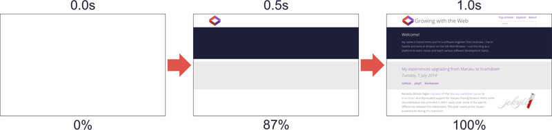
Plotting the visual progress of a page over time gives a graph something like this:
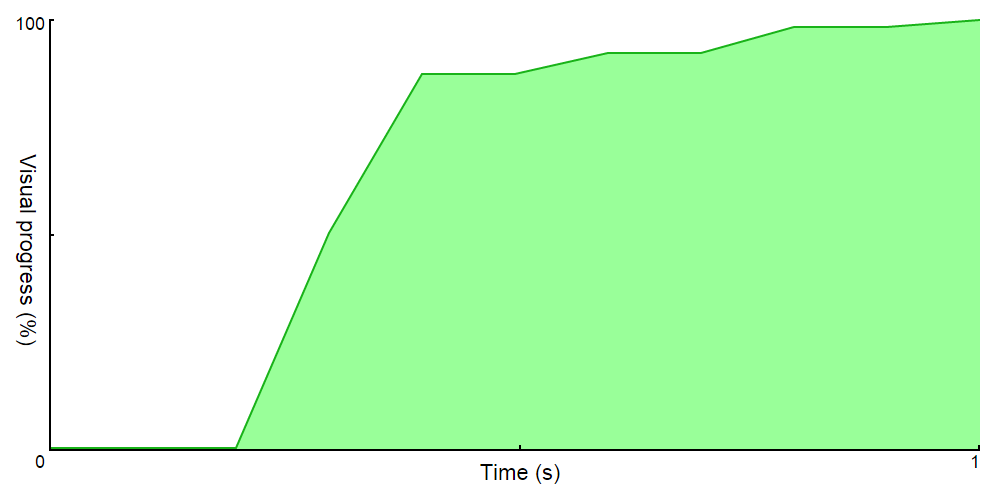
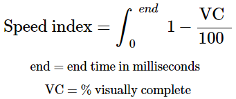
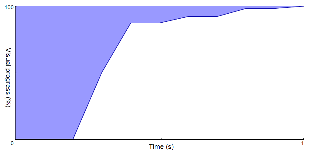
The area under the curve represents the visual complete progress, but since it is unbounded it doesn’t make a good score to measure, as it will keep increasing. Instead, the speed index is the area above the curve that will approach 0 as the page gets faster.
Measuring Visual Completeness
The simplistic approach to measure visual progress is to compare the pixel at each position with the corresponding pixel in the completed frame. This turns out to have some issues though, particularly around new elements triggering a layout that shifts other elements around. Using this method, if a photo was positioned even a single pixel off its final position, it would mark the entire sector as incomplete.
WebPagetest measures visual progress by taking a histogram of colors and calculating the difference with the final frame. While this does have issues of its own, it fixes the problem outlined above.
Frames Per Second
WebPagetest currently captures in 10 frames per second, but that could change in the future. The more frames that are measured, the more accurate the result will be.
Paint Events
There is another more recent method of calculating visual progress that uses browser paint events emitted via the remote debugging protocol. This removes the need to create a video recording of the page load which could potentially negatively impact the page load itself. This method is for Chromium-powered browsers only, so it cannot be applied to all browsers.
Telemetry
The Chromium team have developed a testing framework written in Python called Telemetry that is responsible for generating all the results on the Chrome Performance Dashboard. It can also be used to run page load tests on URLs of your choosing to generate speed index and other valuable metrics like navigation timings.
Telemetry works with Chromium-powered browsers and is slowly increasing its support to browsers that implement the WebDriver API (see CR implementing IE support).
Setting Up Chromium
The instructions to get the Chromium source are available on the Chromium website, you don’t need to run gclient sync to synchronize the submodules or build the project since we’re only interested in Telemetry which is all contained within the main repository.
Creating a Telemetry Page Set
Telemetry works by running measurements on page sets. Measurements determine how a page is run and what metrics to gather, page sets are a collection of pages to run and the configuration under which to run them.
You will need to create a page set at ./tools/perf/page_sets/ with the URLs you are interested in measuring. Here is an example that measures two URLs on my blog:
from telemetry.page import page as page_module

from telemetry.page import page_set as page_set_module
class GrowingWithTheWebPageSet(page_set_module.PageSet):

  def __init__(self):

    super(GrowingWithTheWebPageSet, self).__init__(

        # Forces Math.random to use the same seed to improve result consistency

        make_javascript_deterministic=True,

        # Sets the browser to use the generic desktop user agent

        user_agent_type='desktop')
    urls = [

        'http://www.growingwiththeweb.com',

        'http://www.growingwiththeweb.com/2014/06/fibonacci-heap.html']
    # Add the pages to the page set

    for url in urls:

      self.AddPage(page_module.Page(page_set=self, url=url))
Running Telemetry
Once the repository has been downloaded, the following command will run the page set:
# arguments

# use the page_cycler measurement

# use our custom page set

# use the system browser

# repeat the pageset 5 times

# allow testing of live sites (not the default)

# tell page_cycler to record and report speed index
./tools/perf/run_measurement \

  page_cycler \

  ./tools/perf/page_sets/growing_with_the_web.py \

  --browser=system \

  --pageset-repeat=5 \

  --use-live-sites \

  --report-speed-index
Results
This will run the measurement on your page set and report back various metrics in addition to an HTML file containing the results of this run and previous runs. Here is a snippet from the results of a run (warm means the site resources are cached):
RESULT cold_speed_index: http___www.growingwiththeweb.com= [1062,799,666] ms

Avg cold_speed_index: 842.333333ms

Sd  cold_speed_index: 201.525019ms

RESULT cold_speed_index: http___www.growingwiththeweb.com_2014_06_fibonacci-heap.html= [626,794,656] ms

Avg cold_speed_index: 692.000000ms

Sd  cold_speed_index: 89.599107ms

...

RESULT warm_speed_index: http___www.growingwiththeweb.com= [422,456] ms

Avg warm_speed_index: 439.000000ms

Sd  warm_speed_index: 24.041631ms

RESULT warm_speed_index: http___www.growingwiththeweb.com_2014_06_fibonacci-heap.html= [462,500] ms

Avg warm_speed_index: 481.000000ms

Sd  warm_speed_index: 26.870058ms
The framework is incredibly powerful, providing things like network speed emulation and recording of page sets for replay later to completely remove network noise. Explore more capabilities on the official site or by running ./tools/perf/run_measurement help list.
How Fast is Fast Enough?
Paul Irish, a Google Chrome Developer Advocate, recommends a speed index of under 1000 and to deliver the above-the-fold content in the first 14kb of the page.
Wrap Up
I’ve introduced the speed index metric and tools that can be used to measure them. I recommend you start tracking the speed index of your web site and other important metrics today by checking out WebPagetest and Telemetry.
Frequently Asked Questions (FAQs) about Speed Index and Page Load Time
What is the significance of Speed Index in web development?
Speed Index is a critical metric in web development as it provides a real-world perspective of how quickly the contents of a page are visibly populated. It’s not just about how fast a page can load, but how fast it appears to load from a user’s perspective. This is important because users typically start interacting with a page long before it’s fully loaded. A lower Speed Index indicates a better user experience as it means the page appears to load faster.
How is Speed Index different from other performance metrics?
Unlike other performance metrics that measure the time it takes for specific events to occur during the page load process, Speed Index measures how quickly the page content is visually displayed. It’s a more user-centric metric, focusing on the visual progression of page loads, which can be more reflective of the user’s actual experience.
How can I improve my website’s Speed Index?
There are several strategies to improve your website’s Speed Index. These include optimizing images, leveraging browser caching, minifying CSS, JavaScript, and HTML, reducing redirects, removing render-blocking JavaScript, and improving server response time. It’s also beneficial to use a Content Delivery Network (CDN) to reduce the time taken to fetch resources.
How does Speed Index affect SEO?
Google considers page load speed as one of the ranking factors in its search algorithm. A better Speed Index can improve your website’s SEO, leading to higher visibility and potentially more organic traffic. It’s also important for user experience, as users are likely to leave a site if it takes too long to load, increasing your bounce rate.
Can I use Speed Index for mobile websites?
Yes, Speed Index is equally important for mobile websites. With the increasing use of mobile devices for internet access, it’s crucial to ensure your mobile site loads quickly. A lower Speed Index can lead to a better user experience, potentially leading to higher engagement and conversions.
What tools can I use to measure Speed Index?
There are several tools available to measure Speed Index, including Google’s Lighthouse, WebPageTest, and Pingdom. These tools provide a comprehensive analysis of your page load performance, including Speed Index and other important metrics.
How often should I check my website’s Speed Index?
It’s recommended to check your website’s Speed Index regularly, especially after making significant changes to your site. Regular monitoring can help you identify any performance issues early and take corrective action.
What is a good Speed Index score?
A good Speed Index score depends on the complexity of your website, but as a general rule, a Speed Index of 1000 or less is considered good. However, the lower the score, the better the user experience.
Does Speed Index consider the loading of offscreen images?
No, Speed Index only considers the visual progress of above-the-fold content – the portion of the webpage that is visible without scrolling. Offscreen images, which load below the fold, do not impact the Speed Index.
Is Speed Index affected by the user’s network conditions?
Yes, Speed Index can be significantly affected by network conditions. A slower network can result in a higher Speed Index. Therefore, it’s important to optimize your website for both fast and slow network conditions to provide a good user experience across the board.