New Logo For Glasgow 2014 Commonwealth Games Unveiled
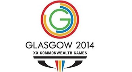
The new logo for the 2014 Commonwealth Games which will take place in Glasgow, was revealed today. The logo was designed by Glasgow-based design agency Marque and according to reports, is said to have cost £95,000. The design is based around numbers associated with the games. This is the 20th time the games have been held, there are 17 sports represented, and it takes place over 11 days of competition and 1 host city.
If you think it’s just a couple of partially completed rings wrapped around the letter G, here’s the full explanation from the press release on the Games website:
1. The Glasgow 2014 Commonwealth Games will be the 20th Games. This is a landmark number that adds to Glasgow’s pride in being its host. The outer ring, that encompasses the others, is a strong, vibrant red – the official “True Red” of the Commonwealth Games Federation (CGF) palette.
2. There will be 17 sports on the programme at Glasgow 2014. The next ring of the brand identity, in “Triumph Yellow” from the CGF palette, represents the number of sports. It’s exactly 17/20ths of the full circle.
3. Glasgow 2014 will host 11 days of competition, which are represented in the third ring of the brand identity, rendered in the CGF’s “Heritage blue”, and making up 11/20ths of the circle.
4. At the heart of our brand identity is 1 Host City, represented by “G” for Glasgow, meaning “Dear Green Place” in Gaelic, and is in a suitably vibrant green.
The Commonwealth Games Federation has also approved, for the first time, the use of an alternative Gaelic form of the design. The Gaelic version contains the type “Glaschu 2014”, followed by “20mh Geamaichean a’Cho Fhlaitheis” (20th Commonwealth Games).
Logo Design Love also has an analysis of the new logo, and you can see an animated version of the logo here, on the Scottish TV website.
Any thoughts on the logo? Do you think it’s a good design or the do you think it’s a type of design you’ve seen many times before?
Frequently Asked Questions about the Glasgow 2014 Commonwealth Games Logo
What was the inspiration behind the Glasgow 2014 Commonwealth Games logo?
The Glasgow 2014 Commonwealth Games logo was inspired by the city’s rich heritage and vibrant culture. The logo, designed by Marque Creative, features a stylized ‘G’ that represents Glasgow and the Games. The design is bold and dynamic, reflecting the city’s energy and the spirit of the Commonwealth Games. The use of multiple colors in the logo represents the diversity of the participants and the wide range of sports in the Games.
Who designed the Glasgow 2014 Commonwealth Games logo?
The Glasgow 2014 Commonwealth Games logo was designed by Marque Creative, a Glasgow-based design agency. The agency was chosen for their innovative approach and their understanding of the city’s unique character. Their design was chosen from a number of submissions, and it has been praised for its boldness and originality.
How was the Glasgow 2014 Commonwealth Games logo received?
The Glasgow 2014 Commonwealth Games logo was generally well received. It was praised for its bold and dynamic design, which was seen as a reflection of the city’s energy and the spirit of the Games. However, like any design, it also had its critics. Some felt that the design was too abstract, while others felt that it didn’t adequately represent the city or the Games.
What is the significance of the colors used in the Glasgow 2014 Commonwealth Games logo?
The colors used in the Glasgow 2014 Commonwealth Games logo were chosen to represent the diversity of the participants and the wide range of sports in the Games. The use of multiple colors also adds to the logo’s dynamism and energy, reflecting the spirit of the Games.
How does the Glasgow 2014 Commonwealth Games logo compare to logos of previous Games?
The Glasgow 2014 Commonwealth Games logo is unique in its design and use of color. While previous logos have often used a single color or a simple design, the Glasgow logo is bold and dynamic, with a complex design and multiple colors. This reflects the city’s vibrant culture and the energy of the Games.
How does the Glasgow 2014 Commonwealth Games logo represent the city of Glasgow?
The Glasgow 2014 Commonwealth Games logo represents the city of Glasgow through its bold and dynamic design. The stylized ‘G’ in the logo stands for Glasgow, and the design reflects the city’s energy and vibrant culture. The use of multiple colors also represents the city’s diversity.
What was the process of designing the Glasgow 2014 Commonwealth Games logo?
The process of designing the Glasgow 2014 Commonwealth Games logo involved a number of steps. First, a design brief was created, outlining the requirements for the logo. Then, a number of design agencies were invited to submit their designs. The design by Marque Creative was chosen for its boldness, originality, and its representation of the city and the Games.
How does the Glasgow 2014 Commonwealth Games logo reflect the spirit of the Games?
The Glasgow 2014 Commonwealth Games logo reflects the spirit of the Games through its bold and dynamic design. The use of multiple colors represents the diversity of the participants and the wide range of sports in the Games. The stylized ‘G’ stands for Glasgow, reflecting the city’s energy and the spirit of the Games.
What are some of the criticisms of the Glasgow 2014 Commonwealth Games logo?
Some of the criticisms of the Glasgow 2014 Commonwealth Games logo include its abstract design and the feeling that it doesn’t adequately represent the city or the Games. However, these criticisms are subjective and many people have praised the logo for its boldness and originality.
How does the Glasgow 2014 Commonwealth Games logo compare to the logos of other major sporting events?
The Glasgow 2014 Commonwealth Games logo stands out for its bold and dynamic design. While many logos of major sporting events use a single color or a simple design, the Glasgow logo uses multiple colors and a complex design. This reflects the city’s vibrant culture and the energy of the Games, setting it apart from other logos.
Jennifer Farley is a designer, illustrator and design instructor based in Ireland. She writes about design and illustration on her blog at Laughing Lion Design.
Published in
·Android·App Development·iOS·Mobile·Mobile Web Development·Tools & Libraries·August 7, 2015
Published in
·Design·Design & UX·Mobile·Mobile Web Development·UI Design·Usability·UX·January 5, 2016

Published in
·Content strategy·Copywriting·Design·Design & UX·Technology·UI Design·Usability·UX·June 28, 2016

