
Our journey to the world of CSS3 shadows continues. Today we will focus on another interesting feature—how to use multiple backgrounds with CSS3.
Key Takeaways
- Multiple backgrounds in CSS3 can reduce bandwidth usage, especially if the image contains repeating patterns, and provide a way for independent manipulation of different layers such as implementing a parallax effect.
- The use of multiple backgrounds simplifies the page structure and reduces the need for additional HTML elements or images, making the code easier to maintain.
- While multiple backgrounds can be used to create complex and dynamic backgrounds, there are some limitations. For instance, you cannot access a separate layer by ID, class, or any other parameter. To change an attribute for just one layer, you need to build a string describing this attribute for all the layers.
- All modern browsers, including IE10 and 9, support multiple backgrounds. However, it is advisable to use tools like Modernizr to provide some level of compatibility for older browsers by providing an alternative background.
Backgrounds Composition
There are many reasons why you may need to create a composition of multiple images to build your background. I think the most important are the following:
- to reduce bandwidth usage where the sum of the file sizes of separate images is less than the size of an image with merged layers (especially if your image contains repeating patterns), and
- to provide a way for independent manipulation of different layers (for example, if you are going to implement a parallax effect).
I believe you may have other reasonable arguments. :)
Classic Approach
So we need to build a multi-layered background by placing some images on top of others. How is this problem usually solved? It is really easy: just create a container (like a div element) for each of the images you have and add a background for it using a CSS rule. Next, you insert one container into another, or place them in a row, and apply corresponding CSS positioning rules. I have here a simple sample:
<div class="sample1">
  <div class="sea">
    <div class="mermaid"><div class="fishing"></div></div>
    <div class="fish"></div>
  </div>
</div>
The fishing class is inside the mermaid class for demo purposes only.
And here we have some CSS styles:
.sample1 .sea, .sample1 .mermaid, .sample1 .fishing {
   height: 300px;
   width: 480px;
   position: relative;
}


.sample1 .sea {
   background: url(media/sea.png) repeat-x top left;
}


.sample1 .mermaid {
   background: url(media/mermaid.svg) repeat-x bottom left;
}


.sample1 .fish {
  background: url(media/fish.svg) no-repeat;
  height: 70px;
  width: 100px;
  left: 30px;
  top: 90px;
  position: absolute;
}


.sample1 .fishing {
  background: url(media/fishing.svg) no-repeat top right 10px;
}
Result:
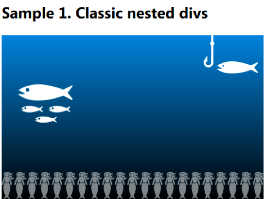
In this sample, I have three nested divs with background images and one more neighbor div, fish. You may imagine that the fish can be animated using JavaScript, or CSS3 transitions or animations.
Note, for the fishing class I’m using the new background positioning syntax, defined in CSS3. But for now it is supported only by IE9+ and Opera 11+; it does not yet work in Firefox 10 or Chrome 16. So the users of the last two cannot catch the fish. :(
Let’s continue. Is it possible to simplify this composition?
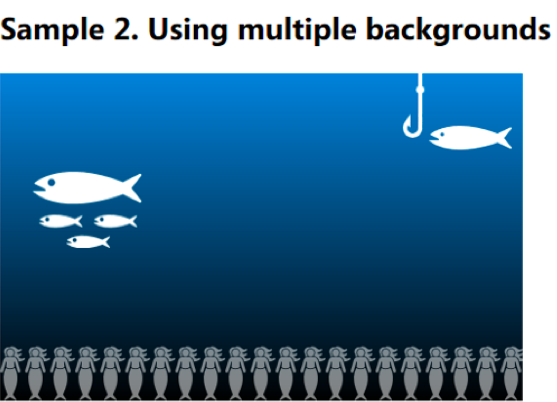
Multiple Backgrounds
This is when the multiple backgrounds come to the scene. This feature allows you to add more than one background at once, to the same element. Here is how it looks:
<div class="sample2">
  <div class="sea">
    <div class="fish"></div>
  </div>
</div>
And the styles:
.sample2 .sea {
  height: 300px;
  width: 480px;
  position: relative;
  background-image: url("media/fishing.svg"), url("media/mermaid.svg"), url("media/sea.png");
  background-position: top right 10px, bottom left, top left;
  background-repeat: no-repeat, repeat-x, repeat-x ;
}


.sample2 .fish {
  background: url("media/fish.svg") no-repeat;
  height: 70px;
  width: 100px;
  left: 30px;
  top: 90px;
  position: absolute;
}
To define multiple backgrounds you should use the background-image rule by enumerating your images (comma-separated). You may also use other rules to set a position, repeating mode, and other attributes to each of the images—just write them also using a comma-separated list for the corresponding rule. Note the order of images: they are listed left to right starting with the uppermost one and ending with the lowest one.
The result is 100% identical:
In One Rule
If you don’t need your fish to swim in an independent block, the whole background can be written in one simple rule:
<div class="sample3">
  <div class="sea"></div>
</div>
Styles:
.sample3 .sea {
  height: 300px;
  width: 480px;
  position: relative;
  background-image:  url("media/fishing.svg"), url("media/mermaid.svg"), url("media/fish.svg"), url("media/sea.png");
  background-position: top right 10px, bottom left, 30px 90px, top left;
  background-repeat: no-repeat, repeat-x;
}
I’m not showing the same picture one more time, but trust me—it is equal to the two images above. Look at the styles one more time, especially on the background-repeat rule. According to the spec, if a part of the list is omitted, the UA (browser) should repeat the present list to fill the rest.
In our case, it is equal to the following definition:
background-repeat: no-repeat, repeat-x, no-repeat, repeat-x;
Shorter Version
If you remember, in CSS2.1 it is possible to describe a background image in a one short background rule. What about multiple backgrounds? Actually, you can also use the background rule for multiple backgrounds:
.sample4 .sea {
  height: 300px;
  width: 480px;
  position: relative;
  background: url("media/fishing.svg") top right 10px no-repeat,
              url("media/mermaid.svg") bottom left repeat-x,
              url("media/fish.svg") 30px 90px no-repeat,
              url("media/sea.png") repeat-x;
}
But note that you can’t easily omit arguments unless the values are equal to the default ones. Also, if you would like to define the color of the background you should do it in the last layer.
Dynamic Images
Here is what we already know: if your background is mostly static—it may depend on the container size (i.e. if you are using % length so that some layers will shift on resizing window)—then the magic of multiple backgrounds is useful as it really simplifies the page structure. But what if you need to animate some of the layers using JavaScript (move, rotate and so on)?
I have a real life sample—the dandelion theme on the Yandex website (Russian search provider, YNDX):

If you look into the source code (press F12 in your IE to open devtools) you will find code like this:
<div class=b-skin-bg sizcache="272" sizset="0">
<div class=b-fluff-bg sizcache="272" sizset="0">
<div class=b-fluff__sky sizcache="272" sizset="0">
<div style="background-position: 3244px 0px" class=b-fluff__cloud></div>
<div style="width: 1200px" class=b-max-width sizcache="214" sizset="0">
<div class=b-fluff__placeholder sizcache="302" sizset="0">
<div style="bottom: 105px; display: none; left: 940px" class="b-fluff__item b-fluff_item_3" jQuery1328289994769="30"></div>
<div style="bottom: 50px; display: none; left: 879px" class="b-fluff__item b-fluff_item_3" jQuery1328289994769="31"></div>
<div style="bottom: 105px; display: none; left: 940px" class="b-fluff__item b-fluff_item_3" jQuery1328289994769="32"></div>
…
</div>
</div>
</div>
</div>
</div>
The divs with classes b-fluff-bg, b-fluff__cloud & b-fluff__item have the CSS rules applied, adding overlaying background images. The background with cloud scroll from left to right, and the backgrounds with dandelion seeds are flying across the screen.
Is it possible to rewrite such a composition using CSS3 multiple backgrounds? Actually, yes, but only if 1) it is supported in all target browsers and 2) continue reading ;)
How can we make our multiple backgrounds more dynamic? Internally, the browser parses every background rule into separate background-* rules for each of the attributes. It is very useful if you need to change only one of the attributes. For example, you can use the background-position rule to shift your images. But there are some penalties for dealing with multiple backgrounds: if you are going to move only one layer, you still need to rewrite this rule for all layers.
To animate our sea background, we can use the following JavaScript code:
$(document).ready(function() {
  var sea = $(".sample5 .sea")[0];
  var fishesX = 30;
  var fishesY = 90;
  var fishX = 0;
  var fishY = 0;
  var mermaidX = 0;
  var t = 0;

  function animationLoop() {
      fishesY = 90 + Math.floor(30 * Math.sin(t++ / 180.0));
      if(--fishesX  480) mermaidX = 0;
      fishY = -10 + (10 * Math.cos(t * 0.091));
      fishX = 10 + (5 * Math.sin(t * 0.07));

      sea.style.backgroundPosition = "top " + fishY + "px right " + fishX + "px, " + mermaidX + "px bottom," + fishesX + "px " + fishesY + "px, top left";

      window.requestAnimFrame(animationLoop);
  }
  animationLoop();
});
Where:
window.requestAnimFrame = (function() {
  return
      window.requestAnimationFrame ||
      window.msRequestAnimationFrame ||
      window.mozRequestAnimationFrame ||
      window.oRequestAnimationFrame ||
      window.webkitRequestAnimationFrame ||
      (function(callback) { window.setTimeout(callback, 1000 / 60); });
})();
Result (video):
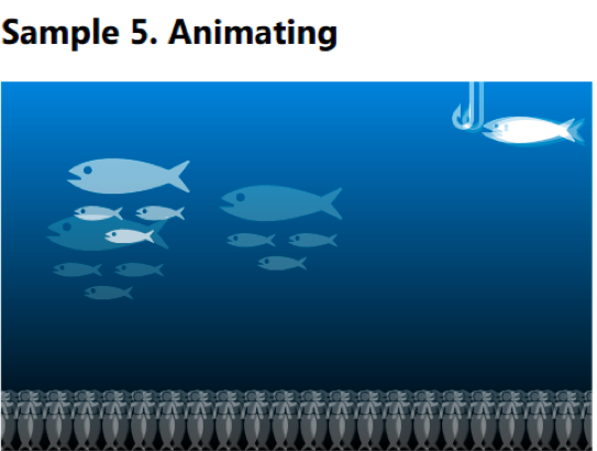
You may also use CSS3 Transitions or Animations, but that is a good topic for a separate discussion.
Parallax and Interactivity
Finally, using similar techniques you can easily add some parallax effects or other interactive effects to your background:
Multiple backgrounds are useful in such scenarios, and while we are talking only about backgrounds (not the content), using them is definitely a good way to avoid polluting the HTML code with complex, unnecessary elements. But as I said, there are some penalties if you need to build a complex and dynamic background: you cannot access a separate layer by ID, class or any other parameter. You should remember the order of layers in your code, and to change an attribute for just one layer you will need to build a string describing this attribute for all the layers you have. To update one layer, you need to update the whole composition:
sea.style.backgroundPosition = "top " + fishY + "px right " + fishX + "px, " + mermaidX + "px bottom," + fishesX + "px " + fishesY + "px, top left";
I’m sure it is possible to build a nice and useful JavaScript library which will virtualize all these layers and provide an easy way to change attributes for a separate layer, keeping clean your HTML code and the DOM.
Compatibility
All modern browsers including IE10 and 9 support multiple backgrounds. You may also use some tools like Modernizr to provide some level of compatibility for older browsers, i.e. by providing an alternative background. As Chris Coyier wrote in his article on the stacking order of multiple backgrounds, you can use the following approach:
.multiplebgs body {
  /* Awesome multiple BG declarations that transcend reality and impress chicks */
}


.no-multiplebgs body {
  /* laaaaaame fallback */
}
If you are confused about using JavaScript to provide backward-compatibility for the new CSS3 rules, you can just define the background property twice (but this approach may result in unnecessary downloads for modern browsers, depending on how they process such rules):
/* multiple bg fallback */
background: #000 url(...) ...;
/* Awesome multiple BG declarations that transcend reality and impress chicks */
background: url(...), url(...), url(...), #000 url(...);
And finally, if you wish to know it: yes, you can use multiple backgrounds in you Windows 8 metro style apps built with HTML and JavaScript.
PS Check this phenomenal article about the Cicada Principle by Alex Walker.
Note
CSS properties discussed in this article are defined in the CSS3 Backgrounds and Borders module, which is currently in the Working Draft status. Meanwhile it seems to be quite stable it still can change in details.
Frequently Asked Questions on Mastering CSS3 Multiple Backgrounds
What are the benefits of using multiple backgrounds in CSS3?
Using multiple backgrounds in CSS3 offers several benefits. Firstly, it allows for more complex designs without the need for additional HTML elements or images. This can simplify your code and make it easier to maintain. Secondly, multiple backgrounds can be layered to create a depth effect, adding visual interest to your design. Lastly, using multiple backgrounds can also improve performance by reducing the number of HTTP requests, as multiple images can be loaded in a single CSS declaration.
How can I control the position of multiple backgrounds?
You can control the position of multiple backgrounds in CSS3 by using the ‘background-position’ property. This property accepts two values: one for the horizontal position and one for the vertical position. You can specify these values in pixels, percentages, or using keywords like ‘top’, ‘right’, ‘bottom’, and ‘left’. If you’re using multiple backgrounds, you can specify a position for each background by separating the values with a comma.
Can I use different types of images as multiple backgrounds?
Yes, you can use different types of images as multiple backgrounds in CSS3. This includes raster images like JPEGs and PNGs, vector images like SVGs, and even gradients. You can specify the type of image using the ‘background-image’ property. If you’re using multiple backgrounds, you can specify a different type of image for each background by separating the values with a comma.
How does the browser render multiple backgrounds?
The browser renders multiple backgrounds in CSS3 from front to back, with the first background specified in your CSS being the frontmost layer and each subsequent background being placed behind the previous one. This means that if any of your backgrounds are partially or fully transparent, the backgrounds behind them will be visible.
Are multiple backgrounds supported in all browsers?
Multiple backgrounds are a feature of CSS3, and as such, they are supported in all modern browsers, including Chrome, Firefox, Safari, and Edge. However, they are not supported in Internet Explorer 9 or earlier. You can check the current level of support for multiple backgrounds on websites like Can I Use.
Can I use multiple backgrounds with CSS animations?
Yes, you can use multiple backgrounds with CSS animations. You can animate each background independently using keyframes and the ‘animation’ property. This allows for complex animations where different backgrounds move or change at different times or rates.
How can I control the size of multiple backgrounds?
You can control the size of multiple backgrounds in CSS3 using the ‘background-size’ property. This property accepts two values: one for the width and one for the height. You can specify these values in pixels, percentages, or using keywords like ‘cover’ and ‘contain’. If you’re using multiple backgrounds, you can specify a size for each background by separating the values with a comma.
Can I use multiple backgrounds on any HTML element?
Yes, you can use multiple backgrounds on any HTML element in CSS3. This includes block elements like divs and sections, inline elements like spans and links, and even pseudo-elements like ::before and ::after.
How can I control the repeat of multiple backgrounds?
You can control the repeat of multiple backgrounds in CSS3 using the ‘background-repeat’ property. This property accepts keywords like ‘repeat’, ‘repeat-x’, ‘repeat-y’, and ‘no-repeat’. If you’re using multiple backgrounds, you can specify a repeat for each background by separating the values with a comma.
Can I use multiple backgrounds with CSS transitions?
Yes, you can use multiple backgrounds with CSS transitions. You can transition each background independently using the ‘transition’ property. This allows for complex transitions where different backgrounds change at different times or rates.