

For a while now, I’ve been creating these 3D scenes with CSS for fun — usually on my live stream.
3D CSS Responsive Stunt Plane! 🛩️
It does loops and rolls! 😎
Responds to mouse movement 🐭
👉 https://t.co/A1zNmfEzzi via @CodePen pic.twitter.com/87D7LIXLr2
— Jhey 🐻🛠 (Exploring Opportunities ✨) (@jh3yy) March 27, 2021
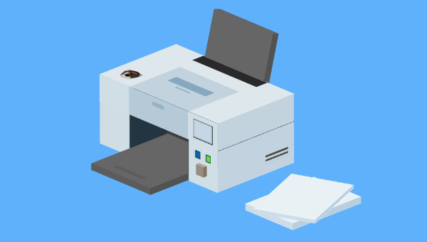
Each demo is an opportunity to try something different or work out ways to do things with CSS. One thing I often do is take suggestions for what we should try and make on the stream. A recent suggestion was a printer that prints in “3D”. And here’s what I put together!
📢 CSS Print Shop is open for business! 😅
Free printing! 😮
Input an image URL to see it printed out by the 3D CSS Printer 😁
👉 https://t.co/UWTDAyUadn via @CodePen pic.twitter.com/z3q9dJavYv
— Jhey 🐻🛠 (Exploring Opportunities ✨) (@jh3yy) April 22, 2021
Key Takeaways
- Utilize CSS transforms with the `transform-style: preserve-3d` property to create realistic 3D models and scenes directly in your web browser.
- Speed up 3D CSS modeling by using Pug as an HTML preprocessor, allowing for quick and efficient generation of complex 3D structures.
- Leverage CSS custom properties to easily manipulate and maintain the dimensions and positioning of 3D objects, enhancing reusability and reducing code redundancy.
- Explore the potential of CSS for creating interactive animations and effects, such as printing simulations, by combining keyframe animations and JavaScript interactions.
- Implement advanced CSS techniques, like extrusion and detailed texturing, to add depth and realism to 3D models, making them more visually appealing and dynamic.
- Enhance user interaction and functionality by integrating forms and JavaScript to control animations, demonstrating practical applications of CSS in web development beyond static designs.
Making Things 3D with CSS
I’ve written about making things 3D with CSS before. The general gist is that most scenes are a composition of cuboids.
To make a cuboid, we can use CSS transforms to position the sides of a cuboid — the magic property being transform-style. Setting this to preserve-3d allows us to transform elements on the third dimension:
* {
  transform-style: preserve-3d;
}
Once you create a few of these scenes, you start picking up ways to speed things up. I like to use Pug as a HTML preprocessor. The mixin ability gives me a way to create cuboids faster. The markup examples in this article use Pug. But for each CodePen demo you can use the “View Compiled HTML” option to see the HTML output:
mixin cuboid()
  .cuboid(class!=attributes.class)
    - let s = 0
    while s < 6
      .cuboid__side
      - s++
Using +cuboid()(class="printer__top") will produce this:
<div class="cuboid printer__top">
  <div class="cuboid__side"></div>
  <div class="cuboid__side"></div>
  <div class="cuboid__side"></div>
  <div class="cuboid__side"></div>
  <div class="cuboid__side"></div>
  <div class="cuboid__side"></div>
</div>
Then I have a set block of CSS I use to lay out the cuboids. The joy here is that we can leverage CSS custom properties to define the properties of a cuboid (as shown in the video above):
.cuboid {
  // Defaults
  --width: 15;
  --height: 10;
  --depth: 4;
  height: calc(var(--depth) * 1vmin);
  width: calc(var(--width) * 1vmin);
  transform-style: preserve-3d;
  position: absolute;
  font-size: 1rem;
  transform: translate3d(0, 0, 5vmin);
}
.cuboid > div:nth-of-type(1) {
  height: calc(var(--height) * 1vmin);
  width: 100%;
  transform-origin: 50% 50%;
  position: absolute;
  top: 50%;
  left: 50%;
  transform: translate(-50%, -50%) rotateX(-90deg) translate3d(0, 0, calc((var(--depth) / 2) * 1vmin));
}
.cuboid > div:nth-of-type(2) {
  height: calc(var(--height) * 1vmin);
  width: 100%;
  transform-origin: 50% 50%;
  transform: translate(-50%, -50%) rotateX(-90deg) rotateY(180deg) translate3d(0, 0, calc((var(--depth) / 2) * 1vmin));
  position: absolute;
  top: 50%;
  left: 50%;
}
.cuboid > div:nth-of-type(3) {
  height: calc(var(--height) * 1vmin);
  width: calc(var(--depth) * 1vmin);
  transform: translate(-50%, -50%) rotateX(-90deg) rotateY(90deg) translate3d(0, 0, calc((var(--width) / 2) * 1vmin));
  position: absolute;
  top: 50%;
  left: 50%;
}
.cuboid > div:nth-of-type(4) {
  height: calc(var(--height) * 1vmin);
  width: calc(var(--depth) * 1vmin);
  transform: translate(-50%, -50%) rotateX(-90deg) rotateY(-90deg) translate3d(0, 0, calc((var(--width) / 2) * 1vmin));
  position: absolute;
  top: 50%;
  left: 50%;
}
.cuboid > div:nth-of-type(5) {
  height: calc(var(--depth) * 1vmin);
  width: calc(var(--width) * 1vmin);
  transform: translate(-50%, -50%) translate3d(0, 0, calc((var(--height) / 2) * 1vmin));
  position: absolute;
  top: 50%;
  left: 50%;
}
.cuboid > div:nth-of-type(6) {
  height: calc(var(--depth) * 1vmin);
  width: calc(var(--width) * 1vmin);
  transform: translate(-50%, -50%) translate3d(0, 0, calc((var(--height) / 2) * -1vmin)) rotateX(180deg);
  position: absolute;
  top: 50%;
  left: 50%;
}
Using custom properties, we can control various characteristics of the cuboids, and so on:
--width: the width of a cuboid on the plane--height: the height of a cuboid on the plane--depth: the depth of a cuboid on the plane--x: the X position on the plane--y: the Y position on the plane
This isn’t very impressive until we put the cuboid into a scene and rotate it. Again, I use custom properties to manipulate the scene whilst I work on making something. Dat.GUI comes in super handy here.
See the Pen
CSS 3D Sandbox 🏖 by SitePoint (@SitePoint)
on CodePen.
If you inspect the demo, using the control panel updates custom CSS properties on the scene. This scoping of CSS custom properties saves a lot of repeated code and keeps things DRY.
More Than One Way
Much like many things in CSS, there’s more than one way to do it. Often you can compose a scene from cuboids and position things as and when you need. It can get tricky to manage though. Often there’s a need to group things or add some type of container.
Consider this example where the chair is its own sub-scene that can be moved around.
See the Pen
CSS Feng Shui by SitePoint (@SitePoint)
on CodePen.
Many recent examples aren’t as complex. I’ve been reaching for extrusion. This means I’m able to map out whatever I’m making in 2D elements. For example, here’s a helicopter I recently created:
.helicopter
  .helicopter__rotor
  .helicopter__cockpit
    .helicopter__base-light
    .helicopter__chair
      .helicopter__chair-back
      .helicopter__chair-bottom
    .helicopter__dashboard
  .helicopter__tail
  .helicopter__fin
    .helicopter__triblade
    .helicopter__tail-light
  .helicopter__stabilizer
  .helicopter__skids
    .helicopter__skid--left.helicopter__skid
    .helicopter__skid--right.helicopter__skid
  .helicopter__wing
    .helicopter__wing-light.helicopter__wing-light--left
    .helicopter__wing-light.helicopter__wing-light--right
  .helicopter__launchers
    .helicopter__launcher.helicopter__launcher--left
    .helicopter__launcher.helicopter__launcher--right
  .helicopter__blades
Then we can drop cuboids into all the containers using the mixin. Then apply a required “thickness” to each cuboid. The thickness becomes dictated by scoped custom properties. This demo toggles the --thickness property for cuboids that make the helicopter. It gives an idea of what the 2D mapping looked like to start with.
See the Pen
Extruding a Helicopter by SitePoint (@SitePoint)
on CodePen.
That’s the gist of how to go about making 3D things with CSS. Digging into the code will unveil some tricks for sure. But, in general, scaffold a scene, populate with cuboids, and color the cuboids. You’ll often want some different shades of a color so we can differentiate the sides of a cuboid. Any extra details are either things that we can add to a cuboid side or transforms we can apply to a cuboid. For example, rotating and moving on the Z axis.
Let’s consider a stripped-down example:
.scene
  .extrusion
    +cuboid()(class="extrusion__cuboid")
The new CSS for creating a cuboid with extrusion could look like this. Note how we’re including scoped custom properties for the color of each side too. It would be wise to drop some defaults under the :root here or fallback values:
.cuboid {
  width: 100%;
  height: 100%;
  position: relative;
}
.cuboid__side:nth-of-type(1) {
  background: var(--shade-one);
  height: calc(var(--thickness) * 1vmin);
  width: 100%;
  position: absolute;
  top: 0;
  transform: translate(0, -50%) rotateX(90deg);
}
.cuboid__side:nth-of-type(2) {
  background: var(--shade-two);
  height: 100%;
  width: calc(var(--thickness) * 1vmin);
  position: absolute;
  top: 50%;
  right: 0;
  transform: translate(50%, -50%) rotateY(90deg);
}
.cuboid__side:nth-of-type(3) {
  background: var(--shade-three);
  width: 100%;
  height: calc(var(--thickness) * 1vmin);
  position: absolute;
  bottom: 0;
  transform: translate(0%, 50%) rotateX(90deg);
}
.cuboid__side:nth-of-type(4) {
  background: var(--shade-two);
  height: 100%;
  width: calc(var(--thickness) * 1vmin);
  position: absolute;
  left: 0;
  top: 50%;
  transform: translate(-50%, -50%) rotateY(90deg);
}
.cuboid__side:nth-of-type(5) {
  background: var(--shade-three);
  height: 100%;
  width: 100%;
  transform: translate3d(0, 0, calc(var(--thickness) * 0.5vmin));
  position: absolute;
  top: 0;
  left: 0;
}
.cuboid__side:nth-of-type(6) {
  background: var(--shade-one);
  height: 100%;
  width: 100%;
  transform: translate3d(0, 0, calc(var(--thickness) * -0.5vmin)) rotateY(180deg);
  position: absolute;
  top: 0;
  left: 0;
}
We’ve gone with three shades for this example. But sometimes you may need more. This demo puts that together but allows you to change scoped custom properties. The “thickness” value will change the extrusion of the cuboid. The transforms and dimensions will affect the containing element with the class “extrusion”.
See the Pen
CSS Extrusion Example by SitePoint (@SitePoint)
on CodePen.
Scaffolding a Printer
To start, we can scaffold out all the pieces we need. With practice this becomes more obvious. But the general rule is to try to visualize everything as boxes. That gives you a good idea of how to break something up:
.scene
  .printer
    .printer__side.printer__side--left
    .printer__side.printer__side--right
    .printer__tray.printer__tray--bottom
    .printer__tray.printer__tray--top
    .printer__top
    .printer__back
See if you can visualize what we’re going for here. The two side pieces leave a gap in the middle. Then we have a cuboid that sits across the top and one that fills the back. Then two cuboids to make up the paper tray.
Once you’re at that stage, it’s a case of populating the cuboids, which looks like this:
.scene
  .printer
    .printer__side.printer__side--left
      +cuboid()(class="cuboid--side")
    .printer__side.printer__side--right
      +cuboid()(class="cuboid--side")
    .printer__tray.printer__tray--bottom
      +cuboid()(class="cuboid--tray")
    .printer__tray.printer__tray--top
      +cuboid()(class="cuboid--tray")
    .printer__top
      +cuboid()(class="cuboid--top")
    .printer__back
      +cuboid()(class="cuboid--back")
Note how we’re able to reuse the class names such as cuboid--side. These cuboids are likely to be the same thickness and use the same colors. Their position and size gets dictated by the containing element.
Piecing it together, we can can get something like this.
See the Pen
Printer Foundation by SitePoint (@SitePoint)
on CodePen.
Exploding the demo shows the different cuboids that make up the printer. If you turn off the extrusion, you can see the flat containing elements.
Adding Some Detail
Now, you may have noticed that there’s more detail than you’d get by just adding colors to each side. And this comes down to finding ways to add extra detail. We’ve got different options depending on what we want to add.
If it’s an image or some basic color changes, we can make use of background-image to layer up gradients, and so on.
For example, the top of the printer has details, as well as the opening of the printer. This code addresses the top side of the top cuboid. The gradient handles the opening of the printer and the details:
.cuboid--top {
  --thickness: var(--depth);
  --shade-one: linear-gradient(#292929, #292929) 100% 50%/14% 54% no-repeat, linear-gradient(var(--p-7), var(--p-7)) 40% 50%/12% 32% no-repeat, linear-gradient(var(--p-7), var(--p-7)) 30% 50%/2% 12% no-repeat, linear-gradient(var(--p-3), var(--p-3)) 0% 50%/66% 50% no-repeat, var(--p-1);
}
For the bear logo, we could use a background-image or even reach for a pseudo-element and position it:
.cuboid--top > div:nth-of-type(1):after {
  content: '';
  position: absolute;
  top: 7%;
  left: 10%;
  height: calc(var(--depth) * 0.12vmin);
  width: calc(var(--depth) * 0.12vmin);
  background: url("https://assets.codepen.io/605876/avatar.png");
  background-size: cover;
  transform: rotate(90deg);
  filter: grayscale(0.5);
}
If we need to add more extensive details, we’ll likely have to break out of using our cuboid mixin. For example, the top of our printer is going to have a preview screen using an img element:
.printer__top
  .cuboid.cuboid--top
    .cuboid__side
    .cuboid__side
    .cuboid__side
    .cuboid__side
      .screen
        .screen__preview
          img.screen__preview-img
    .cuboid__side
    .cuboid__side
Add some more details and we’re ready to get some paper in the mix!
See the Pen
Printer With Details by SitePoint (@SitePoint)
on CodePen.
Paper Journey
What’s a printer without some paper? We want to animate some paper flying into the printer and getting shot out the other end. Something like this demo: click anywhere to see a piece of paper fed into the printer and printed.
See the Pen
Click to Print by SitePoint (@SitePoint)
on CodePen.
We can add a block of paper to the scene with a cuboid and then use a separate element to act as a single sheet of paper:
.paper-stack.paper-stack--bottom
  +cuboid()(class="cuboid--paper")
.paper-stack.paper-stack--top
  .cuboid.cuboid--paper
    .cuboid__side
      .paper
        .paper__flyer
    .cuboid__side
    .cuboid__side
    .cuboid__side
    .cuboid__side
    .cuboid__side
But animating the paper flying into the printer takes some trial and error. It’s wise to play with different transforms in the DevTools inspector. This is a good way to see how things will look. Often, it’s easier to use wrapper elements too. We use the .paper element to make the transfer and then use .paper__flyer to animate feeding the paper:
:root {
  --load-speed: 2;
}

.paper-stack--top .cuboid--paper .paper {
  animation: transfer calc(var(--load-speed) * 0.5s) ease-in-out forwards;
}
.paper-stack--top .cuboid--paper .paper__flyer {
  animation: fly calc(var(--load-speed) * 0.5s) ease-in-out forwards;
}
.paper-stack--top .cuboid--paper .paper__flyer:after {
  animation: feed calc(var(--load-speed) * 0.5s) calc(var(--load-speed) * 0.5s) forwards;
}

@keyframes transfer {
  to {
    transform: translate(0, -270%) rotate(22deg);
  }
}

@keyframes feed {
  to {
    transform: translate(100%, 0);
  }
}

@keyframes fly {
  0% {
    transform: translate3d(0, 0, 0) rotateY(0deg) translate(0, 0);
  }
  50% {
    transform: translate3d(140%, 0, calc(var(--height) * 1.2)) rotateY(-75deg) translate(180%, 0);
  }
  100% {
    transform: translate3d(140%, 0, var(--height)) rotateY(-75deg) translate(0%, 0) rotate(-180deg);
  }
}
You’ll notice that there’s a fair bit of calc usage in there. To compose the animation timeline we can make use of CSS custom properties. Referring to a property, we can calculate the correct delays for each animation in the chain. The paper transfers and flies at the same time. One animation handles moving the container, another handles rotating the paper. Once those animations end, the paper gets fed into the printer with the feed animation. The animation delay is equal to the duration of the first two animations that run at the same time.
Run this demo where I’ve colored the container elements red and green. We make use of .paper__flyer‘s pseudo-element to represent the piece of paper. But the container elements do the hard work:
See the Pen
Paper Trail by SitePoint (@SitePoint)
on CodePen.
You may be wondering when the paper comes out at the other end. But, in fact, the paper isn’t the same element throughout. We use one element to go into the printer. And another element for the paper when it flies out of the printer. This is another instance where extra elements make our life easier.
The paper uses more than one element to do the loop, and then the paper gets positioned to the edge of that element. Running this demo with more colored container elements shows how it’s working.
See the Pen
Full Paper Trail by SitePoint (@SitePoint)
on CodePen.
Once again, it requires a bit of trial and error, as well as thinking about how we can leverage the use of container elements. Having a container with an offset transform-origin allows us to create the loop.
Printing
We have everything in place. Now it’s a case of actually printing something. To do this, we’re going to add a form that allows users to pass in the URL of an image:
form.customer-form
  label(for="print") Print URL
  input#print(type='url' required placeholder="URL for Printing")
  input(type="submit" value="Print")
With some styling, we get something like this.
See the Pen
With Printing Form by SitePoint (@SitePoint)
on CodePen.
The native behavior of forms and the use of required and type="url" means we only accept a URL. We could take this further with a pattern and check for certain image types. But some good URLs for random images don’t include the image type, such as https://source.unsplash.com/random.
Submitting our form doesn’t behave as we want, and also the printing animation runs once on load. A way around this would be to only run the animation when a certain class gets applied to the printer.
When we submit the form, we can make a request for the URL and then set the src for images in our scene — one image being the screen preview on the printer, the other being an image on one side of the paper. In fact, when we print, we’re going to add a new element for each printed piece of paper. That way, each print looks like it gets added to a pile. We can remove the piece of paper we have on load.
Let’s start by handling the form submission. We’re going to prevent the default event and call a PROCESS function:
const PRINT = e => {
  e.preventDefault()
  PROCESS()
}

const PRINT_FORM = document.querySelector('form')
PRINT_FORM.addEventListener('submit', PRINT)
This function will handle making the request for our image source:
let printing = false

const PREVIEW = document.querySelector('img.screen__preview-img')
const SUBMIT = document.querySelector('[type="submit"]')
const URL_INPUT = document.querySelector('[type="url"]')

const PROCESS = async () => {
  if (printing) return
  printing = true
  SUBMIT.disabled = true
  const res = await fetch(URL_INPUT.value)
  PREVIEW.src = res.url
  URL_INPUT.value = ''
}
We also set a printing variable to true, which we’ll use to track current state, and disable the form’s button.
Why do we make a request for the image instead of setting it on the image? We want an absolute URL to an image. If we use the “Unsplash” URL mentioned above, and then share it between the images, this might not work. That’s because we can run into scenarios where we have different images displayed.
Once we have the image source, we set the preview image source to that URL and reset the form’s input value.
To trigger the animation, we can hook into the “load” event of our preview image. When the event fires, we create a new element for the piece of paper to print and append it to the printer element. At the same time, we add a printing class to our printer. We can use this to trigger the first part of our paper animation:
PREVIEW.addEventListener('load', () => {
  PRINTER.classList.add('printing')
  const PRINT = document.createElement('div')
  PRINT.className = 'printed'
  PRINT.innerHTML = `
    <div class="printed__spinner">
      <div class="printed__paper">
        <div class="printed__papiere">
          <img class="printed__image" src=${PREVIEW.src}/>
        </div>
      </div>
      <div class="printed__paper-back"></div>
    </div>
  `
  PRINTER.appendChild(PRINT)
  // After a set amount of time reset the state
  setTimeout(() => {
    printing = false
    SUBMIT.removeAttribute('disabled')
    PRINTER.classList.remove('printing')
  }, 4500)
})
After a set amount of time, we can reset the state. An alternative approach would be to debounce a bubbling animationend event. But we can use a setTimeout, as we know how long the animation will take.
See the Pen
Printing Progress by SitePoint (@SitePoint)
on CodePen.
Our printing isn’t to the correct scale though. And that’s because we need to scale the image to the piece of paper. We need a small piece of CSS for this:
.printed__image {
  height: 100%;
  width: 100%;
  object-fit: cover;
}
It would also be neat if the lights on the front of the printer communicated that the printer is busy. We could adjust the hue of one of the lights when the printer is printing:
.progress-light {
  background: hsla(var(--progress-hue, 104), 80%, 50%);
}
.printing {
  --progress-hue: 10; /* Equates to red */
}
Put that together and we’ve got a “working” printer made with CSS and a smidge of JavaScript.
See the Pen
Printing to Scale by SitePoint (@SitePoint)
on CodePen.
That’s It!
We’ve taken a look at how we can make a functional 3D Printer with CSS, a smidge of JavaScript, and leveraging Pug. Try adding the following image link in the URL field, or another one of your choice, and take it for a spin!
https://source.unsplash.com/random
See the Pen
CSS Printing Shop ✨ by SitePoint (@SitePoint)
on CodePen.
We covered a bunch of different things to achieve this, including these:
- how to make 3D things with CSS
- using Pug mixins
- using scoped custom CSS properties to keep things DRY
- using extrusion to create 3D scenes
- handling forms with JavaScript
- composing animation timelines with custom properties
The joy of creating these demos is that many of them pose different problems to overcome, such as how to create certain shapes or construct certain animations. There’s often more than one way to do something.
What cool things could you make with 3D CSS? I’d love to see!
As always, thanks for reading. Wanna see more? Come find me on Twitter or check out my live stream!
Frequently Asked Questions (FAQs) about 3D CSS Printer
What is a 3D CSS Printer?
A 3D CSS Printer is a unique concept that uses Cascading Style Sheets (CSS), a style sheet language used for describing the look and formatting of a document written in HTML, to create a 3D representation of a printer. This innovative approach allows developers to create interactive and visually appealing web elements that can enhance user experience.
How does a 3D CSS Printer work?
A 3D CSS Printer works by using CSS properties to create a 3D model of a printer. It uses properties such as transform, perspective, and animation to create the 3D effect. The printer is made up of multiple elements, each styled and positioned to create the overall 3D effect. The animation property is then used to create the printing effect.
Can I customize the 3D CSS Printer?
Yes, you can customize the 3D CSS Printer. You can change the colors, size, and even the animation speed. This is done by modifying the CSS properties of the printer. For example, you can change the color by modifying the background-color property of the printer elements.
How can I integrate a 3D CSS Printer into my website?
Integrating a 3D CSS Printer into your website involves copying the CSS and HTML code into your website’s code. You will need to ensure that the CSS code is included in the head section of your HTML document, and the HTML code is placed where you want the printer to appear on your webpage.
Is it possible to animate the 3D CSS Printer?
Yes, it is possible to animate the 3D CSS Printer. The animation is achieved using the CSS animation property. This property allows you to create keyframes that define the start and end states of the animation, as well as any intermediate steps.
What browsers support 3D CSS Printer?
The 3D CSS Printer should work on all modern browsers that support the CSS transform and animation properties. This includes browsers like Google Chrome, Mozilla Firefox, Safari, and Microsoft Edge.
Can I use 3D CSS Printer for commercial purposes?
Yes, you can use the 3D CSS Printer for commercial purposes. However, it’s always a good idea to check the licensing terms of any code you use to ensure you’re in compliance.
What skills do I need to create a 3D CSS Printer?
To create a 3D CSS Printer, you need a good understanding of HTML and CSS. You should be familiar with CSS properties like transform, perspective, and animation. Basic knowledge of 3D modeling can also be helpful, but it’s not necessary.
Can I use JavaScript with 3D CSS Printer?
Yes, you can use JavaScript with the 3D CSS Printer. While the printer can be created using only CSS, JavaScript can be used to add interactivity, such as starting or stopping the animation based on user actions.
Are there any resources to learn more about 3D CSS Printer?
There are many online resources to learn more about 3D CSS Printer. Websites like SitePoint, CSS-Tricks, and MDN Web Docs have extensive tutorials and guides on CSS animations and 3D transformations. YouTube also has many video tutorials on the subject.

