Key Takeaways
- Password strength is determined by its entropy, a measure of randomness, which is usually expressed in bits. Therefore, a long password with nothing but lower-case letters is stronger than a short password with a mixture of characters.
- Password validation tools often mislead users by emphasizing character substitution over length, teaching users to create passwords that are hard for humans to remember but easy for computers to guess.
- Best practices for password creation should focus on validating password length, not format. Encouraging users to create long, memorable passwords using phrases or associations can result in stronger passwords that are less likely to be cracked by brute-force methods.
It’s getting more common for sign-up forms to validate the format of passwords, and then give visual feedback on the password’s content or strength.
You’ve probably seen Google’s signup form, or something very like it, which is actually quite a good example (and I’ll talk about why in a moment):

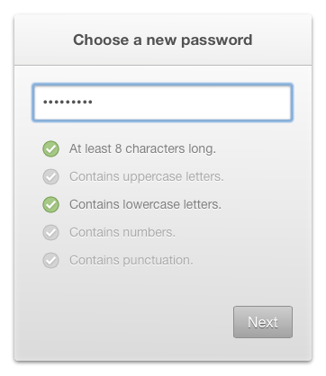
You might also have seen examples like this being suggested and used on the web:

The idea of having that checklist is to reduce friction for users, by providing specific feedback on the format that’s required, rather than simply rejecting the password on vague or unspecified terms.
But it’s still a bad idea, however well it’s implemented, because it propagates a misleading view of what constitutes a good password.
To understand this issue, we need to begin by understanding how a password’s strength is determined.
What makes a strong password?
The strength of a password is typically described using the term password entropy
, which is a measure of its randomness. It’s not so much a measure of that specific password, as of all the possible passwords which contain the same range of characters (i.e. all the possibilities a computer would have to try in order to crack it by brute-force).
Entropy is usually expressed in bits: if we refer to a password as having n bits of entropy, it means that the entropy value is 2 to the power n. A single lower-case English letter has approximately 4.7 bits of entropy, because 24.7 is approximately 26. So if a password only contains lower-case letters, then each will add another 4.7 bits of entropy (i.e. a two-letter password will have 9.4 and so on).
If we replace one or more letters with other characters, then the range (and therefore the entropy) will increase. There are 94 non-diacritic letters, numbers and special characters in US ASCII, so each will have approximately 6.55 bits of entropy (because 26.55 is approximately 94).
Therefore an eight-letter password which might contain any of these characters will have approximately 52.4 bits of entropy, whereas a password of the same length with only lower-case letters will have 37.6 bits of entropy.
However a sixteen-letter password with only lower-case letters will have 75.2 bits of entropy.
To put that into some kind of context: a password with 52.4 bits of entropy might be cracked by a desktop PC in less than half an hour, while a password with 75.2 bits of entropy could take several hundred years. The longer the password, the more time it takes to crack, exponentially.
So in general terms, a long password with nothing but lower-case letters is better than a short password with a mixture of characters.
Putting theory into practice
This throws a different light on what constitutes a good password. It means that this is my password
is a much stronger password than pA5%w*rD
, and yet it’s so much easier to remember.
Although we must concede that there is a problem with this way of analysing passwords, which is its assumption that every character was randomly chosen. In practice that’s seldom the case, since passwords are usually chosen by people, and people don’t make random choices.
One example of non-random choices is psychological traits — the tendency of people to use obvious words, celebrity names, or common associations. Password-cracking software might take account of such things to optimize its work, and produce results more quickly than is mathematically probable. But it’s not really possible to quantify this when calculating password entropy, because it requires knowledge that can’t be easily abstracted.
Though the Gmail validation tool clearly does takes account of some of these things, since it indicates that this is my password
is weaker than this is my whatever
, simply because it contains the word password
.
But it also indicates that pA5%w*rD
is stronger, even though it’s actually very much weaker (as we’ve seen).
And this is the problem with all the password-validation tools I’ve seen — character substitution is given far more emphasis than it deserves, while creating a longer password is given little or no emphasis at all. They’re teaching users to create passwords which are hard for humans to remember but easy for computers to guess.
Putting practice into best-practice
I said at the start that the Gmail tool was quite a good example, and that’s because it assesses the overall password rather than just its individual characters, so it will at least indicate that a longer password is stronger than a short one. I also said that the second example was a bad idea, and that’s because it only highlights character replacement, which is nowhere near as important, and potentially counter-productive.
If I were to sum this up into a general suggested best-practice, it would be this:
- don’t validate the format of a password, only validate its length
- or if you are going to validate the format, don’t make it required
I can remember once or twice being forced by a site to choose a different password, simply because it didn’t have a mixed-character format. As a user, I found that incredibly frustrating; but it’s also doubly ironic, since it could end up making people use a shorter, and therefore weaker password, or to use the same password for many different sites.
I would advocate two separate fields — one for the password and one to confirm — along with some notes underneath that explain how to write a strong yet memorable password. Both fields are required and must have a minimum length (and obviously must be the same), but the password’s character format isn’t validated or required.
Because ultimately, it’s up to users what kind of password they want to use. As service providers, it’s our responsibility to maintain the security of our users’ accounts. If we’re using techniques like salting and key stretching to store passwords more securely, then it shouldn’t really matter what they choose.
Personally, I like to use old phone numbers and places I’ve lived. For example, if I lived in New York and I can still remember my phone number there, I might use “New York 219 555 4209” as my password. That’s immensely strong, but also easy for me to remember.
A more general approach is to take several words that are not commonly associated, and then visualise an association between them (like that xkcd cartoon). Simply forming a visual association makes the password more memorable, especially if it has a personal meaning for you; and if it’s all in lower-case letters then you don’t need to remember any convoluted replacements.
It’s easy to imagine some kind of TV drama situation, where Sherlock Holmes is sitting at our computer, trying to guess our password using psychological insights. Do we like Star Trek, drink Yorkshire Tea, or listen to Iron Maiden? In that case “ir0n//ma1d3n” would be harder to guess than “iron maiden” (though not by much, given Holmes’ inevitable knowledge of common substitutions!).
But that’s not going to happen anyway, and users may need to be taught to understand this. Passwords are almost never cracked by people with personal knowledge, they’re cracked by computers with brute-force — and for them, size is everything!
Frequently Asked Questions about Password User Experience (UX)
Why is password UX important in web design?
Password UX is a critical aspect of web design because it directly impacts user satisfaction and security. A well-designed password UX encourages users to create strong, unique passwords, which enhances their account security. It also reduces user frustration by making the password creation and login process smooth and intuitive. Poor password UX, on the other hand, can lead to weak passwords, user frustration, and even account abandonment.
What are some common mistakes in password UX design?
Common mistakes in password UX design include not providing clear instructions for password requirements, not offering a password strength meter, forcing users to create overly complex passwords, and not providing an option to show or hide the password. These mistakes can lead to user frustration and weak passwords.
How can I improve the password UX on my website?
To improve the password UX on your website, you should provide clear instructions for password requirements, offer a password strength meter, allow users to show or hide their password, and avoid forcing users to create overly complex passwords. You should also consider implementing passwordless login options, such as biometric authentication or single-use codes sent via email or SMS.
What is a password strength meter and how does it improve password UX?
A password strength meter is a tool that provides real-time feedback on the strength of a user’s password as they type it. It encourages users to create stronger passwords by showing them how their current password could be improved. This not only enhances account security but also educates users about what constitutes a strong password.
Why is it a bad idea to force users to create overly complex passwords?
Forcing users to create overly complex passwords can lead to user frustration and weak passwords. Users are likely to forget complex passwords and may resort to insecure practices, such as writing their password down or reusing passwords across multiple accounts. Instead, encourage users to create long, unique passwords and provide a password strength meter to guide them.
What are passwordless login options and how do they improve password UX?
Passwordless login options, such as biometric authentication or single-use codes sent via email or SMS, eliminate the need for users to remember a password. This not only improves user satisfaction but also enhances account security, as these methods are typically harder to hack than traditional passwords.
How can I educate users about creating strong passwords?
You can educate users about creating strong passwords by providing clear instructions for password requirements, offering a password strength meter, and providing tips and best practices for password creation. You could also consider implementing a password education program or providing resources for further reading.
What role does password UX play in account security?
Password UX plays a crucial role in account security. A well-designed password UX encourages users to create strong, unique passwords, which enhances their account security. Poor password UX, on the other hand, can lead to weak passwords and increased vulnerability to hacking.
How can I test the effectiveness of my password UX?
You can test the effectiveness of your password UX through user testing. This involves observing users as they create a password and log in to their account, and asking them for feedback on the process. You can also analyze user behavior data, such as the number of failed login attempts or password resets.
What are some examples of good password UX?
Examples of good password UX include clear instructions for password requirements, a password strength meter, an option to show or hide the password, and passwordless login options. Websites that implement these features typically see higher user satisfaction and stronger account security.
James is a freelance web developer based in the UK, specialising in JavaScript application development and building accessible websites. With more than a decade's professional experience, he is a published author, a frequent blogger and speaker, and an outspoken advocate of standards-based development.

