
Icons have been used in design since, well, since design began. From the hieroglyphics on the pyramids of ancient Egypt to the orange RSS icon now gracing so many web sites, icons have been used in both print and in web design for the same purpose — to draw the eye quickly to important parts of the document or web page.
Practical Use
Icons sum up and convey lots of information quickly, and you can use them on your site to grab your visitor’s attention, rapidly communicate an idea, or highlight a section of your site.
Let’s take a look at some random sites and how they use icons to communicate, make navigation easier, or just make the page look pretty!
Some examples of the use of icons include:
1. Add visual interest to navigation.

The digital artifex site uses icons in association with some text for a mid-page navigation setup .
2. Draw attention to specific parts of a page, such as special offers.
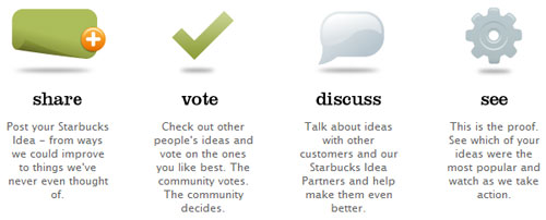
On the My Starbucks Idea homepage, the icons draw the user’s eyes to what might otherwise be a fairly cluttered page with a lot of text.
3. Draw the eye to services that you provide.

Sitemaker uses icons to communicate using well understood images — for example, a pie chart icon to illustrate increasing sales.
4. Add extra “oomph” to headings.
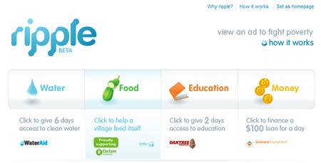
The Ripple site is currently in beta but the homepage consists almost entirely of the four icons. It’s very simple and engaging.
As well as providing a very practical function, you can also use icons for aesthetically pleasing purposes too. On some web pages you’ll find that the icons used are an extension of the company branding, while on others there is sometimes a sense that they icons are there for no other reason than to look pretty. If you are using icons to add a little extra “oomph” to your site, remember that for most of your visitors, the icons should have some sort of meaning or association so make sure that your choice of icons does not confuse your users.
Evolution of the Web Icon
Old-school icons such as a little house representing “home” and the outline of an envelope representing “email” have now been replaced with miniature works of art.
![]()
(Yes this is actually an icon!)
If you like a challenge, you can make your own icons in an image editor such as Photoshop or Paint Shop Pro. Otherwise, there are some incredibly beautiful icons available to download for free, such as the Silk icon set or those available at IconPot. A quick search on Google will astound you with what’s available.
A New Icon
I think it’s important to mention a new kind of icon that has evolved in recent times entirely for use on web sites — the favicon. As you’re no doubt aware, the favicon is that little picture that appears on the URL address bar of your browser, and also on the tabs of some browsers.
![]()
The favicon is now part and parcel of every web design, and should be included as part of your overall branding. Alyssa recently covered an amazing list of 88 outstanding examples.
What do you think makes a good icon? Do you use icons on your sites? If not, why not?
Related Reading:
Frequently Asked Questions about Using Icons on Websites
How can I use icons effectively on my website?
Icons are a great way to enhance the user experience on your website. They can be used to guide users, highlight important information, or simply to add visual interest. To use icons effectively, it’s important to choose icons that are clear and easy to understand. They should also be consistent in style and size to maintain a professional look. You can use tools like Iconse to find and customize icons to suit your website’s design.
Can I customize the icons I use on my website?
Yes, most icon libraries like Iconse allow you to customize the icons to match your website’s design. You can change the color, size, and sometimes even the shape of the icons. This allows you to maintain a consistent look and feel across your website.
Are there any rules or guidelines for using icons on a website?
While there are no hard and fast rules for using icons, there are some best practices to follow. Icons should be used sparingly and only when they add value to the user experience. They should be clear and easy to understand, and they should be consistent in style and size. It’s also important to ensure that your icons are accessible to all users, including those with visual impairments.
How can I ensure that my icons are accessible to all users?
To ensure that your icons are accessible, you should provide alternative text for each icon. This text will be read out loud by screen readers, allowing visually impaired users to understand the purpose of the icon. You should also ensure that your icons are large enough to be easily seen and clicked on, and that they contrast well with the background.
Can I use icons to replace text on my website?
While icons can be a great way to simplify your website and make it more visually appealing, they should not be used to replace important text. Icons can be ambiguous and may not be understood by all users, so it’s important to use them in conjunction with text to ensure that your message is clear.
Where can I find free icons for my website?
There are many online resources where you can find free icons for your website. Websites like Iconse, FontAwesome, and Flaticon offer a wide range of icons in various styles and sizes. You can search for specific icons or browse through categories to find the perfect icons for your website.
What are the benefits of using icons on my website?
Icons can enhance the user experience on your website in several ways. They can guide users, highlight important information, and add visual interest. Icons can also make your website more accessible by providing visual cues for users with visual impairments.
How can I add icons to my website?
Adding icons to your website is relatively straightforward. Most icon libraries provide code snippets that you can simply copy and paste into your website’s HTML. You can also download the icons and upload them to your website as images.
Can I use icons on my mobile website?
Yes, icons can be a great way to simplify the user interface on mobile websites. They can be used to replace text, making the website easier to navigate on small screens. However, it’s important to ensure that your icons are large enough to be easily clicked on a mobile device.
How can I choose the right icons for my website?
Choosing the right icons for your website depends on your website’s design and the message you want to convey. You should choose icons that are clear and easy to understand, and that match the style of your website. You can use tools like Iconse to search for specific icons or browse through categories to find the perfect icons for your website.