

Key Takeaways
- The tutorial provides a step-by-step guide to creating Windows XP-style icons using Adobe Illustrator or Freehand, starting with deconstructing an existing XP icon.
- The process involves creating individual shapes for different parts of the icon, filling them with gradients, and arranging them in the correct order to create a 3D effect.
- The tutorial also demonstrates how to add a drop-shadow in Photoshop to give the icon a more “official” XP look.
- The tutorial emphasizes the importance of understanding perspective drawing, simplifying objects for icon design, and being familiar with Microsoft’s style and design guide for creating Windows XP icons.
In this third and last article of our vector graphic series, you’ll use your knowledge of faux 3d vector graphics as we walk step-by-step through a real-life, practical application that I think you’ll find extremely useful.
You’ll learn how to make your own Windows XP-style artwork, which you may end up using for Website graphics, software application icons, or in other projects.
Note: I’ll be making my diagrams and commands using Adobe Illustrator 8, but those who use Freehand should be able to follow along just as easily.
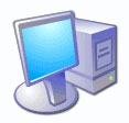
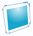
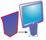
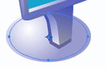
Let’s start by deconstructing a familiar XP icon — the flat-screen monitor shown here:
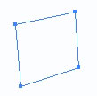
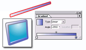
First, create a rectangular shape for the screen using the Pen tool. It’s helpful if you understand a little bit about how to draw with perspective (see the links at the end of this article if you want to learn more).
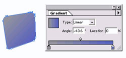
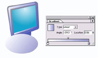
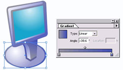
Fill the shape with a radial, white-to-aqua gradient.
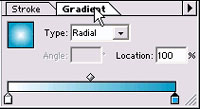
Using the gradient tool, click and hold near the upper middle edge of the shape and drag down, releasing the mouse button just before you reach the bottom of the shape.
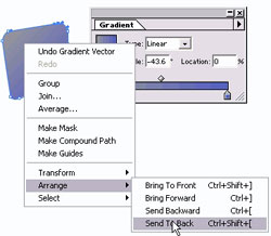
Now, we’ll create a rounded-edged shape around the screen, which will act as the frame of the monitor. Set the fill of the shape to “none” to help you see what you’re doing, then use the pen tool to draw an edge around the screen with rounded corners.
One the shape looks the way you like it, fill it with a grey-to-purple gradient.
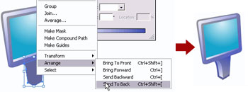
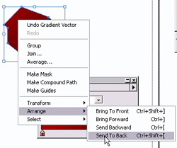
Right-click on the shape and choose Arrange > Send to Back. This will allow the blue screen shape to lie on top.
Now, use the Pen tool to create a rounded “L” shape along the top and left edges of the screen and fill it with a purple-to-white gradient. Use the gradient tool to fill the shape with the white coming from the top left corner to make it look like the light is coming from that direction.
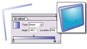
Create a highlighted edge along the bottom of the screen using the Pen tool as well. Don’t be afraid to zoom in and use the white arrow tool to adjust the edges. We also filled this with the same white-to-purple gradient.
The screen part is done! Now, for the stand…
The stand is essentially made up of two shapes that make the front surface and side surface. First, create the shape for the front surface. I filled it with the grey-to-purple gradient.
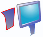
Next, create the side shape and fill it with a purple-to-white gradient. The gradient changes from dark-to-light from top to bottom, which makes it look as if the light is hitting the monitor from that side, but the top part is slightly shaded by the screen.
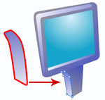
Finally, create a “border” for the shape. This new shape juts out slightly on the left and bottom of the stand, but aligns with the right border of the stand.
When you fill this shape (with a dark purple color, or purple-to-grey gradient), it will hide the pair of shapes that make up the stand.
Again, right-click on the shape and go to Arrange > Send to Back to send the “border” behind the shapes of the stand.
Finally, using the ellipse tool, create the base of the stand, filled with a light white-to-lavender fill.
Again, “Send to Back” to place the base behind all the other objects.

Choose the Scale tool.
With the base still selected, click and hold the mouse button to scale it down very slightly. Hold the Alt key (Option for Mac) while you drag slightly inward and let go of the mouse button. What this does is scale down a copy of the shape. Now you should have two ellipses, one inside of the other.
Select the outer shape and fill it with the darker grey-to-purple gradient colors.
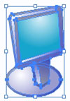
And there you have it: a vector version of a flat-screened monitor that looks disturbingly like the Windows XP monitor graphic, using nine individual shapes and lots of gradients.

Now, let’s put this shape into Photoshop and add a drop-shadow to make it look “officially” XP-ish. Select the entire group of objects and copy.
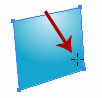
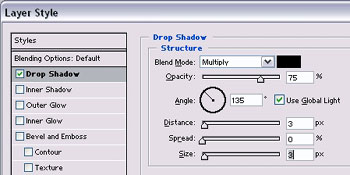
Paste the shape into a Photoshop document (“as pixels”), resize it as needed, then go to Layer > Layer Style > Drop Shadow.
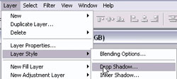
Set the angle of the drop shadow to 135. Set the Distance and Size to 2 or 3 pixels and adjust it to suit the size of your graphic.
And there you have it: an XP-style computer monitor!

Now, to create and make up your own Windows XP-style graphics will take a bit more artistic skill. In particular, you have to be comfortable with drawing in perspective, and you must be able to take the object you want to draw and “simplify” it so that the icon or graphic will work at small or large sizes.
The first step is to get familiar with Microsoft’s style and design guide for creating Windows XP icons. This gives you some guidelines on what the “look” is all about (“fun, color, and energy”), provides a general color palette (duplicated below), and gives examples of how objects should be angled and grouped.
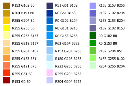
The color palette used in Windows XP icons.
Did you enjoy reading through the style guide? Then, let’s get started with this last step-by-step example, where I’ll show you how I make a dog house graphic in the Windows XP style.
In The Dog House!
First, I make a rough sketch of what I want the icon to look like, keeping in mind the angle guidelines provided by Microsoft.

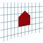
Then, I create a grid of lines that match the perspective grid from the Microsoft style guide, and use the pen tool to create the front of the doghouse. (You may download an Illustrator file with the same grid.)
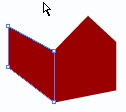
Once I have the front of the doghouse, I hide the grid (View > Hide Guides) and use the pen tool to draw the side of the dog house:
I fill the side and the front with a red-to-darker-red gradient:
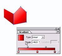
Then I draw two more shapes for the roof and fill them with a darker red-brown gradient. The second shape (the right diagram) is the back side of the roof; it’s what the shape would be if you could “see through” the house. It looks a bit odd in the diagram because it’s lying on top of all the other pieces of the dog house.
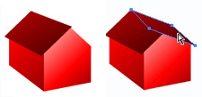
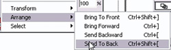
So, I right-click the second shape (the “back” roof) and choose Arrange > Send to Back.
This gives me a nice dog house shape.

I use the pen tool again to create a door shape and fill it with the darker gradient colors.
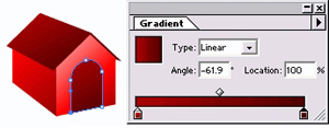
Then, I use the pen tool — set to “no fill” — to draw an outline around the entire shape. I fill it with an even darker red-brown gradient to get a “border” for the shape.
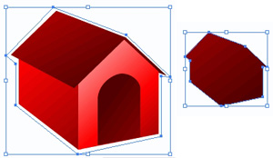
Since this new shape is lying on top of everything else (and hiding the other parts of the image), I send it to the back as before.
My finished vector graphic:

After I copy it into Photoshop and add a drop shadow, the graphic is complete!

That wasn’t too hard, was it?
Notes, Links, and References
In some cases, you can get away with setting a stroke for a shape instead of using the pen tool to make a “custom border.” With larger-sized graphics, however, I like to make a custom border because then I can have a gradient-filled “stroke.”
The Microsoft “Creating Windows XP Icons” document also gives a nice overview of how to take your Photoshop file and, using another piece of icon-editing software, create an icon file (.ico) out of it.
There are tons of other icon editors out there. A simple search at download.com returns lots of results that you can try.
If you want to learn more about perspective drawing, here are a few places to start:
Did this article make you wonder, “How do I make ‘aqua’ (Mac) icons?” Here are two sites that might be helpful with the design aspect of that particular challenge. Just be aware that Mac icons generally require “real” 3D-rendering:
- http://www.pixelcentric.net/aquaicons.html
- http://www.pyrusmalus.com/icons/c/icons_process.html
Stuck for ideas with the “drawing” aspect? intersmash.com shows just how many ways you can make an arrow icon or a shopping cart icon.
Frequently Asked Questions about Creating XP-Style Icons
What software can I use to create XP-style icons?
There are several software options available for creating XP-style icons. Some of the most popular ones include Adobe Photoshop, GIMP, and IconXP. These programs offer a range of tools and features that can help you design and create icons that resemble the classic Windows XP style. They also allow you to save your icons in various formats, including .ico, which is the format used for Windows icons.
Can I use vector graphics to create XP-style icons?
Yes, you can use vector graphics to create XP-style icons. Vector graphics are ideal for icon design because they can be scaled without losing quality. This means you can create a single icon design and then resize it to fit different applications, from small toolbar icons to larger desktop icons.
How can I add a shadow effect to my XP-style icons?
Adding a shadow effect to your XP-style icons can give them a more three-dimensional look. This can be done using the layer styles feature in graphic design software like Adobe Photoshop. Simply create a new layer for your icon, apply the shadow effect, and adjust the settings to achieve the desired look.
What are the standard sizes for XP-style icons?
The standard sizes for XP-style icons are 16×16, 32×32, and 48×48 pixels. However, you can create icons in other sizes as well, depending on your specific needs. Just remember that the icon should be clear and recognizable at its smallest size.
Can I use custom colors in my XP-style icons?
Yes, you can use custom colors in your XP-style icons. While the classic Windows XP icons are known for their bright, bold colors, you are not limited to these hues. You can use any colors you like in your icon designs, as long as they are clear and easy to distinguish at small sizes.
How can I make my XP-style icons look glossy?
To give your XP-style icons a glossy look, you can use the gradient tool in your graphic design software. Apply a gradient to your icon, going from a lighter color at the top to a darker color at the bottom. This will create the illusion of a light source and give your icon a shiny, glossy appearance.
Can I create animated XP-style icons?
While Windows XP does not natively support animated icons, there are third-party software options that allow you to create and use animated icons on your desktop. However, keep in mind that animated icons can be more resource-intensive and may slow down your system if used excessively.
How can I convert my XP-style icons to other formats?
Most graphic design software allows you to save your icons in various formats. For example, you can save your icon as a .png or .jpg file for use on the web, or as a .ico file for use as a Windows icon. Simply choose the desired format when saving your icon.
Can I use my XP-style icons on other operating systems?
Yes, you can use your XP-style icons on other operating systems, as long as the operating system supports the .ico file format. However, the appearance of the icons may vary depending on the operating system’s icon rendering capabilities.
How can I share my XP-style icons with others?
You can share your XP-style icons with others by saving them as .ico files and then sending them via email, uploading them to a file sharing site, or including them in a software package. Just make sure to respect copyright laws and only share icons that you have created yourself or have permission to distribute.

