
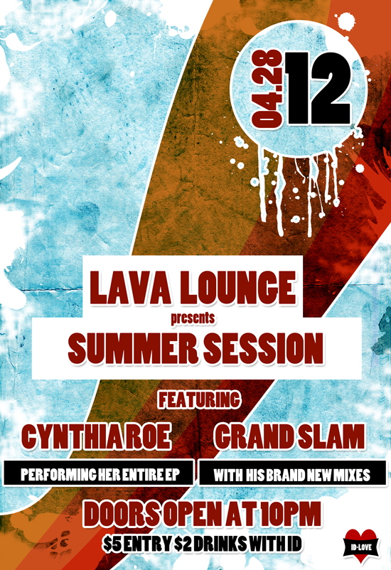
Despite living in a world that’s growing progressively more digital, printed event flyers are still a surprisingly common project to find on a designer’s desk or within their inbox. These flyers are often for parties, Q&A sessions, fundraisers, conferences, film screenings, and other events. In fact, just last week I was asked to design a flyer for a film festival. Believe me when I say that this is far from a complaint; it just goes to show you that – despite the advent of smartphones, the prevalence of tablets, and the meteoric growth of social networking websites – print promotion is still very much in demand. Print advertising is still a big thing, and learning how to create good advertisements via posters and flyers is still very useful design skill to have. There are thousands of ways to design a flyer. Depending on the nature of the event, you may need your design to be a bit more stylish compared to something more bland and boring. Ladies and gents, power up your Photoshop, because today we are creating a simple but eye-catching flyer using only text, texture, and of course, some Photoshop filters. Here’s a peek ahead at our finished flyer:
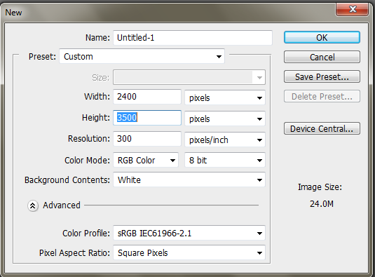
Step 1: Canvas
Creating a new document within Photoshop, change your dimensions to match the settings in the image below.
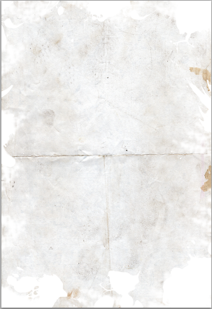
Step 2: Texture
Go to this website and download the grunge paper texture provided by Bashcorpo. Copy the image and paste it onto your canvas. You will need to resize the image by pressing Ctrl + “T” and scaling it so that it fills the entire whitespace. Don’t forget to press Enter when you are done scaling your image so that the changes can take effect.

Step 3: Erasing
Once you have your texture in place, go to your brushes and select a brush that will give you some cool edges when you erase. For example, I used some splatter brushes. If you don’t have splatter brushes, you can either download some or use some other unorthodox brush. As long as it’s not a standard circle brush, it will serve our purposes well.
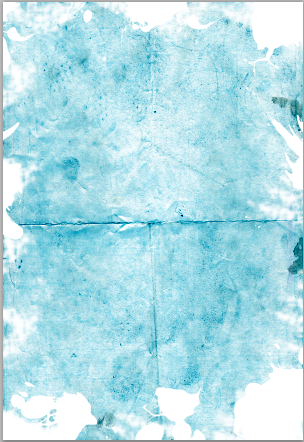
Step 4: Color
Create a new layer, fill it in with #348ee1, and change the layer mode to Color Burn. You should now have a pretty blue color.
Step 5: Lines
Select the Rectangular Marquee Tool (or simply press “M” on your keyboard) and with the colors #348ee1, #34b2e1, and #37d9f6, create a vertical rectangular bar like so.

Step 6: Warping and Layer Modes
If you created your vertical colors in separate layers, you will need to merge them. If you created them in one layer, you can go ahead and start warping the image by going to “Edit” > “Transform” > “Warp.” Feel free to get creative; you don’t have to replicate the same bend that I did; just make sure the final image touches the corners.

When everything is to your liking, go to the layer mode and change it to Subtract, so that you have nice, rustic colors on your blue background.

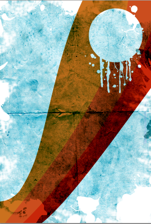
Step 7: Circles and Splatters
Under a new layer, create a giant white circle in the upper corner of your overlapping the rustic bar of color. Using splatter or drip brushes, simply add white drops towards the bottom of the circle until you get something close to the image below. Once again, if you don’t have splatter or drop brushes, any textured brush that adds drips, scratches or marks will do.

Step 8: Selecting and Deleting
Using the magic wand, click the newly created dripping circle, then select the rustic bar layer and press Delete. Once this is done, hide the layer with your white dripping circle so that you have a cut out of where the image used to be. This is where we are going to put the date of the event.
Step 9: White Box
Create two white boxes using the Marquee Tool, making the smallest box on top. This is where we are going to put the name of the venue presenting the event. Try to get your box as centered as possible. As you can see, I am beginning to add some stroke options around the elements of my designs; this will help it stand out from the background.

Step 10: Adding Text
With the color #880f00, I typed my text and centered it in the middle of my white boxes. In order to get the desired effect, I used the Blending Options and selected the Drop Shadow and the Stroke options. The font that I used is called Poplar Std for those who want to know.

Step 11: Finishing Text
Finish adding in the rest of the text for the event, making sure to utilize the remaining space. Try using two vastly different colors to create a nice contrast; I used maroon and white for mine.
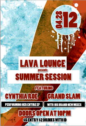
Step 12: Logo
If your event has sponsors, make sure to add their logo to the flyer, as it is a great habit to get into for print advertisements. In general, you’ll want to add your sponsors at the bottom of the flyer so that they don’t distract viewers from the pertinent information. After you are all done with your flyer, the only thing left to do is get your design printed and distributed.
Conclusion
Depending on your event, the design I created in this particular tutorial may not suit your needs. In order to figure out what type of flyer would best benefit your event, take in consideration the venue and the target audience. For more business type events, keep it simple and try to use only text and perhaps some gradients. Flyers for more informal things like can include use stock images, textures, gradients, and glowing elements to make them stand out. Here are a couple of examples of flyers I’ve done for several different events, just to show you a wide variety of flyer designs.

I hope you enjoyed it!
Do you get frequent requests for flyer design? Do you have any designs of your own to show off? Do you find yourself doing more or less print work compared to the past?
Frequently Asked Questions (FAQs) about Designing a Stylish Event Flyer
What are the key elements to consider when designing an event flyer?
When designing an event flyer, it’s crucial to consider several key elements. Firstly, the purpose of the flyer should be clear. Whether it’s to promote an event, a product, or a service, the message should be concise and compelling. Secondly, the design should be visually appealing, with a balanced use of colors, fonts, and images. Thirdly, the flyer should include all the necessary information about the event, such as the date, time, location, and contact details. Lastly, a call-to-action is essential to encourage the audience to take the desired action, such as buying a ticket or registering for the event.
How can I make my event flyer stand out?
To make your event flyer stand out, you can use a unique design concept that aligns with the theme of the event. Use high-quality images and graphics, and choose a color scheme that grabs attention. Also, consider using a catchy headline and compelling copy to draw in your audience. Lastly, don’t forget to include your brand logo and contact information for easy recognition and accessibility.
How can I effectively display sponsors on my event flyer?
Displaying sponsors on your event flyer can be done effectively by allocating a specific section for them. This can be at the bottom or side of the flyer. Ensure that the logos of the sponsors are clearly visible and of high resolution. Also, consider the size and placement of each logo, as these should reflect the level of sponsorship.
How can I negotiate logo placement with sponsors?
Negotiating logo placement with sponsors involves clear communication and understanding of each party’s expectations. Discuss the size, location, and duration of the logo placement on the flyer. Also, consider offering different sponsorship packages with varying levels of visibility and benefits.
What are some common mistakes to avoid when designing an event flyer?
Some common mistakes to avoid when designing an event flyer include overcrowding the design with too much information or graphics, using low-quality images, choosing hard-to-read fonts, and not proofreading the content for errors. Also, failing to include a clear call-to-action can result in a less effective flyer.
How can I add value to donors and sponsors on my event flyer?
You can add value to donors and sponsors on your event flyer by giving them prominent placement on the flyer, mentioning them in the event description, or offering them special recognition at the event. This not only provides them with visibility but also shows your appreciation for their support.
How can I use templates to design my event flyer?
Using templates can simplify the process of designing your event flyer. Templates provide a pre-designed layout that you can customize with your own text, images, and colors. This can save you time and ensure a professional-looking design.
What are some effective strategies for distributing my event flyer?
Effective strategies for distributing your event flyer include both online and offline methods. Online, you can share the flyer on social media, email newsletters, and your website. Offline, you can distribute printed copies at local businesses, community centers, or public bulletin boards.
How can I measure the success of my event flyer?
You can measure the success of your event flyer by tracking the response rate. This can be done by including a call-to-action that can be tracked, such as a discount code to use when purchasing tickets or a QR code to scan for registration. You can also gather feedback from attendees about how they heard about the event.
How can I improve my event flyer design skills?
Improving your event flyer design skills can be achieved through practice, studying successful examples, and taking design courses. Also, staying updated with design trends and seeking feedback on your work can help you refine your skills over time.