


In order to create meaningful visual representations of our data, and the complimentary tools to analyze said data, it is important to have a well-conceived data management framework. This requires the right backend storage, a paradigm for data access, and an engaging front-end for presentation and analysis. There are a variety of tools that you can use to build a data access stack in your web applications which we will be exploring here.
If you are collecting data that data is relevant to your visitors they will want some way to consume it. Our responsibility is to provide transparency to our visitors, give them the best possible experience, and build intuitive and performant tools to allow them access to these insights. The visual representation of that data is only a part of that. It is the mechanisms that we use to store, transform, and transport that data which plays as much a part in providing these rich experiences.
Key Takeaways
- A well-conceived data management framework is crucial for creating meaningful visual representations of data and complementary tools for data analysis. This framework requires the right backend storage, a data access paradigm, and an engaging front-end for presentation and analysis.
- Data storage options include flat datasets, relational databases, document-oriented databases, unstructured databases, and client-side storage. Each has its own advantages and disadvantages, and the choice depends on factors like performance, scalability, ease of implementation, and the skill set of your team.
- Creating access layers into your data can be achieved through methods like views in relational databases, hybrid approaches using MongoDB and SQL Server, and OLAP (Online Analytical Processing). These methods allow for the creation of smaller, more targeted datasets for visualizations and analytics.
- JavaScript offers built-in functions and libraries like D3 and Chart.js for data manipulation and visualization. These tools provide the ability to filter, reduce, and map data, as well as create interactive visualizations.
- Balancing performance and features for users is essential when passing data to users. It’s important to control the number of dimensions/measures users can play with to limit the amount of data being passed and the amount of number crunching that needs to be done on the client side.
Data Storage Options
Data storage has become a huge market in recent years. Deciding which technology you want to use for your application can be a daunting task. There are a few things to think about: performance, scalability, ease of implementation, as well as the particular skill set of you and your team. This last point being extremely important and often overlooked. If you have a team of SQL developers on your team the benefits of moving to a MongoDB implementation would have to be overwhelming in order to persuade you to go down that route.
Other than “stick with what you know” there is no quick and easy answer to which you should use. Flat datasets can be relatively easy to work with. They are structured as a single table (think CSV files) and can be relatively easy to understand. The limitations of these sources show themselves quickly, because they perform poorly as they grow and can be difficult to maintain. If you have a flat dataset you most likely want to break it apart into one of the other storage options.
Relational Databases (MySQL, SQL Server) are great for storing data in separate tables that can be joined up using unique keys. Advantages of these are that they reduce the size of the datasets, perform better, and can be accessed using a well established querying language (SQL). This solution also requires a good deal of planning, creating unique keys for establishing relationships, and tuning for performance.
Growing in popularity are Document-Oriented Databases (e.g. MongoDB) that allow you to store data in JSON objects. This is also more efficient than flat files in that data is structured to reduce redundancy. There is the added advantage of storing the data in a format that is native to JavaScript, but it can get increasingly complicated if you are trying to join multiple datasets or summarize/create aggregations.
Unstructured databases (e.g. Hadoop) are good for extremely large datasets and outside the scope of this discussion. If you are working with datasets of this size you are likely going to want to use an ETL process to normalize the data before bringing it into your application.
The option to store data client-side is also appealing but it doesn’t come without its disadvantages. File storage and caching data on a client machine has some advantages in certain use cases but it requires a certain level of trust between you and the user. If this is a trusted service, or if the user knows they are going to be working with large volumes of data, then it is reasonable to expect them to allow access to file storage. By default, however, I would not recommend making this an expectation in any but the most demanding of use cases.
Creating Access Layers
There are a few methods for creating access layers into your data. Views have long been the standard way of doing this in relational databases. Views allow you to write queries around your data and present it as a table. Using data aggression techniques such as group by, order by, sum, etc you can create smaller, more targeted datasets for your visualizations and analytics.
CREATE VIEW population_vw AS
SELECT country, age, year,
sum(total) AS TOTAL
FROM census_data
WHERE year IN ('2010')
AND country IN ('United States')
GROUP BY country, age, year;
Most relational databases also allow for the creation of materialized views that require ETL to create the view but perform better because they only require one table to be accessed.
A hybrid approach can be effective as well. Often times this can be accomplished by creating a more targeted MongoDB layer for your larger dataset that is being stored in SQL Server. Offloading the most crucial data to the document-oriented database for quick access and consumption while storing the full breadth of data in your backend SQL database. If you are using Node you can use Express to manage the creation of these datasets and store them on your MongoDB server.
OLAP also allows you to create datasets that can be aggregated but allow you to pre-establish the dimensions and measures you want to use to represent your data. OLAP uses Multidimensional Expressions (MDX) for accessing data types but is not very well supported in web applications.
Network Dependencies
Aggregating your data before sending it to the client has always been considered best practice. Most likely, you want to reduce the data as much as possible on the server before you present it to your users. This can be troublesome, however, because you will often be tempted to reduce it to its most aggregated form on the server. If the user wants to change the layout of the data, you end up with network thrashing because you constantly need to pull a dataset from the server with the appropriate level of aggregation.

It is critical that you find that medium where the data is aggregated to a size that is responsible from a bandwidth perspective but also provides adequate detail to allow for analysis. This can be accomplished through requirements gathering and establishing the key metrics and dimensions that the end user requires for analysis.

One of the common ways of accessing data would be via a RESTful API. RESTful APIs allow you to request data from a remote server and use it in your applications. Often times this will be in a JSON format. In practice, it is recommended to reduce the number of HTTP calls because every request will have some degree of latency. You should try to reduce the data to a less detailed but not fully aggregated level on the server and store the dataset client-side to be further reduced.
To make API requests more explicit you can use GraphQL, which allows you to formulate a query against your API. Using a language like GraphQL, you can easily pull a specific subset of data. GraphQL is quickly becoming a standard for apps that have complex relations across multiple taxonomies such as Facebook.
Functions, Tools, and Techniques
JavaScript has a great set of tools built into the array prototype starting with ES5. This includes filter(), which allows you to take an array and return just those elements that are relevant to your query, reduce() which aggregates your data and returns a summarized dataset that is easily consumable, and map(), which can be used to change the way that the values in your data are presented. These are well supported, don’t mutate the original array, and don’t require any additional libraries.
To learn more about these built-in JavaScript functions, check out our Premium course on Functional JavaScript Programming
For data presentation my personal preference is D3, which allows you to manipulate the DOM, specifically SVG elements, to present your data in unique ways. This can range from simple bar, line, and pie charts to complex, interactive data visualizations. I have created a demo of full featured dashboard in D3. We will be referencing the code from this repo throughout the rest of the article.
Other tools that are simpler to use but less customizable (such as Chart.js) are great if you are just looking to add in some quick visualizations without a lot of custom code.
Typically, what I will do when I am rendering a visualization on the screen would be to bind an event to the form field that will call our render function on an object associated with our SVG element on the page:
document.getElementById("total").addEventListener('click', function() {
  barGraph.render(d, "total")
});
to which we will pass our data set d, as well as the metric that we will be presenting, total. This will allow us to do two things:
- By taking in the dataset we can initially reduce and filter the data as well as map the values to “friendly” names
- It will allow us to select a metric from a variety of different metrics in the dataset
Within the render function we will handle adding axis, tooltips, rendering the visuals, and updating. This will usually take place in three steps:
render: function(d, m) {
  this._init(d, m);
  this._enter(d);
  this._update(d);
  this._exit();
}
These are the four main steps in a D3 application:
- init – Initialize the scales, axis, and the dataset
- enter – generate the initial view update
- refresh – the view when the dataset is changed
- exit – cleanup
Other APIs, like Chart.js, will allow you to create charts using a configuration instead of building the chart from the ground up. This would be done by making a call out to its API and passing in the required config:
var chartInstance = new Chart(ctx, {
  type: "bar",
  data: data,
  options: {
    legend: {
      display: true,
      labels: {
        fontColor: "rgb(255, 99, 132)"
      }
    }
  }
});
The difference here is you are limited to the form and function that was defined in the API and do not have as much flexibility in building unique and customized visualizations.
These are the two libraries (D3 and Chart.js) that I have worked with the most but there are many other options available (both free and paid) that can be used to expose data to your users. A few tips I would recommend when selecting a product:
- Get something that is built with Canvas/SVG. There are still surprisingly many Flash-based applications (and even SilverLight). These are not built with HTML standards in mind and you will regret them when you are trying to integrate your application.
- Consider the skill sets of your team. Something like D3 is great for a team of skilled JavaScript developers but something that is less customizable (like ChartJS) might suffice and better align with your team’s skill set.
- Program to an interface. If you couple your data too closely with your application eventually, if you have to change tools, it will be significantly more work.
Often times you are going to find yourself working with multiple datasets. It is important that if you are going to be combining these on the frontend that you load them asynchronously and wait for all to be fully loaded before joining them. D3 has built-in methods for handling multiple datasets:
d3.queue()
  .defer(d3.json, "data/age.json")
  .defer(d3.json, "data/generation.json")
  .await(function(error, d, g) {
If you are going to be presenting data in a rollup there are D3’s nest and rollup functions that provide this functionality. This will allow you to easily select the dimension (key) and metric that you will be summarizing
    var grp = d3.nest()
      .key(function(d) {
        return d.generation;
      })
      .rollup(function(v) {
        return d3.sum(v, function(d) {
          return d.total;
        })
      })
      .entries(dg);
Performance and Features
The most important things to consider when you are passing data to your users? Give them the ability to analyze the data without giving them the ability to screw it up. This means controlling how many different dimensions/measure they have to play around with. This will help from a performance standpoint as you are not passing large datasets over the wire as well as limiting the amount of number crunching that needs to be done on the client side.
Be careful: This does not mean to reduce the dataset to a fully aggregated dataset. You want it to be flexible. Provide a set of four or five key metrics that can be selected. Keep a few different dimensions in the dataset as well to allow for grouping your data and aggregating using things JavaScript’s array functions (filter, reduce, and map) or a library like D3. Considerations should be for performance and features for the user in how they can analyze their data.
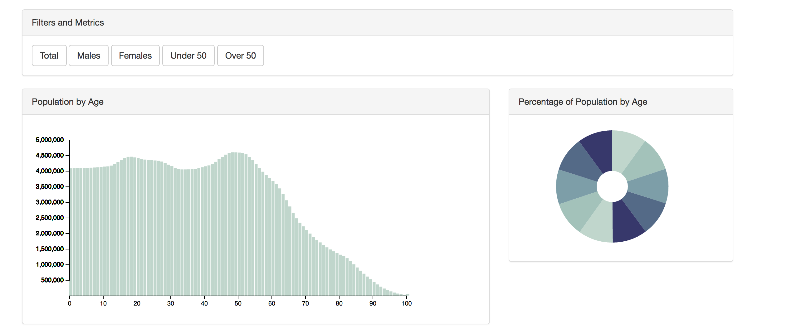
Once you have your dataset in hand it is important to know how you are going to present your data. Here is an example of a JSON dataset boiled down:
[{
  "females": 1994141,
  "country": "United States",
  "age": 0,
  "males": 2085528,
  "year": 2010,
  "total": 4079669
}, {
  "females": 1997991,
  "country": "United States",
  "age": 1,
  "males": 2087350,
  "year": 2010,
  "total": 4085341
}, {
  "females": 2000746,
  "country": "United States",
  "age": 2,
  "males": 2088549,
  "year": 2010,
  "total": 4089295
}, {
  // ...
You can see from this dataset that we have a few dimensions (age, year, country) and several metrics (females, males, and total). This will give us enough information to display graphically while still giving us the ability to slice the data in a few different ways.
Say, for instance, that we want to group the data into respective age groups. We can use JavaScript’s array functions to roll up the age groups to Gen X, Baby Boomers, etc without having to make any additional calls to the server and re-render it in SVG directly on the client machine.
As you can see from the demo, we are presenting the data with a few different visual options as well as providing some buttons for filtering the data and selecting metrics. This is key to giving the user capability to analyze their data.
Set up functions to render your data and set the required metric:
document.getElementById("total").addEventListener('click', function() {
  barGraph.render(d, "total")
});
Use filter() to narrow your data down to the appropriate level
document.getElementById("over50").addEventListener('click', function() {
  const td = d.filter(function(a) {
    return a.age >= 50
  });
  barGraph.render(td, "total");
});
Assign these to functions to filters on your document and you can filter your dataset, change metrics, and slice your data any way you want.
Summary
At the end of the day, you have to use a data access methodology that lends itself to your team and their particular skill sets. Having a thoughtfully designed data storage layer, a proper data access layer, and the right front-end tools for presenting the data will give your users a solid foundation for reporting.
I hope this article has given you an overview of the important considerations when creating data-driven applications. If there’s anything you’d like to know more about, please let me know in the comments!
Frequently Asked Questions on Data Management and Visualization
What is the importance of data management and visualization in business?
Data management and visualization play a crucial role in business. They help in organizing, analyzing, and interpreting vast amounts of data, which can be overwhelming if not properly managed. With effective data management, businesses can ensure data accuracy, consistency, and security. On the other hand, data visualization aids in presenting complex data in a more understandable and actionable format. It allows decision-makers to see connections between multi-dimensional data sets and provides new ways to interpret data through heat maps, fever charts, and other rich graphical representations.
How does data visualization enhance data interpretation?
Data visualization is a graphical representation of information and data. It uses visual elements like charts, graphs, and maps to provide an accessible way to see and understand trends, outliers, and patterns in data. By turning large and complicated datasets into visual, it becomes easier to understand complex data sets. This not only enhances data interpretation but also aids in making data-driven decisions quickly and effectively.
What are some of the best practices for data management?
Effective data management requires a strategic and organized approach. Some best practices include establishing clear policies and procedures for data collection, storage, and usage; ensuring data quality and accuracy; implementing robust security measures to protect data from unauthorized access and breaches; and regularly reviewing and updating data management strategies to keep up with technological advancements and business needs.
What tools can be used for data visualization in JavaScript?
JavaScript offers a variety of libraries and frameworks for data visualization. Some popular ones include D3.js, Chart.js, Google Charts, and Highcharts. These tools provide a wide range of features and customization options to create interactive and visually appealing data visualizations.
How can I improve my data visualization skills?
Improving data visualization skills involves a combination of technical knowledge, creativity, and a keen understanding of the audience’s needs. You can start by learning and mastering various data visualization tools and software. Additionally, studying good examples of data visualization, understanding the principles of good design, and practicing creating your own visualizations can significantly enhance your skills.
What are the challenges in data management and visualization?
Some common challenges in data management include ensuring data quality, maintaining data security, managing large volumes of data, and complying with regulatory requirements. In data visualization, challenges may include selecting the right visualization type, dealing with complex data sets, ensuring accessibility, and maintaining the accuracy of visual representations.
How does data management and visualization aid in decision making?
Data management ensures that high-quality, accurate, and timely data is available for analysis. Data visualization, on the other hand, presents this data in an easily digestible format, highlighting trends, correlations, and patterns. Together, they provide a solid foundation for making informed, data-driven decisions.
Can data visualization be used for real-time data?
Yes, data visualization can be used for real-time data. Many data visualization tools and platforms support real-time data streaming and can create dynamic visualizations that update as new data comes in. This is particularly useful in scenarios where timely insights are critical, such as monitoring network traffic or tracking social media sentiment.
What is the role of data management in data visualization?
Data management is the foundation of data visualization. It involves collecting, storing, organizing, and ensuring the quality of data. Without proper data management, the data used in visualizations may be inaccurate, incomplete, or misleading, leading to incorrect conclusions and decisions.
How can I ensure the security of my data during data management and visualization?
Ensuring data security during data management and visualization involves implementing robust security measures such as data encryption, secure data storage, access controls, and regular security audits. Additionally, it’s important to comply with all relevant data protection regulations and best practices.

