

With summer now upon us, a lot of businesses are turning to their marketing and designing staff in order to produce appropriately themed advertisements and promotions. We see this done seasonally from the obligatory Christmas-themed commercials all the way to Valentine’s Day colored candies. Businesses are aware of the power that seasonally-based promotions have, especially when they’re timed to align with consumer’s seasonal needs.
For many locales, the idea of summer conjures up a lot of visuals, including fun in the sun, the beach, cookouts, and of course extremely hot temperatures. Often these temperatures get so hot that things start melting, and of course when things melt, messes inevitably occur. But, it isn’t just the graphics that can exemplify seasonal changes; cleverly-designed typography can too. To celebrate the potentially hot and messy weather, today’s tutorial will show you how to create melting typography.
Resources
Step 1: New Canvas
Open up Photoshop and create a new file by either going to “File” >”New” or by pressing Ctrl + “N”. When the dialogue menu pops up, change the settings so that your canvas is 800px x 500px. Then press “OK”.

Step 2: Background
Since our typography design will be summer-inspired, we want to have a background that reflects that. In this case, we will create a new layer and name it “BKG”. We will then fill it with color #1694ff.

Step 3: Gradient
Now, instead of creating a new layer to add our gradient, we will simply use the Blending Options. First, change your background color to #ffffff and keep the foreground as #1694ff. With your colors selected, go to the Blending Options menu by either right-clicking the correct layer or double-clicking on it. Select the “Gradient Overlay” box and then change the gradient so that it reflects your pre-selected foreground and background colors.

Make sure that you check the “Reverse” box and set the blend mode to “Overlay”.
Step 4: Text
We will start with the first letter of our design. Grab the text tool and create a text box a little to the left of the center of our canvas. Change your text color to #ffe92e, the font size to 82pt, and the font type to Arial.

Step 5: 3D Text
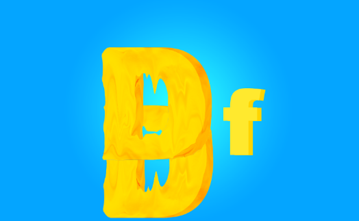
It’s easier to make 3D objects appear as if they are melting compared to 2D objects, so we will make our letter “D” appear 3D. Create another “D” but change the color is #ffd500. Move this layer beneath the original “D” layer and move it slightly to the right so that you see only a part of it. Look below for clarity.

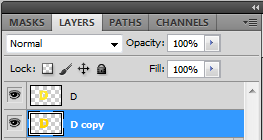
Step 6: Merge
Because we will be working on both of these layers simultaneously, it will be easier if they are just one object instead of two. Rasterize both layers and then merge them so that they are now just one layer.

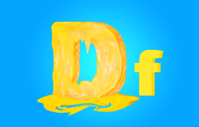
Step 7: Letter “F”
Use the text tool once more to create another letter “F”. Instead of making the letter capital, you will make it lowercase. Use the exact same colors that you used for “D”; the only difference is that the font size will be 48pt instead. Repeat the same actions to make it appear 3D and then merge the layers together.

Step 8: Clay Texture
To aid in making the text look as if it is truly melting, we need to apply a texture to the letters. We will start with the letter “D” first and move on from there. If you haven’t already, go get the texture image provided in the link above then paste it onto the canvas. You will need to resize it so that it’s only covering the “D”.

Delete the excess parts of the texture that do not cover the letter, and then change the layer mode to “Color Burn.” When this is done, merge the two layers so that they are one.

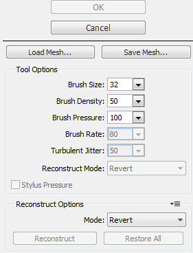
Step 9: Liquify
Now that our texture is applied, we can start melting our image. In order to do this, you will need to use the liquify tool by going to “Filter” > “Liquify” or press Shift + Ctrl + “X”. When the dialogue menu appears, check to make sure the settings are the same as shown in the image below. Also, make sure that you have the forward warp tool selected.
With the settings in place, you can start dragging your brush down the letter to give it a melting appearance.

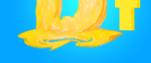
Step 10: Puddle
Just like with ice cream, things that melt usually leave puddles or some form of mess. We need to create a puddle for our letter to further develop its melting look. In order to accomplish this, we need to first start with duplicating our letter. Once this is done, move it so that it is under the “D” and then flip it vertically.
Now, use the warp tool to reshape the duplicated letter so that it starts to look like a puddle. Look below for clarity.

Step 11: Liquify Puddle
Use the liquify tool once again with a varying-sized brush to distort the puddle even more.
Step 12: Smudge
You will notice that there is a visible line between the letter “D” and our puddle. We need to get rid of this because we want it to seem as if these two layers are actually one. Grab the smudge tool and with a hard round brush (the strength at 42% and the blending mode on “Normal”), simply go back and forth over the line until it has been blended in.
Step 13: Plastic Wrap Letter
To further making our letter look “melty” we are going to apply a filter to it, but first we need to duplicate it. Making sure that you are on the correct layer, go to “Filter” > “Artistic” > “Plastic Wrap.” Change the settings so that they are identical to the numbers in the image below.

With the filter now in place, change the layer mode of the layer to “Lighten.”
Step 14: Plastic Wrap Puddle
Duplicate your puddle layer and apply the same filter on that you used in Step 13. Do not forget to change the layer mode.

Step 15: Puddle Goo
Duplicate the puddle layer with the plastic wrap filter applied and pull it underneath the original puddle layer. Use the transform tool and resize it so that you can see it around the edges. Change the layer mode to “Lighter Color.”
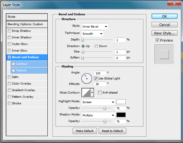
Open the “Blending Options” menu and check the box for Bevel and Emboss. Input the settings shown below and press “OK”.
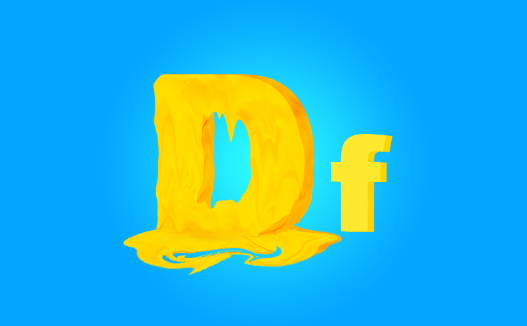
Step 16: Letter “F”
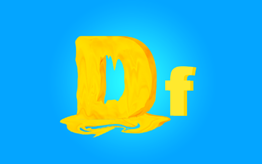
Now that we have our letter “D” completed, we can do the same thing to the letter “F”. When you have finished distorting the letter, you will need to blend the puddle of letter “F” with the puddle of letter “D” by using the smudge tool. Here is the finished image.

Conclusion
It should be noted that you don’t have to just leave your typography in this state. To create an even more creative and summer-inspired piece, consider adding in a background, perhaps sand and beach-themed items. And, it goes without saying that summer isn’t only scenario for melting typography. Try to get creative by using different typefaces as well s color combinations.
I hope that you have found this tutorial useful and inspiring. Happy designing!
Frequently Asked Questions about Creating Melting Typography in Photoshop
What are the basic tools I need to create a melting typography effect in Photoshop?
To create a melting typography effect in Photoshop, you will need to familiarize yourself with a few basic tools. These include the Text Tool for typing your text, the Brush Tool for creating the melting effect, and the Smudge Tool for blending and smearing your design. You will also need to use the Layers Panel to manage your different elements and the Blending Options to add depth and realism to your design.
Can I use any font for the melting typography effect?
Yes, you can use any font for the melting typography effect. However, thicker and bolder fonts tend to work better as they provide more space for the melting effect. You can experiment with different fonts to see which one gives you the desired result.
How can I make the melting effect look more realistic?
To make the melting effect look more realistic, you can use the Brush Tool to add drips and drops to your text. You can also use the Smudge Tool to blend and smear the edges of your text. Additionally, you can use the Blending Options to add shadows and highlights to your design.
Can I add colors to my melting typography?
Yes, you can add colors to your melting typography. You can use the Color Picker to choose your desired color and the Paint Bucket Tool to fill your text with that color. You can also use the Gradient Tool to add a gradient effect to your design.
How can I save my melting typography design?
Once you are satisfied with your melting typography design, you can save it by going to File > Save As. You can choose to save your design as a Photoshop file (.psd) if you want to be able to edit it later, or as a JPEG or PNG file if you want to share it online.
Can I use the melting typography effect for commercial purposes?
Yes, you can use the melting typography effect for commercial purposes. However, you should make sure that the font you are using is free for commercial use.
How can I add a background to my melting typography design?
To add a background to your melting typography design, you can use the Rectangle Tool to create a new layer and fill it with your desired color. You can also use the Gradient Tool to add a gradient effect to your background.
Can I animate my melting typography design?
Yes, you can animate your melting typography design using Photoshop’s animation features. You can create a frame-by-frame animation or a timeline animation depending on your preference.
How can I make my melting typography design stand out?
To make your melting typography design stand out, you can experiment with different fonts, colors, and effects. You can also add additional elements such as shapes, images, or patterns to your design.
Can I create a melting typography effect in other software?
Yes, you can create a melting typography effect in other software. However, Photoshop offers a wide range of tools and features that make it easier to create a realistic and professional-looking design.

