Getting to Know Cutestrap, a Lightweight CSS Framework

Cutestrap is a brand new CSS framework. This article presents Cutestrap’s features and puts the framework to the test by using it to build a simple one-page HTML template.
Key Takeaways
- Cutestrap is an ultra-lightweight CSS framework, ideal for developers seeking a minimalistic approach with only 8kb of CSS.
- It offers easy customization options, especially using Sass, and utilizes the BEM methodology for maintaining CSS organization.
- Despite its simplicity, Cutestrap includes a flexible grid system, typographic styling, and basic UI components like buttons and forms.
- The framework is designed for modern browsers and does not include JavaScript components, focusing solely on CSS.
- Cutestrap’s documentation is generated using KSS, making it easy to turn into a living style guide for projects.
Cutestrap’s Features
Like most successful web development boilerplates and frameworks, Cutestrap decreases development time and cuts down on repetitive tasks. According to the catchy definition on its documentation page, Cutestrap by Tyler Childs is “A sassy, opinionated CSS Framework. A tiny alternative to Bootstrap.” It is a nice starting point for quick prototyping of websites and apps.
For all its small file size, Cutestrap is not just a blank starter template with some basic reset styles. It comes bundled with a choice of typefaces, a color palette, and some definite views on how form fields and a few other elements should look.
On the other hand, Cutestrap is miles away from offering the huge number of features and components that full-blown frameworks like Bootstrap and Foundation bring to the table.
Cutestrap’s key features:
- Super tiny – only 8kb of CSS code
- Easy customization, even easier if you use Sass
- Great CSS organization using the BEM methodology
- Consistent vertical rhythm of typographic elements
- KSS-generated documentation to facilitate turning Cutestrap documentation into your project’s living styleguide
Let’s install Cutestrap to find out more.
Installing Cutestrap
You can take the traditional route and simply download cutestrap.zip from the framework’s homepage. Alternatively, you can integrate Cutestrap into your project using npm:
npm install cutestrap
or bower:
bower install cutestrap
Customizing Cutestrap
You can change pretty much everything in Cutestrap either by using its Sass version or its compiled counterpart.
In this regard, Cutestrap is not different from other popular CSS frameworks. If you prefer vanilla CSS, you can include cutestrap.css (or its minified version in production) directly in your project and then override Cutestrap CSS rules from your custom stylesheet document.
Opting for the Sass alternative gives you more flexibility and speed. One way you can set up your project is by creating a partial file where you can store your custom variables, including what you want to override from the framework. Next, you can create a custom.scss file where you can reference the file containing your custom variables and the original cutestrap/dist/scss/cutestrap.scss file using @import statements:
//custom variables
@import "custom-variables";

//original Cutestrap
@import "path-to-framework-folder/cutestrap";

//custom Sass code goes here
The order in which you write the @import statements is important. In fact, including custom-variables.scss before cutestrap.scss ensures that all Cutestrap variable values you override in your custom file will take effect in the compiled CSS output.
Your custom Sass code goes below the @import statements.
What’s Included in the Cutestrap Framework?
Besides some smart default styles, Cutestrap offers a grid system, beautiful typography, common website components like buttons and form fields, and a few handy utility classes.
Let’s look closer.
Grid
Cutestrap offers a super simple grid built using flexbox.
Here’s the code for a two-column grid:
<div class="wrapper">
  <div class="grid">
    <div>
      Column 1
    </div>
    <div>
      Column 2
    </div>
  </div>
</div>
To control the width of the content area, Cutestrap offers a choice of three CSS classes:
.wrapperfor a maximum width of 960px.wrapper-smallfor a maximum width of 640px.wrapper-large– for a maximum width of 1200px
If you use the grid without enclosing it inside the .wrapper container, your content will span the entire width of the screen, which may or may not be the result you’re after.
The grid itself only needs a container element with a class of .grid. Columns inside this element will be evenly distributed throughout the available space. No need to add classes for rows and columns.
The code sample above is for two columns, therefore each column takes up half of the available space:

If I add four columns, each column will occupy 25% of the available space:
<div class="wrapper">
  <div class="grid">
    <div>
      Column 1
    </div>
    <div>
      Column 2
    </div>
    <div>
      Column 3
    </div>
    <div>
      Column 4
    </div>
  </div>
</div>
This is what the snippet above looks like in the browser:

As you can see, columns don’t wrap to the next line. In order to create a new row, you’ll need a new .grid container:
<div class="wrapper">
  <div class="grid">
    <div>
      Column 1 Row 1
    </div>
    <div>
      Column 2 Row 1
    </div>
    <div>
      Column 3 Row 1
    </div>
  </div>
  <div class="grid">
    <div>
      Column 1 Row 2
    </div>
    <div>
      Column 2 Row 2
    </div>
    <div>
      Column 3 Row 2
    </div>
  </div>
</div>
Here’s how the markup above renders in the browser:

But how does Cutestrap handle a responsive layout? This is a common layout pattern where columns are stacked one on top of the other on a small screen and flow into a grid layout on desktop screens.
You can quickly achieve this using the grid modifier classes below:
.grid--medium– columns are stacked on small screens. They start flowing into a grid layout only when the screen size hits 600px.grid--large– same pattern as .grid–medium, but the columns start arranging themselves into a grid when the screen is a minimum of 960px wide
Here’s the basic code:
<div class="wrapper">
  <div class="grid grid--medium">
    <div>
      Column 1
    </div>
    <div>
      Column 2
    </div>
  </div>
</div>
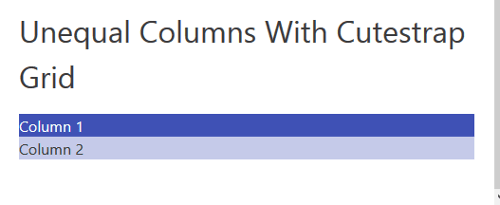
So far you’ve only seen examples of equal column grids. To add columns of different widths, just use one of the following column modifier classes:
.column--light– apply this class to a column to make it half the width of the default column.column--heavy– apply this class to a column to make it double the width of the default column
The two classes above achieve their goal by changing the flex-grow property which determines the amount of space allocated to the item inside the flex container.
Here’s a quick example:
Column 2 will be half the width of Column 1 on screens wider than 600px:
<div class="wrapper">
  <div class="grid grid--medium">
    <div>
      Column 1
    </div>
    <div class="column--light">
      Column 2
    </div>
  </div>
</div>
This is how the code above renders in the browser on wider screens:

Here’s how the same code is displayed when viewed on small screens:

To see the Cutestrap grid in action, head over to the live demo on CodePen.
See the Pen Cutestrap Grid by SitePoint (@SitePoint) on CodePen.
Typography
Typographic elements in Cutestrap are sized using rem units based on a font-size of 62.5% on the root html element, which goes up to 78.125% for viewports larger than 960px. The baseline of 2.4rem results in a harmonious vertical rhythm, which enhances the appearance of content on the webpage.
Cutestrap offers styling for level 1 through to level 6 headings, as well as paragraph, blockquote, and table elements. Here’s the live demo on CodePen.
See the Pen Cutestrap Typography by SitePoint (@SitePoint) on CodePen.
The default CSS font stack for headings and body copy includes the following typefaces:
- Avenir
- Avenir Next
- Helvetica Neue
- Segoe UI
- Verdana
- sans serif
You can easily change this using regular CSS or Sass.
For instance, to use Merriweather Sans for body copy and Merriweather for headings, add this snippet to your custom CSS document:
body {
  font-family: 'Merriweather Sans', sans-serif;
}

h1, h2, h3, h4, h5, h6 {
  font-family: 'Merriweather', serif;
}
To do the same using Cutestrap Sass files, simply replace the values of the $base-font variable for body copy and the $heading variable for headings with your own chosen fonts. You’ll find these variables in the variables/_type.scss file inside Cutestrap’s scss folder.
Buttons
Cutestrap applies distinctive styles to button elements, submit/input elements, and link elements with a class of .btn.
In addition, the framework offers two variations of the default .btn class: .btn--secondary and .btn--link.
<button>Button</button>
<input type="button" value="Input Button" class="btn">
<button class="btn--secondary">Secondary</button>
<a href="#" class="btn btn--link">Button Link</a>

Check out the CodePen demo.
See the Pen Cutestrap Button Styles by SitePoint (@SitePoint) on CodePen.
Forms
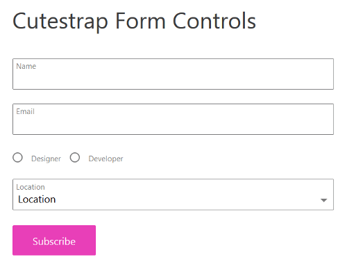
Cutestrap builds form fields using a unified markup structure and CSS styling, which give them a consistent appearance across browsers.
Below is the markup for a simple form:
<form>
  <label class="textfield">
    <input type="text">
    <span class="textfield__label">Name</span>
  </label>
  <label class="textfield">
    <input type="email">
    <span class="textfield__label">Email</span>
  </label>
  <label class="radio">
    <input type="radio" name="designer">
    <span class="radio__label">Designer</span>
  </label>
  <label class="radio">
    <input type="radio" name="developer">
    <span class="radio__label">Developer</span>
  </label>
  <label class="select">
    <select>
      <option value="Location" disabled selected>Location</option>
      <option value="EU">EU</option>
      <option value="US">US</option>
      <option value="Australia">Australia</option>
    </select>
    <span class="select__label" for="select">Location</span>
  </label>
  <button type="submit">Subscribe</button>
</form>
Here’s how the markup displays in the browser:

To see the live code, checkout the demo on CodePen.
See the Pen Cutestrap Form Controls by SitePoint (@SitePoint) on CodePen.
Utility Classes
Cutestrap offers a small number of handy utility classes to do things like aligning text, clearing floats, increasing or decreasing font-size, and more.
The full list of Cutestrap utility classes is available on the Cutestrap documentation page.
Putting It All Together: Let’s Code a Demo Page
The HTML demo for this article includes all of Cutestrap’s key features discussed so far. The code I’m going to present here is limited to those features only. You’re free to examine the details on CodePen.
See the Pen HTML Template with Cutestrap by SitePoint (@SitePoint) on CodePen.
Here’s the HTML code for the hero section:
<div class="hero">
  <div class="wrapper">
    <article class="ta-center">
      <!-- Hero image here  -->
      <h1 class="section-title">Title</h1>
      <p class="fs-large">Tagline</p>
    </article> <!--/article -->
  </div> <!--/.wrapper -->
</div> <!--/.hero -->
The hero section is full-width but uses the .wrapper class to control the maximum width and centering of the display area.
The section title and tagline are centered with .ta-center, and the tagline’s font size is made bigger using .fs-large. Both are handy Cutestrap utility classes to control the display of text content.

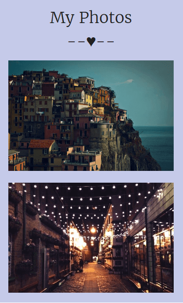
The Portfolio section is a responsive three-column grid of images running along two rows. Here’s the code:
<div class="portfolio">
  <div class="wrapper">

    <!-- First row -->
    <div class="grid grid--medium">
      <figure>
        <img src="image.jpg" alt="portfolio image." />
      </figure>
      <!-- Two more items -->
          ...
    </div><!-- /.grid -->

    <!-- Second row -->
    <div class="grid grid--medium">
      <figure>
        <img src="image.jpg" alt="portfolio image." />
      </figure>
      <!-- Two more items -->
          ...
    </div><!-- /.grid -->

  </div><!-- /.wrapper -->
</div><!-- /.portfolio -->
To achieve a responsive layout, the Portfolio section uses the .grid--medium modifier class: the content is stacked on small screens; on screens wider than 640px, the content is displayed in a three-column grid.


The demo’s three-column footer uses the same structure:

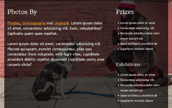
The About section has a responsive two-column layout. The mobile view displays the columns stacked one on top of the other, the desktop view displays the columns side by side, with the right column being narrower than the left column.
You achieve the responsive layout using the .grid--medium modifier class as above. The .column--light class applied to the second column is all you need to make it narrower:
<div class="about">
  <div class="wrapper">
    <div class="grid grid--medium">
      <!-- Wider column -->
      <article>
        Content in wider column
      </article>
      <!-- Narrower column -->
      <article class="column--light">
        Content in narrower column
      </article>
    </div><!-- /.grid -->
  </div><!-- /.wrapper -->
</div><!-- /.about -->

The Contact section displays just a centered form element. To avoid having the form span the regular width of the page, and lacking ready-made classes to offset columns, I’ve used the .wrapper-small class. This results in a centered container that constrains the form element within narrower boundaries with respect to the regular width of the webpage.
The relevant markup looks like this:
<div class="contact">
  <div class="wrapper-small">

    <!-- form element here -->

  </div><!-- /.wrapper-small -->
</div><!-- /.contact -->
To build the form element, just use Cutestrap markup and CSS classes as illustrated earlier in this article.
For this demo, I’ve chosen a different color for the default link and button elements. You can customize these elements using the CSS snippets below:
/*Links*/
a:link {
  color: #ff9800;
}

a:visited,
a:active {
  color: #ffad33;
}

a:hover,
a:focus {
  color: #cc7a00;
}

/*Buttons*/
.btn,
input[type="submit"],
input[type="button"] {
  background-color: #ff9800;
}
.btn:focus, .btn:hover,
input[type="submit"]:focus,
input[type="submit"]:hover,
input[type="button"]:focus,
input[type="button"]:hover {
  background-color: #cc7a00;
}
.btn:active,
input[type="submit"]:active,
input[type="button"]:active {
  background-color: #ff9800;
}
If you use the Sass version of Cutestrap, just change the value of the following variables to your desired colors:
$link$link--visited$link--hover$link--active
The .btn class uses the $primary color variable to style the background color. Therefore, if you want to modify the default background color of your button elements, simply change the color value of the $primary variable.
Compile and you’re done!
Here’s what the form element looks like in the browser:

Conclusion
In this article, I’ve introduced Cutestrap, a brand new CSS framework.
Cutestrap has a number of interesting features, but its biggest plus for me is its easy learning curve: it took me just over an hour to learn how to use the framework and build the demo page that accompanies this article. Partly, this is due to the fact that Cutestrap is tiny: the framework doesn’t support older browsers, it just provides styles for a few key elements, the grid doesn’t allow for the offsetting or nesting of columns (although I love its simplicity), and JavaScript interactive components aren’t included. The Sass code is excellently organized but minimal, not even a mixin in sight.
Is this a good thing? That depends on what you need as a starting point for your project.
The ecosystem of open source CSS frameworks has become very competitive. Being tiny is not enough. Even the big players like Bootstrap and Foundation, which have often been the target of criticism for causing unnecessary code bloat, have become highly modularized so that picking and choosing only what you need is often just a matter of enabling or disabling the use of a Sass variable.
However, I need to remind myself that Cutestrap is very young, still a baby really – I’ve just noticed that its initial commit on GitHub at the time of writing this article is only about a month old. This means that the framework has plenty of time to develop and mature.
If you’ve tried Cutestrap and would like to suggest a new feature or send a pull request, head over to the project’s page on GitHub and get involved.
Have you used Cutestrap in your development work? What did you build? I can’t wait to hear from you!
Frequently Asked Questions about Cutestrap CSS Framework
What makes Cutestrap different from other CSS frameworks?
Cutestrap stands out from other CSS frameworks due to its lightweight nature. It is only 2.7kb in size, making it an excellent choice for developers who want to keep their projects lean and fast. Unlike other frameworks that come with a lot of pre-designed components, Cutestrap provides a minimalistic approach, offering only the essential tools needed to build a website. This allows developers to have more control over their designs without having to override a lot of pre-existing styles.
How can I get started with Cutestrap?
Getting started with Cutestrap is quite straightforward. You can download the framework from the official website or install it via npm. Once installed, you can import the Cutestrap CSS file into your project and start using its classes and utilities. The official Cutestrap documentation provides a comprehensive guide on how to use the framework, including examples and code snippets.
Does Cutestrap support responsive design?
Yes, Cutestrap supports responsive design. It uses a 12-column grid system that automatically adjusts to the screen size. This makes it easy to create layouts that look great on both desktop and mobile devices. You can control the layout of your elements at different screen sizes using Cutestrap’s responsive classes.
Can I customize Cutestrap to match my brand?
Absolutely. Cutestrap is built with customization in mind. It uses CSS variables, which makes it easy to change the color scheme, typography, and other design elements to match your brand. You can also extend the framework with your own classes and components.
Is Cutestrap suitable for large-scale projects?
Cutestrap is a lightweight framework, but that doesn’t mean it’s not suitable for large-scale projects. Its minimalistic approach can actually be beneficial for large projects as it keeps the codebase clean and manageable. However, if your project requires a lot of pre-designed components, you might need to build them yourself or consider using a more feature-rich framework.
How well is Cutestrap supported and maintained?
Cutestrap is an open-source project, which means it’s maintained by a community of developers. It’s regularly updated with bug fixes and improvements. If you encounter any issues or have suggestions, you can contribute to the project on GitHub.
Does Cutestrap have a large community?
While Cutestrap may not have a community as large as some other CSS frameworks, it does have a dedicated group of users and contributors. You can find help and resources on the official website, GitHub, and various online forums.
What are the browser compatibility issues with Cutestrap?
Cutestrap is built with modern web standards and is compatible with all modern browsers. However, it may not work perfectly with older browsers that don’t support certain CSS features. It’s always a good idea to test your website in different browsers to ensure it works as expected.
Can I use Cutestrap with other CSS frameworks?
Yes, you can use Cutestrap alongside other CSS frameworks. However, keep in mind that this might lead to conflicts and inconsistencies in your styles. It’s generally recommended to stick to one framework unless you have a specific reason to use multiple.
Is Cutestrap a good choice for beginners?
Cutestrap’s simplicity and minimalistic approach make it a great choice for beginners. It provides just the right amount of tools to get started with CSS without overwhelming you with a lot of pre-designed components. The documentation is also very beginner-friendly, with clear explanations and examples.
Maria Antonietta Perna is a teacher and technical writer. She enjoys tinkering with cool CSS standards and is curious about teaching approaches to front-end code. When not coding or writing for the web, she enjoys reading philosophy books, taking long walks, and appreciating good food.

Published in
·Animation·CSS·Design·Design & UX·HTML·HTML & CSS·Illustration·Prototypes & Mockups·UI Design·February 8, 2017


