We know in the brave new world of 2013 there is a lot of wonderful CSS being implemented across the web, delivering high quality visitor experiences and often pushing the boundaries of what people thought could be done on a web page without resorting to Flash.
There’s probably no better recent example than our own SitePoint Christmas Sale. If you’ve forgotten what that was like (already?), you can check it out again here, and read the story of how Alex Walker put it together.
Sadly, we also know that there is also a lot of less than wonderful CSS out there, delivering cracked, broken and poorly constructed web experiences that turn people off certain sites and sometimes the web itself.
How good would it be if we could find all the broken CSS and, well … fix it?
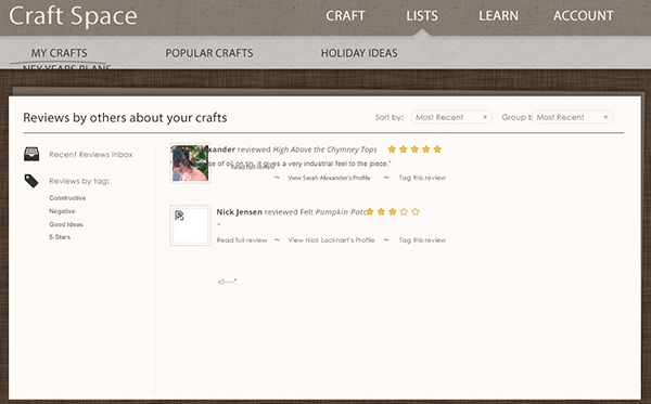
As people who value the web, we all know that things are at their worst when they look broken to users. Here’s an example.

Yikes! Broken images, overlapping text, page elements flowing into each other: it’s a mess.
Using the comments below, we’re asking you to point out sites to us that look broken, either because of CSS or JavaScript problems on desktop, tablet or smartphone screens.
We do have an aim for this exercise, but we’ll let you in on our plans when we’ve gathered enough material to make a good start.
So, go ahead, give us some links to broken sites you know about and be part of making a better web in 2013 and beyond.
Frequently Asked Questions about Broken CSS
What is broken CSS and how does it affect my website?
Broken CSS, also known as bad CSS, refers to CSS code that doesn’t function as intended. This could be due to syntax errors, outdated properties, or conflicts between different stylesheets. The impact on your website can be significant, leading to visual inconsistencies, layout issues, and a poor user experience. It’s crucial to identify and fix broken CSS to ensure your website looks and functions as intended across different browsers and devices.
How can I identify broken CSS in my code?
Identifying broken CSS can be done through various methods. One common approach is to use browser developer tools, which allow you to inspect individual elements and see which CSS rules are being applied. If a rule isn’t having the expected effect, it may be broken. Additionally, there are online tools and validators that can scan your CSS code for errors or inconsistencies.
What are some common examples of broken CSS?
Broken CSS can manifest in many ways. Some common examples include incorrect syntax, such as missing semicolons or brackets, using outdated or unsupported properties, and conflicts between different stylesheets or CSS rules. For instance, you might have two conflicting rules targeting the same element, causing unexpected visual results.
How can I fix broken CSS?
Fixing broken CSS involves identifying the issue, understanding why it’s happening, and then correcting the code. This might involve correcting syntax errors, updating outdated properties, or resolving conflicts between different CSS rules. It’s also important to test your changes across different browsers and devices to ensure the fix works as expected.
What are the best practices to avoid broken CSS?
To avoid broken CSS, it’s important to follow best practices for writing CSS. This includes using a consistent naming convention, organizing your code in a logical way, and commenting your code to explain what each section does. Additionally, always validate your CSS code using a CSS validator to catch any errors or inconsistencies.
How does broken CSS impact SEO?
Broken CSS can negatively impact SEO by affecting the user experience on your website. If your site doesn’t look or function as expected, users may leave, increasing your bounce rate. This can signal to search engines that your site isn’t meeting user needs, potentially affecting your rankings.
Can broken CSS affect website loading speed?
Yes, broken CSS can affect your website’s loading speed. If your CSS code is inefficient or contains unnecessary rules, it can slow down the rendering of your website. This can lead to a poor user experience and potentially impact your site’s SEO.
What tools can I use to identify and fix broken CSS?
There are many tools available to help identify and fix broken CSS. Browser developer tools are a great starting point, allowing you to inspect individual elements and see which CSS rules are being applied. Online validators can also scan your CSS code for errors. For more complex issues, you might consider using a CSS debugging tool.
How can I ensure my CSS code is compatible with different browsers?
To ensure your CSS code is compatible with different browsers, it’s important to test your website across multiple browsers and devices. You can also use tools like Can I Use, which shows browser support for different CSS properties. Additionally, consider using CSS prefixes to ensure compatibility with older browser versions.
What is the role of CSS in website design?
CSS plays a crucial role in website design by controlling the visual presentation of a website. It allows you to apply styles (like colors, fonts, and layouts) to HTML elements, enabling you to create visually engaging and consistent designs. However, it’s important to write clean, efficient CSS to ensure your website looks and functions as intended.
Ricky Onsman is a freelance web designer, developer, editor and writer. With a background in information and content services, he built his first website in 1994 for a disability information service and has been messing about on the Web ever since.


