
Key Takeaways
- CSS angles can be used to create unique effects on a webpage, opening up new possibilities for design and user engagement.
- The CSS border property is a valuable tool for enhancing webpage readability and aesthetic appeal, and can be used in conjunction with other properties to create effects such as triangles and shelves.
- The future of CSS angles may include new properties such as rotation and rotation-point, which are part of the proposed CSS3 box model extension called Rotating Boxes.
- Using CSS for design elements, rather than images, can result in lighter webpage weight, fewer HTTP requests to the server, and greater creative flexibility.
With the influx of JavaScript libraries like jQuery and Prototype, a lot of the more basic elements of front-end development have fallen through the cracks. Gone are the days when we would sit down for a couple of hours to find a creative way to solve a CSS problem; now we immediately turn to JavaScript. Not to say that it’s a bad thing – it is what it is in the current state of web development. But sometimes we have to look back on those old techniques to find a new way of achieving a solution.
The first place I saw the use of CSS angles was in Eric Meyer’s Slantastic demo. Right away, I thought that was so cool and was amazed at the possibilities it opened up. After that, I started playing around with the border property a lot, seeing what could actually be done, what works in which browsers, and how I could combine it with other elements to create some really unique effects.
The border Property
The border property is one of the most used and valuable properties available in CSS. It can vastly improve the readability of a web page, add some much-needed pop to a site, and help guide the eye through content. It can, generally, be broken down into three parts: width, style, and color. In longhand:
border-width: 10px;

border-style: solid;

border-color: #333333;
And in shorthand:
border: 10px solid #333;
There are also some popular CSS3 properties that have found their way onto the Web via vendors’ proprietary extensions: -moz-, -webkit-, and -khtml-. These are used in conjunction with the border property, such as border-radius:
-moz-border-radius: 5px;

-webkit-border-radius: 5px;

-khtml-border-radius: 5px;

border-radius: 5px;
Changing the width, color, and style of your borders is pretty common practice nowadays. Most recently, I’ve noticed a trend in replacing text-decoration:underline on links with border-bottom:1px solid color.
Creating the Triangle
The border property only makes straight lines and boxes – everyone knows that, right? Well, I hope not, or this article is going to be a huge let down for a lot of people. Let’s hope that isn’t the case…
When a border intersects another border at a corner, it creates a diagonal line, which is easy to overlook or not think twice about since borders are usually one or two pixels wide and all one color. If we change the color of one of the borders we can see a natural diagonal line appear. This diagonal line is the basis for creating CSS angles.
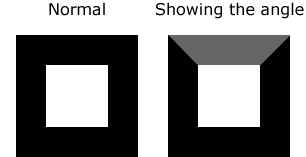
We can further accent this line by changing the border-top-color declaration to white, which creates a knockout effect with the box: it makes it look like there’s no top, but retains the angles.
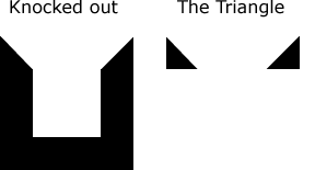
But we still have some very thick border lines to deal with. So, next we have to remove the bottom border. I also like to clear out the height and width to make sure any cross-browser issues are dealt with.
#box {

  border: 30px solid #000;

  border-top: 10px solid #fff;

  border-right: 10px solid #000;

  border-bottom: 0;

  height: 0;

  width: 0;

}
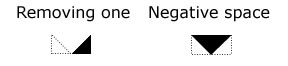
After clearing out the width, the two triangles should be touching in the middle. You can handle this a couple different ways:
- remove one triangle by setting the
border-left-color(orborder-right-color) to white - use the negative space in the middle to create a downward pointing arrow
Do that a few more times, mix in some positioning, and eventually you’ll come out with a nice, compass-like directional pad of arrows. The slope of each triangle can be controlled by changing the width of each element’s border.

Building a Shelf
Along the same theme, we can apply this to everyday web design by adding some 3D emphasis to a link or navigation by creating some CSS shelves. And honestly… it wouldn’t kill you to put up some shelves.
The idea for the CSS shelf first came to me during a visit to Webmonkey. Their old design (about a year ago) positioned the search box on what looked like a little shelf with the search box itself casting a shadow. And I wondered if that could be done with pure CSS. Turns out, it can.
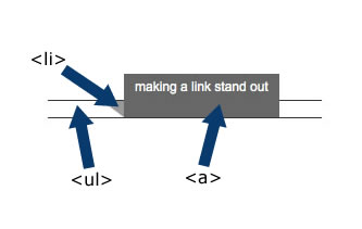
Anatomy of the Semantic Shelf
The CSS shelf comes in three parts (four if you include the container <div>). Keeping the markup semantic lets us treat it just like any other type of navigation, and allows us to keep the layout extremely flexible for later design changes.
<div id="shelf">

  <ul>

    <li><a href="#">making a link stand out</a></li>

    <li><a href="#">isn't really all that hard</a></li>

    <li><a href="#">however, i did seem to swear a lot</a></li>

  </ul>

</div><!--/shelf-->
For the base of the shelf we need to first establish a relative positioning point with our <div>, set our height and width properties, and set a font base.
#shelf {

  position: relative;

  top: 50px;

  width: 700px;

  font: normal .75em Arial, Helvetica, sans-serif;

}
The second step in building our shelf is dealing with the <ul> to create a base for our link to stand on. Many properties in this part of the shelf are cosmetic, but the margin actually fixes some layout issues I ran into.
#shelf ul {

  margin: 0 0 0 -50px;

  padding: 0;

  border-top: 1px solid #333;

  border-bottom: 1px solid #333;

  height: 15px;

}
The <li> holds the length (width: 130px) of each shelf item, creates the shadow (border-top), and provides some vital positioning properties (position: relative). Setting the border-left color to white creates that knockout effect we mentioned earlier. In this case, it fills in the area below and to the left of the shadow.
#shelf li {

  list-style: none;

  margin: 0 20px 0 50px;

  float: left;

  border-top: solid 15px #999;

  border-left: solid 20px #fff;

  position: relative;

  width: 130px;

}
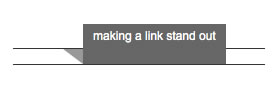
Lastly, we have to set the link properties: the cosmetic styles that form the bottom of the shelf. If you play with these values a little, you can see how much the slightest change can alter the look and feel of your shelf.
#shelf a {

  display: block;

  height: 30px;

  position: absolute;

  top: -40px;

  white-space: nowrap;

  padding: 5px 10px;

  color: #fff;

  text-decoration: none;

  background: #555;

}
Then we hang it on the wall, sit back, and admire some good old-fashioned quality craftsmanship.
The Future of CSS Angles
The W3C has drafted an extension to the CSS3 box model called Rotating Boxes. This model includes two properties: rotation and rotation-point. Rotation can be applied to block-level, inline table, and inline-block elements; it can take a value from 0 to 360 degrees. Rotation-point can only be applied to block-level elements, takes two values (for example, bottom and left), and defines the point where the rotation occurs. These values may also be numeric and/or negative.
The proposed syntax also includes a block progression property, which can define the direction of the text in the rotated box, and whose use goes beyond being paired with the rotation property.
thead th {

  block-progression: rl;

  padding: 0.5em 1em;

  rotation: 45deg;

  rotation-point: bottom left;

}
The above code example (via the W3C examples) will produce slanted table headings, as displayed below.

Benefits
What are the benefits of spending an extra hour buried up to your eyes in CSS trying to achieve a task that an image could accomplish in less than half the time?
- You take pride in your CSS and hate using unnecessary images to accomplish a design.
The best part about using basic properties (like borders) creatively to solve a problem, is that all the browsers can support these techniques; more often than not, they have very few cross-browser issues. Adding a layer of JavaScript on top of this can create some very cool effects, like James Edwards’ 3D Maze.
Closing
There are many things coming down the CSS pipeline: some from the W3C, others from the community. And a hot topic right now seems to be that JavaScript is the gateway to CSS3. While we wait for some areas of the Web to catch up to the desires of ambitious developers, there’s still a large amount of exploration to be done with the current state of CSS.
Sites like CSS Zen Garden can show us the power of CSS; this is just another example of how semantic markup can be manipulated a great deal with a little sweat and creativity. Of course, this is just the tip of the iceberg with what you can do using pure CSS. The key is to avoid the mindset that a table has to look like a table (sorry, that link works in Firefox only). A lot of the greatest CSS techniques we all know and use came from a combination of imagination, free time, and trying new things over and over again. Don’t let common practices become law just because it’s “how things are done” and it’s a “standard”. CSS is still very young and we’re all feeling out its limitations; the web moves too fast for us to get set in our ways. Remember, using a table for layout used to be a standard too…
Frequently Asked Questions about CSS Angles
How can I create a slanted border using CSS?
Creating a slanted border using CSS involves using the transform property. The transform property allows you to rotate, scale, move, or skew elements. To create a slanted border, you would use the skew or rotate methods. For example, if you want to create a slanted border at the bottom of a div, you could use the following code:div {
position: relative;
overflow: hidden;}div:after {
content: "";
position: absolute;
bottom: 0;
width: 100%;
height: 100px;
background: #000;
transform: skewY(-5deg);
transform-origin: 100% 100%;}
This code creates a pseudo-element with a black background that is skewed by -5 degrees.
What is the use of the border-radius property in CSS?
The border-radius property in CSS is used to add rounded borders to an element. This property can have one to four values, and it allows you to set the radius of the four corners individually. The values can be specified in pixels, percentages, or ems. For example, the following code will create a circle:div {
width: 100px;
height: 100px;
background: #000;
border-radius: 50%;}
This code creates a div with a width and height of 100px and a border-radius of 50%, which makes the div a circle.
How can I create shapes using CSS borders?
Creating shapes using CSS borders involves using the border property and the width and height properties. For example, to create a triangle, you could use the following code:div {
width: 0;
height: 0;
border-left: 50px solid transparent;
border-right: 50px solid transparent;
border-bottom: 100px solid #000;}
This code creates a div with a width and height of 0, and it uses the border property to create a triangle. The border-bottom property creates the base of the triangle, and the border-left and border-right properties create the sides of the triangle.
How can I create sloped edges with a consistent angle in CSS?
Creating sloped edges with a consistent angle in CSS involves using the transform property and the pseudo-element ::before or ::after. For example, to create a sloped edge at the top of a div, you could use the following code:div {
position: relative;
overflow: hidden;}div:before {
content: "";
position: absolute;
top: 0;
width: 100%;
height: 100px;
background: #000;
transform: skewY(5deg);
transform-origin: 0 0;}
This code creates a pseudo-element with a black background that is skewed by 5 degrees.
How can I create a slanted border with a consistent angle in CSS?
Creating a slanted border with a consistent angle in CSS involves using the transform property and the pseudo-element ::before or ::after. For example, to create a slanted border at the bottom of a div, you could use the following code:div {
position: relative;
overflow: hidden;}div:after {
content: "";
position: absolute;
bottom: 0;
width: 100%;
height: 100px;
background: #000;
transform: skewY(-5deg);
transform-origin: 100% 100%;}
This code creates a pseudo-element with a black background that is skewed by -5 degrees. The transform-origin property is used to set the origin for the transformation. In this case, the origin is set to the bottom right corner of the div.