Creating A Letterpress Effect For Logo Design In Illustrator

This week I have another Illustration tutorial for you. The letterpress style has been popular in logo design in recent year, both for print-based and web-based work. It’s pretty easy to create the letterpress style effect in both Photoshop and Illustrator. I’m using Adobe Illustrator here because it’s a standard tool for logo design. We’ll create a graphic style which can be applied to text and any other vector object. The difficulty level here is beginner and the technique is something you can play around with to create your own styles. I’m using Adobe Illustrator CS5 here, but this effect can be achieved with any recent version of Illustrator.
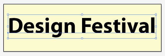
Here’s the effect we’ll create:

Step 1. Select the Rectangle tool (M), choose a color that you like in the color picker and draw out a rectangle. This is your background color. I chose a green color (#99CC99), but you can also use a white background if you prefer.

Step 2. Select the Type tool (T) and add some text. It doesn’t matter what color you choose for the font as it will be irrelevant in a few steps time. I chose Myriad Pro – a nice sans serif font, set in bold, size 70.
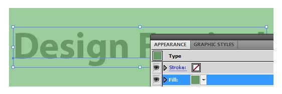
Step 3. With the text still selected, remove any fill or stroke. Open the Appearance panel, and from the context sensitive menu, choose New Fill. If the Appearance panel is not open choose Window > Appearance.

Now click the swatch thumbnail in the Appearance panel of the new fill and choose a color which is a darker shade of your background color. I picked #669966.
Step 4. With the new fill still selected in the Appearance panel, choose Effect > Stylize > Inner Glow. When the Inner Glow dialog box opens, check the preview box so that you can see the changes as you make them. Set the Mode to Normal and the fill color to a color slightly darker than your background color. I set the Opacity to 95% and the Blur to 2 pixels. Depending on the size of your text, you may need to play around with the Blur value.
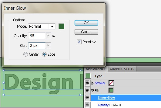
Notice that when you press the drop-down arrow of the new fill in the Appearance panel you can see the Inner Glow effect listed under it.

Step 5. Keep the text selected, then as before choose Create a new fill from the context sensitive menu. Don’t worry if it looks like you’ve lost your Inner Glow effect, it’s just hidden under the new fill. Simply rearrange the order of the fills by dragging the new fill under the first Inner Glow you created.
Now set the new fill color to a darker color than the last fill. I used #336633. You won’t actually see any change because the new fill is sitting under the Inner Glow effect.

Step 6. With the latest new fill selected, choose Effect > Distort & Transform > Transform. When the Transform Effect dialog box opens, again check the preview box then change the Vertical Move to -1 pixel. Depending on the size of you text, you can experiment with this value.

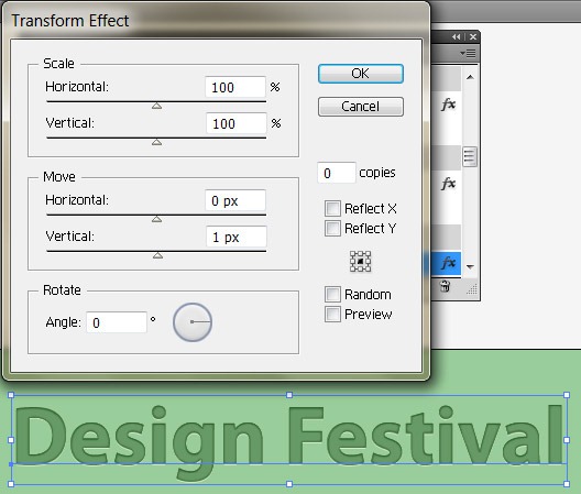
Step 8. Ok, once more with feeling! With the text still selected, create another new fill from the Appearance panel and fill it with a light green color. I used #CCFFCC. You could try white here, I felt it was a bit too bright for the green colors I was using. Drag the new fill underneath the other two fills you have created.

Choose Effect > Distort & Transform > Transform. In the Transform Effect dialog box, set the Vertical Move to 1 pixel. Play around with this value depending on the size of your text. This is a very subtle effect but finishes off the letterpress effect with a small highlight.
That’s your letterpress style created. The best bit about this technique is that your text is still editable.

Step 9. (optional) If you want to add a little bit of texture, choose Effect > Texture > Texturizer. Note that this is listed under Photoshop effects and can sometimes make your lovely smooth vectors look a bit rough around the edges.

Step 10. At this point you can create a Graphic Style which can be reused anytime you want to use your letterpress effect. Select the text again, then press the New Graphic Style button in the Graphic Style panel. If the Graphic Style panel is not open choose Window > Graphic Style. To use the style again just click the thumbnail of the graphic Style you created and it will be applied.

Frequently Asked Questions on Creating a Letterpress Effect for Logo Design in Illustrator
What are the basic tools needed in Illustrator to create a letterpress effect?
To create a letterpress effect in Illustrator, you will need to familiarize yourself with a few basic tools. These include the Text Tool for creating and editing text, the Appearance Panel for managing the visual aspects of your design, and the Gradient Tool for adding depth and dimension to your design. You will also need to use the Effects Menu to apply the letterpress effect, specifically the ‘Bevel and Emboss’ option.
How can I add depth to my letterpress design in Illustrator?
Adding depth to your letterpress design in Illustrator can be achieved by using the Gradient Tool and the Bevel and Emboss effect. The Gradient Tool allows you to create a gradient fill, which can give the illusion of depth. The Bevel and Emboss effect, on the other hand, can be used to add a three-dimensional effect to your design, further enhancing the depth.
Can I edit my text after applying the letterpress effect in Illustrator?
Yes, you can edit your text after applying the letterpress effect in Illustrator. To do this, you will need to use the Appearance Panel. This panel allows you to manage and modify the visual aspects of your design, including the text. You can change the font, size, color, and other attributes of your text even after applying the letterpress effect.
How can I create a custom gradient for my letterpress design in Illustrator?
Creating a custom gradient for your letterpress design in Illustrator can be done using the Gradient Panel. This panel allows you to create and edit gradients by adjusting the color stops, the type of gradient (linear or radial), and the angle of the gradient. You can also add or remove colors from your gradient to achieve the desired effect.
What is the role of the Appearance Panel in creating a letterpress effect in Illustrator?
The Appearance Panel plays a crucial role in creating a letterpress effect in Illustrator. It allows you to manage and modify the visual aspects of your design, including the fill, stroke, and effects. You can use this panel to apply the Bevel and Emboss effect, which is essential for creating the letterpress effect. You can also use it to edit your design after applying the effect.
How can I apply the Bevel and Emboss effect to my design in Illustrator?
Applying the Bevel and Emboss effect to your design in Illustrator can be done using the Effects Menu. This menu allows you to apply various effects to your design, including the Bevel and Emboss effect. To apply this effect, you will need to select your design, go to the Effects Menu, choose the ‘3D’ option, and then select ‘Bevel and Emboss’.
Can I use the letterpress effect for other types of designs in Illustrator?
Yes, you can use the letterpress effect for other types of designs in Illustrator. While this effect is commonly used for logo design, it can also be applied to other design elements such as text, shapes, and graphics. The process of applying the effect is the same, regardless of the type of design.
How can I achieve a realistic letterpress effect in Illustrator?
Achieving a realistic letterpress effect in Illustrator requires a combination of the right tools and techniques. You will need to use the Text Tool, the Gradient Tool, the Appearance Panel, and the Effects Menu. You will also need to apply the Bevel and Emboss effect and create a custom gradient. The key is to experiment with different settings and adjustments until you achieve the desired effect.
What are some common mistakes to avoid when creating a letterpress effect in Illustrator?
Some common mistakes to avoid when creating a letterpress effect in Illustrator include not using the right tools, not applying the Bevel and Emboss effect correctly, and not creating a custom gradient. These mistakes can result in a less realistic and less effective letterpress effect. It’s important to familiarize yourself with the necessary tools and techniques before starting your design.
Can I save my letterpress effect settings in Illustrator for future use?
Yes, you can save your letterpress effect settings in Illustrator for future use. To do this, you will need to use the Graphic Styles Panel. This panel allows you to save and manage your design styles, including the letterpress effect. You can then apply these styles to other designs with just a few clicks, saving you time and effort.
Jennifer Farley is a designer, illustrator and design instructor based in Ireland. She writes about design and illustration on her blog at Laughing Lion Design.


Published in
·Accessibility·Community·Computer science·Debugging·Design·Design & UX·Programming·Software·Software·Software Development·Web·January 28, 2015

Published in
·Canvas & SVG·Design·Design & UX·HTML & CSS·HTML & CSS·Performance·UI Design·August 12, 2020