
Key Takeaways
- Web Components, introduced by the W3C, are a collection of specifications that allow developers to create reusable components for their web applications. This changes the traditional approach of web design and makes it easier to maintain and enhance the code as the application scales.
- Polymer is a library created by Google that allows developers to use the features of Web Components in modern browsers. It provides a set of polyfills to use web components in non-compliant browsers and also provides a suite of ready-made UI and non-UI elements to use and extend in your project.
- Custom elements are a key feature of Web Components and Polymer. They can be styled via CSS and scripted via JavaScript just like any other HTML element. In addition, Polymer provides the ::shadow pseudo-element and the /deep/ combinator to style elements under different shadow trees from outside the custom element.
- Despite the advantages of using Polymer and Web Components, using these custom elements on a large scale could degrade the network performance of your website due to the many HTTP requests they generate. To tackle this problem, the Polymer team built Vulcanize, which inlines all your HTML imports, flattens their dependencies, and produces an output that generates fewer network requests.
Modern web applications are not only complex to design but also quite difficult to develop. Given the range of tools involved, amount of testing required, and the combination of libraries/frameworks used, the development process has become harder. As the application scales over a period of time, it becomes harder to maintain the code and make enhancements.
For instance, take a look at the frontend code of these few popular websites:
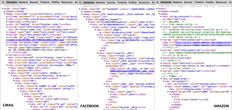
Developer tools may not necessarily indicate the complexity of the actual source code, but this surely gives you an insight into the complex DOM structure of modern web applications. This is largely due to the indiscriminate usage of div(s) and span(s) in your markup that results into an unmanageable code. Much has been discussed about the semantic value of HTML5 tags but they still fall short of providing a meaningful markup, mainly because of two reasons:
- We have too many similar components in our web page that fall under the same semantic structure. To distinguish them from each other, we use classes, IDs, or other attributes.
- The available list of semantic tags are simply not enough to target the wide variety of components that constitute our design. As a result, we fall back to traditional tags like
divorspan.
The Solution to Semantic Madness
The W3C aims to address this problem by introducing Web Components. Web components are a collection of specifications that enable developers to create their web applications as a set of reusable components. Web Components provide a paradigm shift from the traditional approach of web design by fundamentally changing the way we build and conceive web apps.
Each component lives in its self-defined encapsulated unit with corresponding style and behavior logic. These components can not only be shared across a single web application but can also be distributed on the web for use by others.
Web components are made up of four different specifications:
- Custom Elements – These enable developers to create their own elements that are relevant to their design as part of the DOM structure with the ability to style/script them just like any other HTML tag.
- HTML Templates – These let you define fragments of markup that stay consistent across web pages with the ability to inject dynamic content using JavaScript.
- Shadow DOM – This is designed to abstract all the complexities from the markup by defining functional boundaries between the DOM tree and the subtrees hidden behind a shadow root.
- HTML Imports – Similar to import one CSS file into another, these allow you to include and reuse HTML documents in other HTML documents.
What is Polymer?
The specifications introduced above are quite new and it is hardly surprising to know that browser support is not very good. But, thanks to the Polymer library, created by the awesome folks at Google, we can use all these features in modern browsers today. Polymer provides a set of polyfills that enables us to use web components in non-compliant browsers with an easy-to-use framework. Polymer does this by:
- Allowing us to create Custom Elements with user-defined naming schemes. These custom elements can then be distributed across the network and used by others with HTML Imports.
- Allowing each custom element to have its own template accompanied by styles and behavior required to use that element.
- Providing a suite of ready-made UI and non-UI elements to use and extend in your project.
Note: X-Tag is a similar project by Mozilla that brings the promise of Custom Elements to all modern browsers.
This article primarily focuses on using visual elements that are part of the Polymer library. The elements collection is divided into two sections:
- Core Elements – These are a set of visual and non-visual elements designed to work with the layout, user interaction, selection, and scaffolding applications.
- Paper Elements – Implements the material design philosophy launched by Google recently at Google I/O 2014, and these include everything from a simple button to a dialog box with neat visual effects.
Installing Polymer
The recommended way to install Polymer (v0.3.4) is through Bower. Bower is a package manager that manages dependencies for your project. If you are not familiar with Bower, then I recommend you read the instructions on its website to learn how to install and get started with it.
Assuming you have a project folder setup with a bower.json file, you can install the latest version of Polymer by running the following via the command line:
bower install --save Polymer/polymer
This will install the Polymer library and the platform polyfills inside the bower-components folder.
bower_components/

├── core-component-page

├── platform

└── polymer
Note: --save will add the package as a dependency to the bower.json file. This is useful when you want to update the packages used in your project.
Since installing Polymer, you can start by creating the index.html file in the root of your project folder.
.
├── bower_components/
├── bower.json
└── index.html
Add the platform.js polyfill in the <head> of your document and then you’ll be ready to use predefined custom elements in your documents.
<script src="bower_components/platform/platform.js"></script>
Using Custom Elements
Using custom elements in your markup typically involves the following steps:
- Download the Custom Element package via Bower.
- Import the corresponding
.htmlfile in your document. - Use the custom element markup anywhere in your document.
In this example, we’ll experiment with the paper-input custom element and use it in our HTML page. You can install paper-input directly from Bower and it will automatically download other required dependencies.
bower install --save Polymer/paper-input
Before you use any custom elements in your page, you need to import the corresponding .html file:
<link href="bower_components/paper-input/paper-input.html" rel="import">
Now you can use the paper-input element anywhere inside the <body> tag:
<paper-input></paper-input>
There are quite a few variations possible with the vast number of attributes accompanying this custom element. The component page has the complete list of attributes that can be used with paper-input. With the help of the Polymer Designer Tool, I have created a demo page that provides example usage of various attributes.
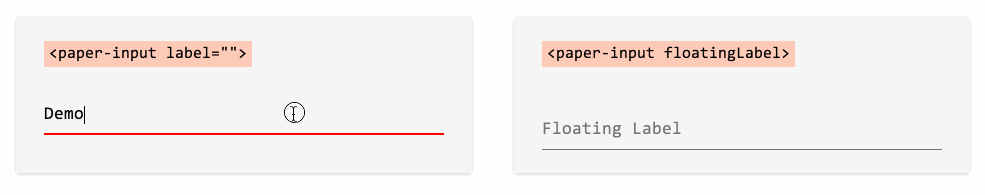
The one that I particularly like is the Floating Label technique, which has become very popular and a number of people have written about it. All those techniques are great but none could be simpler than just adding an attribute to the tag:
<paper-input floatingLabel label="Floating Label"></paper-input>
Styling Custom Elements
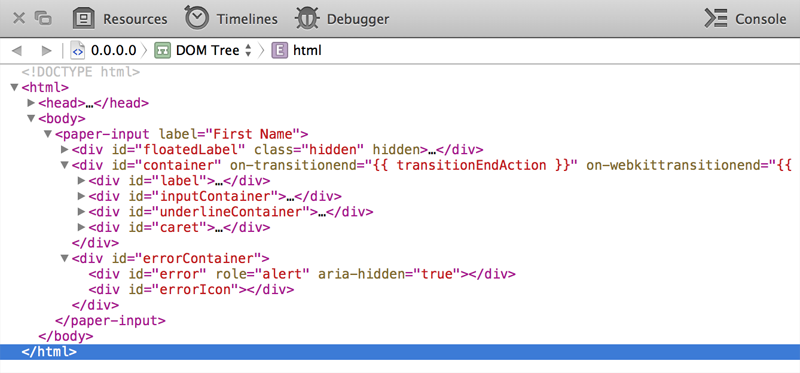
Custom elements are first-class HTML elements, which means that they can be styled via CSS and scripted via JavaScript just like any other HTML element.
For instance, to style our paper-input custom element, we can use the tag name as the selector to style all paper-input elements:
paper-input {

    width: 400px;

    height: 15px;

}
Or style a bunch of them with the same class:
.first-name {

    width: 400px;

    height: 15px;

}
Or target a specific paper-input element with an ID:
$('#first-name').addClass('show');
There may be instances when you want to override the default styles of the custom element that may not necessarily be affected by the above selectors. This happens because the markup that makes up a custom element lives under the Shadow DOM, which remains immune to the styles directly applied to the custom element.
Thankfully, Polymer provides the ::shadow pseudo-element and the /deep/ combinator to pierce through the boundaries of the Shadow DOM and allow us to style elements under different shadow trees from outside the custom element.
For example, let’s say you want to override the default blue scheme of our paper-input to green.
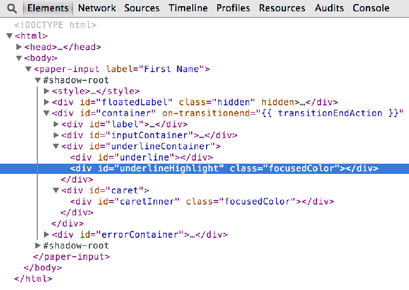
Looking at the markup of the custom element beneath the Shadow DOM, you can figure out that you need to alter the styles of .focusedColor to change the color scheme.
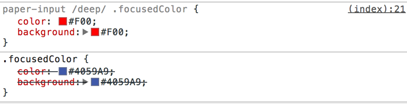
So, paper-input::shadow will match #shadow-root within the paper-input element. From there, you can write a normal descendant selector to target individual elements:
paper-input::shadow .focusedColor {

    color: white;

    background: red;

}
Similarly, the /deep/ combinator can completely ignore all shadow boundaries, letting you cross into any number of shadow trees to reach the target element:
paper-input /deep/ .focusedColor {

    color: white;

    background: red;

}
Note: In this example, both ::shadow and /deep/ would work the same way. /deep/ will become useful when you want to target descendent elements of custom elements that live under concentric shadow boundaries.
The combination of ::shadow and /deep/ selectors lets you style elements across the component. But at the same time, styling custom elements from outside does add layers of cancelled overridden styles that were previously authored for the custom element.
Browser Compatiblity
Polymer aims to support the latest version of evergreen browsers (meaning browsers that auto-update). In practice, the paper-input custom element should work the same in recent versions of all major browsers.
This has a caveat though, because our specific styles to override the default color scheme of the paper-input element do not work as expected in Safari. In case you aren’t aware, Apple has removed Shadow DOM from Safari, that means ::shadow and /deep/ represent invalid selectors for Safari, which forces the CSS parser to completely ignore the rule sets defined with those selectors.
As it stands, the latest version of Safari (v7.0.4) exposes the elements inside the Shadow DOM to the outer level, which means we can use standard CSS descendant selectors to achieve the same effect.
paper-input .focusedColor {

    color: white;

    background: red;

}
Note: Do not combine rule sets with selectors for other browsers with this one, otherwise Safari will ignore the entire rule set.
Too many HTTP requests?
It’s tough to imagine that using a simple element like paper-input would result into so many HTTP requests!
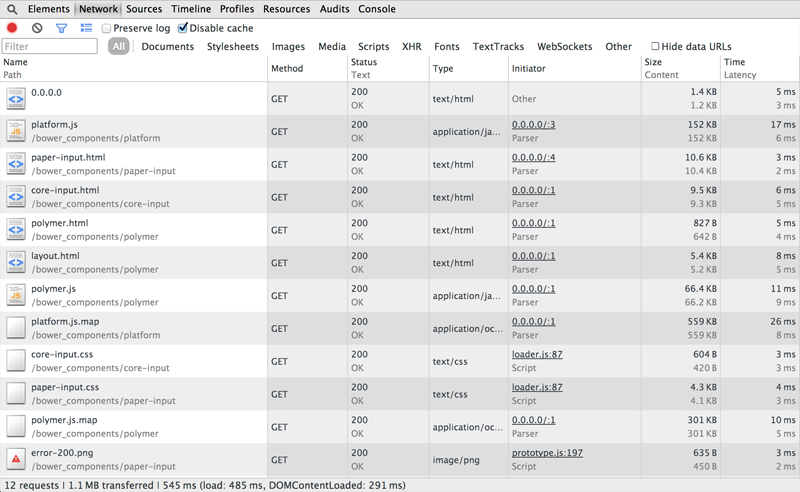
This can be attributed to the modular nature of Polymer, where each component is composed of several other functional units with each unit possessing the capability to run independently.
Using these custom elements on a large scale web application could drastically degrade the network performance of your website. To tackle this problem, the Polymer team built Vulcanize. Vulcanize inlines all your HTML imports, flattens their dependencies, and produces an output that generates far fewer network requests.
Addy Osmani has written an in-depth article about Vulcanize on the Polymer blog, describing the process of concatenation and inlining assets using Vulcanize.
It is important not to forget that Polymer is still in developer preview and is continuously being worked on by the community (you can contribute too!).
That being said, this shouldn’t stop us from building today’s web applications with the powerful features of Polymer and web components.
Frequently Asked Questions about Web Components and Polymer Tutorial
What is the main difference between Web Components and Polymer?
Web Components are a set of web platform APIs that allow you to create new custom, reusable, encapsulated HTML tags to use in web pages and web apps. They are part of the browser, and so they do not need external libraries like jQuery or Mootools. Polymer, on the other hand, is a library that provides syntactic sugar for creating Web Components. It smoothens the rough edges of Web Components and adds some additional features, making it easier to create your own custom elements.
How can I start learning Google Polymer?
To start learning Google Polymer, you need to have a basic understanding of HTML, CSS, and JavaScript. You can then visit the official Polymer website and go through their documentation and tutorials. You can also find many online tutorials and courses on websites like Udemy, Coursera, and YouTube.
What are the advantages of using Polymer?
Polymer provides a number of advantages. It simplifies the process of creating custom elements, provides a way to easily extend HTML, and allows for the creation of reusable components. It also provides data binding capabilities, making it easier to create dynamic applications.
Can I use Polymer with other JavaScript frameworks?
Yes, Polymer is designed to be used with any JavaScript framework. It is not a replacement for frameworks like Angular or React, but rather a tool that can be used alongside them to create custom elements.
How does Polymer compare to other libraries for creating Web Components?
Polymer is one of the most popular libraries for creating Web Components, but there are others like X-Tag and Bosonic. Polymer stands out because it is backed by Google and has a large community of developers. It also provides a number of additional features like data binding and conditional templating.
Is Polymer compatible with all browsers?
Polymer uses Web Components, which are a part of the HTML5 specification. However, not all browsers fully support HTML5 or Web Components. To ensure compatibility, Polymer provides polyfills, which are pieces of code that provide the functionality that the browser lacks.
What is the future of Polymer?
The future of Polymer looks promising. It is backed by Google and is being used in a number of Google services like YouTube and Google Earth. With the growing popularity of Web Components, it is likely that the use of Polymer will continue to grow.
How can I contribute to the Polymer project?
The Polymer project is open source, and anyone can contribute to it. You can contribute by reporting bugs, suggesting new features, improving documentation, or writing code. You can find more information on how to contribute on the Polymer GitHub page.
What is the performance impact of using Polymer?
The performance impact of using Polymer is minimal. The Polymer library is lightweight, and the use of Web Components can actually improve performance by reducing the amount of DOM manipulation required.
Can I use Polymer for mobile app development?
Yes, you can use Polymer for mobile app development. Polymer elements are responsive and can adapt to different screen sizes. Additionally, Polymer supports touch events, making it suitable for mobile devices.