
Atom describes itself as a “hackable text editor for the 21st century“. It has become the go-to text editor for thousands of developers all over the world and is very easy to extend and customize. Developers share new features with the Atom community by publishing packages and themes. After reading this article, you can publish your own Atom syntax theme – a great first step in hacking Atom!
Key Takeaways
- Atom is a customizable text editor that allows developers to create and share their own syntax themes using CSS.
- To create a syntax theme, one must first download the Atom text editor, then use the auto-generate feature to create a syntax theme package.
- Atom uses Less, a superset of CSS, for styling. This includes features like variables, nested styles, and the & operator. Changes to the theme can be viewed by reloading the Atom window.
- Once a theme is created and refined, it can be shared with the Atom community through the Atom Package Manager (APM).
What is a Syntax Theme?
A syntax theme lets you style the text/code area in the editor. An interface theme, on the other hand, allows you to style all other aspects of the Atom text editor (like the sidebar, status bar, tabs and so on). We’ll restrict ourselves to writing a syntax theme. This article only assumes a working knowledge of CSS.
Getting Started
So what do you need to get started? You just need to download the Atom text editor, and you’re good to go! Atom uses Less, which is a superset of CSS with some nifty features like variables which we’ll learn as we go along.
Generate an Atom syntax theme package
There was a time when writing a syntax theme meant a lot of work. Today, there’s an excellent auto-generate feature built right into Atom.
- Open Atom and hit
Cmd + Shift + P(for Windows useCtrl + Shift + P) - Type
generate - Choose the Package Generator: Generate syntax theme option
Atom will prompt you for a location to save the package. You can save it anywhere you like.
Name your package
Atom will open up the generated package as a project that you can start editing. Atom recommends that the package name ends with -syntax, and it’s best practice to use a lower case hyphen separated name. I’m going to name my package blue-everywhere-syntax and well, turn up the blue.
Package structure
The auto-generated package has been laid out carefully so that it is very easy to edit.
- The main stylesheet resides in
index.less. - The base styles reside in
styles/base.less, and the colors reside instyles/colors.less. We’ll dig deeper into these files soon. - If you’ve used Node.js and NPM then
package.jsonwill be familiar. It gives the package a name and description and lets you provide some useful metadata. - The
README.mdfile allows you to describe your theme using markdown. If you publish your theme, this README will be visible to users who visit your download page.
Show Me The Code
So let’s dive right in. Without getting into the details, it’s useful to know that Atom’s rendering engine is basically Chrome under the hood (check out Electron if you want to understand how it all works). That’s why we can style it using good old CSS. But since the folks who built Atom wanted to make use of some convenient features like variables and nested imports, they chose to use Less. Not to worry, because we only need a couple of Less features and I’ve laid them out for you in the article!
Since Atom uses Chromium, all you need to do to see your changes reflect in your editor is, you guessed it, reload! You can reload Atom using Cmd + Alt + Ctrl + L or View > Developer > Reload. Let’s go to Atom Settings (Cmd + ,) > Themes and set our editor’s syntax theme to the new theme that we just created.
Let’s turn things blue
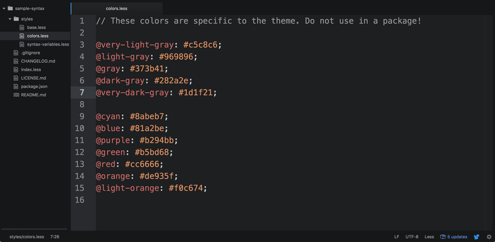
Open the colors.less file (style > colors.less). You can see a variable called @very-dark-gray, whose value is set to #1d1f21.
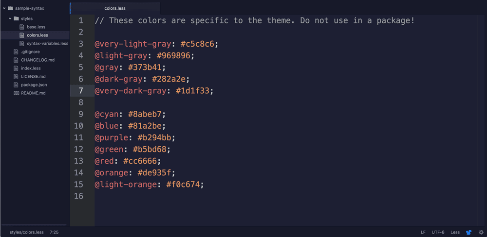
Let’s change this to a dark blue instead #1d1f33. Now reload atom (Cmd + Alt + Ctrl + L or View > Developer > Reload). Boom! The background of the text area should have changed.
What just happened?
Let’s take a deeper look at these less files. index.less imports base.less. If we open up base.less, we see that it’s quite similar to CSS. We can see that the theme is using some Less features like variables. Variables are easy to spot, since they begin with an @ symbol.
For now, let’s focus on the editor’s background color. The color is defined in the first few lines.
@import "syntax-variables";
atom-text-editor, :host {

  background-color: @syntax-background-color;
We can see that the editor’s background-color is set to the variable @syntax-background-color. But where is @syntax-background-color defined?
We can see that a file called syntax-variables has been imported in the first line. Let’s look inside syntax-variables.less for @syntax-background-color‘s definition.
@import "colors";
// This defines all syntax variables that syntax themes must implement when they

// include a syntax-variables.less file.
// General colors

@syntax-text-color: @very-light-gray;

@syntax-cursor-color: white;

@syntax-selection-color: lighten(@dark-gray, 10%);

@syntax-background-color: @very-dark-gray;
We find that @syntax-background-color is set to @very-dark-gray. As you might’ve guessed, @very-dark-gray is defined in colors.less. This is why we opened up colors.less and changed @very-dark-gray to change the editor’s background color.
Organization of stylesheets
How you organize variables between stylesheets is a matter of taste. Atom is suggesting through it’s auto-generated template that you group together items which ought to have the same colors using syntax variables in base.less and then assign a color to each of these variables in syntax-variables.less. But you can see that this is more for our convenience, and in many cases, colors are also directly defined in base.less. Armed with this information, it should be fairly easy to change up the colors in your new theme! Experiment with an entirely new palette and view the results by reloading your Atom window.
Advanced Styling
But what if we want to change the styling for very specific cases? Apart from variables and imports, there are a couple of other Less features that we will find useful in reading and modifying our stylesheets. You can skip the next two subsections if you’re already comfortable with using Less.
- Nested styles
- The
&operator
Nested styles
Less supports nested styles. How do they work?
<div class="container">

  <a href="http://some-url.com">Click here!</a>

  <div class="red-block">

    <a href="http://some-url.com">Click here!</a>

    <a href="http://some-url.com">Click here!</a>

  </div>

  <a href="http://some-url.com">Click here!</a>

  <a href="http://some-url.com">Click here!</a>

</div>
Let’s say we wanted all the <a> tags inside .red-block to be red, but not the ones outside. We would write the Less stylesheet this way:
.container {

  .red-block {

    a {

      color: red;

    }

  }

}
This is the same as:
a.container.red-block {

  color: red;

}
The auto-generated stylesheets use nested styles extensively, since this ensures that related styles appear together.
The & operator
The & operator is best explained with an example.
.box {

  color: black;

  &-red {

    color: red;

  }

  &-blue {

    color: blue;

  }

  &:hover {

    color: gray;

  }

}
This is the same as:
.box {

  color: black;

}

.box-red {

  color: red;

}

.box-blue {

  color: blue;

}

.box:hover {

  color: gray;

}
As you can see, & is shorthand for the parent selector. It’s used quite frequently in base.less and now we know how it works.
Blue variable names
Now let’s try some advanced color changes. Let’s turn all variable names dark blue. Let’s also underline the variable name when we hover on it.
Atom automatically adds the .variable class to all variables in the code editor. So, we need to modify styling for the .variable class.
.variable {

  color: #336699;

  &:hover {

    text-decoration: underline;

  }

  ...
Reload the page and all the variable names (which start with an @), should now be blue. And hovering on one should result in an underline!
Current line number
Now let us also turn the current line number blue so that it catches our eye. If you read through base.less, you’ll find a section called .gutter, inside which we can style .line-number.
In colors.less we add @deep-sky-blue: #009ACD;.
We then use this color in base.less. You might’ve noticed that there are two cursor-line classes in the stylesheet – .cursor-line-no-selection and .cursor-line. Now if some text is selected in a line, we can make the line number stand out even more by making it lighter. Less has a nifty lighten function which enables us to do this easily.
.gutter {
background-color: @syntax-gutter-background-color;
color: @syntax-gutter-text-color;
.line-number {
&.cursor-line {
background-color: @syntax-gutter-background-color-selected;
color: lighten(@deep-sky-blue, 10%);
}
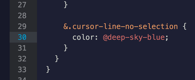
&.cursor-line-no-selection {
color: @deep-sky-blue;
}
That change, if done correctly, looks like so:
Conclusion
Through a series of simple examples and a working knowledge of CSS, we’ve created a brand new syntax theme for Atom. You can keep improving your Atom theme, and if you like what you’ve built, you can share it with the world using the Atom Package Manager (APM). Happy hacking! Please share the themes that you create in the comments.
Resources
Here’s a list of resources that you can use to dig deeper into some of the ideas introduced in this tutorial -:
- Color operation functions in Less: Less has a number of cool color functions like “lighten” and “darken”.
- Publishing your Atom theme: Instructions on how you can publish an Atom package.
- Atom flight manual: The “Getting Started” manual for all things Atom.
Frequently Asked Questions on Building Your Own Atom Theme with CSS
How can I customize my Atom theme using CSS?
Customizing your Atom theme using CSS is a straightforward process. First, you need to open your Atom style sheet. You can do this by clicking on ‘Edit’ and then ‘Stylesheet’. This will open a CSS file where you can add your custom styles. For instance, if you want to change the background color of your editor, you can add the following code:atom-text-editor {
background-color: #yourcolor;}
Remember to replace ‘#yourcolor’ with the color code of your choice. Save the changes and your Atom editor will automatically update to reflect them.
What are some popular Atom themes I can use for inspiration?
There are numerous Atom themes available that you can use for inspiration. Some popular ones include One Dark, Monokai, and Dracula. These themes are well-designed and have a good balance of colors, making them easy on the eyes. You can check them out and see how they have used CSS to style different elements of the Atom editor.
Can I share my custom Atom theme with others?
Yes, you can share your custom Atom theme with others. Atom allows you to package your theme and publish it on the Atom package manager. This way, others can download and use your theme. To do this, you need to create a new Atom package, copy your styles to it, and then publish it.
How can I change the font size in Atom using CSS?
Changing the font size in Atom using CSS is simple. You just need to add the following code to your stylesheet:atom-text-editor {
font-size: 14px;}
You can replace ’14px’ with the font size of your choice. Save the changes and the font size in your Atom editor will update.
How can I change the color of the syntax highlighting in Atom?
Syntax highlighting in Atom can be changed using CSS. Each language has different classes assigned to different parts of the code. For instance, to change the color of strings in JavaScript, you can use the following code:atom-text-editor .syntax--string .syntax--quoted,atom-text-editor .syntax--string .syntax--regexp {
color: #yourcolor;}
Replace ‘#yourcolor’ with the color code of your choice. Save the changes and the color of the strings in your JavaScript files will update.
Can I use CSS to style the Atom tree view?
Yes, you can use CSS to style the Atom tree view. The tree view has its own classes that you can target. For instance, to change the background color of the tree view, you can use the following code:.tree-view {
background-color: #yourcolor;}
Replace ‘#yourcolor’ with the color code of your choice. Save the changes and the background color of the tree view will update.
How can I reset my Atom theme to the default settings?
If you want to reset your Atom theme to the default settings, you can simply delete the custom styles from your stylesheet and save the changes. Atom will automatically revert to the default theme.
Can I use CSS to style the Atom tab bar?
Yes, you can use CSS to style the Atom tab bar. The tab bar has its own classes that you can target. For instance, to change the background color of the active tab, you can use the following code:.tab-bar .tab.active {
background-color: #yourcolor;}
Replace ‘#yourcolor’ with the color code of your choice. Save the changes and the background color of the active tab will update.
How can I change the color of the cursor in Atom using CSS?
Changing the color of the cursor in Atom using CSS is simple. You just need to add the following code to your stylesheet:atom-text-editor .cursor {
border-color: #yourcolor;}
You can replace ‘#yourcolor’ with the color code of your choice. Save the changes and the color of the cursor in your Atom editor will update.
Can I use CSS to style the Atom status bar?
Yes, you can use CSS to style the Atom status bar. The status bar has its own classes that you can target. For instance, to change the background color of the status bar, you can use the following code:.status-bar {
background-color: #yourcolor;}
Replace ‘#yourcolor’ with the color code of your choice. Save the changes and the background color of the status bar will update.