7 Famous Design Hacks You Can Steal From Star Wars

Key Takeaways
- Depth is a key design tactic used in Star Wars to create a sense of spacing between the background, mid-ground, and foreground. This can be applied in your own designs by overlapping different elements across these three planes.
- Contrast is another design hack used in Star Wars, achieved by placing opposing visual elements side by side. This can be applied in your own designs by depicting the impact or importance of specific sets of data or information with as much physical contrast as possible.
- Negative space is used in Star Wars to define an object and bring it into focus. This can be applied in your own designs by surrounding the focal point with white space, providing a visual pause between different elements.
- Perspective is used in Star Wars to create dynamic compositions and make certain objects and figures appear more dominant. This can be applied in your own designs by starting with a focal point and drawing lines away from that point to guide the viewer’s gaze.
- Repetition is a design hack used in Star Wars to emphasize an idea through the use of repeated visual elements. This can be applied in your own designs by using various patterns, lines, and colors repeatedly in close proximity to one another to create a sense of uniformity and strength.
Star Wars: A New Hope was the first movie in the Star Wars franchise and one of the great success stories of movie history. The film had a production budget of 11 million dollars, but made well over 700 million in the worldwide box office.
As was the case with any movie of its era, George Lucas’s team had no access to the jaw-dropping digital animation capabilities we take for granted today. Imagine having to create an entirely new galaxy, far, far away without even the most basic CGI help?
Instead, they worked entirely with traditional practical effects – using a blend of stop-motion photography, scale models, matte painting and puppetry techniques to bring George Lucas’s universe to life.
In large filmmakers succeeded by using some very common design tactics to produce a revolutionary series of films that continue to be referenced generation after generation.
Re-watching the films recently, a few classic design hacks caught my eye that you can apply when creating your own infographics, websites and user interfaces.
Hack #1 : Depth
One of the design tactics used incredibly well in the Star Wars series was that of depth. Depth is achieved by creating a sense of spacing between the background, mid-ground and foreground.
How depth is used in Star Wars:
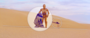
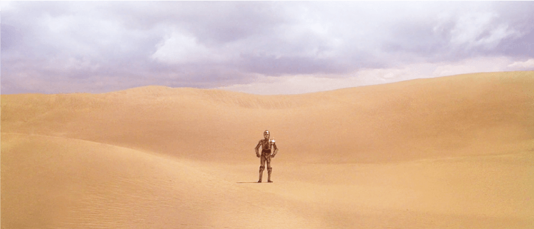
Many of the Star Wars films are made up of multiple frames which portray massive expanses of space as well as wide landscapes. In this shot of C-3PO and R2-D2 standing together in the desert, you can see how the use of depth creates a sense of isolation and distance.
The desert seems never ending and the two characters appear a lot closer and more in focus to the viewer in relation to the abandoned ship wreckage in the distance. This is done by dividing the scene into three sections to add texture, with the two characters placed in the centre.
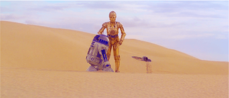
This allows us to see the illusion of distance. The use of light and shadow give their bodies a much more rounded appearance, while the ship in the background seems more flat and unfocused.

How to apply depth to your own designs:
When applying this principle to your own designs, try overlapping different elements across the foreground, mid-ground and background. By doing so, you’ll be able to create the effect of looking directly at the focal image or aspect of your design while other shapes in the distance come across as being farther in the distance.
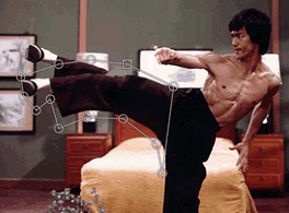
Hack #2: Use Contrast
The next design hack is to create contrast. This is achieved by placing opposing visual elements side by side. In doing so you can create a dramatic effect, especially when using objects of varying sizes.
How contrast is used in Star Wars:
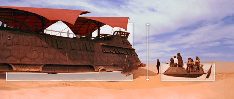
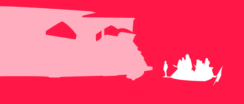
In this example from Return of the Jedi, we can see that the stories main heroes are displayed next to Jabba the Hutt’s large ship in a much smaller transportation device.
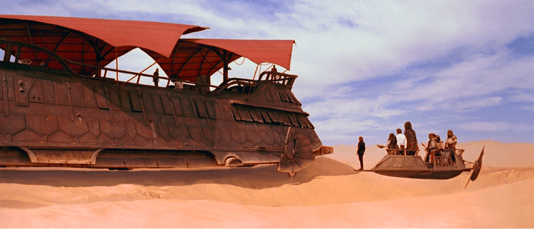
This acutely emphasizes the sheer dominance and power of Jabba the Hutt’s vessel. By contrasting both of these ships, our view is drawn to the much smaller transport. This creates tension based on its proximity to the larger ship.
How to apply contrast to your own designs:
When attempting to use contrast in your own work, try to depict the impact or importance of specific sets of data or information with as much physical contrast as possible. This is often seen in many infographic designs that require one data set to stand out from another.
This infographic example from Pfizer illustrates just how much of a fine they need to pay because of their profits:
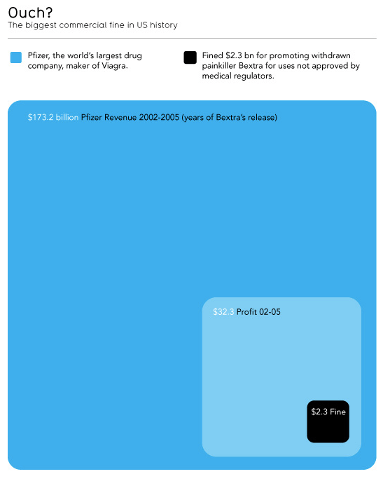
By seeing the data displayed in such a way, the use of contrast tells us a story so much more dramatically than mere numbers ever could.
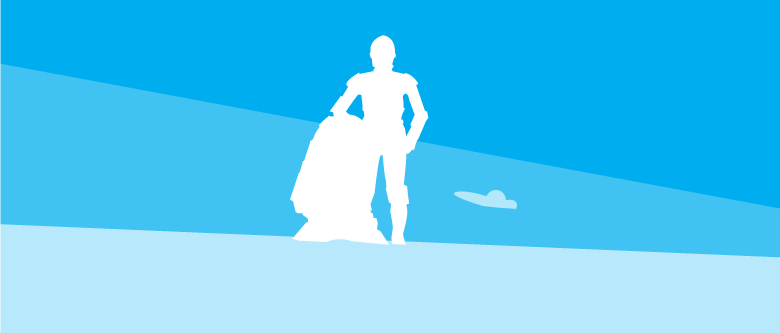
Hack #3: Exploit Negative Space
Another hack used is that of creating negative space. This is done to define an object and bring it into focus by surrounding it with white space. What this manages to accomplish is drawing attention to the focal point. Using negative space also provides a visual pause between different elements, making it easier for the viewer or reader to digest and process the important information.
How negative space is used in Star Wars:
Here’s a scene from A New Hope that presents C-3PO standing by himself in Tatooine. The desert acts as the negative space surrounding C-3PO. By depicting this character as a solitary figure, he is brought into much greater focus.
This also sends a symbolic message to viewers and helps them better understand just how isolated the character feels.
How to apply negative space to your own designs:
If you want to draw your viewer’s attention to focus on a specific object, avoid grouping too many objects closely together. What this does is that it makes it difficult for people to distinguish one item from another. You don’t want to distract your audience, you want to draw them into the most important element.

Let’s say that you’re designing a pricing page for a website. You can use negative space around some of the primary features you want to highlight, or around the package you want to push people to by surrounding it in more negative space.
You can also try layering various background components to tackle both depth as well as negative space.
Here’s an example of a simple way that this can be done:
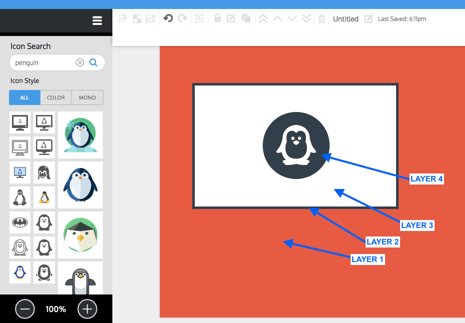
Notice how your eye is entirely drawn to the penguin icon in this screenshot.
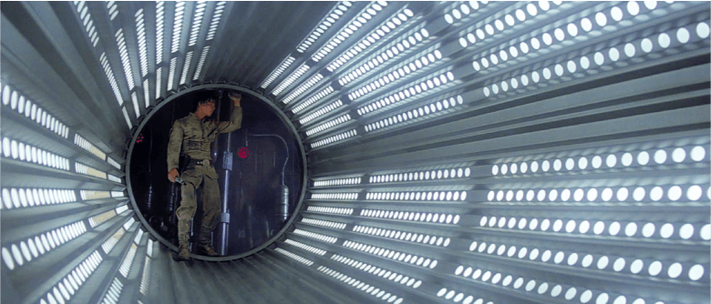
Hack #4:Get some Perspective
Perspective is used to create dynamic compositions. Based on their placement, this lets certain objects and figures appear more dominant. You can use lines to direct perspective and help your audience feel like they are either the character or within the scene itself.
How perspective is used in Star Wars:
Here is another shot from Return of the Jedi. What made this movie, and the entire Star Wars series so ahead of its time were the shots of the interior and exterior of the various ships that were taken from different angles.
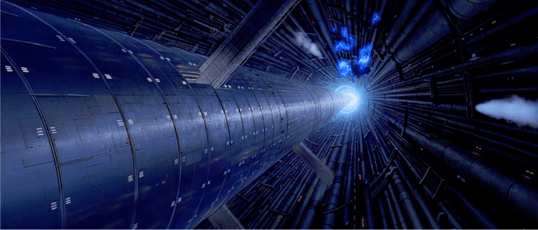
With the earlier movies, the filming of the ships was all done with the use of miniature models created by Colin Cantwell. Large interior shots often combined live action footage with ‘glass matte paintings’ – exquisitely hand-painted oil-on-glass frames.
In order to convey the impression of vastness and detail, the filmmakers had to be very creative in the way they composed each scene.
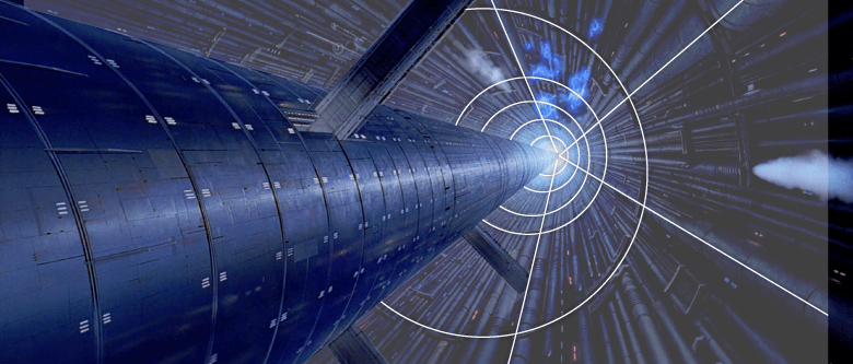
In this image, you can see how the straight lines of the reactor core point down to create an arrow shape. This gives the impression that we are looking down.
The effect is also enhanced by the use of light at the bottom, which draws the audience’s gaze to the base of the core. You might be realizing that the use of perspective has a lot of similarities with that of depth, and this is partly because both have a lot to do with the placement and size of objects in the background, mid-ground and foreground.
How to apply perspective to your own designs:
When applying perspective, start with a focal point that you want to guide your audience’s eye towards. Draw lines away from that point and towards you to guide them in the direction you want them to look at.

Hack #5: Attaining Symmetry
Now we’re at our fifth hack – using symmetry in design. Symmetry is used to balance a design and – you guessed it – highlight its focal object. You might be noticing how a lot of these design hacks have something in common – they all have to do with bringing focus to one specific part of your overall creation.
How symmetry is used in Star Wars:
In this scene from A New Hope, you can spot the uniformity and order. Shots with objects that are not balanced can sometimes confuse the viewer and give the impression of chaos. There are times when this is a conscious decision that is made, however, if you are trying to provide balance in a specific image, symmetry is the way to achieve that.
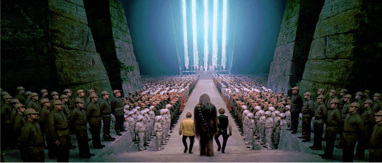
As you can see, Luke, Han Solo, and Chewbacca are flanked on either side by rows of soldiers that look exactly alike. In fact, look closely and you’ll see most of the green foreground guys are copies of 4 or 5 soldiers. Tricky, huh?
As they make their way down a straight path you can clearly see the way the lines are pointing to the stage in the background.
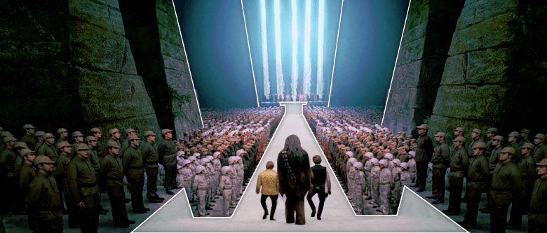
How to apply symmetry to your own designs:
In order to achieve a similar effect, you can create symmetry by mirroring different design components on each side of your canvas, and by placing the focal objects in the middle of the composition. Here’s an outline of how this is done in the shot above.

Can you see how the path, the stage, and the people are all mirror images of each other?
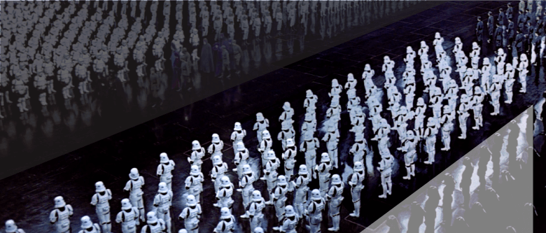
Hack #6: Directional Cues
Next we have the use of directional cues. Similar to the use of perspective, directional cues have to do with the visual elements that help direct the viewer’s gaze. They help the eye navigate through different elements towards that object you want people to pay attention to.
How directional cues are used in Star Wars:
Now in this scene from The Empire Strikes Back, can you see how the lines and lights in the ship’s hallway direct the eye towards Luke Skywalker in the background? We now know that Luke is the primary focus of this scene, despite the fact that he is not in the foreground.
How to apply directional cues to your own designs:
Start by addressing where you want your viewer to be looking. Unlike the use of perspective which can often give your audience the impression that they are in the shot, the use of directional cues are primarily to tell your audience where exactly to look.
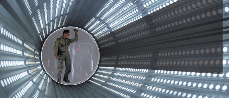
You can highlight a main point or image by placing it on your canvas and drawing away from that point, just like with creating perspective.
Hack #7: Repetition
Lastly, we’ve got repetition. This design hack emphasizes an idea through the use of repeated visual elements. As a result, this can create a sense of uniformity and strength between those different elements.
How repetition is used in Star Wars:
Another overhead scene from Return of the Jedi shows the Stormtroopers all lined up in formation.
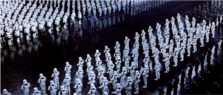
The endless rows create the sense of a single terrifying, unified entity, emphasizing their vast number and power. The use of repetition in this shot also creates contrast with the figures moving down the path. They come off as insignificant and isolated in comparison.
How to apply repetition to your own designs:
It almost goes without saying, but in order to achieve this design hack in your own work, use various patterns, lines, and colors repeatedly in close proximity to one another. This is to make them appear like they all belong to the same group.
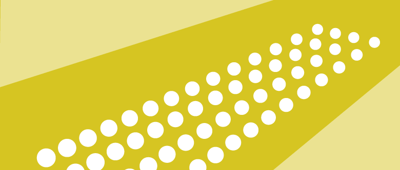
Pictograms are an example of a visual means of representing data with repetition. You also use pictograms to draw attention to outliers in data or to provide impact.
“You’re all clear, kid! Now let’s blow this thing and go home!”
It’s truly incredible how Star Wars managed to use relatively simple design and positioning choices in such creative ways that they were able to create a rich, believable universe with no access to computerized special effects.
As a result, they managed to differentiate their style and stand out to eventually become some of the more revolutionary films of all time.
Often it’s not the technology, the money or the tools that make our designs remarkable. There are times when all we need is the right hacks to draw attention to the most important elements.
Frequently Asked Questions (FAQs) about Design Hacks from Star Wars
What are some design principles that Star Wars has taught us?
Star Wars has taught us several design principles. One of the most significant is the principle of balance. The Star Wars universe is a perfect example of how different elements can be balanced to create a harmonious whole. Another principle is contrast, which is evident in the stark differences between the dark side and the light side, or between different characters and their environments. The principle of repetition is also used effectively in Star Wars, with certain themes, motifs, and designs recurring throughout the series.
How has Star Wars influenced modern design?
Star Wars has had a profound influence on modern design. Its unique blend of futuristic technology and traditional elements has inspired many designers to think outside the box and create innovative designs. The iconic Star Wars typography, for example, has been widely used in various design projects. The series’ use of color, texture, and shape has also influenced many aspects of modern design, from architecture to fashion.
What are some famous design hacks from Star Wars?
There are several famous design hacks from Star Wars that designers can learn from. One of them is the use of minimalism, as seen in the simple yet striking design of the Stormtrooper helmets. Another hack is the use of symbolism, with various elements in the series carrying deep symbolic meanings. The use of practical effects and models, as opposed to relying solely on CGI, is another design hack that has contributed to the timeless appeal of Star Wars.
How can I apply the design principles from Star Wars in my own work?
Applying the design principles from Star Wars in your own work involves understanding these principles and creatively incorporating them into your designs. For instance, you can use the principle of balance to ensure that different elements in your design work together harmoniously. You can use contrast to make certain elements stand out, and repetition to create a sense of unity and coherence. You can also use symbolism to add depth and meaning to your designs.
What is the significance of the Royal Award Ceremony in Star Wars?
The Royal Award Ceremony in Star Wars is a significant scene that showcases the series’ excellent production design. The grandeur and opulence of the ceremony, contrasted with the simplicity and austerity of other scenes, creates a powerful visual impact. The ceremony also serves as a symbol of victory and hope, reinforcing the themes of the series.
How has Star Wars used infographics in its design?
Star Wars has effectively used infographics in its design to convey complex information in a visually appealing and easily understandable way. The opening crawl, for example, is a form of infographic that provides a brief overview of the story’s background. The series has also used infographics in its promotional materials, such as posters and merchandise.
What can we learn from the typography used in Star Wars?
The typography used in Star Wars is a great example of how type can be used to create a distinctive and memorable brand identity. The iconic Star Wars logo, with its bold, angular letters, has become synonymous with the series. The use of different typefaces and styles throughout the series also adds variety and interest to the design.
How has Star Wars influenced the use of color in design?
Star Wars has had a significant influence on the use of color in design. The series is known for its bold and contrasting color schemes, which create a strong visual impact. The use of color in Star Wars also carries symbolic meanings, with different colors representing different characters, factions, or themes.
What is the role of practical effects and models in Star Wars’ design?
The use of practical effects and models in Star Wars’ design has contributed to the series’ unique aesthetic. These elements add a sense of realism and tangibility to the Star Wars universe, making it more immersive and believable. They also showcase the craftsmanship and attention to detail that went into the production of the series.
How has Star Wars used symbolism in its design?
Star Wars has effectively used symbolism in its design to convey deeper meanings and themes. For instance, the contrast between the dark side and the light side is symbolized through the use of color and lighting. The design of various characters and objects also carries symbolic meanings, reflecting their roles and characteristics in the story.
Nadya Khoja is the Head of Marketing at Venngage Infographic Maker, an online design software for those who are lacking professional design skills. She likes to educate her readers on how to create better content and also speaks frequently on the topics of Content Marketing, Design and SEO.