A Study of Symmetry: When, Where, and Why to Use It

Finding the proper balance in your designs is an essential part of building quality visual communication. When your design is out of balance, your message gets lost in the confusion. Key elements such as proportion and hierarchy suffer, causing the design to lose its impact. Symmetry is a key factor to having proper balance in your designs. We’ll take a look at symmetry: when, where and why you should use it, and when to abandon it altogether.
Key Takeaways
- Symmetry in design refers to the arrangement of elements on a page that are equal to each other on both sides, providing balance and enhancing visual communication. It can be bilateral, radial or translational.
- Asymmetry in design, where elements of the layout are not mirrored, can also be visually pleasing. This often involves the use of the golden ratio to determine the optimal size of elements.
- The choice between symmetry and asymmetry in design depends on the application. Symmetry is often used in traditional designs that require a sense of trust, while asymmetry is effective for reading materials with sidebars containing extra information.
- Symmetry is a key principle in various aspects of design, including website and graphic design, and can be observed in many natural and man-made forms.
- Despite its importance, symmetry is not always the best choice. Thoughtful asymmetrical design can be very pleasing to the eye and effectively communicate the hierarchy of content.
Symmetry
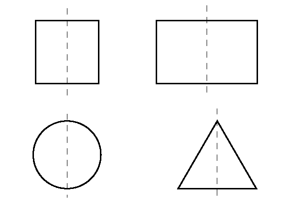
Let’s start with the obvious. Symmetry in design refers to the arrangement of the elements on a page that are equal to each other on both sides. Think of a butterfly, a circle, a square, a triangle, or a rectangle. If you fold any of those forms down the center, each side would be equal in size and shape to its opposite side. This is referred to as bilateral symmetry. Shapes like the ones below can all be divided in half symmetrically on their vertical axis.
The face, as well as the rest of the human body is (usually) symmetrical as well. If you draw a line down the middle of a typical human face, you will find that if you were able to fold that image, the eyes would line up as well as the ears, both halves of the nose, and the mouth.

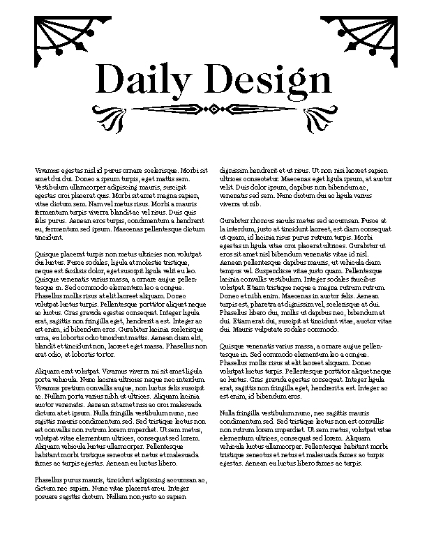
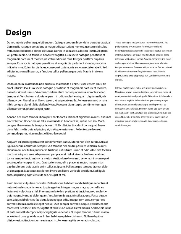
Symmetry doesn’t just apply to one object. Symmetry can refer to an arrangement of elements as well. If you divide the design of a page in half, and there are equal elements on both sides, then the layout is symmetrical. In the image below, the ornaments, the columns of type, and the headline are all centered. The columns of type have a gutter that runs through the vertical center of the page. This design is symmetrical.
There are other types of symmetry as well. You can observe symmetry in unexpected places. You can even find symmetry in circular designs. Radial symmetry is when an object is rotated around a circle in equidistant increments. In other words, when something is rotated around a circle to form a symmetrical design. The example below shows a square that has been rotated around a circle in 20° increments. The result is a circular pattern that is symmetrical.

If we take the same original square and simply move a copy of it at a 45° angle without rotating it, we have what is called translational symmetry. It is in the same orientation, just moved to another position.

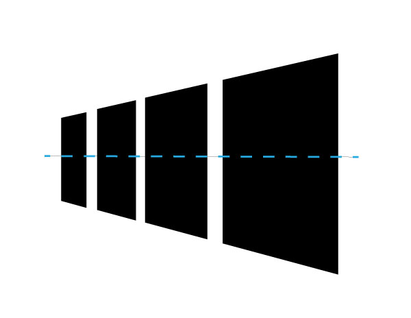
Translational symmetry doesn’t mean that the objects have to all be the same size. In the example below, the squares move from the background to the foreground, and get bigger as they get closer. This implies motion and movement.
Examples of Symmetry in Design
Symmetry is found in all types of design. It is found in print and on the web. Here are some examples of symmetry in design.
Apple

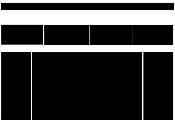
The basic layout of the Apple Store online is set up on a symmetrical grid. If you fold the Apple Store’s layout down the middle, it would match up perfectly. Take away the extra elements from the site and you can see the blocks that make up the general layout in the example below.
Treehouse
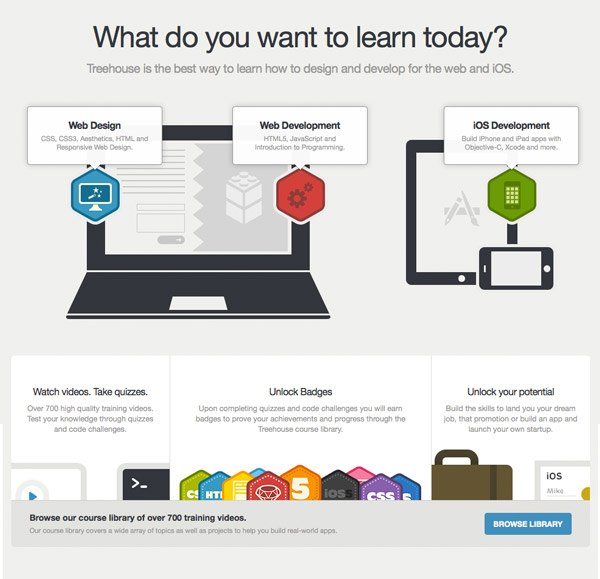
Treehouse is another good example of symmetry in website design. Notice that the images of the laptop and tablet are asymmetrical, but the overall layout of the site, when broken down into its basic elements, are symmetrical, as you can see below. Slightly breaking the symmetry with the images creates a more interesting layout than if both images would have been proportionally the same.
Asymmetry
Asymmetry has its place in design as well. You can find asymmetry in many different types of design; the concept can be applied to just about anything. Asymmetry is where the elements of the layout are not mirrored. Asymmetrical designs are visually uneven, and the columns or grids that make them up are inequal.
One popular way of using asymmetry is to incorporate the golden ratio in your design. If you are creating a 2-column layout, you would use the golden ratio to determine the optimal size of both columns in order to make them most pleasing to the eye. The ratio comes out to be 1.6. To simplify this concept, to find the golden ratio of an object, you divide its width or height by 1.6 and you get the golden ratio of the total width. Take a look at the golden ratio model below.
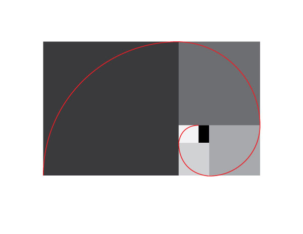
This ratio can be applied to graphic design and web design. You can apply it to columns of text in a book or a magazine. When designing a website, you can determine the width of the content and the sidebar by using the golden ratio. This will give you a surprisingly pleasing asymmetrical design.
Asymmetry in Design
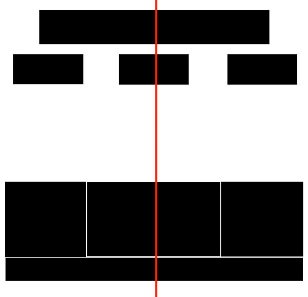
Now it is time to take a look at asymmetry in design. The sources are abundant, and a thoughtful asymmetrical design is very pleasing to the eye. In the simple example below, you can see a title, the main content, and a notes section on the side. The layout is simple, but you immediately understand the hierarchy of the content and the order of what should be read. You read the title because it is large and bold. Then, you read the large area of text, because the type is larger than the type on the right side. Finally, you read the text in the right column last because it is the smallest.
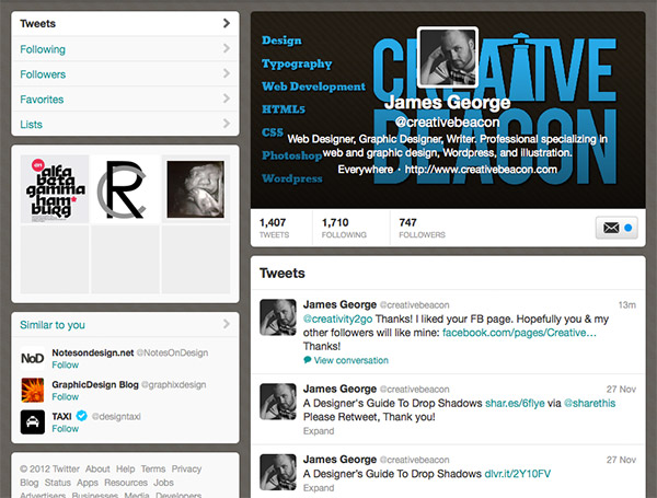
Below is a screenshot of Twitter. Many times, the main content or the largest section is on the left. However, Twitter has placed the main content (the “tweets” themselves) on the right side.
Noupe is a very nice site that uses two wide columns. One is for the content, and the other side is for ads and sidebar information. Having the asymmetrical layout here shows that the larger portion is for the important information( such as the actual content of the site), while the smaller areas are for the secondary information (such as a list of the most recent articles or the most recent “tweets”).

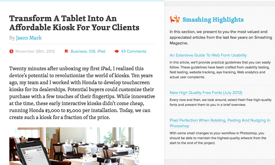
Smashing Magazine — Another design blog that uses the asymmetrical layout to call attention to the main content. The site’s design is minimal, but this further emphasizes the content itself.
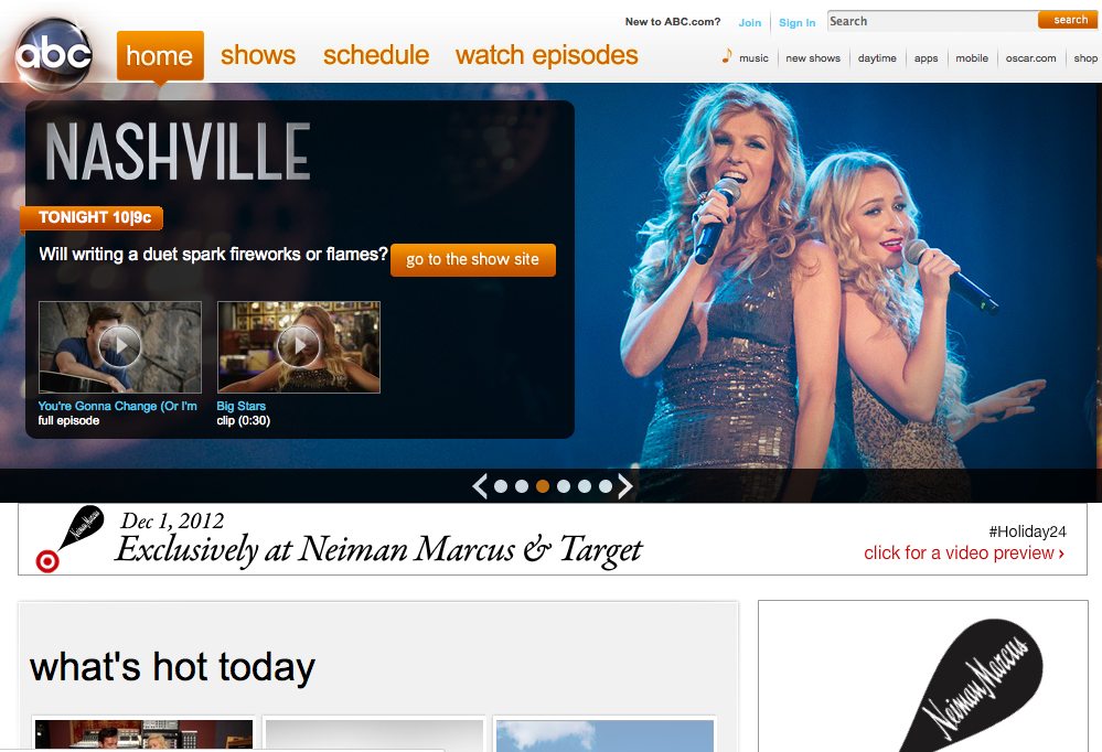
ABC — The ABC website is very complex and is asymmetrical in its layout. The header of the site features an asymmetrical slider, and the main content below the fold is places in the larger section, while advertisements are placed in the sidebar.
ESPN — Filled with scores and sports coverage, the site uses a distinctly asymmetrical 2-column layout. The big stories are in the larger content area, while lists of the latest news and social media sharing are built into the right column.

Conclusion
Symmetry and asymmetry are major factors in design. Deciding whether to use symmetry or asymmetry depends on the application, but the seemingly-innocuous choice can make or break a design. You use symmetry on designs that are traditional and require a sense of trust. Asymmetry works well when creating reading material with sidebars containing extra information, text, or links to more content. You can use the golden ratio to ensure that your layout is pleasing to the eye. No matter which one you decide to use, your designs will be much more appealing if you use the right technique for your application.
Do you prefer symmetry or asymmetry in your design work? Share your opinions in the comments section and let us know.
Frequently Asked Questions about Symmetry
What is the importance of symmetry in design?
Symmetry plays a crucial role in design as it helps to create balance, harmony, and order. It’s a fundamental concept in aesthetics that’s used to create visually pleasing and effective designs. Symmetry can be used to draw attention to a specific part of the design, create a sense of stability, or add visual interest. It’s a powerful tool that can enhance the overall impact of a design when used correctly.
How does symmetry relate to mathematics?
In mathematics, symmetry refers to the invariance of a system or pattern under a set of transformations. It’s a fundamental concept in geometry, where it’s used to analyze shapes and structures. Symmetry can be seen in various mathematical concepts, such as equations, functions, and geometric figures. It’s a key concept in understanding the structure and behavior of mathematical systems.
What are the different types of symmetry?
There are several types of symmetry, including reflection symmetry, rotational symmetry, and translational symmetry. Reflection symmetry, also known as mirror symmetry, occurs when one half of a shape or pattern is a mirror image of the other half. Rotational symmetry occurs when a shape or pattern can be rotated around a central point and still look the same. Translational symmetry occurs when a pattern can be shifted or translated along a vector and still maintain its appearance.
How is symmetry used in nature?
Symmetry is a fundamental characteristic of nature and can be seen in a wide range of natural phenomena. It’s evident in the structure of crystals, the patterns on animal coats, the shape of leaves and flowers, and the structure of snowflakes. Symmetry in nature often serves functional purposes, such as aiding in camouflage or attracting mates.
How does symmetry relate to physics?
In physics, symmetry principles are fundamental to our understanding of the physical world. They’re used to derive conservation laws and to classify physical phenomena. Symmetry in physics can refer to spatial symmetry, temporal symmetry, or more abstract forms of symmetry related to fundamental physical laws.
What is the role of symmetry in architecture?
Symmetry is a key principle in architecture, used to create balance and harmony in building designs. It can be used to enhance the aesthetic appeal of a structure, create a sense of stability, or guide the viewer’s eye. Symmetry in architecture can be seen in the layout of buildings, the design of facades, and the arrangement of architectural elements.
How is symmetry used in art?
In art, symmetry is used to create balance, harmony, and visual interest. It can be used to draw attention to a specific part of the artwork, create a sense of stability, or add depth and dimension. Symmetry in art can be seen in the composition of paintings, the design of sculptures, and the arrangement of elements in graphic design.
What is the relationship between symmetry and beauty?
Symmetry is often associated with beauty, both in nature and in human-made objects. It’s thought to contribute to our perception of beauty by creating a sense of balance and harmony. In human faces, for example, symmetry is often associated with attractiveness. However, the relationship between symmetry and beauty is complex and can be influenced by many factors.
How is symmetry used in graphic design?
In graphic design, symmetry is used to create balance, harmony, and visual interest. It can be used to guide the viewer’s eye, create a sense of order, or add depth and dimension. Symmetry in graphic design can be seen in the layout of pages, the arrangement of elements, and the design of logos.
What is the role of symmetry in photography?
In photography, symmetry can be used to create visually striking images. It can help to create a sense of balance and harmony, draw attention to a specific part of the image, or add depth and dimension. Symmetry in photography can be seen in the composition of shots, the arrangement of elements, and the use of light and shadow.
James George is a professional web developer and graphic designer. James is an expert in design, and a professional web developer, with a special interest in WordPress. Founder of Design Crawl, James has been a professional designer since 2005.