

Key Takeaways
- Texture is a critical element in digital artwork that adds depth and interest to illustrations, moving them from a cartoonish or underdeveloped look to a more convincing and dimensional one.
- Techniques such as layering, using different brush strokes, blending modes, and texture overlays can be used to add texture in digital art, enhancing the tactile quality and realism of the work.
- Texture can be used to create a variety of effects in artwork, from creating a sense of distance or proximity, conveying mood or atmosphere, suggesting movement, to creating striking contrasts, making it a powerful tool in both realistic and abstract art.
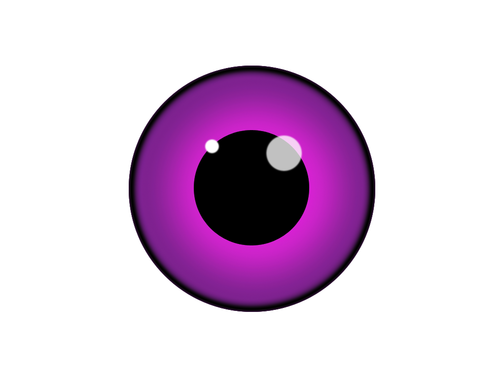
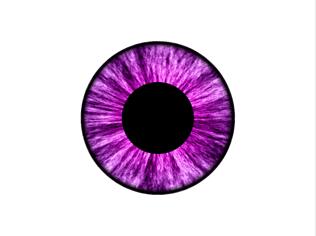
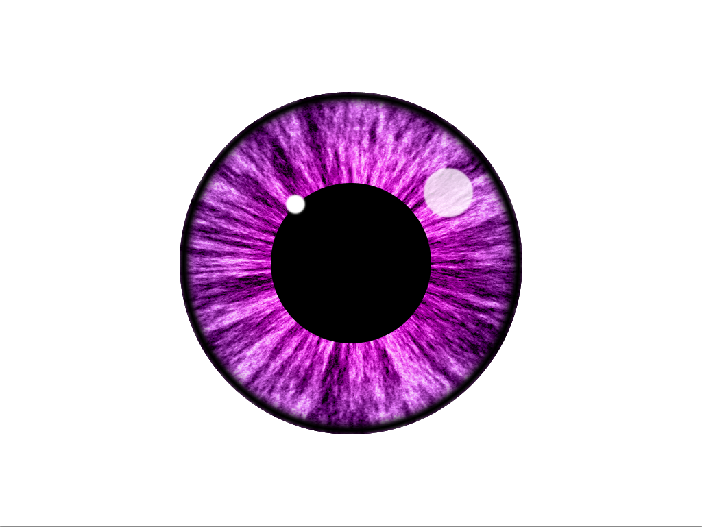
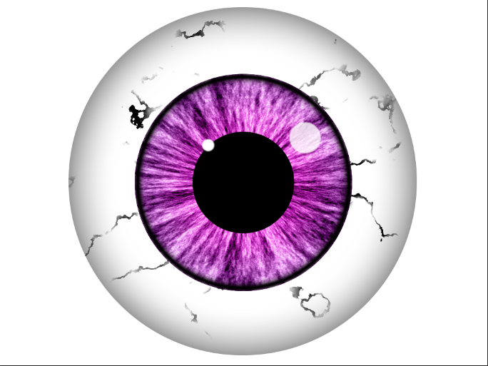
Creating digital artwork requires a lot of skill, talent, and technique. Texture is one way that professional illustrators distinguish themselves from amateurs or hobbyists. Textures add interest to an illustration through the use of variation and depth. With proper texture, illustrations no longer look “cartoonish” or underdeveloped. Instead, they look more convincing by adding dimension to an otherwise flat plane. Consider the eyeball below. It looks fairly recognizable, and “correct” in a rudimentary sense, but with just a little effort, we can make it look far more convincing.
Open up Photoshop and create a new document. I set the dimensions to 1024 x 768 pixels, but you can use whatever dimensions you’d like. Select the Custom Shape Tool, and choose the Ellipse Tool within the options. Hold Shift and draw a circle on your canvas to represent the outside of the eyeball. It doesn’t really matter what color you choose for this, since the following layers will cover this starting shape up.

Next, hit Command/Ctrl + “J” to duplicate the outer eye layer. Double-click that layer to bring up the layer styles options, and choose Inner Shadow. Set the distance and choke to 0 pixels, but set the size to roughly 25-30px. You won’t be able to see any changes, but these settings will take effect in just a moment.
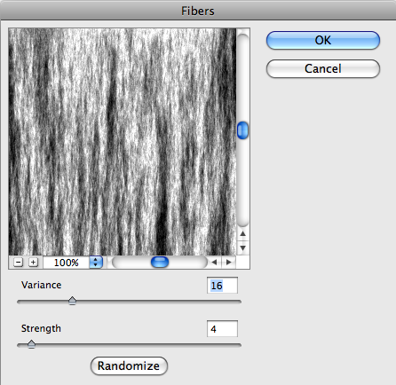
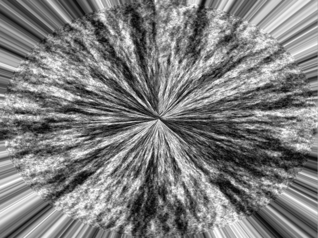
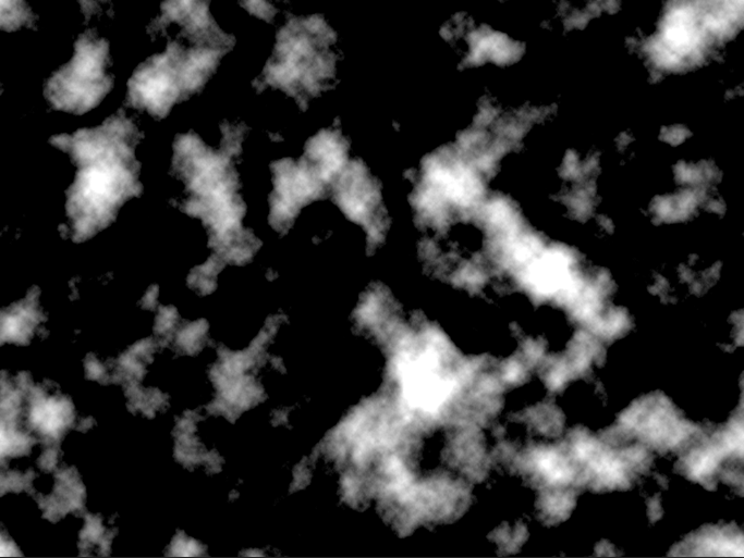
Next, create a new layer. If you are set to the default colors, hit Command/Ctrl + Delete to fill the layer with white. Go to “Filter” > “Render” > “Fibers.” You’ll want to fill the layer with white because there has to be pixel information in order for this filter to run. For this dialog box, I hardly ever try to dial in settings or numbers. What I usually do is click the “Randomize” button until I and happy with what is shown in the preview box. Click “OK.” You will notice that the layer is full of black and white fibers.

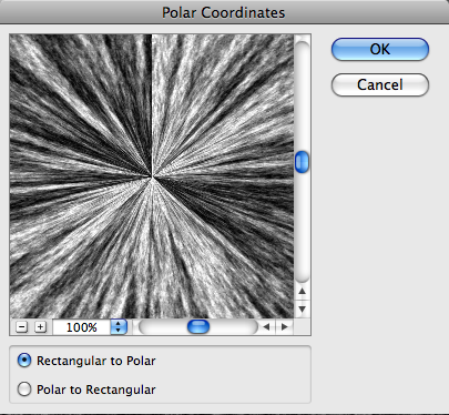
There is a lot of texture here, but it isn’t quite how we want it to look, so go to “Filter” > “Distort” > “Polar Coordinates.” Choose Rectangular to Polar, and click OK. You should see fibers springing out from the center of the canvas.

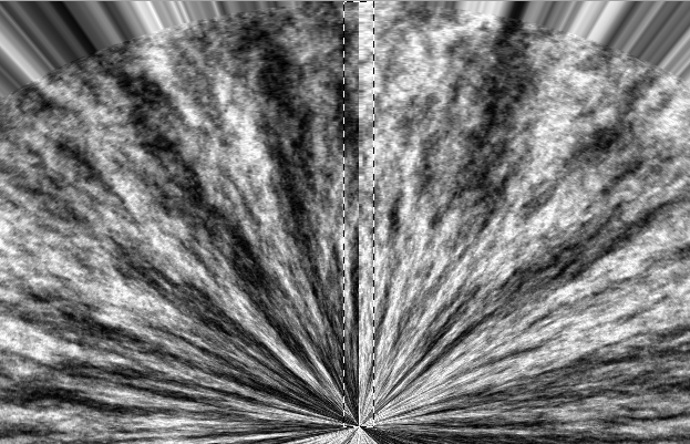
If you look closely, you will notice a sharp seam dividing the top half of fibrous portion of the layer. To get rid of that, select the Marquee Tool and click and drag over that area, hold Shift, and hit Delete. Within the Fill Options, select content aware, and it should fill in this area of breakage with fibrous texture.
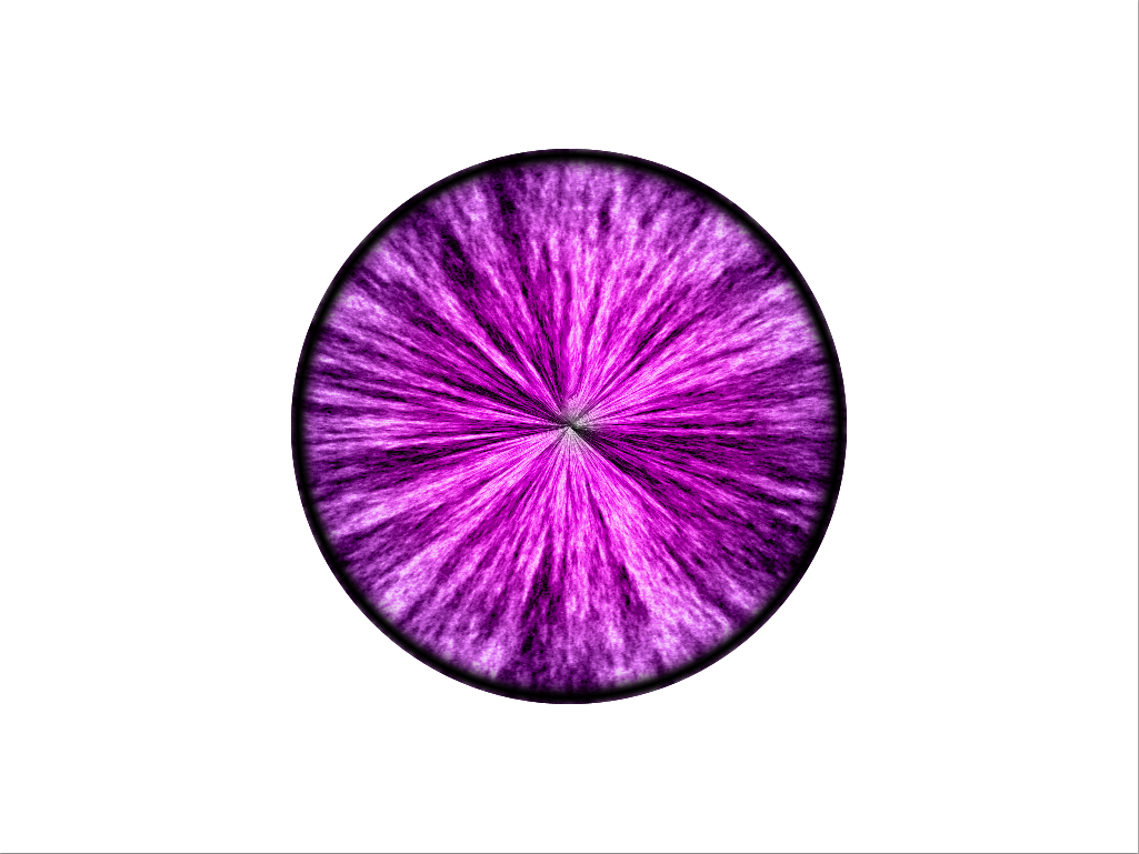
To see the eye start to take shape, you can clip the texture to the outer eye shape in two ways. Right-click on the fiber layer and choose Create Clipping Mask. The other method is to simply hold the Alt/Option key and click the dividing line between the black circle layer and the fiber layer within your layers panel. You should end up with something like the image below.

Next, to add some color, create a new layer and select the Gradient Tool. Click the gradient options at the top and select a gradient that you would like for your eye color, or make your own. Click OK and choose the radial gradient in the options bar.

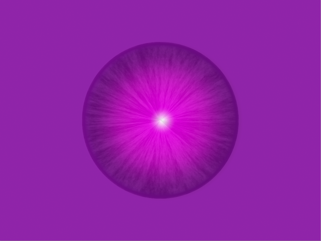
Start from the center point of the eye and click and drag your mouse outward to draw a radial gradient. Clip this layer to the layers below, like we did for the fiber layer.

Change the Blend Mode to Color.
Next, we need to create the pupil, so select the Custom Shape Tool and choose the Ellipse Tool. From the center point, draw a black circle roughly 1/3 the size of the rest of the eye.
Next, change the color to white and draw two smaller white circles, one slightly smaller than the other in the positions shown below. Go to “Filter” > “Blur” > “Gaussian Blur” and set the blur to around 1.5 pixels. Photoshop will ask you if it is okay to rasterize the layer, which is fine, so click OK. Lower the larger circle’s opacity to roughly 80%. Leave the smaller circle at full opacity.
Now that we have created the iris and pupil areas, we can create the white portion of the eye. To do so, choose white as your foreground color, select the Custom Shape Tool, choose the Ellipse Tool, and from the center point of the eye, click and drag out a circle larger than the rest of the eye. Double-click the layer to bring up the layer styles and select Inner Shadow. Set the distance to 0 pixels and the size to 100 pixels.

A normal eyeball has tiny reddish veins, so we will need to create those to make the eye more convincing. Create a new layer above the eye layer that we just created. Fill it with white, then go to “Filter” > “Render” > “Clouds.” Then Go back to “Filter,” choose “Render,” then select “Difference Clouds.” If you do not like the results of the difference clouds filter, you can hit Command/Ctrl + “F” to repeat the filter until you get the results that you want.

The reason that we used these filters is so that we could get the “veiny” cloud effect like the one shown above. Now, we just have to tweak the clouds to turn them into veins. To do this, hit Command/Ctrl + “L” to bring up the levels dialog box. Select the white slider arrow and bring it as far to the left as possible until the clouds go away and only rigid vein shapes remain.


Next, right-click on the vein layer and choose “Create Clipping Mask.” This will clip the vein layer to the eyeball shape layer below.

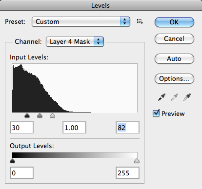
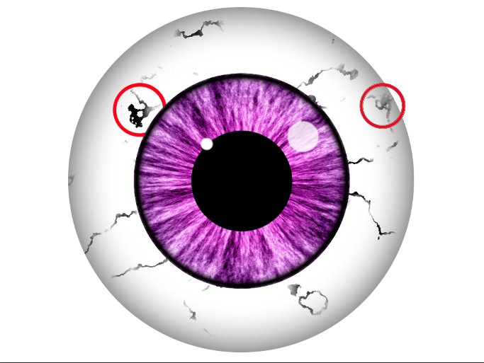
The veins are too prominent, so we need to create a randomized mask to make the veins look more natural. Create a layer mask and go to “Filter” > “Render” > “Clouds,” then go to “Filter” once again, and choose “Render” > “Difference Clouds.” To increase the strength of the mask, make sure the mask itself is selected, and hit Command/Ctrl + “L” to bring up the levels dialog box. Within the levels dialog, bring the white and black sliders in towards the center until the long veins are broken up, as shown in the example below. Lower the opacity of the vein layer to 70%.
Be sure to paint with black on the mask to get rid of any problem areas, such as the large, unwanted patches in the example below. Remove other inconsistent areas and mask out areas that look unnatural. The key here is subtlety.
Create a new layer and fill it with red. Clip it the the other layer below so that is is constrained to the area of the eye. Then, change the blend mode to screen, giving you subtle, natural looking veins.

Conclusion
There’s no question that when you are creating artwork, texture truly adds dimension to your work. Tactile appeal breaks up the monotony of solid colors, and adds a sense of realism and personality to your work, turning it from good to great. With textures, you can take bland, mediocre work and turn it into artwork that has depth. Adding texture to your work the right way will always take your work to the next level.
Do you spend a lot of time with texture, or are you often asked for clean, immaculate designs without the imperfections of texture?
Frequently Asked Questions about Using Texture in Illustrations
How can I add depth to my illustrations using texture?
Adding depth to your illustrations using texture involves a few steps. First, you need to understand the concept of texture in art. Texture refers to the perceived surface quality in artwork. It can be real or simulated and can be achieved through various techniques such as layering, using different brush strokes, or even incorporating different materials. To add depth, you can use texture to create a sense of distance or proximity. For instance, objects in the foreground can have a rough texture to make them appear closer, while those in the background can have a smoother texture to create a sense of distance.
What are some techniques for creating texture in digital art?
There are several techniques for creating texture in digital art. These include using texture brushes, layering, blending modes, and using texture overlays. Texture brushes can be used to create a variety of effects, from rough surfaces to fine details. Layering involves creating multiple layers of color or texture to create depth and complexity. Blending modes can be used to combine different textures in unique ways. Texture overlays involve placing a texture image over your artwork and using blending modes to integrate it into the piece.
How can I use texture to enhance the realism of my illustrations?
Texture can greatly enhance the realism of your illustrations by adding a tactile quality to your work. This can be achieved by closely observing the textures of the objects you are drawing and replicating them in your artwork. For instance, if you are drawing a tree, you might use rough, irregular strokes to mimic the texture of the bark. Similarly, if you are drawing a piece of fabric, you might use smooth, flowing lines to suggest its softness.
Can I use texture in abstract art?
Absolutely! In fact, texture can be a powerful tool in abstract art. It can be used to create visual interest, evoke emotions, or even convey certain concepts or ideas. For instance, a rough, jagged texture might convey a sense of chaos or conflict, while a smooth, flowing texture might suggest harmony or tranquility.
How can I create texture in traditional art mediums like painting or drawing?
In traditional art mediums, texture can be created using a variety of techniques. In painting, for instance, you can create texture by layering paint, using different brush strokes, or even incorporating materials like sand or fabric into your work. In drawing, you can create texture by varying your line work, using hatching or cross-hatching, or using different grades of pencil.
What are some common mistakes to avoid when using texture in art?
Some common mistakes to avoid when using texture in art include overusing texture, not considering the light source, and not considering the scale. Overusing texture can make your artwork look busy and confusing. Not considering the light source can result in textures that look flat and unrealistic. Not considering the scale can result in textures that are out of proportion with the rest of the artwork.
How can I use texture to create a sense of movement in my artwork?
Texture can be used to create a sense of movement in your artwork by suggesting the direction of movement. For instance, if you are drawing a flowing river, you might use wavy lines to suggest the movement of the water. Similarly, if you are drawing a gust of wind, you might use swirling lines to suggest its direction.
Can I use texture to create a sense of mood or atmosphere in my artwork?
Yes, texture can be a powerful tool for creating a sense of mood or atmosphere in your artwork. For instance, a rough, jagged texture might create a sense of tension or unease, while a smooth, flowing texture might create a sense of calm or tranquility.
How can I use texture to create contrast in my artwork?
Texture can be used to create contrast in your artwork by juxtaposing different textures. For instance, you might place a rough-textured object next to a smooth-textured one to create a striking contrast. This can help to draw the viewer’s attention and create visual interest.
How can I experiment with texture in my artwork?
Experimenting with texture in your artwork can involve trying out different techniques, materials, or even digital tools. You might try using different types of brushes, incorporating unconventional materials into your work, or experimenting with different texture overlays in digital art. The key is to be open to experimentation and not be afraid to try new things.

