

You need options. Anyone that’s spent time collaborating on web design projects knows that every developer has their own processes — even with best practices being observed there is variation in techniques. So your CSS library should give you more than one way to attack a problem.
Website layouts can be a serious pain, but CSS gives you a great deal of flexibility in how you approach the layout issue. Often the home page needs a grid design while post pages have a three column layout, with other formats for custom pages. With CSS layouts already in place, you can quickly implement a layout and change as needed.
The following is a collection of layout libraries you can add to your own with multi-column static and liquid layouts. Enjoy and let us know which ones you like best!
20+ CSS Layouts by MaxDesign
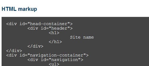
With excellent markup walk-thrus and the sample CSS on-page, this set of CSS layouts will be easy to see in action and almost as easy to implement.
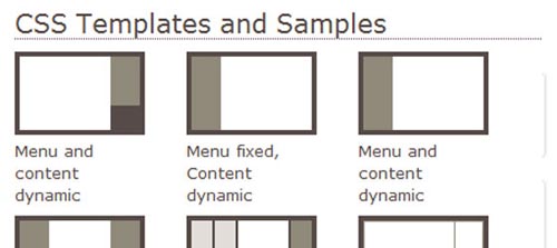
40 CSS Layouts by Layout Gala
Previews are available for each format and you can even download the entire collection in one file.
250+ Layouts by Free CSS
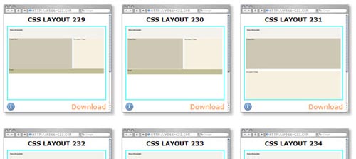
This is a massive list with just about every layout imaginable. Preview and click again to download. The CSS is stripped down so there’s lots of room for tweaking.
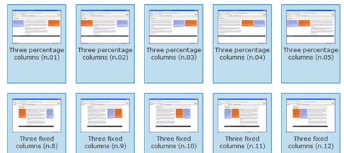
50+ Fixed Width Layouts by Code Sucks
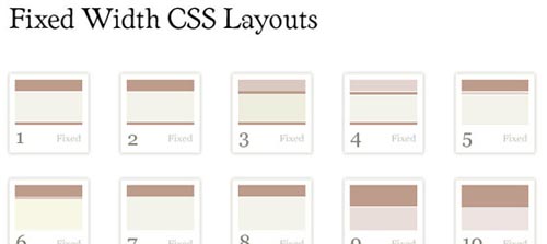
Click to preview and click to download. These layouts are simple with nicely developed whitespace. Worth checking out and easy to modify.
10+ Unique CSS Layouts by Intensiv Station
While on the sparse side in terms of the quantity, this collection includes some impressive tricks like floating menus and dynamic centered boxes worth having on hand.
40+ CSS Layouts by Dynamic Drive

This site has organized their CSS layouts by two-column, three column, fixed, liquid, and frames. Each has a nice description and the ability to preview before downloading.
15+ Interesting CSS Layouts by The Noodle Incident

This site has a unique way of guiding you thru the process of picking the layout you want. Follow the arrows, select your design, and download.
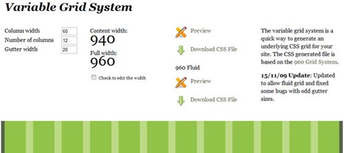
Customized Static CSS Grid Generator by Grid Designer

It doesn’t get much easier than this. Just set up the grid you want using the on-page tools and download your template.
Customized Fluid/Variable CSS Grid Generator by Spry Soft
Static not good enough for ya?! No problem. Fluid/variable grids are easy to make with this site.
Frequently Asked Questions about CSS Layouts
What is the difference between CSS Grid and Flexbox?
CSS Grid and Flexbox are both powerful layout systems in CSS. The main difference between them lies in their use cases. CSS Grid is a two-dimensional system, meaning it can handle both columns and rows, making it ideal for web page layouts. On the other hand, Flexbox is a one-dimensional system, meaning it deals with one dimension at a time, either a row or a column. This makes it perfect for aligning items within a container, such as aligning items horizontally or vertically in a section of your webpage.
How can I create a responsive CSS layout?
Creating a responsive CSS layout involves using media queries. Media queries allow you to apply different styles for different devices based on their screen size. You can define a specific CSS for screens that are larger, smaller, or within a certain range. This way, your layout will adjust and look good on all devices, from desktops to tablets to mobile phones.
What are the different types of CSS positioning?
CSS positioning involves four types: static, relative, absolute, and fixed. Static is the default positioning, and the element follows the normal flow of the page. Relative positioning allows you to position an element relative to its normal position. Absolute positioning removes the element from the normal flow and positions it relative to the nearest positioned ancestor. Fixed positioning positions the element relative to the browser window.
How can I center an element horizontally and vertically in CSS?
Centering an element both horizontally and vertically can be achieved using different methods. One common method is using Flexbox. By setting the display property of the parent element to flex and align-items and justify-content properties to center, the child element will be centered both horizontally and vertically.
What is the use of the CSS Box Model?
The CSS Box Model is a fundamental concept in CSS. It describes how space is distributed around elements. The box model consists of four parts: content, padding, border, and margin. Understanding the box model is crucial for controlling layout as it determines how elements interact with each other in terms of space and positioning.
How can I create a multi-column layout in CSS?
Creating a multi-column layout can be achieved using the CSS Grid or Flexbox. With CSS Grid, you can define a grid with multiple columns and place your items within these columns. With Flexbox, you can create a container and set its display property to flex, then add your items inside this container.
What is the difference between block and inline display in CSS?
In CSS, elements can be displayed as block or inline. Block-level elements take up the full width available and start on a new line, like paragraphs and headings. Inline elements only take up as much width as necessary and do not start on a new line, like links or span.
How can I overlap elements in CSS?
Overlapping elements in CSS can be achieved using the z-index property. The z-index property specifies the stack order of an element. An element with a higher z-index will be displayed on top of an element with a lower z-index.
How can I create a sticky header in CSS?
A sticky header can be created using the position property in CSS. By setting the position of your header to fixed or sticky, it will remain in the same place even when the user scrolls down the page.
How can I create a full-screen background image in CSS?
Creating a full-screen background image can be achieved using the background-size property in CSS. By setting the background-size property to cover, the image will scale to cover the entire background area of the element.