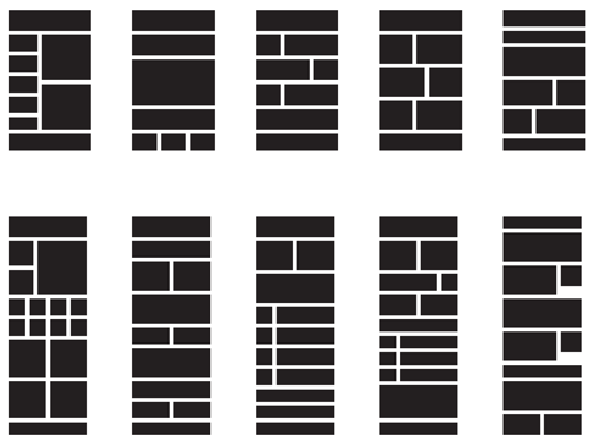
Even at a width of 600 pixels, there are plenty of ways to lay out HTML email content. How do designers usually approach an email layout? The image below shows some the most popular block-level email layouts, as taken from a typical day of email campaigns sent through Campaign Monitor.
(In truth, these are the most popular layouts once we’ve excluded the common but horrifying “jumbled mess of unstructured text and images,” which remains an unfortunate favorite with many senders.)
Two-column layouts (with about an 80/20 split) are by far the most popular layouts, which was true for websites ten years ago as well. The idea of interspersing two-column blocks with full-width blocks is very popular, and gives the email a more dynamic feel if it’s done right. It’s also very flexible, and allows you to use a variety of different content types.
It’s very rare to see more than three columns, and that’s hardly surprising given the design constraints email designers face. If you have a client that sends several different types of content, you can of course create many design variations to suit; you’d still want to make them recognizable as being from the same sender and on the same topic, though.
Remember that the actual content could be shorter than what we were planning on, or longer, or more varied month by month. So our design needs to be flexible enough to hold together over time. Pixel-perfect design never worked very well on the Web, and it certainly won’t work in an email client.
Some designers like to create a more detailed mockup at this point, slotting content sections in wherever they fit. You might find the mockup a useful document to show your client before you commit to particular color schemes or layout sizes.
What’s your preferred HTML email layout?
Frequently Asked Questions (FAQs) about HTML Email Layouts
What are the benefits of using HTML email layouts?
HTML email layouts offer several advantages over plain text emails. They allow for more creative and visually appealing designs, which can help to engage recipients and increase click-through rates. HTML emails can include images, links, and various fonts and colors, making them more interactive and engaging. They also allow for tracking of open rates and other metrics, which can provide valuable insights for improving future email campaigns.
How do I choose the right HTML email layout?
Choosing the right HTML email layout depends on your specific needs and goals. Consider the type of content you will be sending, the audience you are targeting, and the devices your recipients will likely be using to view your emails. For example, a single column layout might be best for mobile users, while a multi-column layout could work well for desktop users. It’s also important to consider the overall look and feel of your brand when choosing a layout.
Are HTML email layouts compatible with all email clients?
While most modern email clients support HTML emails, there can be some variation in how different clients render HTML. This means that your email might not look exactly the same in every client. It’s important to test your emails in various clients to ensure they look as intended. There are also tools available that can help you preview your emails in different clients before sending them.
How can I make my HTML email layout responsive?
Making your HTML email layout responsive involves using CSS media queries to adjust the layout based on the screen size of the device being used to view the email. This can involve changing the size of images, adjusting the layout of columns, and altering font sizes. It’s important to test your responsive design on various devices to ensure it works as intended.
Can I use any type of HTML in my email layout?
While you can use HTML to create your email layout, not all HTML elements are supported by all email clients. Some clients may strip out certain elements or styles, which can affect how your email looks. It’s best to stick to basic HTML and inline CSS when creating your email layout, and avoid using JavaScript or other elements that may not be supported.
How can I track the performance of my HTML email layout?
Many email marketing platforms offer built-in analytics that can help you track the performance of your HTML email layout. This can include metrics like open rates, click-through rates, and conversion rates. You can also use tracking pixels or other methods to gather more detailed data about how recipients are interacting with your emails.
What are some common mistakes to avoid when creating an HTML email layout?
Some common mistakes to avoid when creating an HTML email layout include not testing the email in various clients, not making the email responsive for mobile users, and using too many images or complex designs that can slow down load times or be blocked by certain email clients. It’s also important to ensure that your email is accessible to all users, including those with visual impairments.
Can I use templates for my HTML email layout?
Yes, using templates can be a great way to get started with HTML email layouts. There are many templates available online that you can customize to fit your needs. However, it’s important to remember that a template is just a starting point, and you should still test your emails and make adjustments as needed to ensure they work well for your audience.
How can I improve the readability of my HTML email layout?
Improving the readability of your HTML email layout can involve several strategies. This can include using a clear and easy-to-read font, breaking up text into smaller sections or bullet points, and using headings and subheadings to organize content. It’s also important to use contrast effectively to make text stand out against the background.
What are some best practices for creating an HTML email layout?
Some best practices for creating an HTML email layout include keeping the design simple and clean, making the email responsive for mobile users, testing the email in various clients, and using analytics to track performance and make improvements. It’s also important to keep the user in mind and create an email that is easy to read and navigate, with clear calls to action.
Mathew Patterson looks after Campaign Monitor's customers and recently wrote "Create Stunning HTML Email" for Sitepoint. He's also involved in the Email Standards Project and can be found at http://mathewpatterson.com

Published in
·Design·Design & UX·Illustration·Photography & Imagery·Resources·Typography·June 16, 2016


