
Key Takeaways
- Choosing the right image format and optimizing your images are key to using images correctly on a website. Incorrect usage can lead to slow website performance and poor user experience.
- JPEG, GIF, PNG, SVG, and WebP are popular image formats for websites. JPEG, GIF, and PNG are long-standing formats, while SVG and WebP are newer but gaining popularity due to their suitability for responsive and fast-loading websites.
- The choice of image format depends on the type of image, file size, and browser compatibility. For instance, JPEG is ideal for photographs due to its quality and compression, while PNG works well for logos and icons due to its support for transparency.
- WebP, a modern image format developed by Google, combines the advantages of both JPEG and PNG without the large file size, making it an interesting choice for web use. However, it’s not universally supported by all browsers.
This article is part of a series created in partnership with SiteGround. Thank you for supporting the partners who make SitePoint possible.
As of March 2017, images make up over 65% of web content.
This is not surprising: images add beauty, communicate messages, tell stories and create connections with your website visitors.
The flip side is that, if not used correctly, images are often the main cause of a slow website and poor user experience.
Using images correctly on the web mainly involves two things:
- Choosing the right image format
- Optimizing your images.
In this article, I discuss the first point. In particular, I introduce the image formats that work best on the web and what kind of images they are most suitable for.
But before I go any further, let’s briefly clarify some terminology.
Raster/Bitmap vs Vector Images
Raster or bitmap images are made of a two-dimensional grid of pixels. Each pixel stores color and transparency values.
Raster images don’t scale very well: if you enlarge a raster image, it will lose sharpness and quality. Popular raster image types for the web are JPEG or JPG, GIF and PNG formats.
Here are two raster images (JPG) of an apple. The first one is the image at its natural size. The second one shows a detail of an enlarged version of the same image
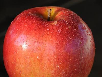

Notice the degradation of the enlarged version of the image with respect to the original copy.
By contrast, vector images are made of lines, shapes, and path points. Information for vectors are not stored in pixels. Rather, they are stored in mathematical drawing instructions, which are completely pixel-independent. Alex Walker puts it very well as he refers to SVG, the most popular vector format for the web, as follows:
SVG isn’t an image format — it’s more of an image recipe.
One implication of being resolution-independent is that you can scale vector images to your heart’s content: they will always look crisp and awesome, perfect for retina screens.
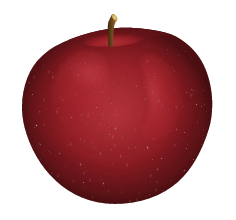
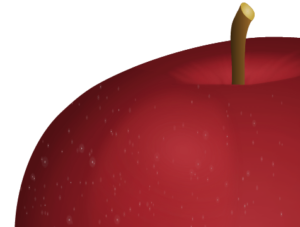
Both images above are views of the same vector graphic, but in the second one, the vector is rendered at more than double the size with respect to the first. Yet, there is no loss of quality.
Lossy vs Lossless
Both Lossy and lossless refer to file compression techniques applied to digital media, i.e., images, audio and video.
Lossy compression:
does not decompress digital data back to 100% of the original. Lossy methods can provide high degrees of compression and result in smaller compressed files, but some number of the original pixels, sound waves or video frames are removed forever.
What this means in practice is that the more you compress a lossy file, the smaller it gets. However, with smaller file size you also irreversibly lose some quality with respect to the original file. Lossy compression involves a trade-off between small file size and quality.
A lossy image type you see a lot on the web is JPEG.
By contrast, lossless compression involves no data loss between the compressed asset and the original. This means that compression does not result in a decrease in file quality. However, because of this, lossless file formats usually have a larger file size than lossy ones.
Lossless image formats you can easily find on the web are GIF and PNG.
This preliminary info is helpful when it comes to decide on the best image format for your content.
The first three image file types I’m going to introduce below, i.e., JPG, GIF and PNG, have been in use on websites for a very long time. The last two, i.e., SVG and webP, although not being exactly new formats, are not mainstream yet. However, because they are highly suited to the demand for responsive and fast-loading websites, their popularity has been considerably growing.
JPEG
JPEG or JPG is a lossy image format developed by the Joint Photographic Experts Group
Almost 3% of all content types on websites is made of JPG images. Here’s why this image format is so popular:
- The JPG format can display millions of colors. This makes it the ideal choice for displaying photography on the web
- Being a lossy file type, you can use compression to reduce its file size quite considerably. JPG files offer various compression levels: around 60% is fine for web images, while anything higher than 75% produces some quality degradation in the image.
- All internet-enabled devices support the JPG image format, which makes it easy to use on websites.
One noticeable thing missing from JPG files is support for transparency. Therefore, if you plan on using a transparent background to blend your image with the background color or texture on your webpage, JPG images are not a suitable choice. Better go with one of the options I outline below.
GIF
GIF stands for Graphics Interchange Format. It is an 8-bit lossless format which supports a maximum of 256 colors. This limitation makes GIF files unsuitable for displaying wide color ranges and photographic images.
Here are some points that have played a huge part in the long-standing use of GIF files on websites:
- Given the limit of 256 colors, file size is usually pretty low
- Support for transparency
- Support for animation. This makes them suited to display looping animated images like icons, emoticons, banners, etc.
- Good for simple images with flat colors, but not for photos
PNG
PNG stands for Portable Network Graphics. It’s an alternative format to GIF, which was developed by the W3C. Like GIF, it uses a lossless compression algorithm and it is available in 8-bit or 24-bit format. Both flavors support transparency. However, transparency in 24-bit PNG images is implemented using an alpha channel alongside the red, green and blue channels. Consequently, while both GIF and 8-bit PNG images are either completely opaque or transparent, each pixel in a PNG image offers up to 256 levels of opacity.
You can use the 24-bit PNG format for
- Web images with various levels of transparency
- Complex photos and graphics
- Graphics that you need to edit and export often: their lossless format ensures that there is no quality degradation.
Unlike GIF formats, PNG image types don’t support animation, and their file size can be quite large.
SVG
SVG stands for Scalable Vector Graphics, and it is an XML-based vector file type. Although being around since 2001, it has only recently become quite popular among web devs. The reason for such belated love lies in the poor browser support SVG has enjoyed for a number of years. Fortunately, I’m happy to say, at the time of writing, SVG is supported in all major browsers, although not without a few inconsistencies and bugs.
The SVG format has tons of features to recommend it as an awesome choice of graphics format for the web, especially when used for simple images like logos, maps, icons, etc., for which it is particularly well suited.
Pros of the SVG Format
- SVGs usually have a smaller file size than their raster counterparts, especially if you optimize them for the web and deliver them gzipped
- They are scalable, which means they look sharp whatever the screen resolution
- You can use SVG code inside the HTML markup and save HTTP requests
- SVG code lends itself to being customized using CSS
- You can animate SVG images, including their individual parts, with both CSS and JavaScript, which is super cool.
Because the file size can grow quite a bit, try to avoid overly-complex SVG images for web use. Finally, for photographic images, SVGs are not suitable, you’d better stick to the JPG format or webP.
WebP
Despite being in existence since 2010, I wouldn’t go far wrong in saying that webP does still feel quite new and it’s not as well-known as JPG or PNG. However, this image format has the web in its DNA: it was born to be used specifically on the web, which makes it super interesting
WebP is an open source image format developed by Google. These are its key features:
WebP is a modern image format that provides superior lossless and lossy compression for images on the web. … WebP lossless images are 26% smaller in size compared to PNGs. WebP lossy images are 25-34% smaller than comparable JPEG images … Lossless WebP supports transparency … at a cost of just 22% additional bytes. For cases when lossy RGB compression is acceptable, lossy WebP also supports transparency, typically providing 3× smaller file sizes compared to PNG.
The beauty of webP is that it combines the advantages of both JPG and PNG formats without the hefty file size.
At this time, Browser support is quite good: Blink-based browsers have all been on board from the start, after all, webP is one of Google’s creatures. For backward-compatibility in non supporting browsers, i.e., IE/Edge, Firefox and Safari, some smart folks have devised appropriate workarounds.
Here are some great resources where you can learn more about webP and how you can implement it right now:
- WebP Frequently Asked Questions
- What is the WebP Image Format (And Why Does It Matter)?
- How to Select the Perfect Image Format to Optimize Your Website
- Guide To Using WebP Images Today: A Case Study
- Using WebP Images
Conclusion
In this article, I’ve presented an overview of image formats for the web and briefly discussed the types of image they are more suited for.
JPG, GIF and PNG are very popular formats and have been in use for a long time. SVG and webP are newer, exciting alternatives. SVG is great for illustrations and simple images, webP covers very well all the instances where JPG and PNG can be used.
Have you used SVG or webP in your development work? Which challenges did you face? Did you experience any significant performance gains?
Hit the comment box to share!
Frequently Asked Questions (FAQs) about Image Formats for Websites
What are the key factors to consider when choosing an image format for my website?
The choice of image format for your website depends on several factors. Firstly, consider the type of image you’re dealing with. For instance, photographs are best saved in JPEG format for optimal quality and compression, while logos and icons work well in PNG format for transparency support. Secondly, consider the file size. Smaller file sizes load faster, improving your website’s speed and performance. Lastly, consider browser compatibility. While most modern browsers support formats like JPEG, PNG, and GIF, newer formats like WebP are not universally supported.
How does image format affect my website’s SEO?
Image format can significantly impact your website’s SEO. Search engines like Google prioritize websites with faster load times, and smaller image file sizes can help achieve this. Additionally, some image formats like JPEG 2000, JPEG XR, and WebP are preferred by Google for their superior compression and quality characteristics. Using these formats can potentially improve your website’s search engine ranking.
What is the difference between lossy and lossless compression?
Lossy and lossless are two types of data compression used in image formats. Lossy compression reduces file size by eliminating “unnecessary” bits of data, but this can result in a loss of image quality. JPEG is a common lossy format. On the other hand, lossless compression reduces file size without sacrificing image quality, but the resulting file size is typically larger. PNG and GIF are examples of lossless formats.
What is the WebP image format and why should I consider using it?
WebP is a modern image format developed by Google. It provides superior lossless and lossy compression for images on the web, allowing images to be smaller in size while maintaining high quality. This can result in faster page loading, better user experience, and potentially improved SEO. However, not all browsers currently support WebP.
Why would I choose PNG over JPEG or vice versa?
The choice between PNG and JPEG depends on your specific needs. PNG supports transparency and offers lossless compression, making it ideal for complex images, logos, and icons. However, PNG files are typically larger. JPEG, on the other hand, uses lossy compression, resulting in smaller file sizes. This makes JPEG ideal for photographs and images with many colors. However, it does not support transparency.
How can I convert my images to different formats?
There are many tools available for converting images to different formats. These include both online tools and software programs. Some popular options include Adobe Photoshop, GIMP, and online converters like Convertio and Online-Convert.
What is SVG and when should I use it?
SVG stands for Scalable Vector Graphics. It’s an XML-based vector image format for two-dimensional graphics. SVG is ideal for logos, icons, and other designs that require scalability and crispness at any screen resolution. Unlike raster formats like JPEG and PNG, SVG images remain sharp and clear at any size.
What is the role of image format in responsive web design?
In responsive web design, image format plays a crucial role in ensuring images display correctly and load quickly on different devices and screen sizes. Formats like SVG are scalable, making them ideal for responsive design. Additionally, newer formats like WebP offer superior compression, which can improve load times on mobile devices.
How does image format affect the loading speed of my website?
The image format directly impacts the file size of your images. Larger file sizes take longer to load, slowing down your website. Formats with better compression, like JPEG and WebP, can reduce file sizes and improve load times.
Can I use different image formats on the same website?
Yes, you can use different image formats on the same website. In fact, it’s common to use different formats for different types of images. For example, you might use JPEG for photographs, PNG for logos and icons, and SVG for scalable vector graphics.