Is Using SVG Images Good for Your Website’s Performance?

Key Takeaways
- SVG images are resolution-independent, meaning they maintain their quality at any screen size or resolution. This makes them particularly beneficial for responsive web design.
- SVG files typically have smaller sizes compared to other image formats like JPEG or PNG, which can significantly improve page load times.
- SVG images can be animated and manipulated with CSS and JavaScript, providing more flexibility and interactivity without the need for additional HTTP requests.
- While SVG images offer many benefits, they may not be fully supported by older browsers and may not be the best choice for highly detailed or photographic images.

There are a few good reasons why Scalable Vector Graphics, or SVG, are a great choice of graphics format for the web. Having a relatively small file size is certainly one of them. However, this claim is not without some qualification. Let’s delve a bit deeper.
This article is part of a series created in partnership with SiteGround. Thank you for supporting the partners who make SitePoint possible.
Benefits of Vector Images
Raster images, e.g., .JPEG, .PNG, etc., are made of square pixels laid out in a grid. Therefore, the larger the image, the more pixels it uses, which causes the file size to increase.
Not only that, but pixels-based graphics don’t scale very well. Here’s what I mean. This is a .JPEG image of a flower at its original width of 300 x 225px:

Here’s the same image when it is displayed at a much higher resolution:

Notice the fuzzy edges, the blurry surface and how the overall quality of the image is considerably degraded.
With retina screens being now common on users’ devices, the risk of having raster images on your website looking like this is high. One alternative is to serve high resolution graphics, which of course can hit web performance pretty hard.
The srcset and picture Elements
Fortunately, modern HTML comes to the rescue with responsive images, i.e., the srcset and the picture elements, which at the time of writing are both supported in the latest versions of all major browsers, except for EI11 and Opera Mini.
The goal of responsive images is to serve the best quality image for the device being used. This involves making available images at various resolutions, but enabling the browser to load just that one image that fits the capabilities of the accessing device.
If you’re curious to know more about how these techniques work, How to Build Responsive Images with srcset by Saurabh Kirtani goes deeply into the topic.
Here’s what srcset looks like in practice:
<img srcset="image_3x.jpg 3x, image_2x.jpg 2x, image_1-5.jpg 1.5x" src="image.jpg" alt="image">
And below is an example of the picture element in action:
<picture>
  <source media="orientation:landscape" srcset="retina-horizontal-image.jpg 2x, horizontal-image.jpg">
  <source media="orientation:portrait" srcset="retina-vertical-image.jpg 2x, vertical-image.jpg">
  <img src="image.jpg" alt="image">
</picture>
As you can see, although only one copy of your image will be served according to the accessing device, both techniques require you to prepare and upload to your server multiple copies of that image. It won’t be a problem for your website’s performance, but it can negatively impact on your time and your server’s bandwidth.
SVGs are Resolution-Independent
Scaling is in the DNA of vector graphics, and SVG is an XML-based vector image format. SVGs are made of geometrical drawing instructions, e.g., shapes, paths, lines, etc., which are independent from pixel size. From the point of view of file size, it doesn’t really matter at what size the image is rendered, simply because those instructions remain unchanged.
One more implication of being resolution-independent is that you don’t need to prepare different copies of the same image for different devices; one size fits all and looks razor sharp at any screen resolution.
That said, there’s something that can have a negative impact on SVG file size, i.e. how complex the image is. The more complex the drawing instructions the larger the file size.
Suggestions for Performant SVG Files
Generally speaking, SVGs for web use are quite simple, things like logos, maps, icons, etc. It’s likely such simple SVG images have a small file size compared to their raster counterparts.
However, there are steps you can take to optimize the file size even more and ensure your visitors get an awesome experience on your website.
Here are a few tips for you.
Bake Performance in the Design from the Start
You can code simple SVG graphics yourself or use a JavaScript library like Snap.svg to draw your vector graphics. Often, to get the job done you’ll simply fire off a vector graphics editor like Adobe Illustrator.
If you use a graphics editor, thinking about simplifying SVG code at the design stage decreases the risk of breaking your artwork when you optimize it at later donw the line.
The first step you can take in this direction is to get the size of the canvas right in your graphics editor of choice. Sarah Drasner recommends setting it at 100 x 100px, give or take, depending on your project. This ensures the canvas is not too small, which generates lots of decimals you can hardly reduce at a later stage without messing up the graphic. On the other hand, this size is not too big either. In fact, a large canvas implies a corresponding large number of path points.
Next, reducing the number of path points is crucial to shave bytes off your SVG file. This means using shapes instead of paths wherever possible, but also combining multiple paths into fewer paths, unless you plan on animating them individually. Adobe Illustrator offers the Simplify panel to further reduce path points. Here’s a quick video tutorial to illustrate its use.
Export SVGs the Smart Way
Take full advantage of your graphic editor’s exporting capabilities. Not doing so, could mean getting some SVG code stuffed with proprietary markup and bloat you don’t need.
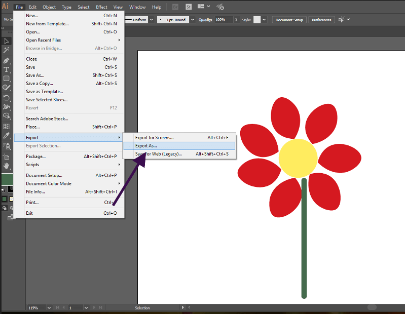
For instance, if you have the latest version of Adobe Illustrator (CC 2017 at the time of writing), export your SVG graphics using the Export As option, and select the .svg file type:

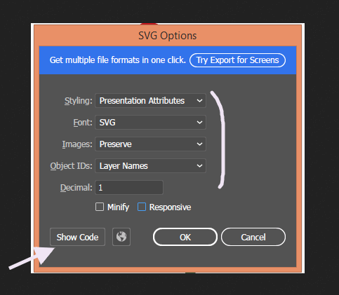
Illustrator’s panel offers a few settings to help you keep file size down and output clean, almost web-ready markup. You can even preview the code by clicking the Show Code button inside the panel.

For a detailed walk-through of each option in Illustrator, The Different Ways of Getting SVG Out of Adobe Illustrator by Geoff Graham is a great read.
Squeeze more Bytes with SVG Optimization Tools
Once your SVG graphic has been exported, you can still shrink it a bit more using one of the excellent SVG optimization tools available.
SVGOMG (and and its web-based GUI counterpart) together with Peter Collingridge’s SVG Editor are the most popular tools.
Check out Optimising SVG images by Guillaume Cedric Marty to learn more about how to use SVGOMG.
Enable Delivery of Gzipped SVG Files
The last step in your SVG optimization to-do list is enabling gzip compression on the server. SVG is just XML markup, therefore it lends itself to compression without any issues.
The benefits in terms of file reduction are significant. Appendix J of the SVG 1.1 Specification shows a comparison table between examples of uncompressed and compressed SVG files. The results are overwhelmingly in favor of compression with a decrease of 77-84% in file size.
Conclusion
SVG graphics are an awesome choice for the web. Used for simple icons, logos, etc., are often more performant than their raster counterparts, especially if you take the few precautions listed in this article.
The tips I mention above are by no means exhaustive. You can push the envelope even more. For detailed optimization techniques, the resources below are a must read:
- W3C SVG 1.1 Spec
- SVG on the Web
- High Performance SVGs by Sarah Drasner
- Tips for Optimizing SVG Delivery for the Web by Sara Soueidan.
- Optimizing SVG by Andreas Larsen
What is your SVG optimization workflow? Hit the comment box to share!
Frequently Asked Questions (FAQs) about SVG and Website Performance
What are the benefits of using SVG for website performance?
Scalable Vector Graphics (SVG) offer several benefits for website performance. Firstly, SVGs are resolution-independent, meaning they maintain their quality regardless of the screen size or resolution. This is particularly beneficial for responsive web design. Secondly, SVGs typically have smaller file sizes compared to other image formats like JPEG or PNG, which can significantly improve page load times. Lastly, SVGs can be animated and manipulated with CSS and JavaScript, providing more flexibility and interactivity without the need for additional HTTP requests.
How does SVG impact SEO?
SVGs can positively impact SEO in several ways. Since SVGs have smaller file sizes, they can improve page load times, which is a ranking factor for Google. Additionally, SVGs can be indexed and crawled by search engines, unlike other image formats. This means you can add alt text and other metadata to your SVGs, further enhancing your SEO efforts.
Can SVGs be used for complex graphics?
Yes, SVGs are ideal for complex graphics such as logos, icons, and illustrations. Unlike raster images, SVGs don’t lose quality when scaled up or down, making them perfect for intricate designs that need to be displayed at various sizes. Additionally, SVGs can be styled and animated with CSS and JavaScript, allowing for more complex and interactive designs.
Are there any drawbacks to using SVGs?
While SVGs offer many benefits, there are a few potential drawbacks to consider. Some older browsers may not fully support SVGs, which could impact how your website is displayed for some users. Additionally, while SVGs are great for simple or medium complexity graphics, they may not be the best choice for highly detailed or photographic images.
How can I optimize SVGs for better performance?
There are several ways to optimize SVGs for better performance. One method is to minify your SVG code, which removes unnecessary characters and spaces, reducing the file size. You can also use gzip compression to further reduce the file size. Additionally, consider using CSS and JavaScript to animate or manipulate your SVGs instead of embedding multiple SVG files.
Can SVGs improve mobile website performance?
Yes, SVGs can significantly improve mobile website performance. Since SVGs are resolution-independent, they maintain their quality on any screen size, making them ideal for responsive web design. Additionally, their smaller file sizes can improve page load times, which is particularly important for mobile users who may have slower internet connections.
How do SVGs compare to other image formats in terms of performance?
SVGs typically outperform other image formats in terms of performance. They have smaller file sizes, which can improve page load times. They also maintain their quality at any size, unlike raster images which can become pixelated when scaled up. However, for highly detailed or photographic images, formats like JPEG or PNG may be more suitable.
Can I use SVGs for animations?
Yes, SVGs can be animated using CSS or JavaScript. This allows for more interactive and engaging designs without the need for additional HTTP requests. However, keep in mind that complex animations can increase the file size and potentially impact performance.
Are SVGs accessible?
Yes, SVGs can be made accessible by adding alt text and other metadata. This allows screen readers to describe the image to users with visual impairments, improving the accessibility of your website.
How can I learn to create and use SVGs?
There are many resources available online to learn about SVGs. Websites like MDN Web Docs, CSS-Tricks, and various coding bootcamps offer tutorials and guides on creating and using SVGs. Additionally, there are several tools available, like Adobe Illustrator and Inkscape, that can help you create SVG graphics.
Maria Antonietta Perna is a teacher and technical writer. She enjoys tinkering with cool CSS standards and is curious about teaching approaches to front-end code. When not coding or writing for the web, she enjoys reading philosophy books, taking long walks, and appreciating good food.


