
 Readability and legibility are two elements that every designer needs to think about when making their type choices. Readability is how easy it is to read words, phrases, blocks of copy such as a book, a web page or an article. Legibility is a measure of how easy it is to distinguish one letter from another in a particular typeface. In this post we’ll focus on readability and next week, in part 2 we’ll look at legibility. As more fonts become available for use on the web, it’s important that you choose one that doesn’t wear your readers out.
There are several factors that determine if text is readable and one of the most important is what typographers refer to as transparency or invisibility. The idea being that if a typeface is noticeable, it can be difficult to read. If you find yourself stopping to admire a font instead of reading the text, that is not a particularly readable font. This can happen if a typeface calls attention to itself because it has extreme features such as swashes, distortion, very thick and thin strokes, is very tall or very short. Take a look at the example below with the paragraph on the left set in Verdana – very readable on the web. The paragraph on the right is set in a more decorative font that really tires your eyes quickly.

Typefaces for Body Copy
For body copy there are two choices – old-style serif and sans-serif. Most other categories of typeface are too distracting. On paper, serif faces are generally the most readable which is why most newspapers and books are set using serif fonts for the body copy. The serifs help lead the eye from one character to the next. However on screen, sans-serif fonts (such as Arial, Verdana) are considered to be more readable. Sans-serif fonts have larger x-heights and little variation in stroke width. That does not mean that you should never use serif fonts on the web, you certainly can but it’s always a good idea to test out how easy it is to read text.
There are other factors which affect the readability of a block of text.
Lowercase and All Caps
Text set in lowercase is easier to read. When we’re reading we’re read in phrases, not letter by letter and the shape of a word is a factor in our recognition and speed of reading. When text is set in all caps every word looks like a rectangle. If you’ve ever received an email set in all caps, I’m sure you’ve found that as well as being difficult to read, it gives the impression that the sender is shouting. All caps are fine for short bursts of text such as headlines or for emphasizing single words, but avoid it for readability of body text.

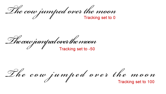
Letter Spacing and Word Spacing
Letter spacing is the amount of space between letters (read more about tracking and kerning here) and word spacing, as the name implies the amount of space between words. Both are major factors in how readable body copy is.
Line Length and Justification
Whether it’s on the web or on a printed page, if a line is too long, it can be difficult to find the beginning of the next line. If a line is too short, it breaks up the phrases we recognize. A very simple rule of thumb is to use shorter lines with extra space between the words when using sans serif typefaces.
Reverse Type and Light or Heavy Weights
Black type on white or light background appears to be larger than white type on a dark background (reverse). To compensate, use a larger or bolder size and avoid typefaces with a dramatic variation in stroke thickness. Thin strokes tend to disappear when reversed out.
![]()

And there you have a few points to keep in mind when choosing your typefaces in order to keep your text legible. Any other tips that you’d add to the list? In next week’s typography post we’ll look at legibility.
Frequently Asked Questions on Typography, Readability, and Legibility
What is the difference between legibility and readability in typography?
Legibility and readability are two distinct concepts in typography. Legibility refers to the clarity of typeface, or how easily individual characters or letters can be distinguished from each other. Factors affecting legibility include font size, spacing, and contrast. On the other hand, readability refers to how easily blocks of text, such as sentences or paragraphs, can be read and understood. It is influenced by factors such as line length, line spacing, and text alignment. While legibility is about the physical appearance of text, readability is more about the overall comprehension and ease of reading.
How does typography affect readability and legibility?
Typography plays a crucial role in both readability and legibility. The choice of typeface, font size, line length, and spacing can significantly impact how easily a reader can distinguish individual letters and understand the text. For instance, a typeface with distinct character shapes enhances legibility, while appropriate line length and spacing improve readability by preventing eye fatigue and enhancing comprehension.
What factors should I consider to improve legibility?
To improve legibility, consider factors such as font size, typeface, and contrast. Larger font sizes and typefaces with distinct character shapes enhance legibility. Additionally, sufficient contrast between the text and background can make the text easier to distinguish.
How can I enhance the readability of my text?
Enhancing readability involves considering factors such as line length, line spacing, and text alignment. Shorter line lengths and adequate line spacing can make blocks of text easier to read and understand. Also, aligning text to the left (for languages read left to right) can improve readability as it provides a consistent starting point for each line.
What is the role of color in legibility and readability?
Color plays a significant role in both legibility and readability. High contrast between text color and background color can enhance legibility by making individual letters more distinguishable. However, overly bright colors or harsh contrasts can strain the eyes, reducing readability. Therefore, it’s essential to strike a balance that ensures clear visibility without causing discomfort to the reader.
How does line length affect readability?
Line length significantly impacts readability. Lines that are too long can cause readers to lose their place, while lines that are too short can disrupt the reading rhythm. The optimal line length for readability is generally considered to be between 45-75 characters.
How does text alignment affect readability?
Text alignment can significantly impact readability. For languages read from left to right, left-aligned text is typically the most readable because it provides a consistent starting point for each line. Centered or justified text can disrupt the reading flow and reduce readability.
What is the impact of spacing on legibility and readability?
Spacing, including both character spacing and line spacing, plays a crucial role in legibility and readability. Adequate character spacing can enhance legibility by making individual letters more distinguishable. Similarly, appropriate line spacing can improve readability by preventing lines of text from blending into each other.
How does font size affect legibility?
Font size significantly impacts legibility. Larger font sizes are generally more legible because they make individual characters more distinguishable. However, excessively large fonts can disrupt the reading flow and reduce readability.
What is the role of typeface in legibility and readability?
The choice of typeface can significantly impact both legibility and readability. Typefaces with distinct character shapes enhance legibility, while those with consistent stroke widths and open shapes can improve readability by creating a smooth reading rhythm.