When we read text, we read in phrases. Our reading pattern is disturbed if letters and words are consistently too close together or too far apart.
We can adjust the space between letters using tracking and kerning – two frequently confused terms. Today we’re looking at tracking.
Tracking
Tracking (also known as letter spacing) is the adjustment of space for groups of letters and entire blocks of text. It can make text appear more airy or more dense and affects the appearance and readability of text. Tracking can be applied to small portions of text or an entire block at a time.
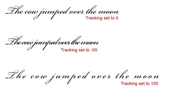
For example script typefaces often require tight letter spacing because the letters should connect, but they also require extra space between the words otherwise they type is difficult to read.

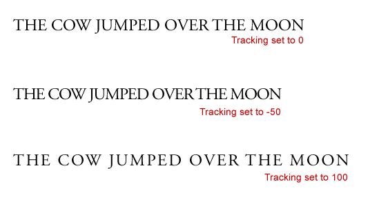
In the example above, when the tracking is set to 100, the space between the letters is too great, at –50 the space is too tight and makes the text difficult to read. When set to 0, the letters are touching each other correctly. This does not mean that all type should always be set to 0 tracking. Take a look at the same tracking settings using Adobe Garamond.

In this example, the text is legible with tracking at 0, –50 and +100. Every font is different and you can get some nice effects by adjusting the space between letters.
Tracking in Photoshop & Illustrator
To change the tracking of type in Photoshop and Illustrator, open up the Character palette. In Photoshop choose Window > Character, in Illustrator choose Window > Type > Character (or Ctrl + T / Cmd + T). In the tracking field you can either choose a preset value or you can simply type in your own numbers, or drag your cursor left and right on top of the tracking icon. ![]() Minus numbers reduce the space between letters.
Minus numbers reduce the space between letters.
![]()
![]()
Photoshop (left) and Illustrator Character palettes.
Tracking in CSS
To adjust the tracking on your web type, you can use the letter-spacing rule. Below I’ve applied a style to some text in a H1 tag and varied the letter-spacing.

![]()

![]()
As you can see adjusting the tracking can completely change the look and feel of the headline. There is no rule to cover tracking for every font. The best guideline is to use your eyes. Generally if the letters look like they’re too close together, they probably are. Lots of practice and experimentation is how you really learn to use tracking in your designs.
Next week we’ll look at Kerning and how and where to apply it.
Frequently Asked Questions (FAQs) about Tracking in Typography
What is the Importance of Tracking in Typography?
Tracking in typography plays a crucial role in enhancing readability and the overall aesthetic appeal of a text. It refers to the consistent adjustment of space for groups of letters and entire blocks of text. Proper tracking ensures that the text is not too tight or too loose, making it easier for the reader to follow. It also helps in maintaining a balanced and harmonious look in the text, contributing to a more professional and polished design.
How is Tracking Different from Kerning?
While both tracking and kerning deal with the adjustment of space in typography, they serve different purposes. Kerning refers to the adjustment of space between two individual letters to correct visually uneven spacing. On the other hand, tracking involves adjusting the spacing uniformly over a range of characters. This means that while kerning is more about fine-tuning individual letter pairs, tracking is about the overall letter spacing in a word, sentence, or paragraph.
How Does Tracking Affect the Readability of Text?
Tracking significantly impacts the readability of a text. If the tracking is too tight, the letters can appear to be jumbled together, making it difficult for the reader to distinguish between individual letters and words. Conversely, if the tracking is too loose, the words can appear disjointed, causing the reader to lose their reading rhythm. Therefore, appropriate tracking is essential to ensure that the text is easy to read and understand.
How Can I Adjust Tracking in Typography?
Most graphic design and word processing software have built-in tools for adjusting tracking. In Adobe Illustrator, for example, you can adjust tracking by selecting the text and changing the tracking value in the Character panel. A positive value increases the tracking, while a negative value decreases it. Remember, the goal is to achieve a balanced and harmonious look in your text.
What is the Relationship Between Tracking and Leading?
Tracking and leading are both essential elements of typography that contribute to the readability and aesthetic appeal of a text. While tracking refers to the horizontal spacing between a group of letters, leading refers to the vertical spacing between lines of text. Both need to be adjusted appropriately to ensure that the text is easy to read and visually appealing.
When Should I Adjust Tracking in Typography?
Tracking should be adjusted whenever the text appears too tight or too loose. This can happen when using certain typefaces or font sizes. For example, smaller font sizes may require looser tracking to improve readability. Similarly, if you’re using a typeface with naturally wide or narrow characters, you may need to adjust the tracking to achieve a balanced look.
Can Tracking Affect the Tone of My Text?
Yes, tracking can subtly influence the tone of your text. Tight tracking can give your text a formal, efficient feel, while loose tracking can make it seem more casual and airy. However, it’s important to remember that tracking should primarily be used to improve readability, not to convey tone.
What is Negative and Positive Tracking?
Negative tracking refers to the reduction of space between characters, making the text appear tighter. This is often used for large headlines or logos where the text needs to be compact. Positive tracking, on the other hand, increases the space between characters, making the text appear looser. This can be useful for small text sizes to improve readability.
How Does Tracking Differ in Print and Digital Media?
The principles of tracking apply to both print and digital media. However, the specific tracking adjustments may vary due to differences in resolution and display. For example, digital screens often have lower resolution than print, which may require looser tracking for better readability.
What are Some Common Mistakes to Avoid When Adjusting Tracking?
One common mistake is over-adjusting tracking, which can lead to text that is either too tight or too loose. Another mistake is not considering the typeface and font size. Different typefaces and font sizes may require different tracking adjustments. Lastly, it’s important to remember that tracking is not a substitute for kerning. While tracking can improve the overall spacing of your text, you may still need to adjust the kerning between specific letter pairs for the best results.
Jennifer Farley is a designer, illustrator and design instructor based in Ireland. She writes about design and illustration on her blog at Laughing Lion Design.


