 Last week, we had a look at the Modern typeface and to continue this series of posts on font categories, today we’ll take a look at the beautiful Old Style typeface. I think for all of us, our design work can only improve when we become more aware of the different categories of fonts, their characteristics and similarities, and for what purpose they are most suited, whether we work in web or print design.
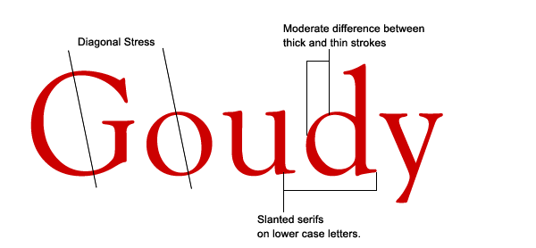
Old Style (occasionally referred to as Humanist) typefaces are based on hand lettering of scribes and they first appeared in the late 15th century, before Modern typefaces. Their relation to calligraphy can be seen in the curved strokes and letters with thick to thin transitions, looking somewhat like letters drawn with a pen and ink. Unlike Modern typefaces, the thick/thin transition is moderate and not so obvious. The serifs on Old Styles are always angled and if you draw a line though the thinnest parts of the letters, you’ll see that the stress is diagonal.
 The very first italic letters were produced with Old Style fonts in the early 1500s.
Old Style typefaces are considered to be the best type for large amounts of body text on paper. That’s why you’ll find them used heavily in newspapers, magazines and books. They can also work well on the web and two Old Style fonts are considered to be web-safe: Times New Roman and Palatino Linotype. Old Styles don’t jump off the page with any sort of quirkiness and that’s what makes them easy on the eye. There is an argument that for print-based work serif fonts are the best, while for the web/screen sans-serif fonts are easiest to read. If you find that’s the case, you could consider using the fonts below for headings and sub-headings.
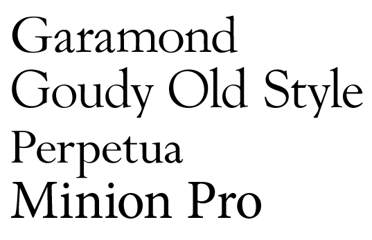
 Other well known examples of Old Style fonts include Garamond, Gaudy Old Style, Perpetua and Minion Pro. Note all of the text below is set at size 80pt and leading of 80pt.
 You might think that these fonts look almost identical on first glance. When you start to look closely though, as well as their similarities, you’ll start to notice the little differences that make each one unique. One way to become more conscious of typefaces is to make an effort to look more closely at type. Sounds obvious I know. Next time you’re reading a magazine or book, or looking at a website, take time to figure out what kind of font is being used. Look at the ads when you’re standing at the bus stop. Are the fonts used serif, sans-serif, decorative? The more familiar you become with type, you’ll find that you begin to experiment and you’ll also start to figure out which fonts work well together. (Something I’ll be writing about in future posts here on Sitepoint).
Related Reading:
Frequently Asked Questions about Old Style Typeface
What is the history of Old Style Typeface?
Old Style typefaces, also known as Humanist, date back to the mid-15th century. They were inspired by the calligraphy of the time and were used in the earliest types of printing presses. The first Old Style typefaces were created by Venetian printers, with the most notable being Nicolas Jenson. These typefaces are characterized by their diagonal stress, moderate contrast, and bracketed serifs, which make them highly legible and suitable for extended reading.
How can I identify an Old Style Typeface?
Old Style typefaces are characterized by a few distinct features. They have a diagonal stress, meaning the thin parts of the letters are on a diagonal rather than vertical. They also have moderate contrast between the thick and thin strokes of the letters. The serifs, or small lines at the end of strokes, are bracketed and the x-height (height of lowercase letters) is relatively small. These features give Old Style typefaces a classic, traditional look.
What are some popular Old Style Typefaces?
Some popular Old Style typefaces include Garamond, Jenson, and Caslon. Garamond is known for its elegance and readability, making it a popular choice for book text. Jenson, named after the Venetian printer Nicolas Jenson, is characterized by its wide, regular proportions. Caslon, created by William Caslon in the 18th century, is considered the first original English typeface and is still widely used today.
When should I use Old Style Typeface?
Old Style typefaces are ideal for extended reading materials such as books, newspapers, and magazines. Their high legibility and classic look make them a popular choice for these types of texts. However, they can also be used in any design where a traditional, elegant look is desired.
Can Old Style Typeface be used in digital design?
Yes, Old Style typefaces can be used in digital design. They are often used in e-books and online publications due to their high legibility. However, due to their small x-height and moderate contrast, they may not be as effective on low-resolution screens.
How does Old Style Typeface compare to other typefaces?
Compared to other typefaces, Old Style typefaces have a more traditional and classic look. They have less contrast between thick and thin strokes than Modern typefaces and are more legible than Decorative typefaces. However, they may not be as versatile as Sans Serif typefaces, which can be used in a wider range of designs.
What is the difference between Old Style and Transitional typefaces?
Old Style typefaces date back to the 15th century and have a traditional, classic look. Transitional typefaces, on the other hand, were developed in the 18th century and serve as a bridge between Old Style and Modern typefaces. They have more contrast between thick and thin strokes and vertical stress, giving them a more modern look.
Can I create my own Old Style Typeface?
Yes, with the right tools and knowledge, you can create your own Old Style typeface. There are many software programs available that allow you to design your own typefaces. However, it’s important to study the characteristics of Old Style typefaces and practice your skills before attempting to create your own.
Are there free Old Style Typefaces available for download?
Yes, there are many websites that offer free Old Style typefaces for download. However, it’s important to check the license of each typeface before using it in your designs, as some may only be free for personal use.
How can I incorporate Old Style Typeface into my design?
Old Style typefaces can be incorporated into your design in many ways. They can be used for body text due to their high legibility, or for headings and titles to give your design a classic, traditional look. They can also be paired with other typefaces to create contrast and visual interest.
Jennifer Farley is a designer, illustrator and design instructor based in Ireland. She writes about design and illustration on her blog at Laughing Lion Design.

